Next-Gen Data Catalog

Problem Statement:
Enterprise users often struggle with inefficient data discovery and understanding, leading to delays in decision-making and inaccurate insights. This problem stems from several key factors:
- Difficulty in locating relevant data assets quickly.
- Inconsistent metadata leading to confusion and errors.
- Lack of understanding of complex data structures and KPIs.
- Inefficient collaboration across teams due to silos of information.
These challenges hinder the ability of data professionals and business users to make timely and accurate decisions, impacting overall organizational efficiency and productivity.
Objectives and Goals
- The primary objective of PowerMe is to streamline data workflows and enhance data literacy across organizations. We aimed to achieve this by:
- Automating data cataloging to ensure all relevant data assets are readily accessible.
- Providing an intuitive search and discovery interface for easy navigation and retrieval.
- Consolidating technical and business metadata into a single, accessible view.
- Leveraging generative AI to enrich metadata, improving data literacy and understanding.
- The success of PowerMe was measured based on the following KPIs:
- Reduction in time taken to locate relevant data assets.
- Increase in user satisfaction with the data discovery process.
- Improvement in user understanding of data assets through metadata enrichment.
Design Thinking
1. Empathize: We conducted interviews with enterprise users, data analysts, and BI professionals to understand their pain points:
- Difficulty locating relevant assets (reports, dashboards, datasets).
- Uncertainty about data quality and how data had been transformed.
- High-time investment in validating the accuracy and relevance of assets.
2. Define: Enterprise users need a way to quickly discover and trust high-quality BI & analytics assets to streamline their decision-making processes.
3. Ideate: Based on insights from user research, we brainstormed several potential solutions, including:
- A unified search and discovery system for BI assets.
- Visual data lineage mapping to track data transformations.
- Data quality indicators at the point of asset consumption.
4. Prototype: We developed a prototype for PowerMe with the following key features:
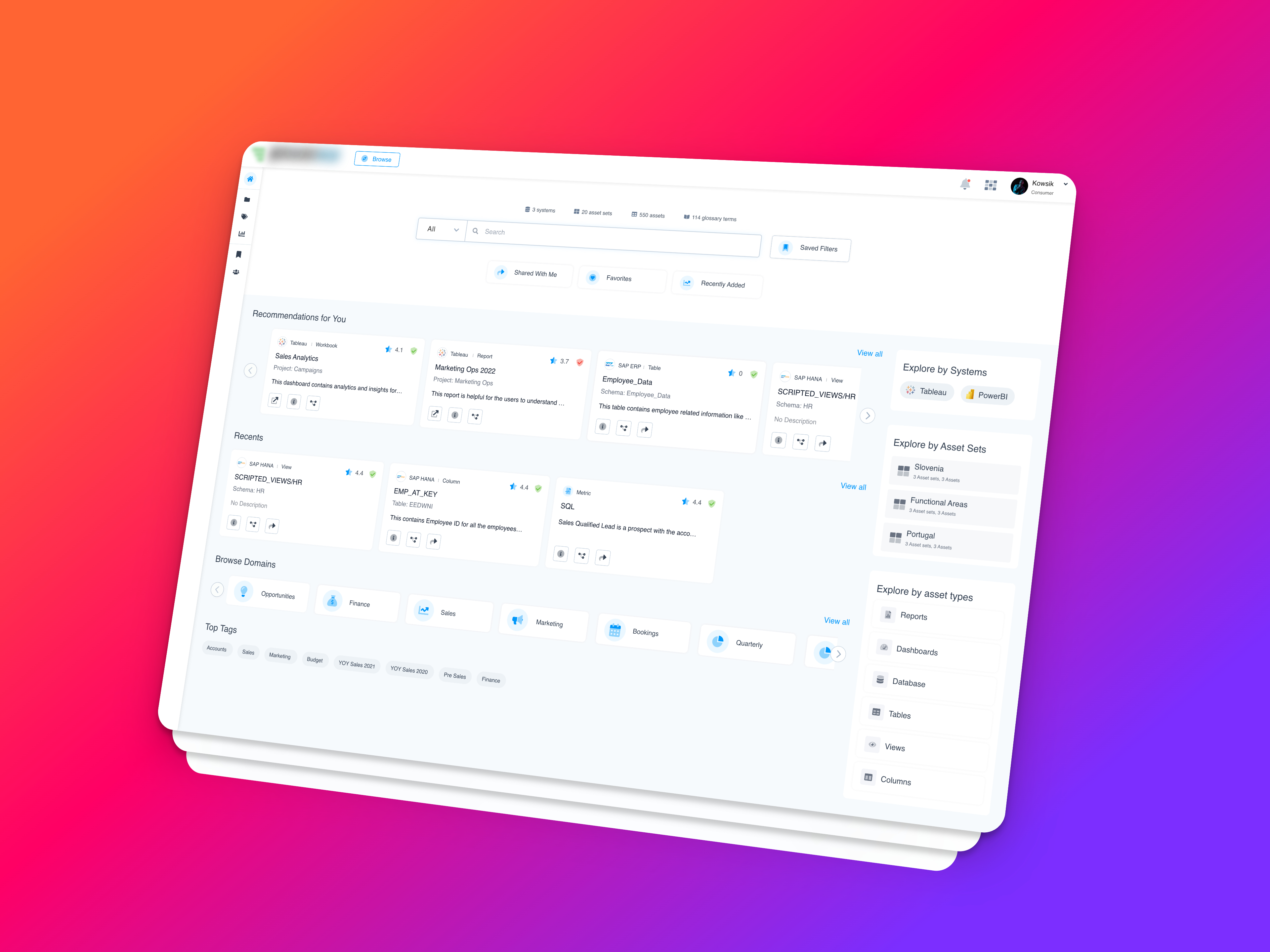
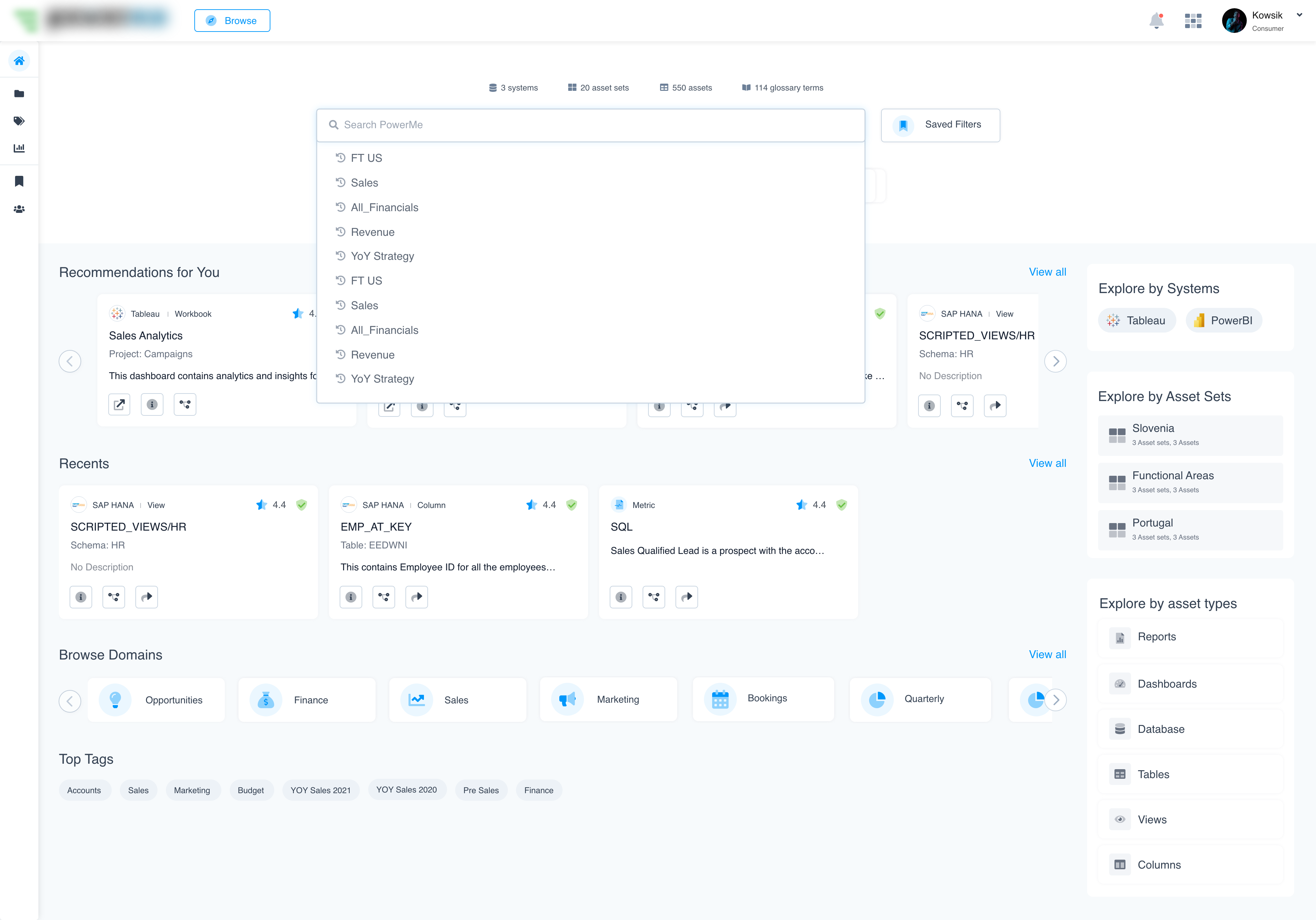
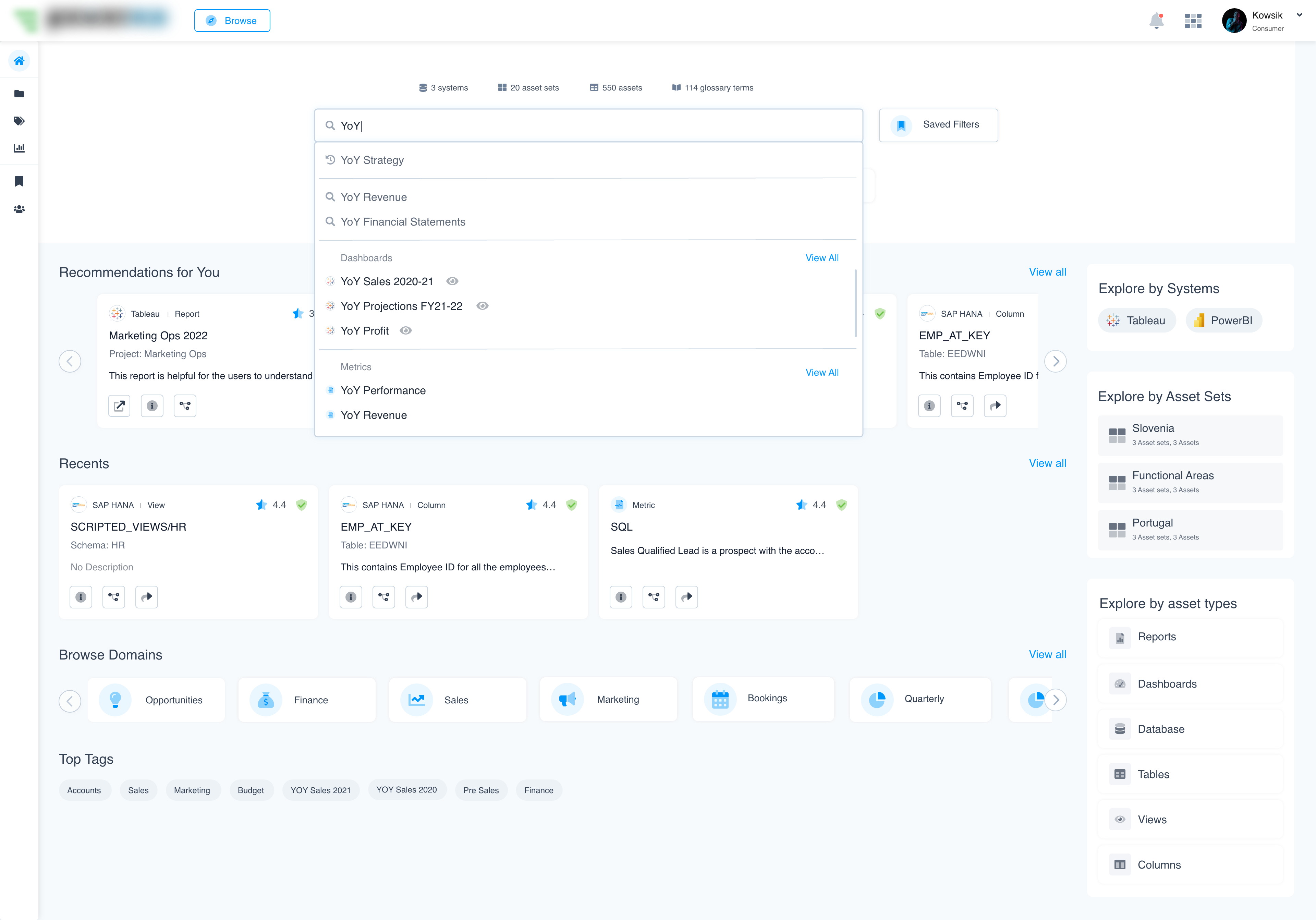
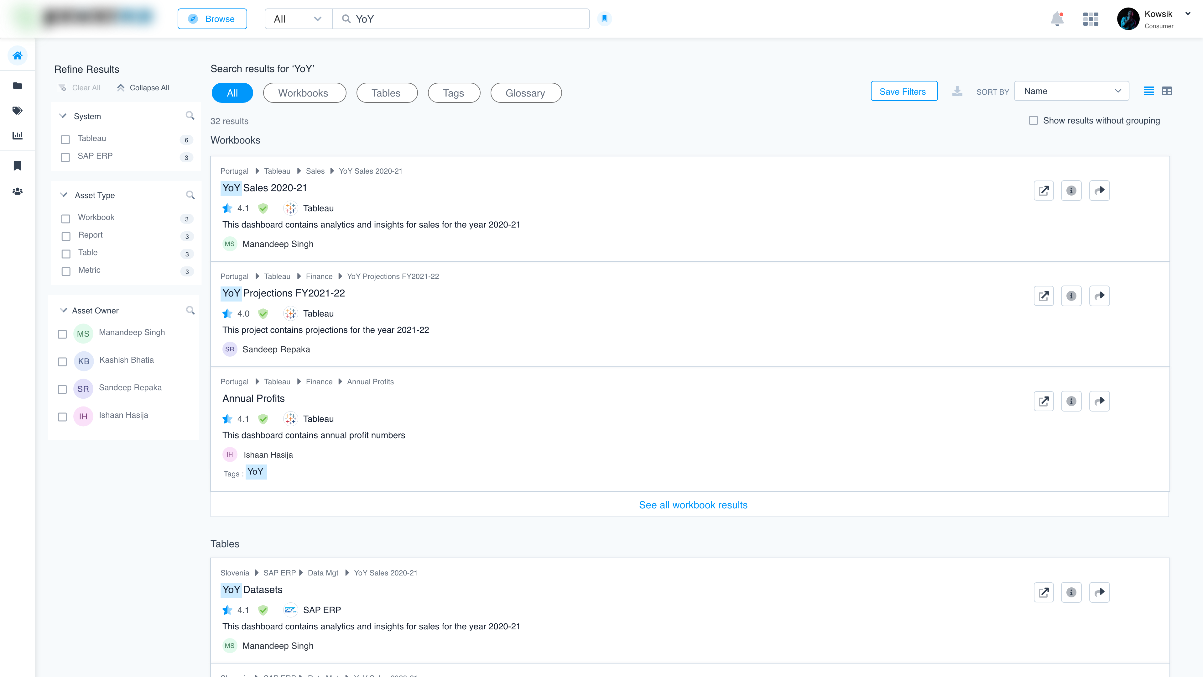
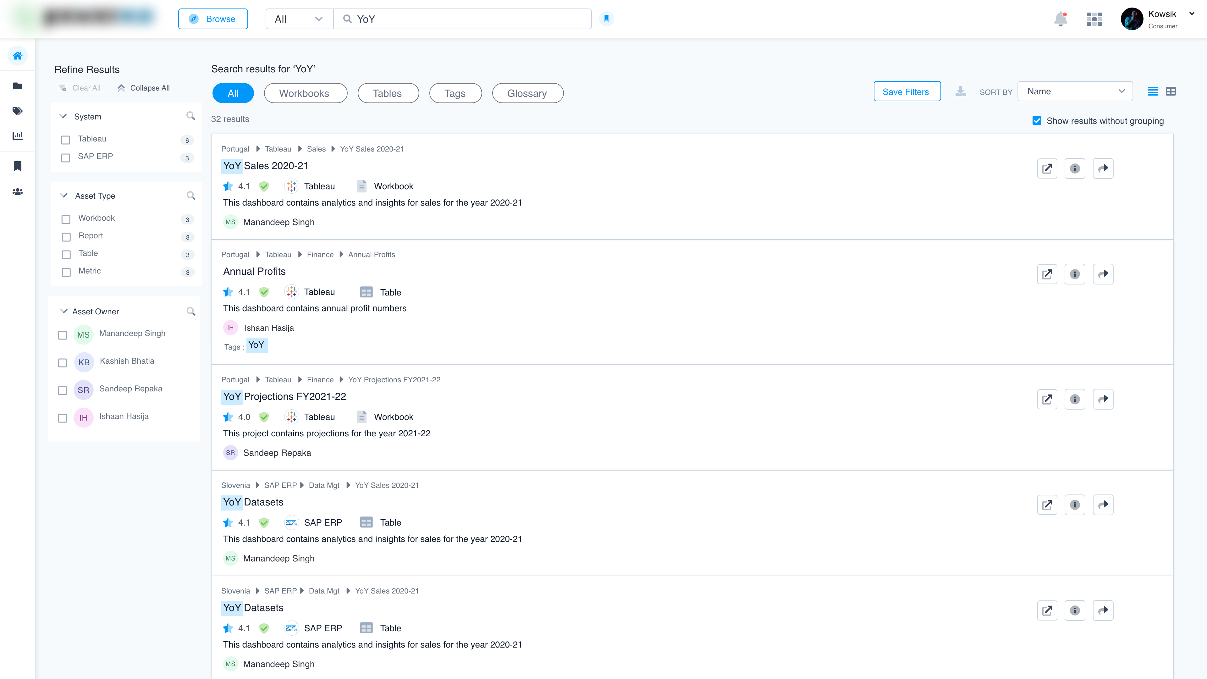
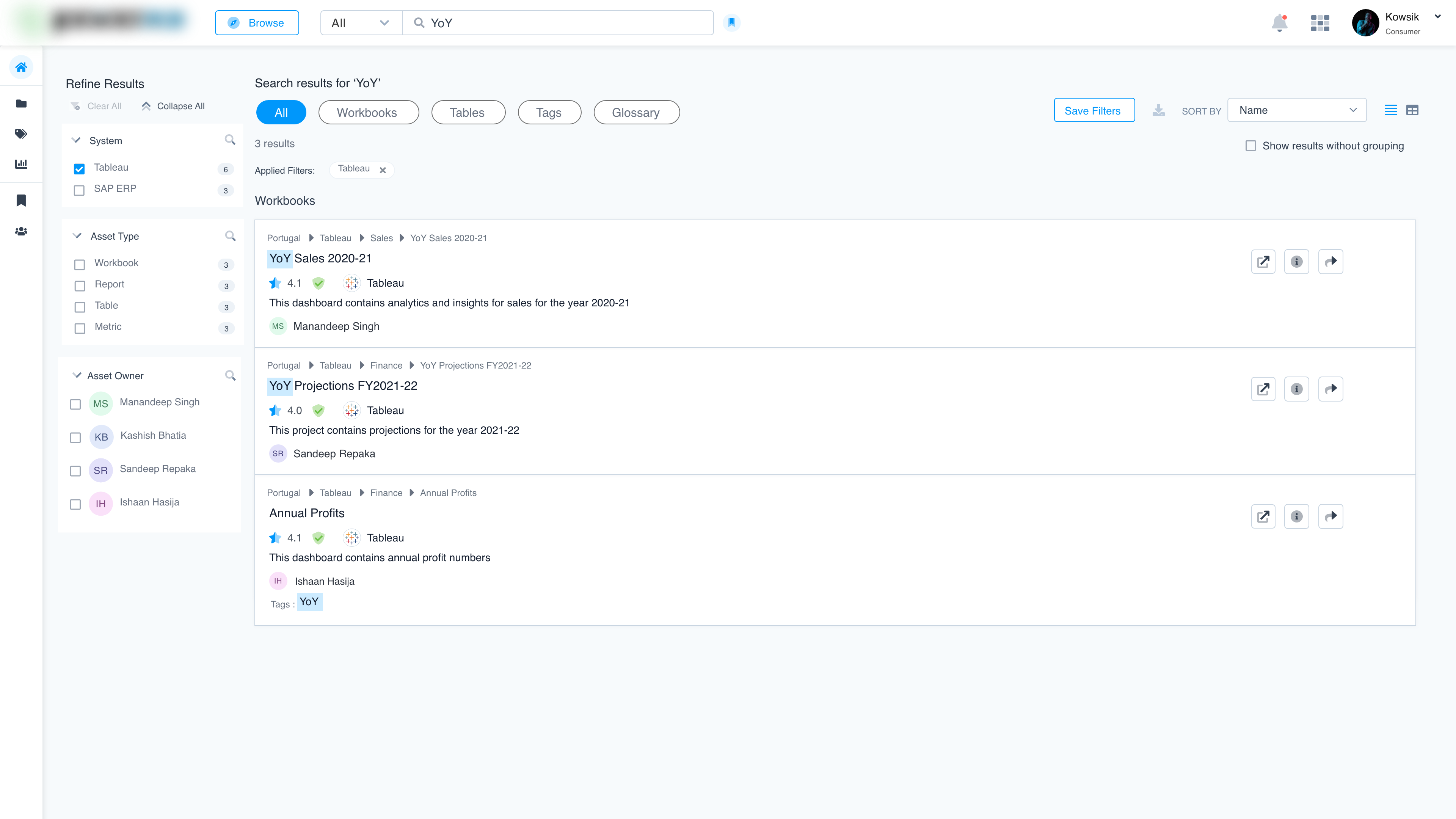
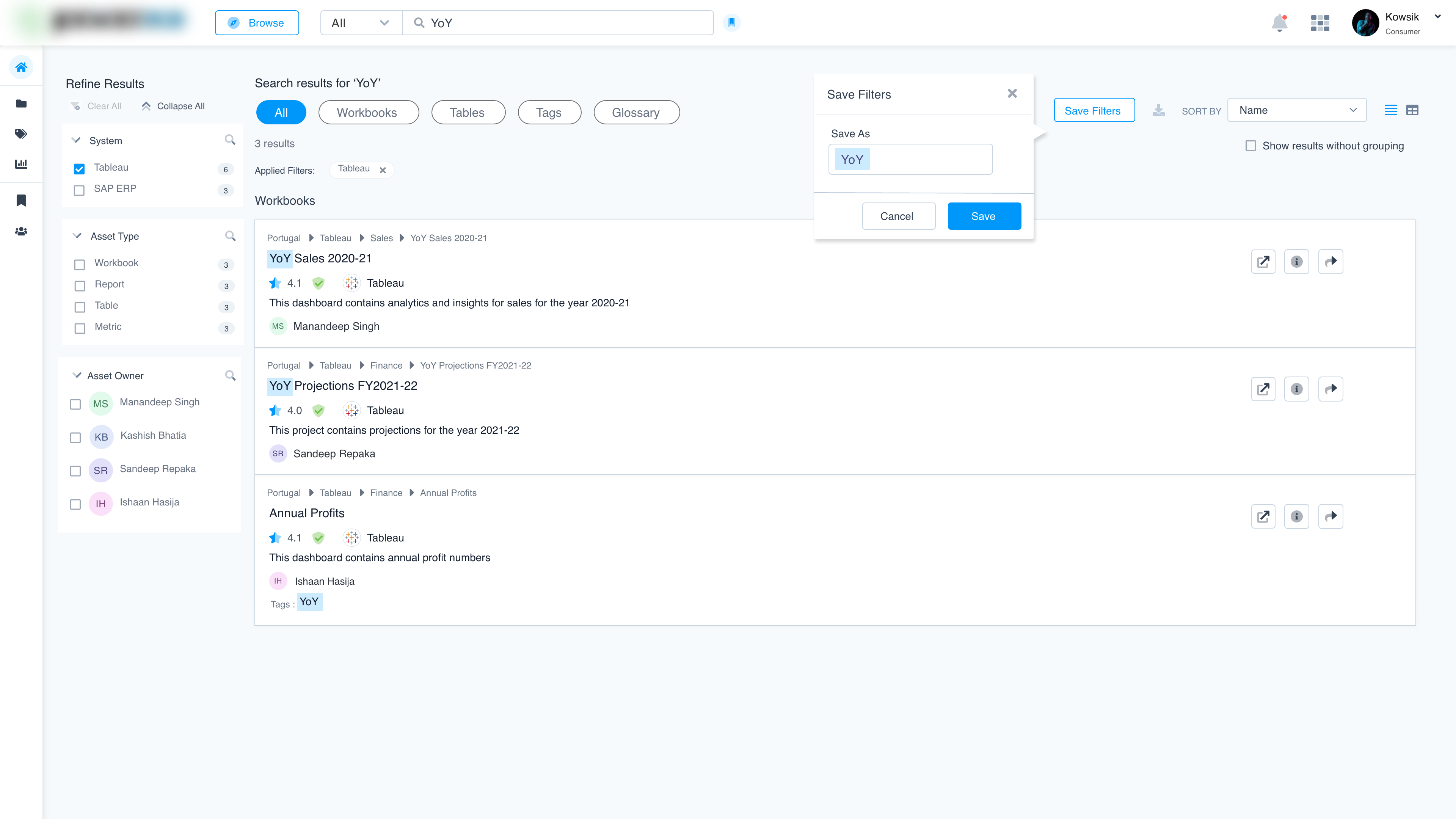
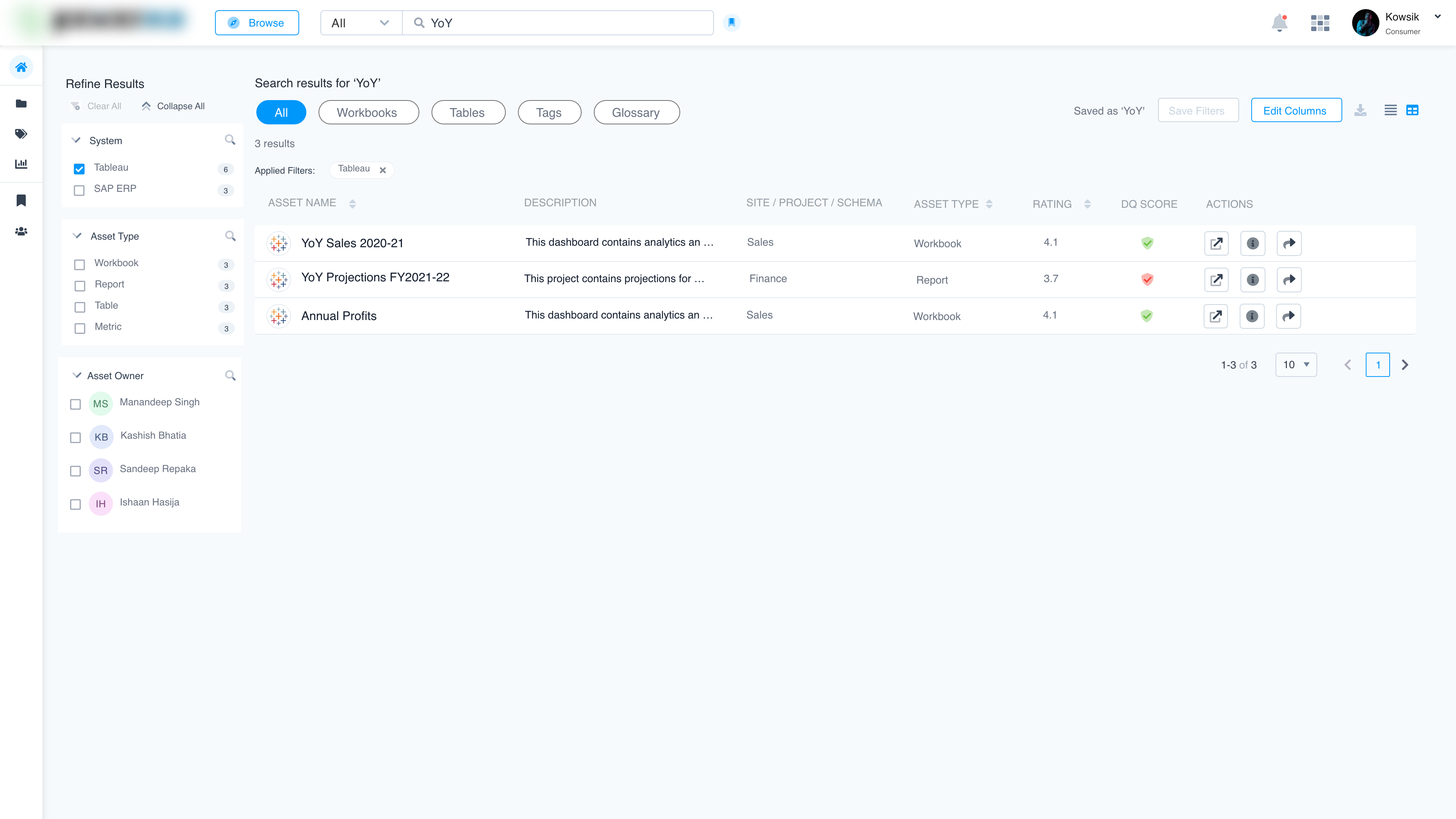
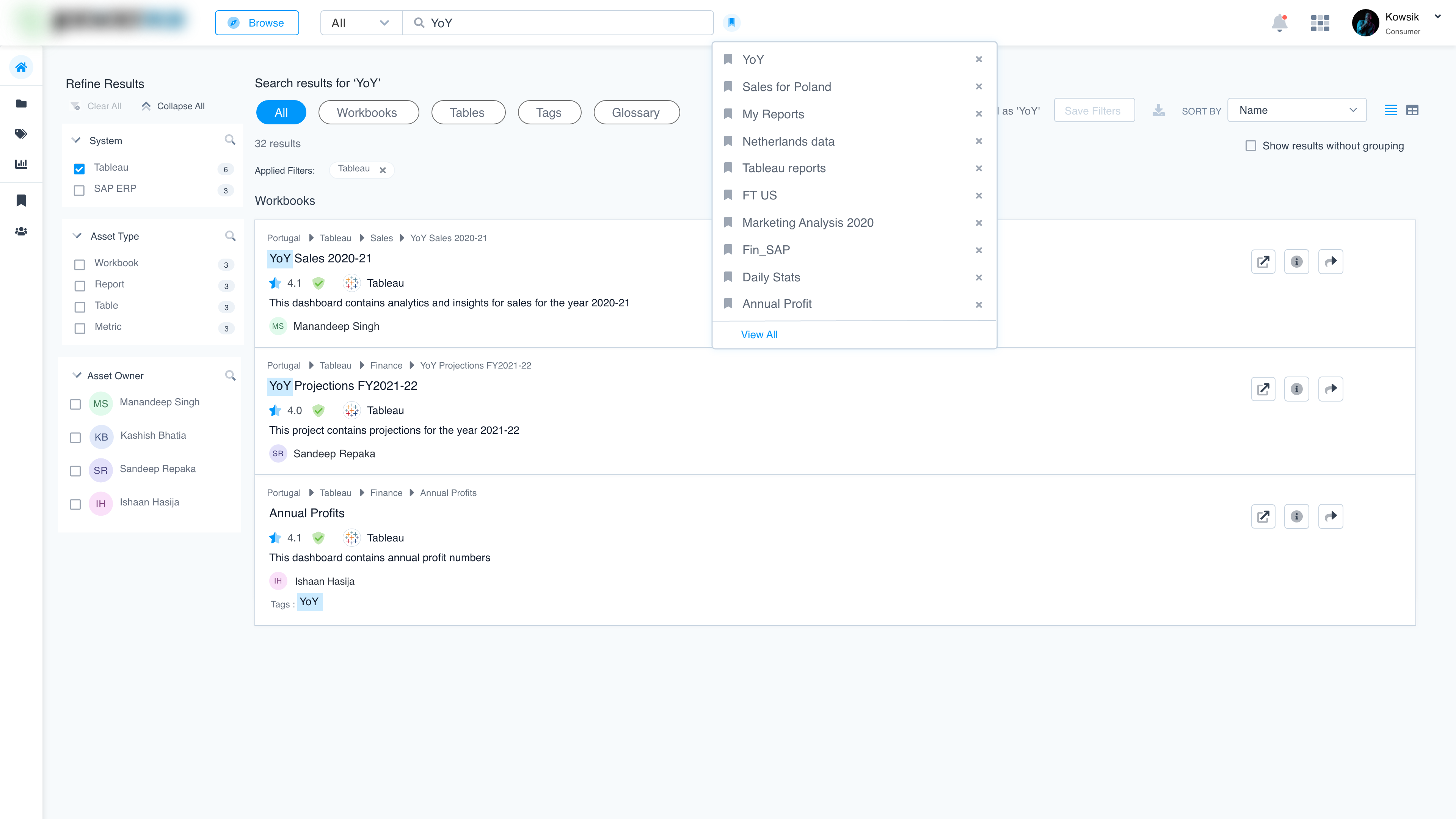
- Searchable Catalog: A centralized interface for users to find all relevant BI & analytics assets.
- Data Lineage Visualization: A visual representation of data flow and transformations, ensuring transparency.
- Quality Assessment Indicators: Built-in data quality metrics displayed alongside assets, giving users immediate confidence in their reliability.
5. Test: We conducted usability tests with diverse enterprise users.
Mockups
Key findings:
- Users found the visual lineage feature reduced time spent validating data.
- Data quality indicators built trust and sped up decision-making.
- The intuitive catalogue interface enabled the faster discovery of assets.
Result:
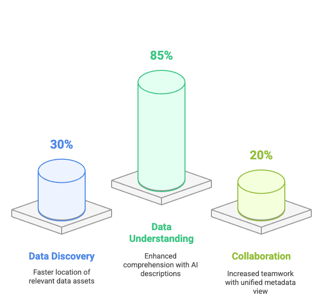
- Users were able to locate relevant data assets 30% faster compared to their previous workflows.
- 85% of users reported a better understanding of data assets due to AI-generated descriptions and similarity insights.
- Teams experienced a 20% increase in collaborative efforts due to the unified view of metadata and enriched explanations.
Reviews
1 review

I really loved the UI elements! They look very clean. Just two little things to take into account:
- "Explore by asset sets": I noticed that the card center width (functional areas) appears to be slightly misaligned.
- "View all" text: Have you considered adding an underline or a white background to make it clearer that it's an actionable element? It could help users recognize it more easily.

Personally I think your UI look clean and modern, Kowsik. It's very easy for eyes to look at. The use of typography and color are also appropriate.
I'm not so clear about the users of this product. What are their pain points and needs, which problem is solved here? On another hand, it's not easy to capture the meaning of the menus on the left without seeing their labels.
I guess this dashboard is for very specific kinds of specialists who are familiar with the specialized terminologies in data analytics. Maybe I lack of adequate knowledge to fully understand it. Somehow the project's description should be explained in a way that’s easier to understand for someone without expertise like me.
Appreciate your efforts! Let's keep going 😀
You might also like

HealthFlow: Designing a Simple and Insightful Wellness Dashboard


Improving Dating App Onboarding: A/B Test Design

FORM Checkout Flow - Mobile


A/B Test for Hinge's Onboarding Flow


Accessibility Asse


The Fitness Growth Engine

Popular Courses

UX Design Foundations


User Psychology


Information Architecture
