Implement a Dark Mode Design

Product is dark mode.

Reviews
2 reviews

Couple points:
- Not an entertainment platform (would ignore if not for the other points)
- No light mode version for this project, one of the brief's request.
- No mode switch on the interface, another brief request.
- No explanation on design choices or thought process... Another brief request.
- This wasn't designed, they are merely screenshots.
My recommendation? Read the brief thoroughly and really understand what is being asked from you by stakeholders.
Even if this was designed somewhere else and the design somewhat feels like "dark mode", it does not fit the brief.
(edited)

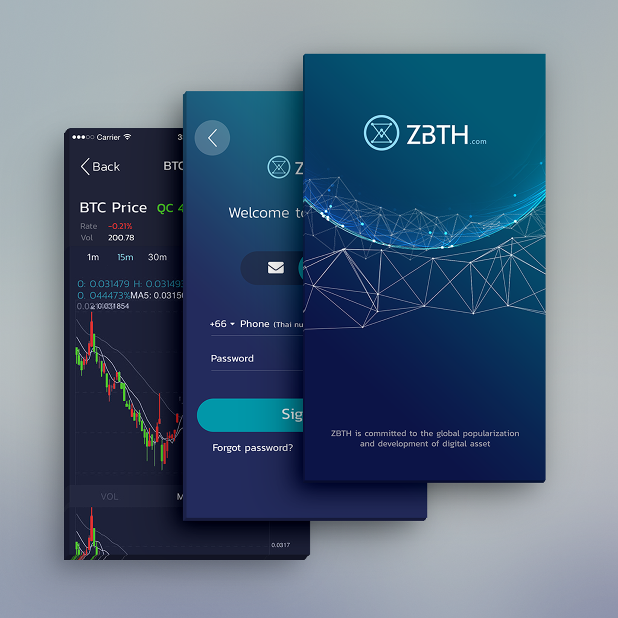
Hey Laksika - Visuals look decent but as a mentor, I see some major errors here:
1. You designed Crypto, but the brief asked for an Entertainment platform. In business, this is an auto-rejection.
- Typos like "Acconding" make the app look fake. One thing that begins two is not writing for real life scenarios. Always check grammar.
- You have to ask, does it solve the real problem because you are making a business and not this app
- One thing I like is to buy and sell BTC buttons are large and accessible, but the colour doesn't means to be red – selling BTC is not a bad thing
- Many things looks sketchy because of the alignment issues, so small things matter here
- The underlines of input peels are barely visible bad for accessibility – run a contrast checker. You will finally see some errors there.
• • The tax inside the password, strength is too small to read. Also, that type that text in the Image Capture is horrible. UX – go for biometric or Face ID screen.
🔥If you need more guidance, definitely check my profile - 🎉 contact me there and we can do one on one, Mentorship
5 Claps
Average 2.5 by 2 people
You might also like

Project
Improving Dating App Onboarding: A/B Test Design
This project explores how improving the onboarding experience of a dating app can increase profile completion and early user engagement. I d

Project
FORM Checkout Flow - Mobile

Try out the prototype here. Design Rationale Why mobile? Mobile accounts for the majority of e-commerce browsing, and premium furniture pur

Project
A/B Test for Hinge's Onboarding Flow

This project focuses on improving the onboarding experience of a dating app - Hinge, by addressing low profile completion rates. Since profi

Project
Accessibility Asse

For this project, the LearnLink website was selected, and the goal was to redesign the login and sign-up pages specifically, adapting them t

Project
The Fitness Growth Engine

This slide shows how user behavior translates into business success by connecting activation, habit formation, retention, and monetization i
Editors’ Choice
Project
Uxcel Halloween Icon Pack

🎃 Introducing the Uxcel Halloween Icon Pack! 🎃 This custom Halloween-themed icon set was created to enhance the seasonal user experience o
Visual Design Courses

Course
UX Design Foundations

Learn UX design fundamentals and principles that create better products. Build foundational knowledge in design concepts, visual fundamentals, and workflows.

Course
Introduction to Figma
Learn essential Figma tools like layers, styling, typography, and images. Master the basics to create clean, user-friendly designs

Course
Design Terminology

Learn UX terminology and key UX/UI terms that boost collaboration between designers, developers, and stakeholders for smoother, clearer communication.