Heuristic Evaluation - Strava Mobile App


I chose this design brief as my first submitted project as I believe I should understand the rules first and how they are applied through product evaluation before creating useful components.
As my first Heuristic Evaluation of a mobile app, I chose Strava because I use it myself to track progress and activities, and I'd also like to discover if the app follows the 10 Usability Heuristics.
For the presentation, I'm using the app's colour palette of the logo and CTA button, to their text font colours. I also tried using the same font, but alas, this is the closest I get to using their font style. I also added organic shapes and lines - in some slides - that resemble maps and trails to fill in negative spaces. With these, I hope incorporating elements from the Strava app in my presentation gives the readers a pleasant journey to this evaluation.
Any comments and suggestions are very welcome to the improvement on my approach and this evaluation. :)


Tools used
From brief

Topics
Share
Reviews
1 review

Hey Stefanie, we cannot visualize the content.
Can you make it available for us to see it?
please.. check the permissions :)
You might also like

Events Managment App


Mobile Onboarding: Casa di Pasta


Accessible Signup & Login Experience — Brainex


Accessible Signup Form


Accessible Signup Form

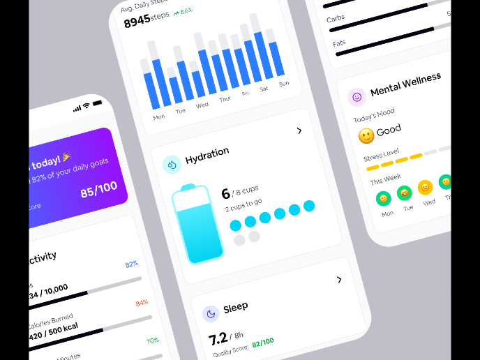
WellNest

User Research Courses

Ethical & Responsible Product Design


Introduction to Product Management


The Product Development Lifecycle & Methodologies
