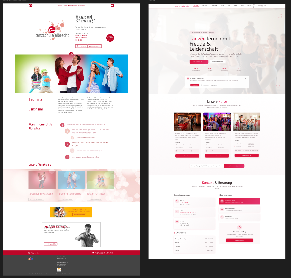
heuristic analysis Tanzshule
Platform & Device Type
- Platform: Website – Tanzschule Albrecht homepage
- Device Type: Desktop (let me know if you'd like to evaluate mobile too later)
I'll highlight a few notable observations based on the homepage content—feel free to capture screenshots based on these insights and fill in the template above.
Identifying Issues:
A. Visibility & Feedback
- Cookie banner: Takes over large screen area; lacks clear distinction between “Annehmen,” “Ablehnen,” and settings.
- Heuristic: User Control & Freedom & Aesthetic and Minimalist Design
- Potential severity: Medium to High (intrusive, may hinder quick site access)
B. Navigation Clarity
- The navigation menu uses plain text links: Erwachsene, Jugendliche, Kinder, etc. No hover-state or current-page highlighting detected.
- Heuristic: Visibility of System Status & Navigation Consistency
- Severity: Medium
C. Call-to-Action Clarity
- Buttons like “Zum Kursangebot” and “Fragen stellen” are visible, but their CTA status is not visually distinct (color, shape) from plain links or images.
- Heuristic: Recognition Rather Than Recall & Aesthetic and Minimalist Design
- Severity: Low to Medium
D. Content Layout Hierarchy
- The homepage mixes large images, headings, buttons, and contact info in one scroll area—could create visual clutter or confusion about where to click first.
- Heuristic: Aesthetic and Minimalist Design & Flexibility and Efficiency of Use
- Severity: Medium
E. Contact Info Accessibility
- Contact details (phone, email) are provided twice—but formatted as plain text, without click-to-call or mailto links.
- Heuristic: Efficiency of Use & Error Prevention
- Severity: Low (minor but affects user convenience)
F. Mobile Responsiveness Check (Optional)
- Though evaluating desktop, check if the desktop layout scales poorly when shrunk. If so, that’s a usability issue related to Responsiveness/Responsive Design (not in Nielsen’s heuristics, but still relevant).
Strengths:
- Clear categorization of courses (Adults, Teens, Kids) makes it easy for users to identify their target section.
- Warm and welcoming branding with engaging visuals that reflect the spirit of dance.
- Essential contact information (phone, email, address) is visible in multiple locations.
- Calls to action (e.g., Zum Kursangebot, Fragen stellen) are present and guide users toward important actions.
Areas for Improvement:
- Cookie banner is intrusive and lacks equally clear choices for consent.
- Navigation menu provides no visual feedback (hover or active states), making orientation difficult.
- Call-to-action buttons do not stand out enough from regular text links.
- Homepage layout lacks a strong visual hierarchy, leading to potential user confusion about where to focus.
- Contact information is not clickable, reducing convenience for users.
Overall Evaluation:
The Tanzschule Albrecht website successfully communicates its brand identity and course offerings, creating a friendly and approachable atmosphere. However, several usability issues reduce efficiency and clarity. By improving navigation feedback, making calls to action more prominent, streamlining the cookie banner, and enhancing visual hierarchy, the site can significantly boost user experience and engagement.
Reviews
1 review
good work Gerda
Great identification of key usability issues like intrusive cookie banner and unclear navigation feedback.
Strengthening visual hierarchy and making CTAs more distinct will further improve clarity and user flow.
You might also like

Bridge: UI/UX Rebrand of a Blockchain SCM Product

Pulse Music App - Light/Dark Mode

Monetization Strategy

Designing A Better Co-Working Experience Through CJM

Design a Settings Page for Mobile

Zoom Sign in Screen
User Research Courses

Ethical & Responsible Product Design

Product Management Foundations


