Happyflix - Safe Streaming
Project Links:
Prototype Video: https://youtu.be/eM2YaN6RMQY
Figma Prototype: https://www.figma.com/design/J4tnnIw5mA3IpU3eYQjcm0/Redesign-Of-Happyflix?node-id=0-1&t=10E4i6ilQC12Jw8V-1
What is Happyflix?
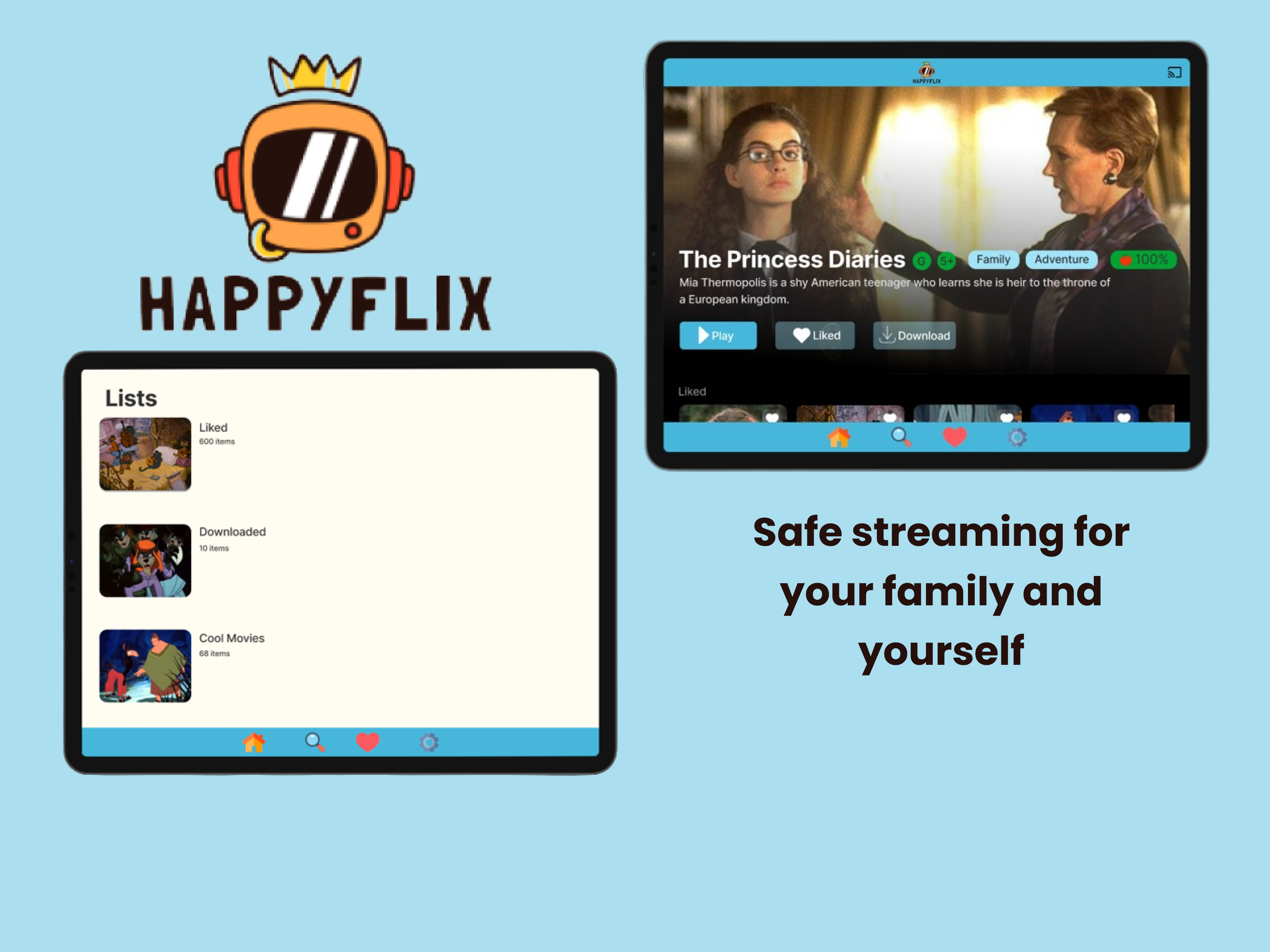
Happyflix is a streaming service made for families and individuals who want to control the content they or their families have access to.
Skills: Ideation, empathizing, user paths, wireframes, prototyping, interactivity, iconography & graphic design.
Design Tools: Miro, Figma and Figjam
The Problem(s)
- Parents want to make sure their children aren’t watching inappropriate movies and TV shows online but don’t have the time to properly research all the shows their children want to watch.
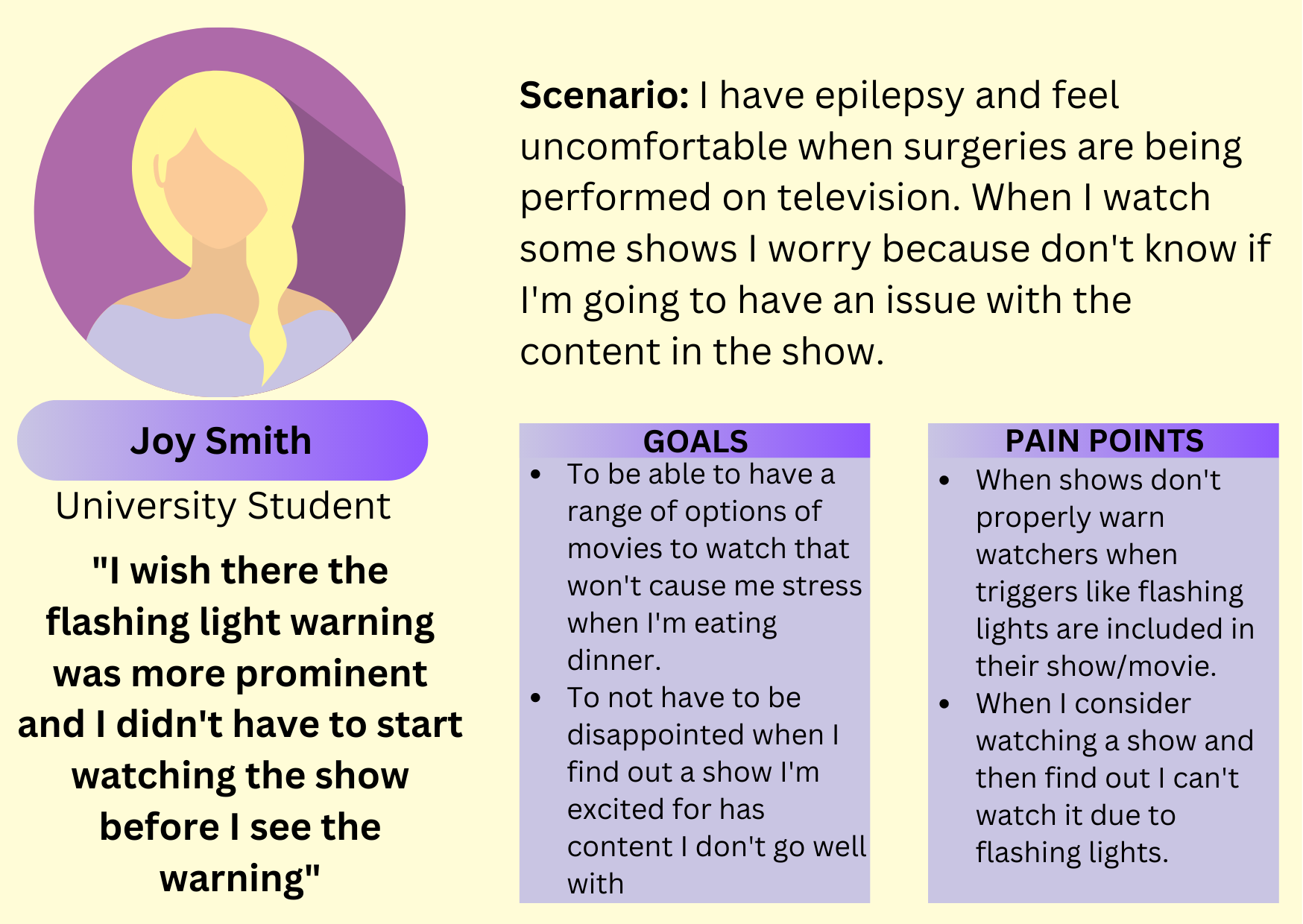
- People with health problems like epilepsy don’t want to watch half of a tv series only to see the trigger warning on the series finale and then be unable to watch it.
User Personas and Pain Points
User Personas:
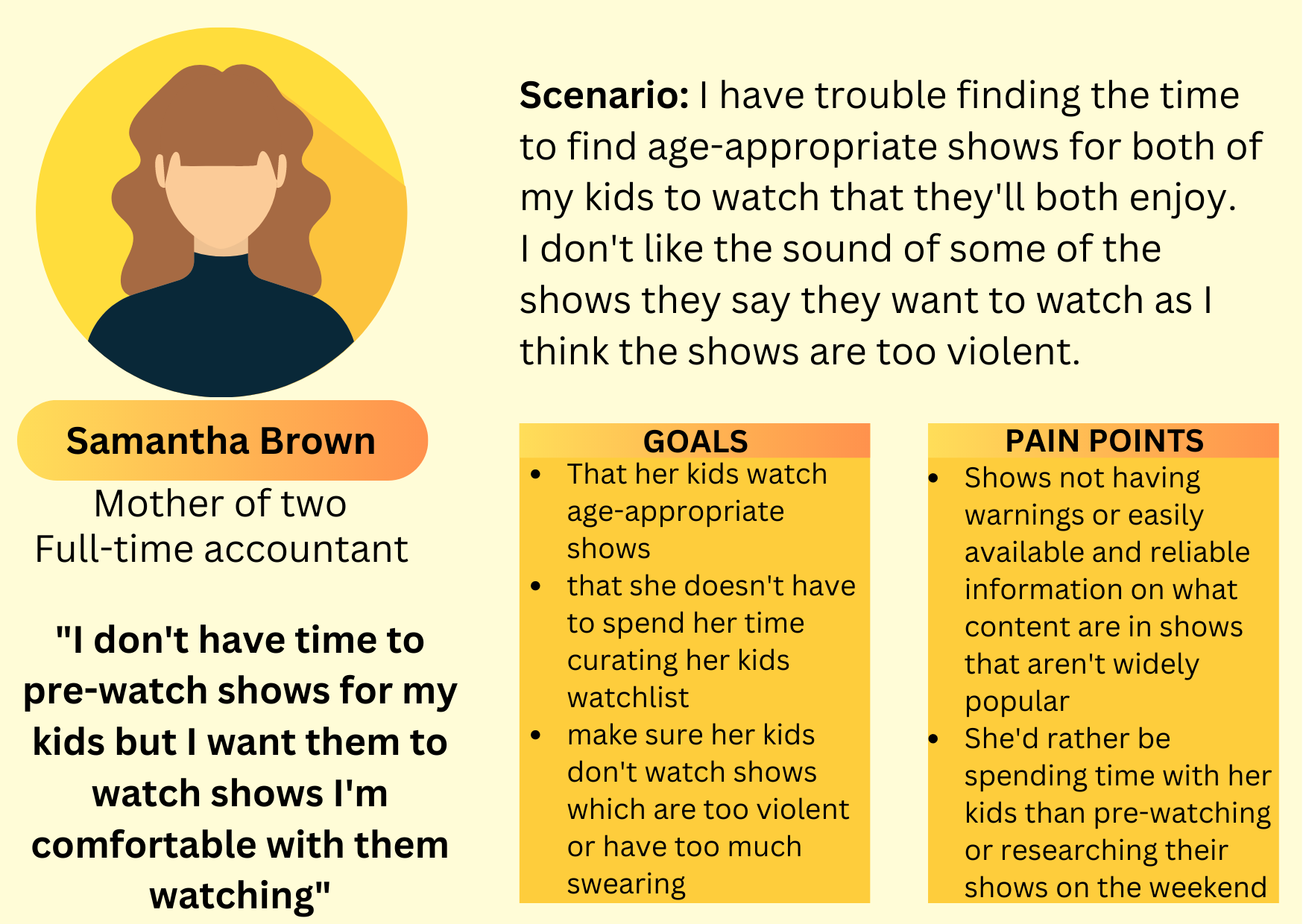
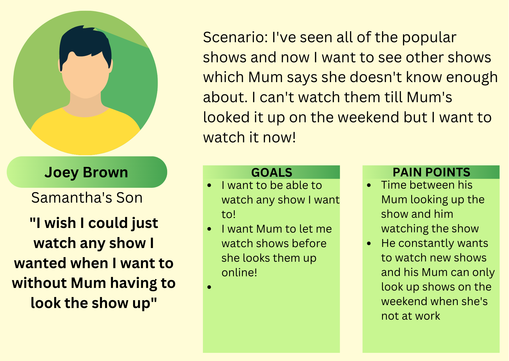
To further define the problem and figure out what features would help users most to eliminate possible pain points based on their predicted behavior, personas of the three main focus groups were created.
Initially there were only two personas; parent and child, but after taking a step back and reflecting upon other possible groups who could benefit from this another group was identified; adults with triggers.
Lets turn our Pain Points into Solutions!
After identifying what the user personas had trouble with in the past I brainstormed what I could do to relieve their pain points.
For Mother Samantha Brown I added the following features to minimize pain points:
Pain Point:
- Lack of content warnings on less popular shows
Solution Feature:
- Add warnings in the details slide when clicking on a show and not allowing users to watch certain banned shows without a pin.
For Samantha’s son Joey Brown, Samantha’s son I added the following features to minimize pain points:
Pain Point:
- Not being allowed wanting to watch what shows he wants.
Solution Feature:
- Similar to website common sense media, have a ranking for what’s allowed. Additionally, not allowing users to view or watch anything with higher rankings than specified.
Thought: Since Joey Brown watches a lot of television it may be beneficial to have a watchlist as well as additional lists which he can put shows he wants to watch on. This passion project is a solo design sprint so user research and interviews were not conducted which is a limitation of the reliability of the project. Conducting user research is something which would immensely improve this project as real-life perspectives would lead to more effective features and a more cohesive project.
For individual Joy Smith I added the following feature to minimize pain points:
Pain Point:
- Being stressed about the potentially harmful content of the movies she wants to watch as there are not always warnings.
- Being disappointed when she’s unable to watch certain shows
Solution Feature:
- Having show’s she can’t watch locked and out of sight so she doesn’t feel left out.
- Have shows which she can’t watch only available through the search function so she doesn’t feel disappointed when she can’t watch a show.
Summary of Solutions
I used the same layout and features as a typical streaming service has but…
Added my own features including:
- A common sense media style ranking of 1 (least) to 5 (most) four categories which parents may want to keep their children away from including violence, coarse language, horror and drinking, drugs & smoking.
- Red tint and lock symbol on top of the tiles of restricted shows when searched for. Restricted shows wouldn’t come up in recommendations or collections; only seen when they’re searched for so that users don’t feel like they’re being left out since they can’t watch all shows.
- the red tint may not be enough contrast depending on the program tile for people with visual impairment so the lock image was added for accessibility.
- Ranking of the four categories in the details slide of each program.
- having different lists inside the watchlists section what are collaborative with family accounts.
User Flow
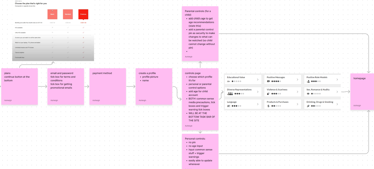
I came up with a basic structure of what I wanted the website map to look like.
I added images of pages and took notes from other sites like competitor streaming services Netflix and Disney+ as well as Common Sense Media warning categories, compared them to my notes of what to include in the page and added to my notes for my final structure.
Link to the Figma file of the User Flow here
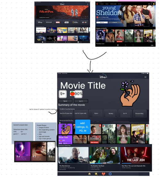
My Sketchy Sketching phase
I didn’t have my pen and paper drawing out my ideas of screens like I would now. For the home screen I took features from Disney+ and Netflix and my own ideas and meshed it into one Frankenstein screen at the bottom of my Figjam page.
With my other projects I sketch out some ideas on pen and paper or draw digitally, wireframe several iterations and then temporarily settle on one idea. I say temporarily as the UX process isn’t linear; changes are always made.
Why I needed a redesign
I completed this project as my first UX/UI design project. I wanted to include it in my portfolio but realized that the design principles that I include in my current designs were not at all present in this design. The UI design needed a lot of work. So I decided to redesign the original
The Redesign:
I included the first iteration of this project in my portfolio because it was the first UX project I ever completed. It’s not perfect and I have grown a lot since completing this project but I wanted to acknowledge how far I’ve come and how much I’ve learnt.
What do I need to redesign?
- Make sure all the functions work properly. Previously not all of the interactions worked.
- Make the design feel more professional, comfortable and more like my current style → the original look of the design looked unprofessional and untrustworthy.
- Make sure all of the elements match the style of the design. Make it more cohesive.
Redesign Prototype Video
Reviews
0 reviews
You might also like
Events Managment App
Customer Journey Map — Offsite Co-Working Experience
Mobile Onboarding: Casa di Pasta
Accessible Signup & Login Experience — Brainex
Accessible Signup Form
Accessible Signup Form
Popular Courses

Introduction to Customer Journey Mapping

Design Thinking


