Accessible Signup Form for SaaS Platform

Design Decisions
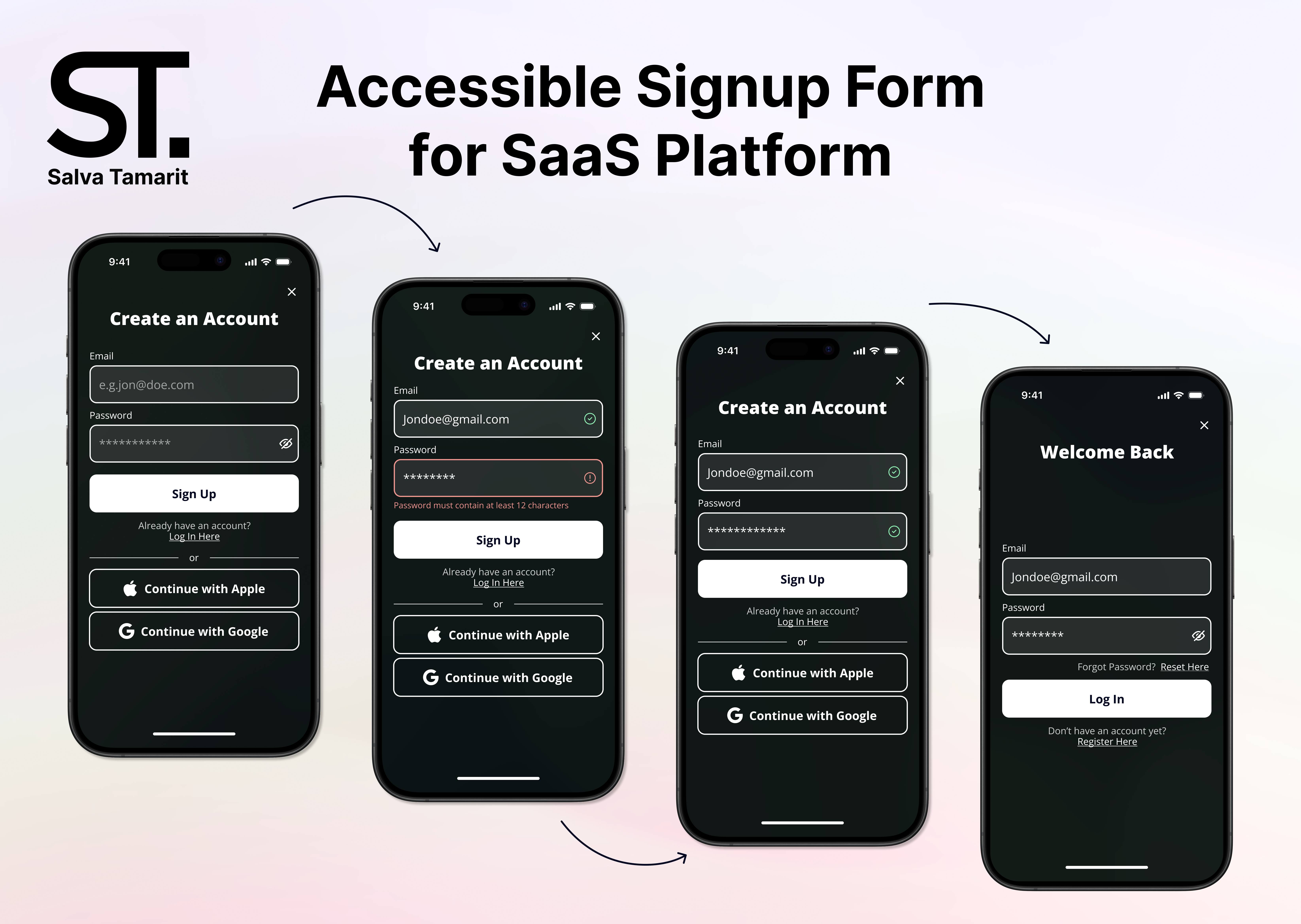
- Focus on WCAG criteria: The design prioritizes meeting the Web Content Accessibility Guidelines (WCAG) for users with disabilities. This includes users with visual impairments, motor impairments, and cognitive impairments.
- Clear Hierarchy and Call to Action (CTA): The “Sign Up” button is the most prominent element, making it clear what the user needs to do. There’s also a “Log In” option for existing users.
- Limited information: The form only asks for the user’s email address and password to create an account.
- Color scheme: A black and green background is used with white and grey for the form fields. This creates high color contrast which is good for accessibility.
Accessibility Considerations
- Color contrast: The text uses a color contrast ratio of 19.69:1 which surpasses the WCAG AAA criteria. This means people with visual impairments will find the text easier to read.
- Font size: All fonts are above 16px, meeting the minimum WCAG AAA criteria for mobile content.
- Target size: Most of the buttons are large enough (44x44px) to meet the WCAG AAA criteria for touch targets. The “Log In” and “Reset Here” buttons are a bit smaller but still meet AA criteria (24x24px).
- Labels: While the placeholder text provides a clue, adding labels for each form field improves accessibility, especially for users who rely on screen readers.
- Error and success messages: Error messages will be displayed in red to indicate which fields need correction. It also has clear and specific error messages that explain the problem with a bouncy animation giving instant visual feedback. There is also an icon showing whether is right or wrong.
All accessibility considerations are checked with the Stark plug-in.
After some tips:
- I made the background darker so the colour contrast is clearer in the error and success image.
- I added a register option on the login page, so you can go back if the user ends up in that tab by accident.
- There's an option to see your password on the login screen to make sure the user can double-check if the password is well-written.
- I added in the labels a faded white to make it more distinguishable from the Apple and Google options. When the user is typing, the white disappears to give visual feedback to the user letting them know which labels are currently on.
Most of the new functions you can try it in the prototype, like when the user is on the label, new visual feedback and more!

Reviews
3 reviews

Hi Salva!
Your work overall looks good.
I have some recommendations for improvement:
- It can be useful to add a "Register" button on the login screen. This way, if users accidentally end up on the login page when they're actually looking to register, they won't feel stuck. Providing options and considering user errors can greatly enhance the user experience.
- The spacing between input fields is almost identical to that between an input field and its label. For users with visual impairments, these spacings might appear to be the same. Also, check the spacing between all elements. Use the Law of Proximity for that. This will enhance your work even further.
- Google and Apple's login buttons are very similar to input fields. It is better to make them visually different. That way, users could easily identify which button to click and which is an input field.
Keep up the great work!

In addition to what my other colleagues said.
- You may want to consider adding more contrast to the background color for better visibility. Especially with error message text.
- Check your prototype when an error message appears. You may want to show an error message when the user leaves the password field.
- How can users check if their passwords are written correctly before form submission?
- Double-check font sizes according to WSAG guidelines. (I'm not sure about this point, tho)
Good luck, and please do submit more works!

The project is well presented and the design rationale is clear. But the error field has a very low contrast on that green background. You could set your color mode to HSL and increase lightness until the contast ratio improves. To make sure you're complying with accessibility guidelines, you can use this website to check the contrast ratio between your colors https://webaim.org/resources/contrastchecker/
You might also like

Improving Dating App Onboarding: A/B Test Design

FORM Checkout Flow - Mobile


A/B Test for Hinge's Onboarding Flow


Accessibility Asse


The Fitness Growth Engine


The Relational Workspace

Visual Design Courses

UX Design Foundations


Introduction to Figma

Design Terminology
