Fashion Rental Service Landing Page

The concept, behind this fashion rental service aims to blend the simplicity seen in competitors like Le Tote and Gwynnie Bee with the sophistication found in Glam Corner and Rent the Runway. Additionally Nuuly incorporates design elements for an appealing experience.
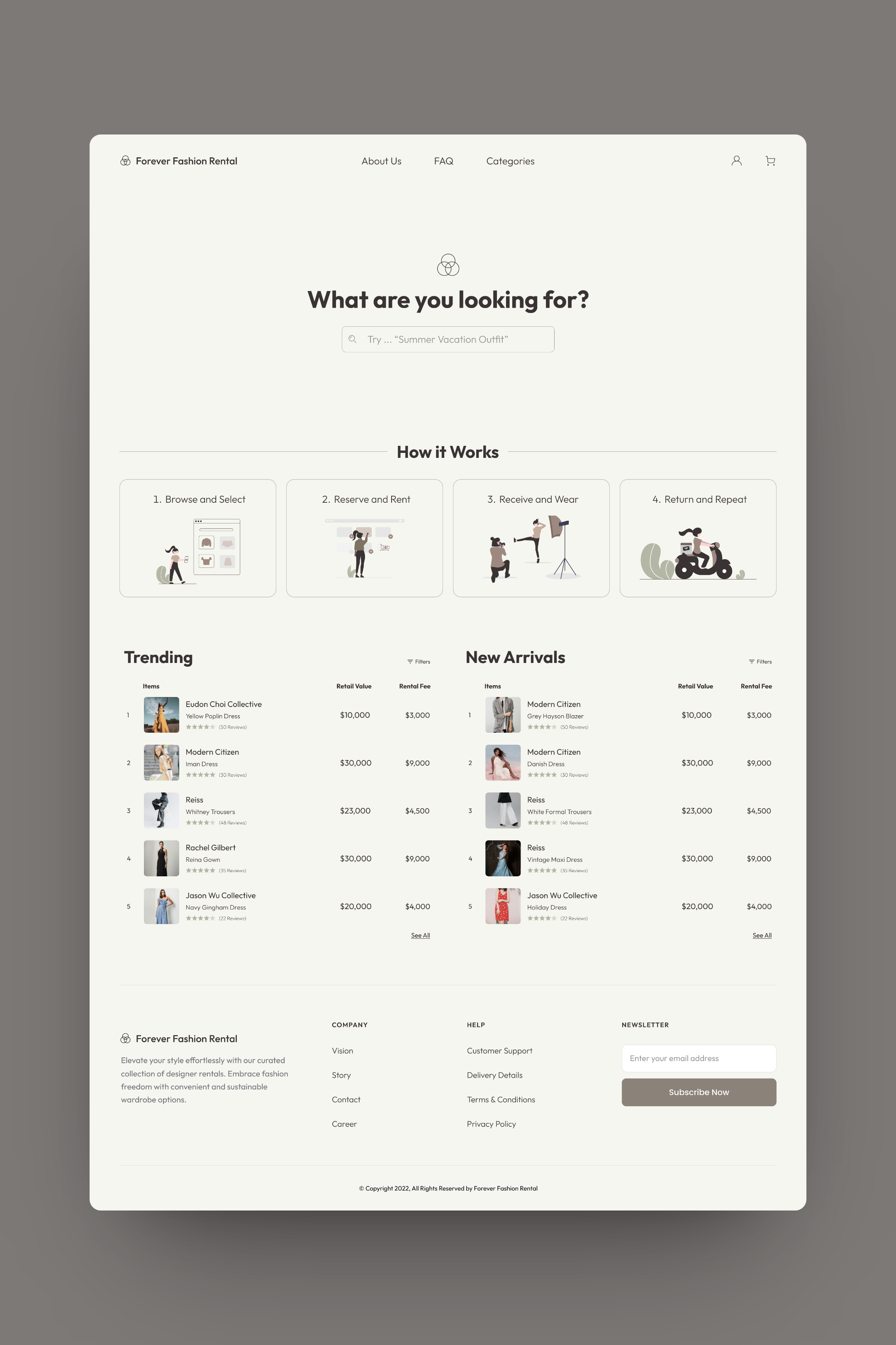
At the top of the page the search feature helps users quickly find items, brands or styles they desire. Since the target audience knows what they're looking for offering an user friendly search engine is crucial for browsing. The "how it works" section is designed to guide users through renting items without any concerns about mishaps; transparency and clarity play a role in building trust and confidence in the service.
Down on the page a display highlights trending and new arrival items to entice users to explore more and discover additions to the collection. This interactive visual component aims to captivate users interest and keep them updated on the fashion choices, for rent.

Reviews
2 reviews

Hey Sarah!
Really clean design, use of text styles and images! I think overall the page reads well and I do like the illustrations!
I do have some suggestions that may help create a bit more impact with your design.
- With such an upscale brand you may want to consider more images showcasing customers using the products in settings they may want to experience for themselves. This would create an emotional connection with the product and brand.
- With upscale brands, it may be worth focusing on the product's brand, features, etc, and saving the price for when the user opens up a more detailed product page. Seeing the high prices right on the front page may scare off some people.
- I think the page would benefit from a value proposition being the first thing the user sees. How would you summarize what the website offers in a short sentence?
Hope the feedback can spark some ideas! Keep on learning and designing!
Good effort on the landing page! However, there are a few areas that could be improved:
Firstly, your work is more of a full website rather than a landing page. The key difference is that a landing page is specifically designed with a single focused objective—usually related to marketing or sales—and typically does not include the complex navigation that a website does.
Secondly, the absence of a clear call-to-action (CTA) could limit user engagement. A CTA is crucial as it directs users towards taking an action, whether it's making a purchase or signing up for a service.
Thirdly, it’s not clear what service you offer. Is it a platform where users can purchase clothes, or is it a clothing rental service?
Fourth, the header occupies a lot of space yet appears empty, with the lonely search field seeming lost within it.
These points are just the tip of the iceberg, but I hope they prove helpful!
You might also like

PLANTIST


Lumen

NORTHSIDE - Coworking space Customer Journey Map


Accessible Signup Form for Monkey Survey


Crave Corner - Bakery App Design


Wealthsimple 404 Page

Content Strategy Courses

UX Writing


Common UX/UI Design Patterns & Flows


Go-to-Market Strategy Fundamentals
