EV Dashboard: Lith EV SaaS UI

Lith.EV – Smart EV Dashboard UI 🚗⚡
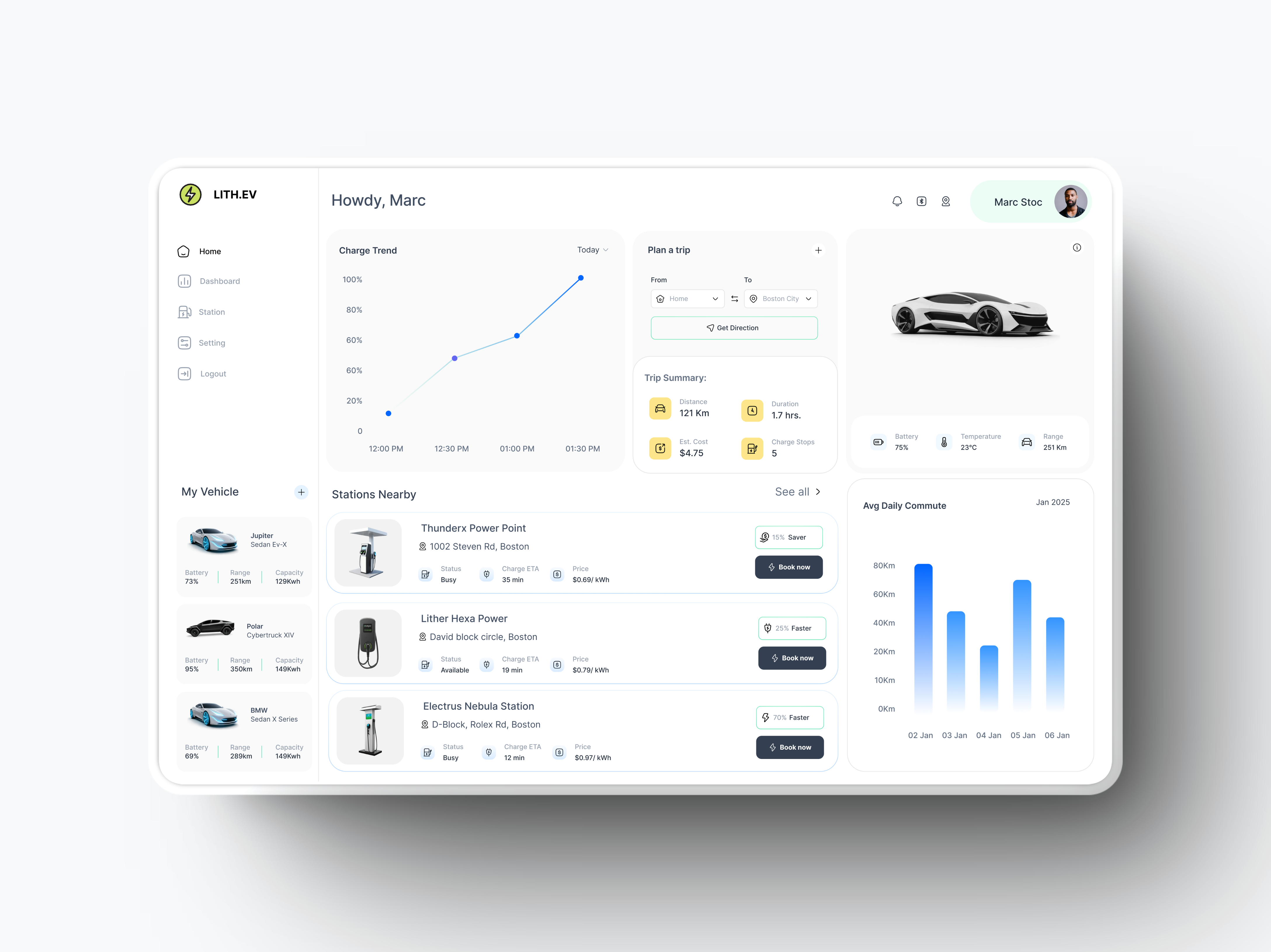
📍 Trip Planner | Charging Insights | EV Stations Nearby
A sleek and intuitive dashboard designed for EV owners, featuring:
✅ Real-time Charge Trends – Monitor battery levels with interactive graphs 📊
✅ Nearby Charging Stations – Find & book stations with availability status ⛽🔋
✅ Trip Planner – Plan your route with optimized charging stops 📍
✅ Vehicle Stats – Track battery health, range, and climate conditions 🌡️
✅ Daily Commute Insights – Visualize your travel patterns & efficiency 🚀
Tools used
Topics
Share
Reviews
8 reviews

Thank you for your sub, Bhaskar!
Your UI skills are amazing! Clear, intuitive, and well organized. I would love to see your storytelling and why you made some design decisions.
The one percenters are in the extra mile you are doing!
Keep it up and I'm waiting for an update!
You rock

Really slick EV Dashboard design! The UI feels modern and well-organized, with a clean layout that makes data easy to digest. The color choices work well for a tech-focused product. Maybe adding a bit more contrast in some areas could improve readability, but overall, it’s a solid and polished design!
your design has great layout, good hierarchy. Clean and easy to read.
Might be more helpful if you could explain your design thought process leading to the decision illustrated.

This dashboard looks clean, well-structured, and easy to navigate. Some refinements can improve usability, readability, and interaction.
1) Layout & Alignment
- Some text elements (e.g., station details) aren’t perfectly aligned. Adjusting padding/margins will fix this.
- Card shadows are a bit harsh. A softer shadow effect will make the design feel lighter.
2) Typography & Readability
- Secondary text contrast is too low (station details, trip summary). Increasing contrast will help.
- Line heights in text blocks are too tight (charge trend data, station details). More spacing will improve readability.
3) Navigation & Interactivity
- "Book Now" buttons don’t stand out enough. A stronger colour contrast or slight elevation will improve visibility.
- Sidebar menu lacks a clear active state. A stronger highlight (colour or indicator) will help.
- The profile section has no quick actions. A dropdown for settings, logout, etc., will make it more useful.
4) Data Visualization & Insights
- Graph labels are too small. Increasing text size will improve readability.
- No tooltips for data points. Hovering should show exact values.
- The daily commute graph lacks peak usage markers. A subtle highlight will make it easier to spot trends.
5) Charging Station Info
- Status labels (Busy/Available) need better differentiation. A small colour-coded icon (green = available, red = busy) will make it clearer.
- Price formatting could be better. Bolding the price will make it easier to scan.
6) Vehicle Info Section
- The car image feels static. A slight hover effect or animation will make it more engaging.
7) Feature Enhancements
- Dark mode toggle for better accessibility.
- Weather integration for trip planning.
- Voice search for stations to improve usability.

Hey Raghvendra,
I absolutely love everything about this EV dashboard design. It's clean, modern, minimalist but yet information packed. I love how every section is rightly aligned to a tight grid structure. The charts are also beautifully designed as well as the clear and appropriate imagery.
This is really masterfully designed.
Kudos for sharing with the community.

Nice shot

Intuitive design and features of EV dashboard. Great work!!

Great job.
You might also like

Lumen — Accessible Signup Form


SONZ - Entertainment platform


Camp & Travel Explorer - App Design

Uxcel Halloween Icon Pack


Solar system Dashboard Utility


Color System

Popular Courses

UX Design Foundations


Introduction to Figma

Design Terminology
