ELECTROLYTE BOOST WEBSITE REVAMP

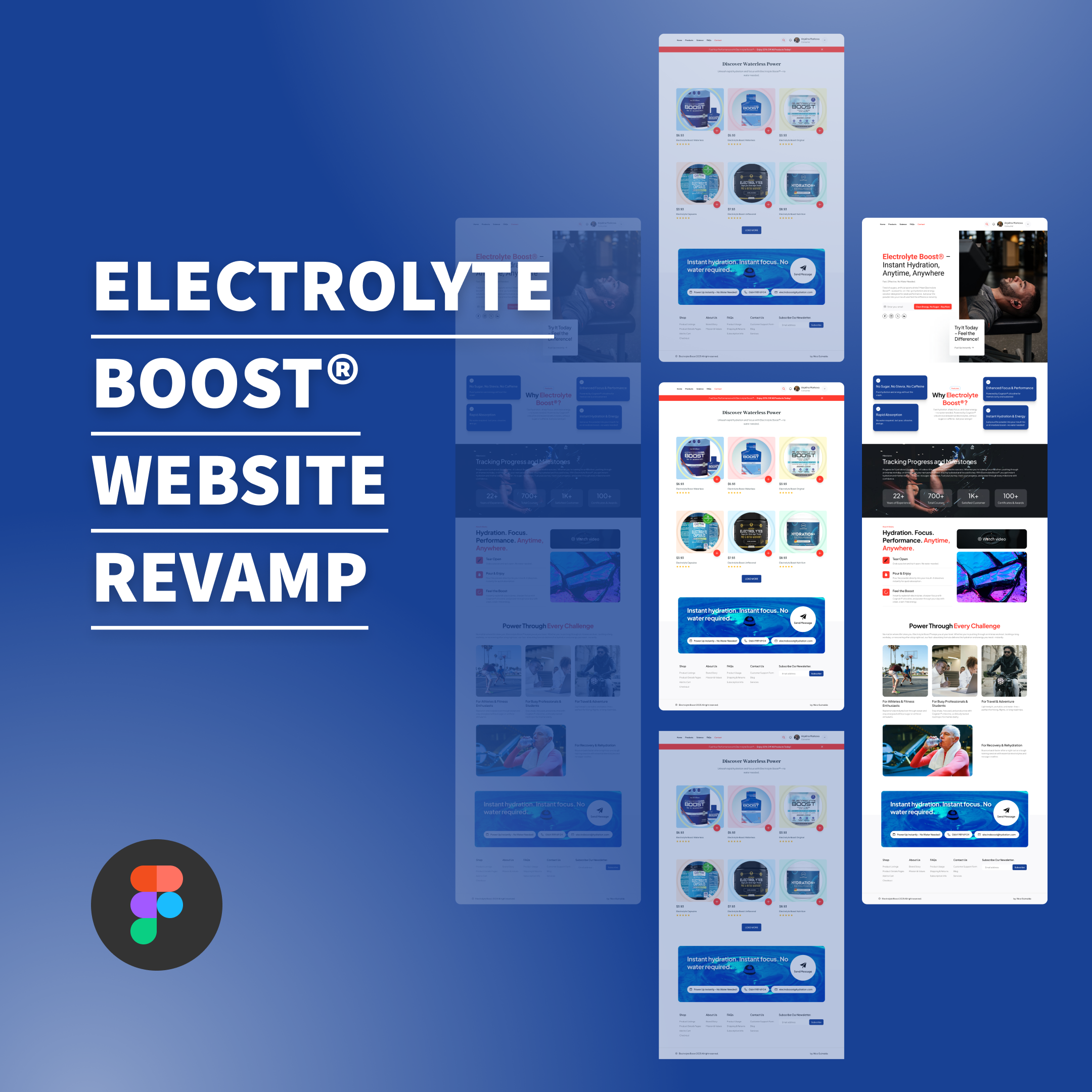
This project is a revamp for the homepage and products page. Applying the same color scheme and organizing UI/UX for new look and feel.
Reviews
1 review

A website redesign should improve usability, conversions, and accessibility—not just aesthetics. It’s modern, structured, and conversion-focused. This feedback breaks down key improvements and areas for refinement, backed by research, numbers, and UX principles to ensure data-driven decisions.
1. Visual Hierarchy & Branding
What’s Better?
✅ Stronger First Impression – 94% of first impressions come from design (Lindgaard et al., 2006). The modern layout, typography, and colour scheme instantly boost credibility.
✅ Better Use of White Space – Spacing increases comprehension by 20% (Lin, 2004). The new layout breathes better, making content easier to scan.
✅ Stronger Brand Identity – Consistent color and font choices improve brand recognition. The contrast between red CTAs and blue branding makes key actions stand out.
Needs Refinement
🔹 Font Sizes on Some Text Blocks – 16px+ body text improves readability (NNG). Some sections could be slightly larger.
🔹 Dark Overlay on ‘Tracking Progress’ Section – WCAG recommends a 4.5:1 contrast ratio (W3C, 2021). Increasing contrast could improve readability.
2. Navigation & User Flow
What’s Better?
✅ More Intuitive Navigation – Users leave sites in 10-20 seconds if they can’t find what they need (Baymard Institute). The new navigation bar is cleaner and better structured.
✅ Stronger Call-to-Action Buttons – Button colours impact conversions by 21% (Bailis, 2019). Your red CTA buttons stand out and drive engagement.
✅ Better Product Discovery – Larger images and pricing upfront make shopping decisions easier. Research shows clear pricing and ratings boost conversions by 35% (Nielsen, 2022).
Needs Refinement
🔹 Sticky Header for Mobile – 60% of traffic comes from mobile (Statista, 2024). A sticky "Buy Now" button could help reduce drop-offs.
🔹 Breadcrumbs or Step Indicators – Users prefer guided shopping experiences (Nielsen, 2021). Adding progress indicators can make navigation smoother.
3. Homepage Experience
What’s Better?
✅ Clearer Product Messaging – Users scan, not read (NNG, 2006). The main headline instantly explains the product's unique value.
✅ Better Social Proof – Customer reviews boost conversions by 34% (BrightLocal, 2023). Your social media integration strengthens credibility.
✅ Scannable Benefits Section – Users follow F-pattern reading behaviour. Your icon-based "No Sugar, No Stevia, No Caffeine" section makes key selling points obvious.
Needs Refinement
🔹 Simplify Hero Section – Users leave cluttered pages in under 3 seconds (Google, 2021). The overlapping elements could be slightly reduced.
🔹 Show Shipping & Return Policies Sooner – 67% of users check return policies before buying (Baymard, 2022). Adding “Free Returns” or “Fast Shipping” text near CTAs can build trust.
4. Product Page & Shopping Experience
What’s Better?
✅ Cleaner Product Listings – Larger product images increase conversion rates by 17% (CXL, 2023). The redesigned product grid is easier to browse.
✅ Stronger Pricing & Review Placement – Clear pricing reduces hesitation (NNG, 2023). Your product ratings and pricing are now more visible.
✅ "Load More" Instead of Pagination – Infinite scrolling reduces decision fatigue by 15% (Baymard, 2021). The new "Load More" button keeps users engaged.
Needs Refinement
🔹 One-Click Checkout Option – Shorter checkouts increase conversions by 26% (Baymard, 2023). Adding a “Buy Now” button next to “Add to Cart” could speed up purchases.
🔹 Uniform Product Image Backgrounds – Consistent imagery boosts trust by 28% (UX Collective, 2023). Standardizing product images would create a more polished feel.
5. Accessibility & Mobile Optimization
What’s Better?
✅ Larger Tap Targets for Mobile – Google’s 48px tap target rule is followed well in the CTAs.
✅ Better Text Contrast – WCAG standards recommend 4.5:1 contrast ratios for readability. Your text is easier to read than before.
✅ Faster Load Times – A 1-second delay reduces conversions by 7% (Google, 2021). Your optimized images and clean layout help improve speed.
Needs Refinement
🔹 Dark Mode Support – 8 out of 10 users prefer dark mode at night (Android Dev Survey, 2023). A dark mode toggle could enhance accessibility.
🔹 Autocomplete for Forms – Autocomplete reduces checkout time by 30% (Baymard, 2022). Enabling auto-suggestions in checkout fields could improve efficiency.
Nico Guirnalda
You might also like

Accessible Signup Form


Entrant - Analytical Dashboard

Uber Eats Push notifications


Transit Cairo — Digital Mobility Redefined


Babylon Balance - Designing Financial Clarity Through Constraint


Entrant Accessible Signup and Login Forms
Popular Courses

UX Design Foundations


Introduction to Figma

Design Terminology
