Community Choice
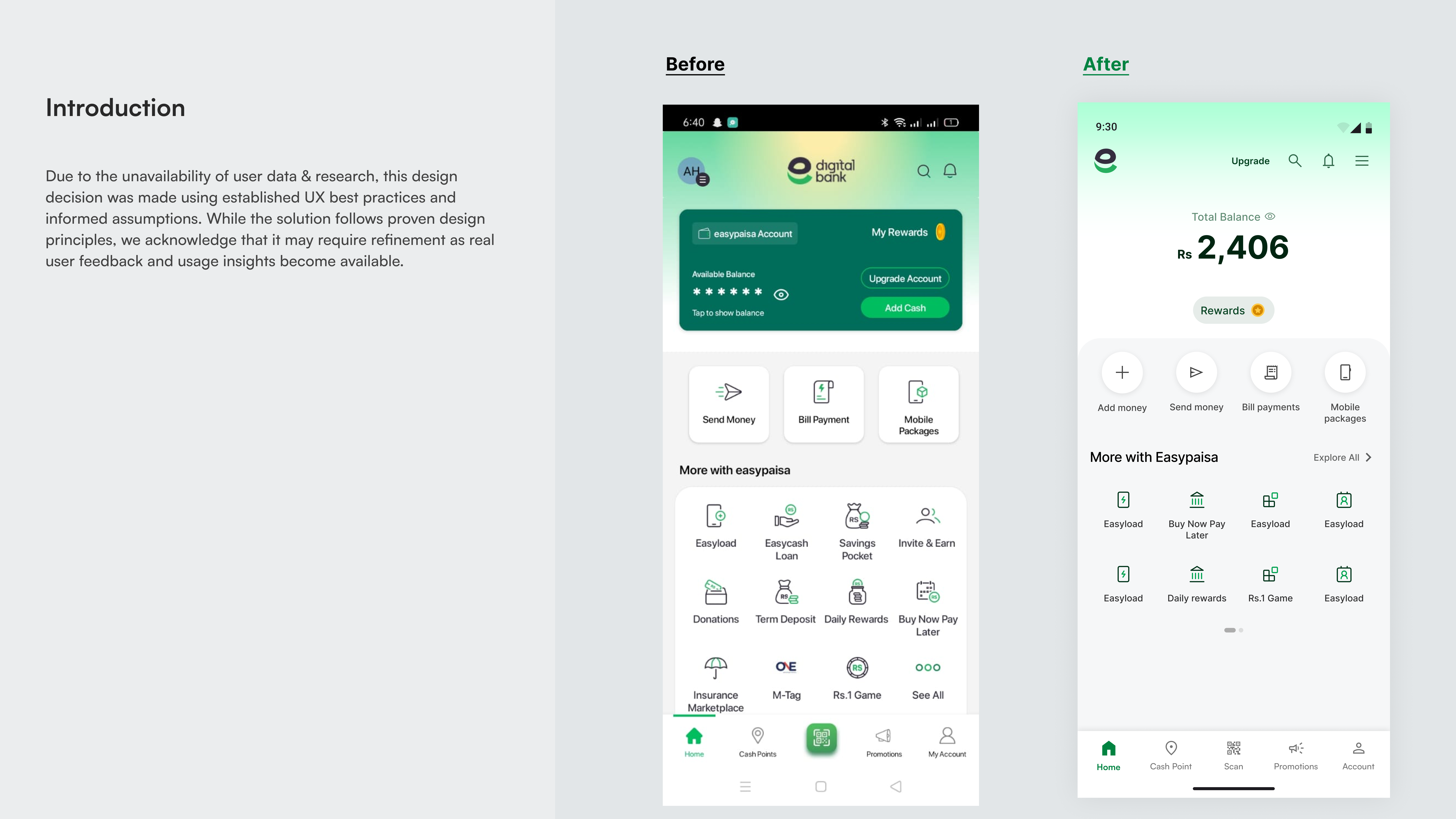
Easypaisa Redesign Homepage
Hey mentors, I’m currently working on developing my critical design thinking skills. I’d really appreciate any suggestions, feedback, or resources you can share to help me grow.
Reviews
4 reviews
Hi Ameer, great work identifying inconsistencies in the app design and sharing your suggestions! A few thoughts from my side:
- The icons are actually consistent. The 'home' icon is filled because it's the active one—this indicates the current view. The QR code is highlighted since it's the primary action we want users to take. That said, having two active-looking icons may still be confusing. You could explore bottom navigation patterns and suggest an alternative approach to handle this more clearly.
- Color changes won't be easy to implement, as they're tied to the brand identity and how users perceive it. Any updates to color or style should be supported by strong reasoning.
- Nice job on ideating around the app bar! However, Version 4 has too many icons. I recommend checking out Material Design guidelines to get a better sense of best practices on icon count and clarity.
Overall, your design looks clean and intuitive. As you mentioned, the key to improving the app lies in truly understanding the users.
Great work!
Yuliia
Thank you so much for the feedback! I've implemented your feedback—feel free to check it out 🙌
https://www.figma.com/design/SyQVOeGH8jlSric9bx9mrf/Easypasa-Redesign?node-id=50-677&t=QmrcbNhL2aUzC9oq-1
The Easypaisa homepage redesign feels modern, clear, and approachable. Strong visual hierarchy guides the user smoothly—an effective and well-executed update!
nice work Ameer
Beautiful designs!
Thanks
20 Claps
Average 4.0 by 5 people
You might also like

Project
Improving Dating App Onboarding: A/B Test Design
This project explores how improving the onboarding experience of a dating app can increase profile completion and early user engagement. I d

Project
FORM Checkout Flow - Mobile
Try out the prototype here. Design Rationale Why mobile? Mobile accounts for the majority of e-commerce browsing, and premium furniture pur

Project
A/B Test for Hinge's Onboarding Flow
This project focuses on improving the onboarding experience of a dating app - Hinge, by addressing low profile completion rates. Since profi

Project
Accessibility Asse
For this project, the LearnLink website was selected, and the goal was to redesign the login and sign-up pages specifically, adapting them t

Project
The Fitness Growth Engine
This slide shows how user behavior translates into business success by connecting activation, habit formation, retention, and monetization i
Editors’ Choice
Project
Uxcel Halloween Icon Pack
🎃 Introducing the Uxcel Halloween Icon Pack! 🎃 This custom Halloween-themed icon set was created to enhance the seasonal user experience o
Popular Courses

Course
UX Design Foundations
Learn UX design fundamentals and principles that create better products. Build foundational knowledge in design concepts, visual fundamentals, and workflows.

Course
Introduction to Figma
Learn essential Figma tools like layers, styling, typography, and images. Master the basics to create clean, user-friendly designs

Course
Design Terminology
Learn UX terminology and key UX/UI terms that boost collaboration between designers, developers, and stakeholders for smoother, clearer communication.


