Cutting Edge Technologies Consulting Website Redesign


Project Overview
The project includes rebranding a website for Cutting Edge Consulting Solutions, which offers recruitment and training services. The website will showcase their services, connect with clients, and provide resources for job seekers and employers.
Product Goal
a) Enhance Staff Recruitment: The website should attract skilled individuals and simplify the hiring process for our clients, while positioning our brand as a trusted source for finding capable staff.
b) Offer Training Solutions: The website should provide a variety of training services and resources to help individuals and organizations stay up-to-date with relevant technologies and skills.
Problem(s) We’re Solving
Outdated Design: The former website looks outdated and it appears unprofessional and untrustworthy. Visitors may perceive the brand as behind the times or not committed to innovation

Inconsistent Branding: There are inconsistencies in branding elements such as logo usage, color schemes, typography, design patterns, and imagery. This messaging can dilute the brand identity and confuse visitors.

Poor User Experience (UX): The previous website was difficult to navigate and it took users a longer time to perform actions. This could lead to frustration among users and potentially deter candidates and clients.
My Solution
- Developed a new brand identity.
- Developed a clearer information architecture for cutting-edge technologies.
- Developing low- and high-fidelity designs for the brand.
My Process
My design process for this project was comprehensive and involved multiple steps aimed at ensuring that the final product met all the requirements and needs of the stakeholders.
Firstly, I conducted a thorough analysis of the market and identified key competitors to gain a better understanding of the industry landscape. This helped me to determine the strengths and weaknesses of our product as well as identify opportunities for improvement.

I created this mood board to help me establish a good brand identity for the solution.
I began by generating many ideas and concepts for the design. This helped me explore possibilities and select the best options. With a clear direction in mind, I then created detailed wireframes to outline the website's structure and layout.

I created a new look for the brand. A new logomark for Cutting Edge Technology Consulting

I created a mid-fidelity wireframe to display the website idea before converting it to a high-fidelity design.
From there, I began working on creating solutions that would address the needs and requirements of the stakeholders while also providing a seamless user experience. I took into account various factors such as ease of use, accessibility, and scalability to ensure that the final product was both functional and effective.
Overall, my design process was thorough and involved multiple steps aimed at ensuring that the final product was of the highest quality and met the expectations of the stakeholders.
The highlight of my design
The Hero section
This area highlights the core benefits of the API offerings as well as a video showing how it works. It was also designed with programming language elements to appeal to engineers.

The Talent section
This area should help attract talented individuals and facilitate the hiring process for Cuttings edge, It should present the brand as a reliable source for finding proficient staff

The Training section
The website should provide a variety of training services and resources to assist individuals and organizations in staying up-to-date with relevant technologies and skills.

My Learnings
In addition, I delved deeper into the realm of information architecture for websites, which has allowed me to construct more intuitive and user-friendly interfaces. Furthermore, I was able to refine my ability to choose the best color schemes for a brand by learning about color psychology and the impact that different palettes can have on a user's perception of a product or service. All of these skills have made me a more well-rounded designer and have given me the tools to create designs that are not only beautiful but also effective in achieving our marketing goals.
Tools used
Share
Reviews
4 reviews

This looks good and there is room for improvement. I won't dwell much on details, but I'd recommend you leverage Figma's wealth of community libraries and design kits to create better, improved and responsive landing pages.
That's an outstanding case study. Well done! I liked how you pointed out the problems with the prior website version and guided us through the updated website. Your design process was clearly explained, including the problems, the team members who helped you at various points, and what you learned.

Nice case study Eneh! The thought process is well documented and the resulting output looks like a vast improvement on the original. Based on the lack of trust being created from the "Before" version, the choice of colour palette and typography elevate the aesthetic to a far more trustworthy first impression through the use of cool and dark blues.
With that in mind, the main navigation looks out-of-place and I think the design could appear to be more balanced if this was white instead of beige. Furthermore, the spacing of the logo and menu items feels somewhat jumbled, perhaps due to inconsistent use of spacing and alignments. These two points may detract from the final desired impression of trustworthiness and professionalism trying to be conveyed.

Your thought process is well-documented, and the final design is a significant improvement. The clear navigation and organized layout are great. Keep up the good work and continue refining your designs!
You might also like

Customer Journey Map for a Co-Working Space


Latios - Free Portfolio Template for UX/UI Designers

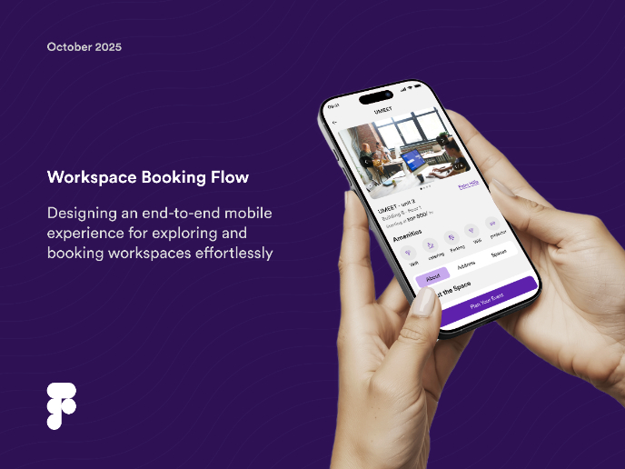
Workspace Booking Flow - UI/UX Design

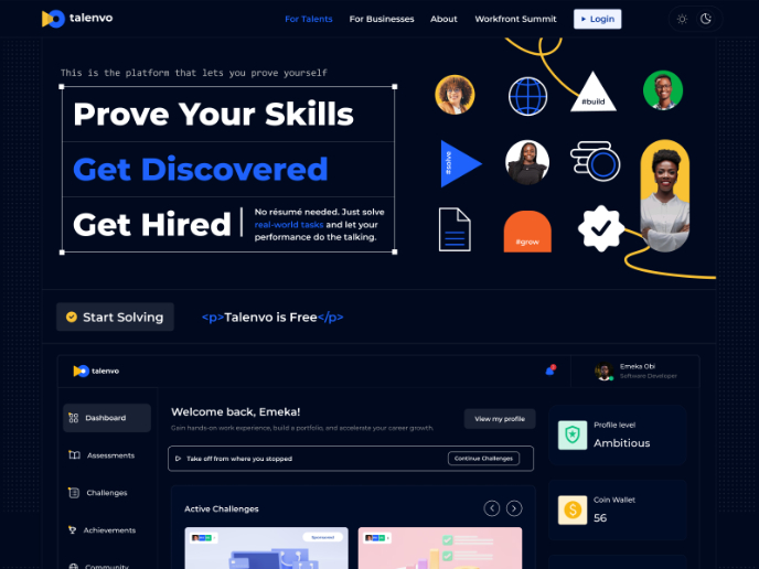
Talenvo Website - Web and Mobile
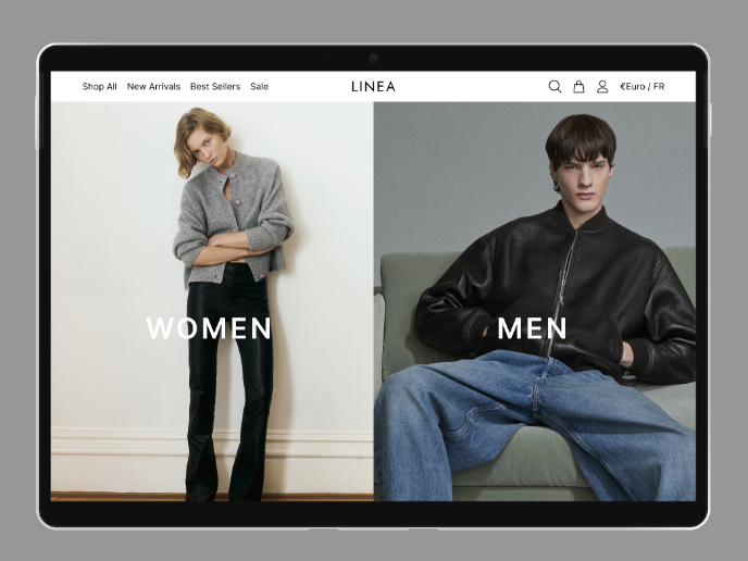
L I N E A - Minimalist Fashion Brand

Video Streaming Service wireframe: Spoil-free mode and Interactivity

Popular Courses

UX Design Foundations


Introduction to Figma

Design Terminology
