Converg - Website design for a clean energy company
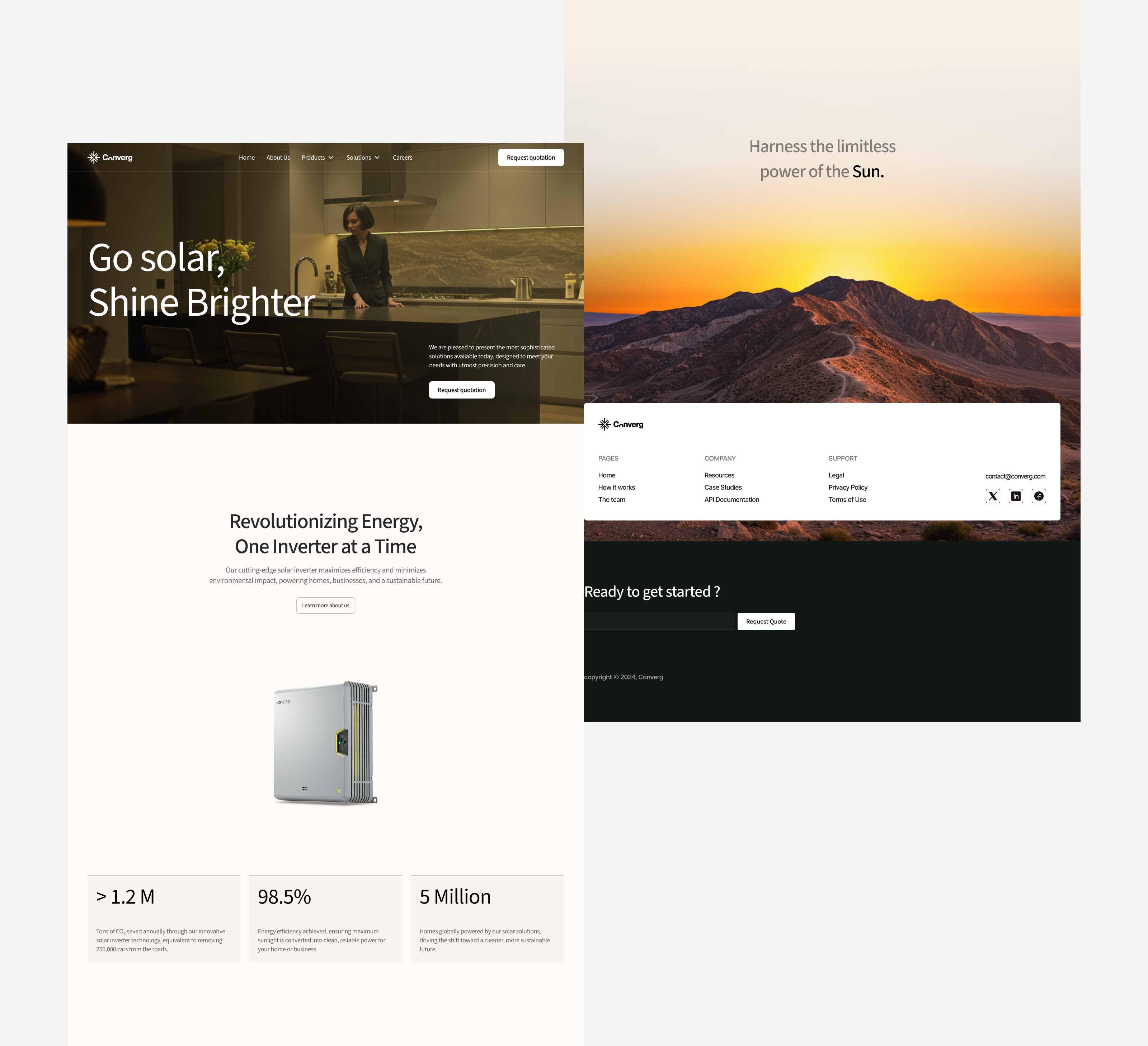
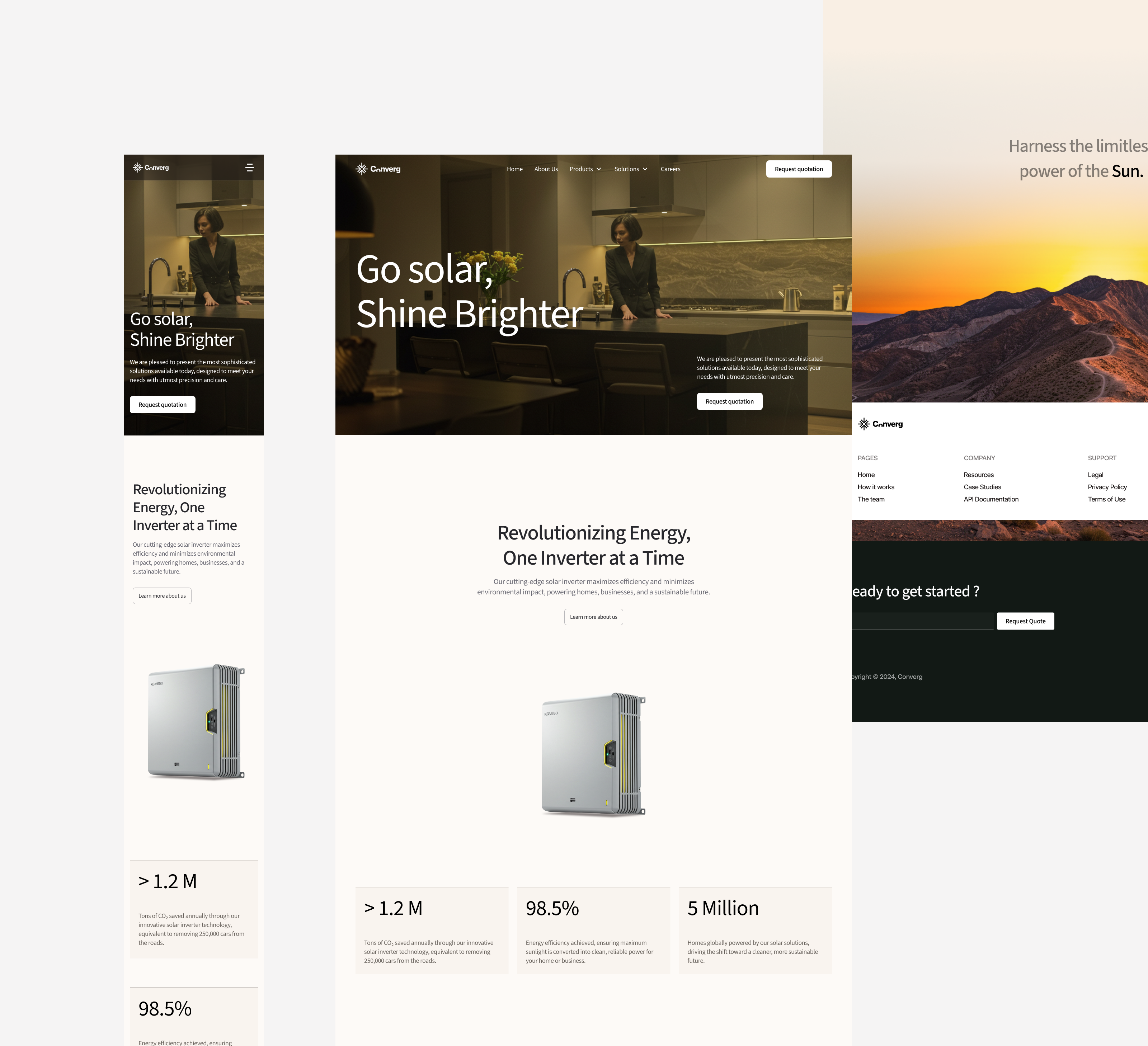
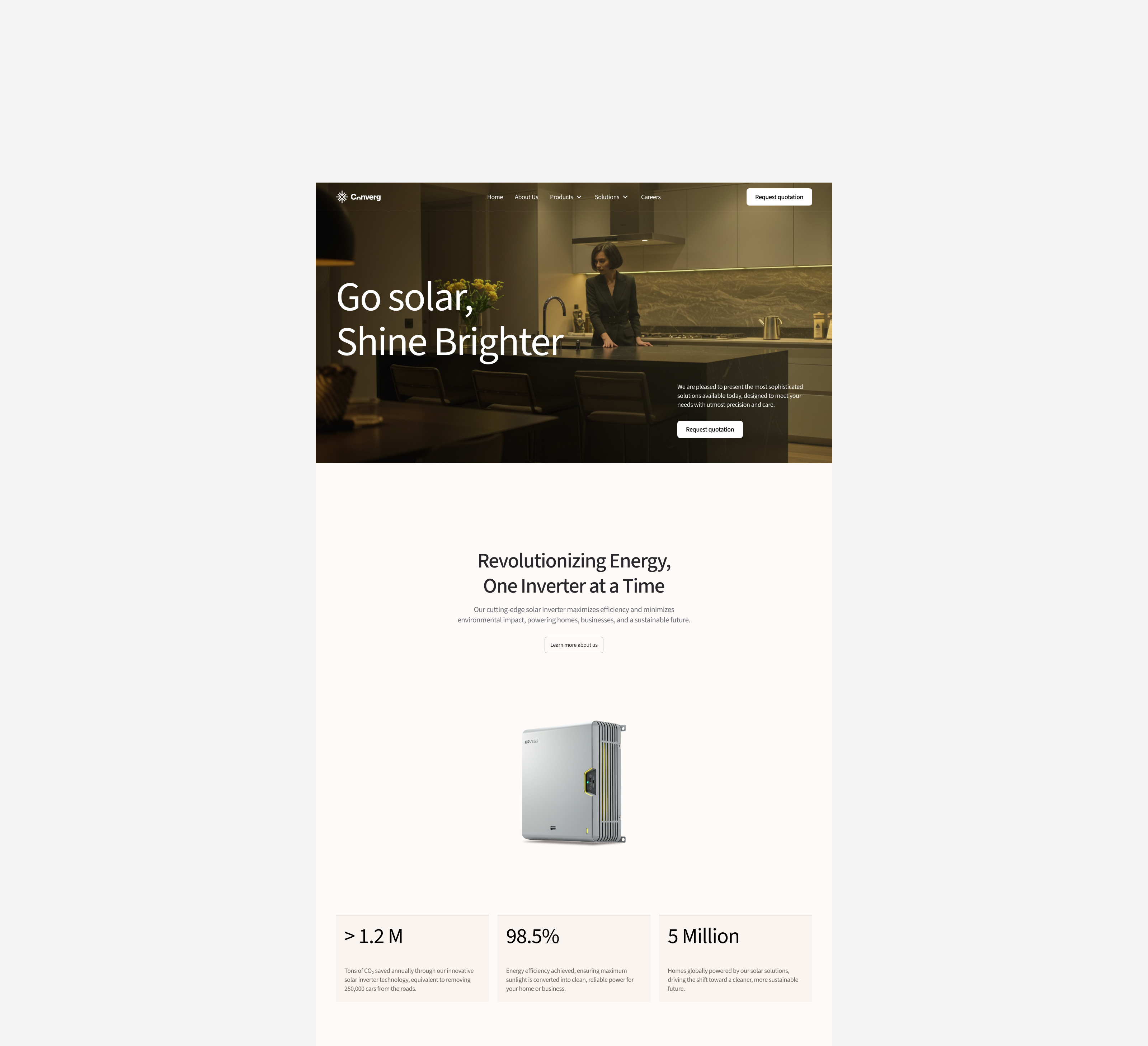
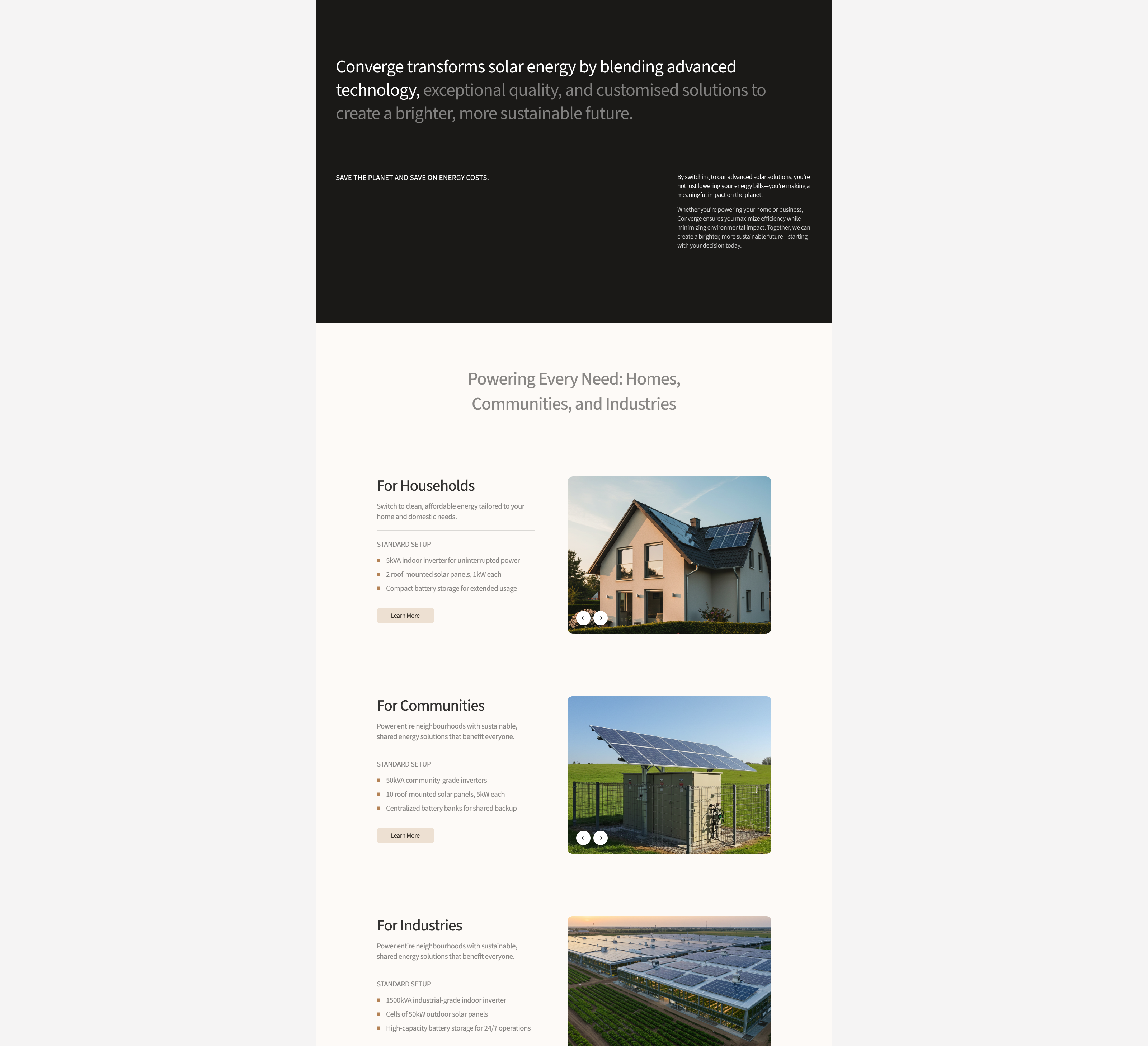
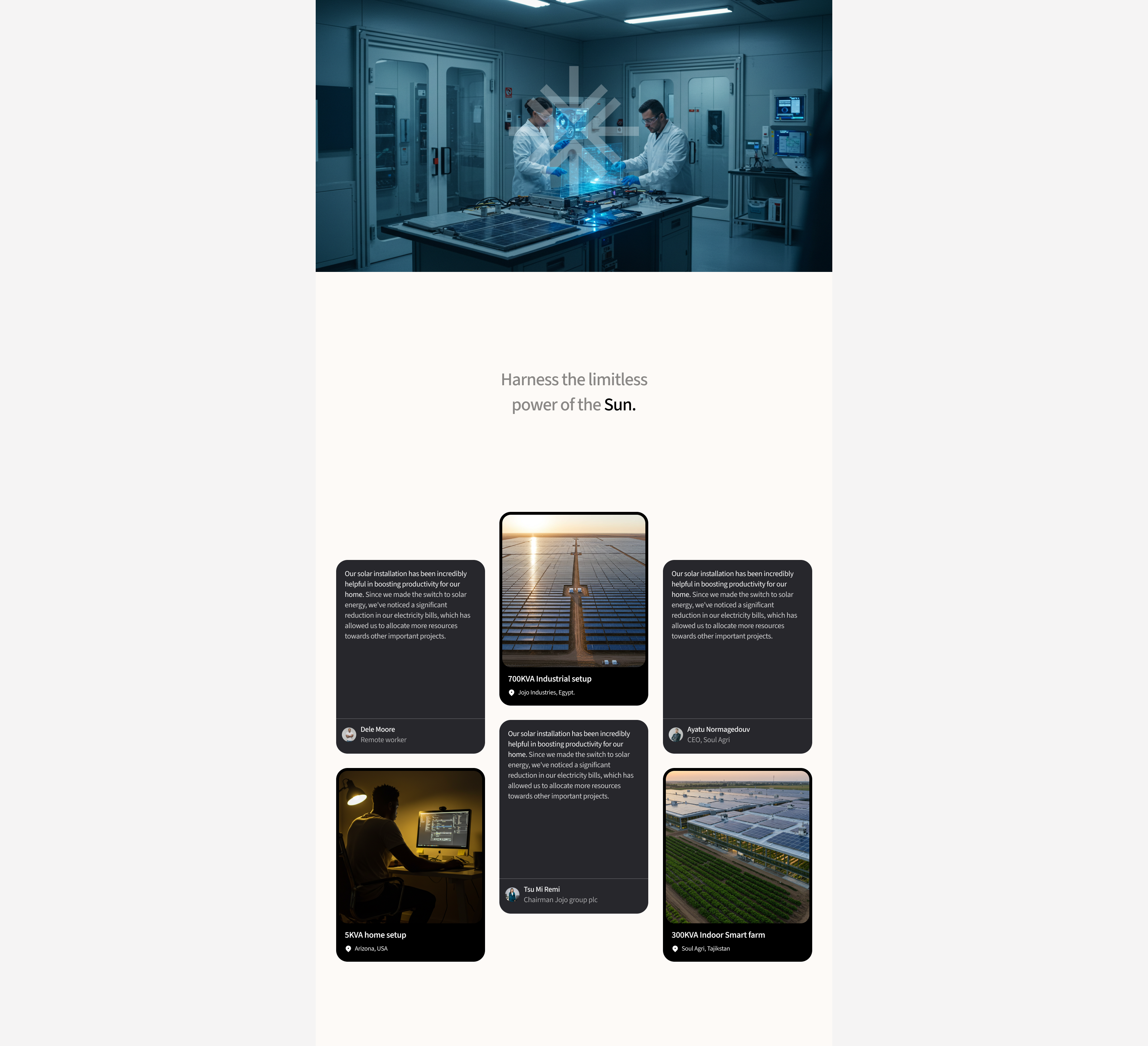
Converg Solar is a high-end clean energy company dedicated to revolutionising power generation through advanced solar technology. Their mission is to provide sustainable, efficient, and scalable energy solutions for households, communities, and industries.
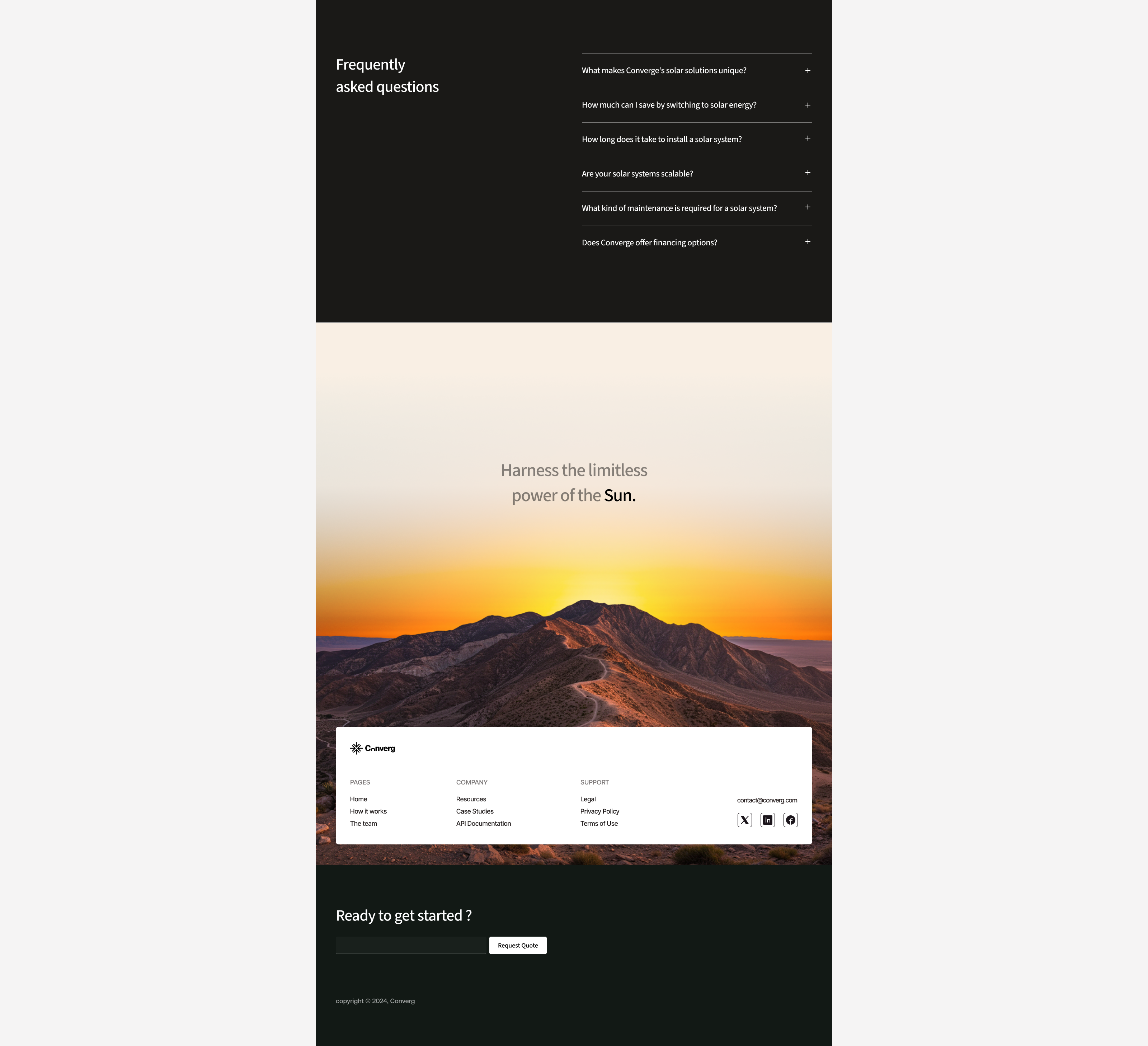
My goal as the UI designer was to create a website that not only reflects Converge Solar’s innovation and reliability but also simplifies the user journey for diverse audiences. I focused on a clean, modern aesthetic with an intuitive structure, ensuring that users can easily explore solar solutions tailored to their needs. Thoughtful use of high-contrast visuals, informative content sections, and interactive elements make the site both engaging and informative.
For a company like Converge Solar, an effective website is more than just a digital presence—it’s a powerful tool for education, trust-building, and conversion. A seamless experience encourages users to explore solar options, understand cost savings, and take action toward a greener future. By combining clarity, sophistication, and functionality, the design enhances Converge Solar’s ability to drive adoption of clean energy solutions at scale.
Reviews
3 reviews
Overall the website looks nice and the use of colour is great, I also love the images that you used.
One thing to take into account that could improve the overall look and feel is the consistent use of spacing, I would define consistent values and reuse them throughout to ensure that the website is balanced.
The layout is clean, simple, and modern, which makes it easy to read the content. However, it feels a bit plain and could use a touch more creativity. Keep exploring more—great work so far! 🔥
The design is clean and well-balanced, with a great mix of imagery, typography, and white space. It has a premium feel that makes it visually appealing. Overall, I think you did a great job. The only thing I’d suggest is making small refinements to the contrast to further enhance the user experience.
You might also like

Improving Dating App Onboarding: A/B Test Design

FORM Checkout Flow - Mobile

A/B Test for Hinge's Onboarding Flow

Accessibility Asse

The Fitness Growth Engine
Uxcel Halloween Icon Pack
Popular Courses

UX Design Foundations

Introduction to Figma

