Color System for Task Management App - Task Flow

TaskFlow’s color system was built to feel fresh, friendly, and grounded in real-world work.
Thought Process and Decision Making
1. The Starting Point
I looked into task management tools such as (Trello, Notion, Todoist, ClickUp and Asana) and tried to understand how people interact with work tools every day. Many platforms use similar shades of blue and gray, which can feel cold or predictable. I wanted to move away from that and create something more personal while keeping it trustworthy.
2. Tone Setting
I thought that TaskFlow should feel calm and confident, not overly corporate. I thought of creating a color system that invites users in, supports focus, and creates a sense of ease while managing tasks. Meaning looking for tones that balance clarity and warmth.
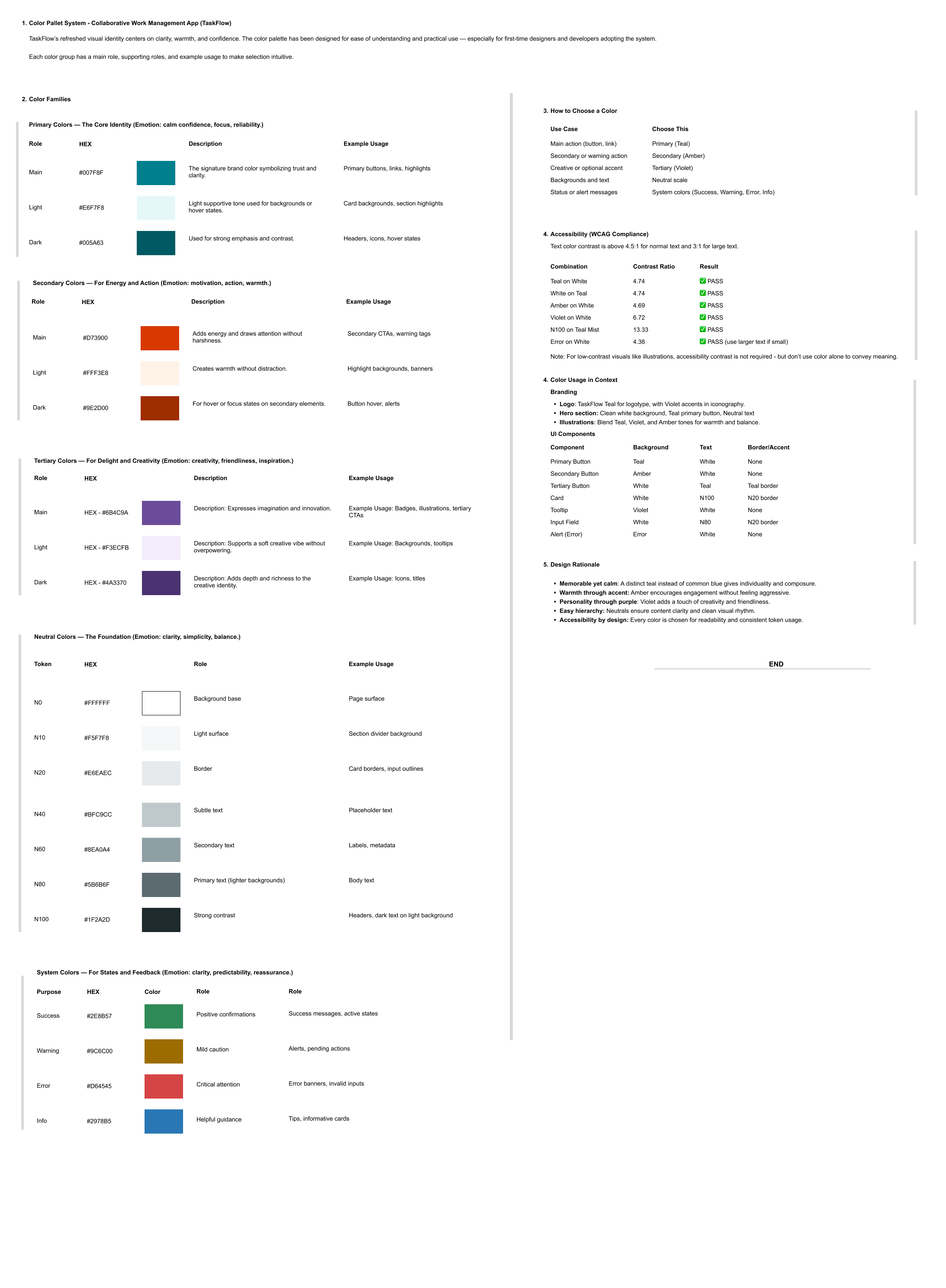
3. Choosing the Primary Color
I chose Teal as the heart of the palette. It’s close enough to blue to feel familiar but carries more personality. It feels steady, like something you can rely on, yet still fresh and approachable. This color helps users feel centered, especially when spending long hours in the app.
4. Building Supporting Colors
I then added Amber to bring in warmth and energy. It naturally draws attention, making it great for actions or alerts, but it’s not too aggressive. Violet joined the palette to express creativity and imagination. It gives the brand a bit of personality and softens the overall feel.
5. Neutrals for Structure
The neutral scale was chosen to support focus. Whites and soft grays keep the interface clean and easy to read, while darker tones add contrast for accessibility. These colors do the quiet work of helping content stand out.
6. System Colors for Communication
Success, Warning, Error, and Info tones were picked, keeping the clarity in mind. Each one follows common color expectations so users don’t have to think twice when reading a message. I thought of adjusting their brightness and contrast so they stay legible on both light and dark backgrounds.
7. Aesthetics and Accessibility Balance
I used WebAIM (https://webaim.org/resources/contrastchecker/) to check the accessibility of selected colors and decisions. It helped me to ensure that the colours worked well for text, buttons, and icons without losing visual harmony. I tried tuning the colors to meet WCAG guidelines when a color was too light or too dark.
8. Humanising the System
My aim was to keep it as close as users’ feelings. My focus was to understand how people will feel when they see these colors my App’s UIs. I created this system to enhance productivity without creating fatigue.
9. Creating an Easy to Understand System
I read different websites and the references given in Uxcel to structure this color system: Primary, Secondary, Tertiary, Neutral, and System. I have organized this in a way that is easy to use and have also given a few examples against each colors to help people understand and apply wherever they need it.

Reviews
2 reviews

Great job explaining your thought process behind this project Shashikant. Your choices make a lot of sense to me and I appreciate you testing them for accessibility.
Now, I wish I could see a mockup of what the colors would look like in action for a better idea of how (and if) they would work together.
The deliverable format is also hard to read. Fonts are too small.

Strong concept and rationale; tighten documentation with tokens, usage examples, and measurable accessibility.
What’s working
You’ve articulated a clear intent, calm, confident, and personable, and anchored it in familiar task‑tool paradigms. The choice of Teal as the primary, with Amber and Violet supporting, feels coherent. Referencing accessibility via WebAIM is a solid signal of craft.
“I chose Teal as the heart of the palette…”
“I used WebAIM to check the accessibility…”
Where to improve (actionable)
Palette structure and tokens
- Define a full ramp for each brand color: Primary (Teal 50–900), Amber 50–900, Violet 50–900, plus Neutral (e.g., Gray 25–950). Document hex, HSL, and semantic aliases.
- Add semantic tokens that map intent, not hue: Brand: brand/fg, brand/bg, brand/border
- Typography: text/default, text/subtle, text/inverse
- UI: surface/default, surface/subtle, border/subtle, overlay/scrim
- States: focus, hover, pressed, disabled
- System: success, warning, error, info (fg/bg/border pairs)
Accessibility: make it measurable
- Include target ratios next to each token: text AA 4.5:1, large text 3:1, non‑text UI 3:1. Provide example pairings that pass both light and dark themes.
- Specify rules for using Amber and Violet in text vs. backgrounds; e.g., Amber as accent on neutral surfaces, never as small text on light backgrounds unless it passes 4.5:1.
- Document focus visible styling: a high‑contrast focus ring (not just color change) with minimum 2px offset and 3:1 contrast against adjacent colors.
Usage guidelines and mockups
- Show the palette “in action” across common task‑app surfaces: Navigation, boards/lists, cards, tags, toasts, dialogs, empty states.
- Primary button vs. secondary vs. tertiary; destructive and success flows.
- Demonstrate state changes with color: default, hover, pressed, disabled, loading. Pair color with shape, weight, and motion for redundancy.
- Include examples where Amber draws attention for alerts or due‑soon tags without feeling aggressive; Violet for creative filters or templates.
Theming and dark mode
- Provide light and dark theme tokens with a clear mapping strategy (e.g., surface/default flips from Gray‑50 to Gray‑950; text/inverse flips accordingly).
- Show how system colors adapt in dark mode to avoid “glow” or low contrast (tune saturation down, increase luminance contrast).
Color naming and governance
- Use semantic names first (error/bg) and color names second (teal‑500) to prevent misuse.
- Add a short decision tree: when to use brand vs. system vs. neutral; how to handle conflicts (e.g., warning in success contexts).
Documentation format and readability
- The current deliverable “fonts are too small.” Increase type scale, spacing, and contrast; add a scannable table of tokens and usage do’s/don’ts.
- Include a one‑page cheat sheet for engineers and a compact handoff section: design token names, values, and Figma styles (a spreadsheet might work here as well to document token values).
Handoff quality
- Publish a Figma library: Color Styles for each token; Components demonstrating usage; Variant properties for states.
- Provide tokens in JSON (style‑dictionary compatible) so engineering can consume them directly (depending on the library you are using with the team, for example, Tailwind, etc).
You might also like
SiteScope - Progress Tracking App


CJM for Co-Working Space - WeWork

Ubani Design System

Accessible Signup Form for SaaS Platform
Loginino

Notification microcopy - Project

Visual Design Courses

UX Design Foundations


Introduction to Figma

Design Terminology
