Color System exercise - Slack

I proposed an exercise for the Slack platform's color system.
I present primary, secondary, tertiary and system colors.
Finally, I show an example of the platform with the colors I've chosen.
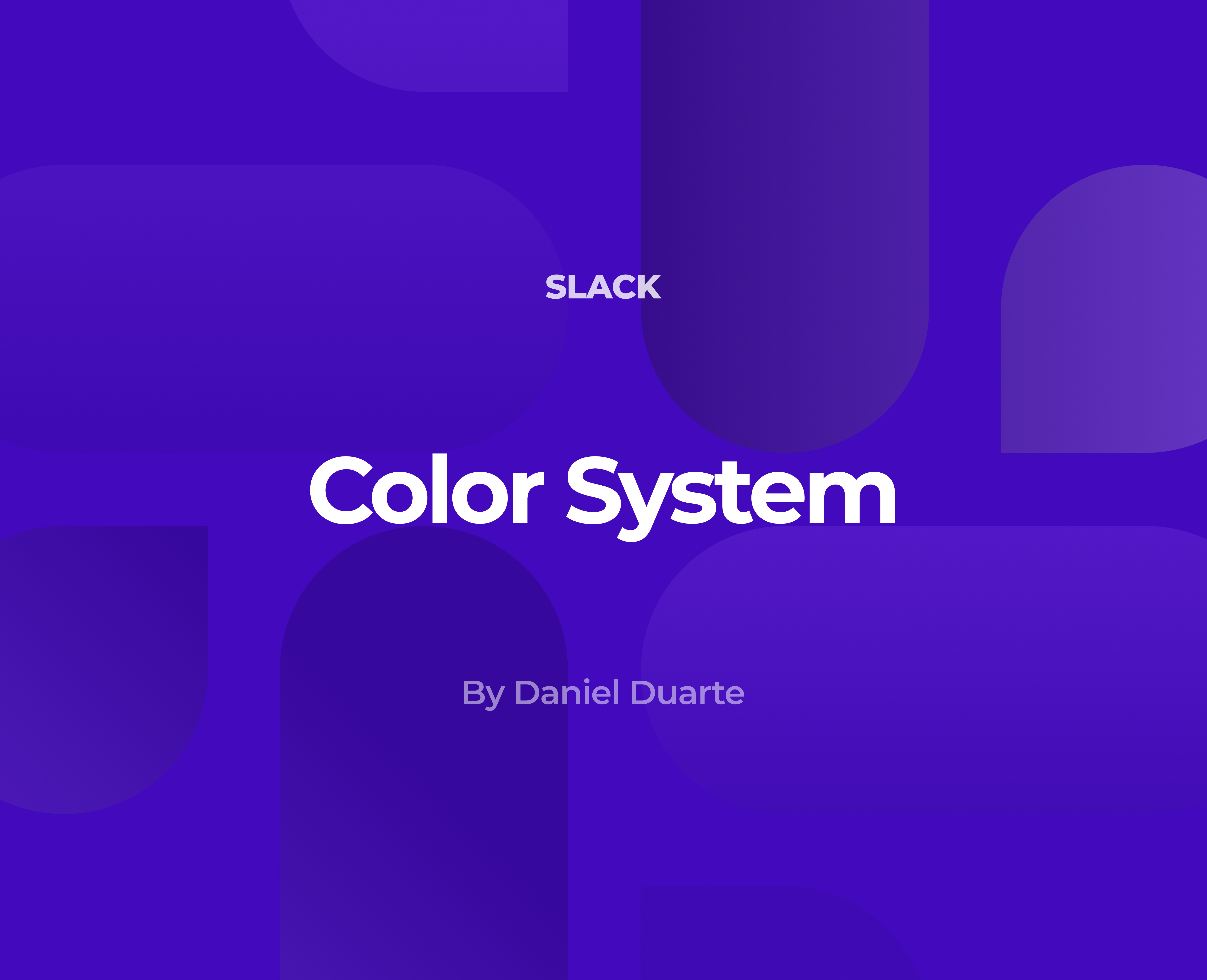
I ended up using purple tones, which reflect wisdom, creativity and independence.

Reviews
5 reviews
Nice work, Daniel! One thing to keep in mind is to treat projects as if you’re pitching them to someone. As a designer, you need to learn how to “sell” your solution. This skill will come in handy in many professional situations. You can have the best design, but if you don’t sell it well to the stakeholders, the chances they’ll miss it are high.
Treat this project space and case study formatting possibilities as your canvas.

Daniel, you did a great job here and the presentation is good.
Like Gene told you, you should sell your decisions otherwise we might not get your vibe.
I would encourage you to start with why and how it made you feel.
The best design ever made might not be rated as it deserves if the author does not guide it.

Hello Daniel! 👋🏻 I appreciate the effort you put into this exercise. 😊
🎨 The purple tones you’ve chosen are intriguing and visually appealing. However, I have a few questions and suggestions to help clarify and enhance your presentation, if I may.
🟣 Firstly, I would have liked a more detailed explanation of why you selected these specific shades of purple beyond the attributes of wisdom, creativity, and independence. Referencing traditional colour meanings, such as those from the Uxcel lesson on Colour Psychology and the colour purple (here --> https://app.uxcel.com/courses/color-psychology-for-designers/traditional-color-meanings-879#purple-3551), could provide additional context. I find purple more commonly associated with magic and fantasy, so a deeper rationale could help clarify your choice.
📊 In your presentation, you describe the primary colour as representing calmness, elegance, creativity, and ambition. This description seems quite generic and somewhat diverges from your project description ("wisdom, creativity and independence"). It would be helpful to specify how each attribute aligns with your design goals.
You mentioned that the secondary colours complement the primary and add "depth", but they appear very similar, just with less luminosity. A clearer explanation of how they provide contrast and variety would be beneficial. Additionally, a more detailed explanation of contrast measurements in your palette would improve the overall clarity.
🖌️ I noticed that while you used Uxcel's template for your presentation, adding a personal touch could make it stand out more. Personal branding could help differentiate your work from other presentations using the same template.
Lastly, the UI example could benefit from more design decisions and maybe even exploration of light and dark modes. Also, consider updating the Slackbot avatar (in the direct messages) to reflect your new colour palette instead of the official Slack colours, which might seem inconsistent with the presentation’s focus.
The project has a solid foundation, and with some refinements, it could be even more effective. Keep up the good work! 👍

Hello Daniel! You’ve done a great job on this project, and your presentation shows real dedication. Your use of purple tones is intriguing, but adding more context on why you selected them could strengthen your case. With a bit more emphasis on explaining your design rationale, your projects will continue to shine. Keep up the excellent work!

You have made an excellent color combination for this proposal, congratulations!
You might also like

edX Sign-Up Page Redesign


Beautify Login page WCAG principles


Design Prioritization Workshop


Notion Login Page Accessibility Optimization


Sanyahawa - Landing page Design


Healthy Dashboard

Visual Design Courses

UX Design Foundations


Introduction to Figma

Design Terminology
