Color System by Karen Velázquez

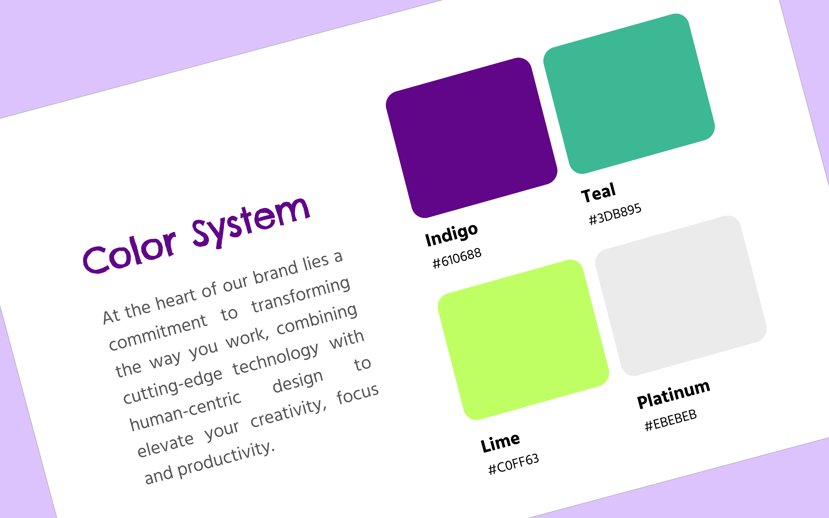
The goal of this design brief was to create a color system for a mobile app that could transform the way users interact with productivity and management tools by providing a playful, clean and intuitive interface that aligns with the brand's core principles of creativity, focus, and productivity.
The design was driven by my tendency to be easily overwhelmed by visual and auditory input. I appreciate uncluttered workspaces that allow the mind to sustain deep focus without sacrificing joyful elements that spark creativity and excitement.
After a thorough analysis of competitors Asana, MeisterTask and Jira, I chose purples for the primary colors and cold greens as secondary colors to embody the core principles of the brand, as well as neutral grays for less prominent elements:
- The vibrant primary and secondary colors like indigo, teal and lime green stimulate creativity and originality.
- The soothing lavender and mint colors enhance focus and create an environment conducive to sustained concentration and productivity,
- The neutral grays, along with the system colors, provide a clear, cohesive, and accessible user experience, guiding users seamlessly through the interface.
This chromatic blend throughout the UI elements ensures that the productivity management tool not only stands out by its minimalistic and clean design but also effectively supports users in their daily tasks, aligning with the brand's mission and values.
PS. This was my first Uxcel’s design brief and also my first time using Figma. There's still a lot to learn, so feedback is most certainly welcome!
Tools used
From brief

Topics
Share
Reviews
3 reviews

Congrats on your first submission!
I can tell that you've done this thoroughly.
Slight improvements in the presentation would be:
• Top alignment between paragraphs and color blocks that are different on each page
• Content headings that can be more centered vertically
• Perhaps play more with font pairings.
Overall, it looks great!

There is so much great content in this, you have put a lot of thought into why you've chosen the colours you have. I like to see the reasoning you have given for the colours you have selected and to take this on the next step it would be good to see more examples of how the colours work together.

Hello, I appreciate the clear structure and methodical organisation of this colour system document for a productivity tool. The different sections, from competitor analysis to UI examples, cover all the essential aspects and are well illustrated with relevant visuals. However, some improvements could be made to enhance the impact of the document. For example, improving the contrast between text and background would increase legibility, and ensuring strict visual consistency in the dimensions and alignment of elements would reinforce the perceived professionalism. In addition, adding examples of the application of colours in various UI contexts, such as buttons or error messages, would provide a more concrete understanding of their practical use. Finally, if the document is intended for online use, incorporating interactive elements could make the user experience more engaging and informative.
You might also like

Customer Journey Map for a Co-Working Space


Latios - Free Portfolio Template for UX/UI Designers

Workspace Booking Flow - UI/UX Design


Talenvo Website - Web and Mobile

L I N E A - Minimalist Fashion Brand

Video Streaming Service wireframe: Spoil-free mode and Interactivity

Visual Design Courses

UX Design Foundations


Introduction to Figma

Design Terminology
