Trello New Color System

Hey everyone! Excited to share my first project—a revamped Trello Color System! 🎨
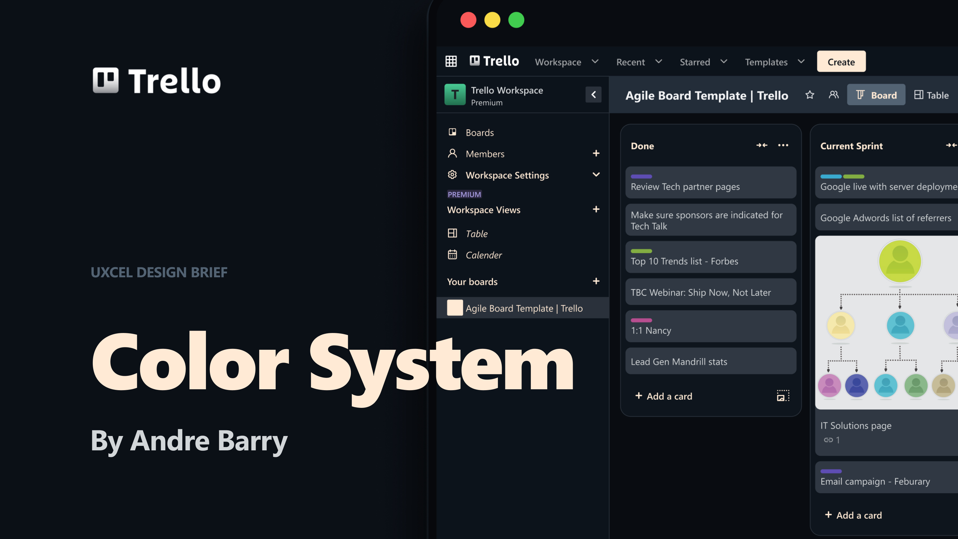
My goal was to give Trello a sleek, professional feel while keeping it simple and inviting to use. I leaned into a dark theme to make it easier on the eyes, especially for regular screen users. The deep blue tones create a sense of focus and reliability, while the soft yellow accents add warmth and motivation.
The result? A balanced, visually engaging workspace that feels both trustworthy and refreshing, making it even easier to stay on top of tasks and collaborate effortlessly.
Let me know what you think! 🚀
Tools used
From brief

Topics
Share
Reviews
2 reviews

Hi Andre, great to see your project. The new color system looks smooth and elegant in overall. The WCAG standard listed is qualified so the clarity and the ease of reading is great.
I only have a small concern of using the cream color for the text in side menu for both inactive and active ones. Let's take a look at the top bar which has the actions like the "star" icon, "table" icon,... the color of inactive and active ones are different. So I think the side menu should apply the same principle for consistency?
Love to hear your feedback. Thank you and have a great day!

I think your project is very well structured and it gives another vibe to Trello's brand. A more serious one, comparing it with the one used nowadays, but still very pratical and functional. I can see it working for tech or financial companies for example. Congrats!
You might also like

Improving Dating App Onboarding: A/B Test Design

FORM Checkout Flow - Mobile


A/B Test for Hinge's Onboarding Flow


Accessibility Asse


The Fitness Growth Engine


The Relational Workspace

Visual Design Courses

UX Design Foundations


Introduction to Figma

Design Terminology
