Click Up Color Palette


Reviews
1 review
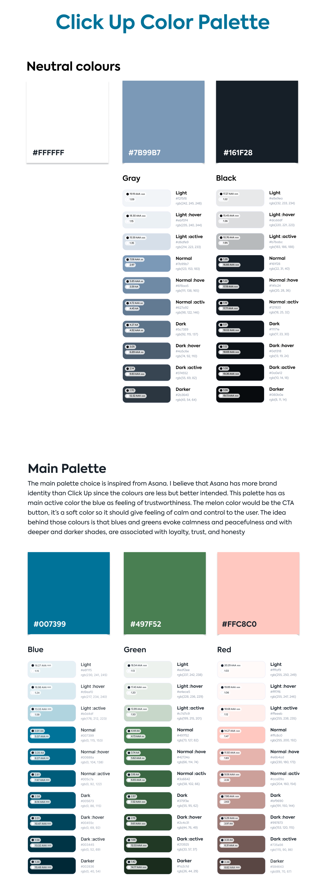
You've put in good effort in selecting colors for ClickUp! I appreciate your attention to color accessibility, which is commendable. However, I feel that the chosen colors don't fully capture the essence of ClickUp's brand. Without reading your description, I might have mistaken them for a yoga studio or meditation app due to their wellness-like vibe. Additionally, demonstrating how these colors work together in interface or branding materials would provide a clearer picture. Keep up the good work!
4 Claps
Average 4.0 by 1 person
You might also like

Project
HealthFlow: Designing a Simple and Insightful Wellness Dashboard

This project focuses on designing a health and wellness dashboard that simplifies how users track and understand their daily well-being. Das

Project
Improving Dating App Onboarding: A/B Test Design
This project explores how improving the onboarding experience of a dating app can increase profile completion and early user engagement. I d

Project
FORM Checkout Flow - Mobile

Try out the prototype here. Design Rationale Why mobile? Mobile accounts for the majority of e-commerce browsing, and premium furniture pur

Project
A/B Test for Hinge's Onboarding Flow

This project focuses on improving the onboarding experience of a dating app - Hinge, by addressing low profile completion rates. Since profi

Project
Accessibility Asse

For this project, the LearnLink website was selected, and the goal was to redesign the login and sign-up pages specifically, adapting them t

Project
The Fitness Growth Engine

This slide shows how user behavior translates into business success by connecting activation, habit formation, retention, and monetization i
Visual Design Courses

Course
UX Design Foundations

Learn UX design fundamentals and principles that create better products. Build foundational knowledge in design concepts, visual fundamentals, and workflows.

Course
Introduction to Figma
Learn essential Figma tools like layers, styling, typography, and images. Master the basics to create clean, user-friendly designs

Course
Design Terminology

Learn UX terminology and key UX/UI terms that boost collaboration between designers, developers, and stakeholders for smoother, clearer communication.