ClickUp Color System

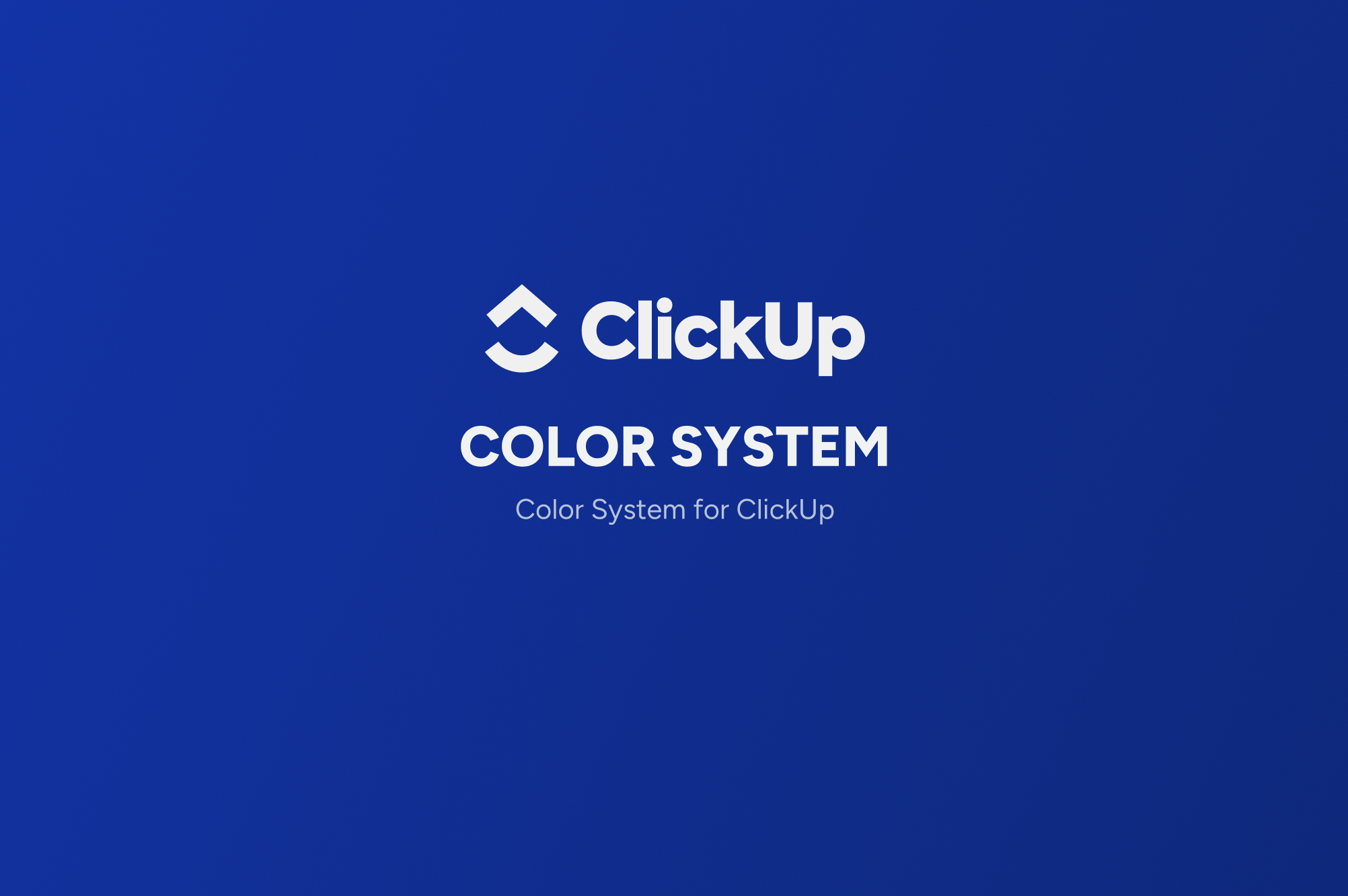
New, Simplified Color System for ClickUp
The primary palette comprises dynamic blues, reflecting innovation and efficiency, core to ClickUp's brand principles. The secondary palette introduces vibrant pinks and purples, evoking creativity and approachability, while the tertiary shades of mint and aquamarine add a refreshing and calming touch. Neutral grays ensure versatility and accessibility, grounding the brighter hues and ensuring WCAG compliance for text contrast. System colors can be used for alerts and are pragmatically applied within the UI to intuitively guide user interaction. This color system not only enhances the brand’s visual identity but also prioritizes user accessibility, creating a harmonious and inclusive digital environment.

Reviews
4 reviews
Samuel, your work is really impressive! I love how you've chosen your colors with such care and thoughtfulness. It's clear that you've put a lot of effort into understanding how each color reflects the personality of the brand. And when I see those colors on the interface and logo, they just look fantastic! You've really brought the brand to life with your choices. Great job!

I am delighted with this presentation of the work, very smoothly, with the right accents, the information is easy to perceive and visually pleasing. The colors are well chosen. I was pleased with the check of compliance with WCAG standards. We see that this works well in the interface.
Great job, I want to see your other works!

Easy to understand why you made these choices.

Great presentation—clear and easy to follow! I especially loved your thoughtful approach to introducing a new color system for ClickUp.
You might also like
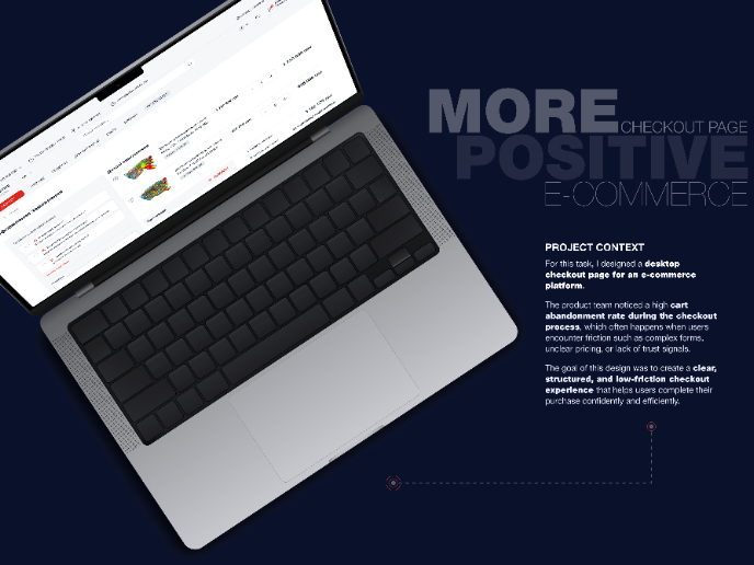
🖥 Desktop Checkout Flow Design

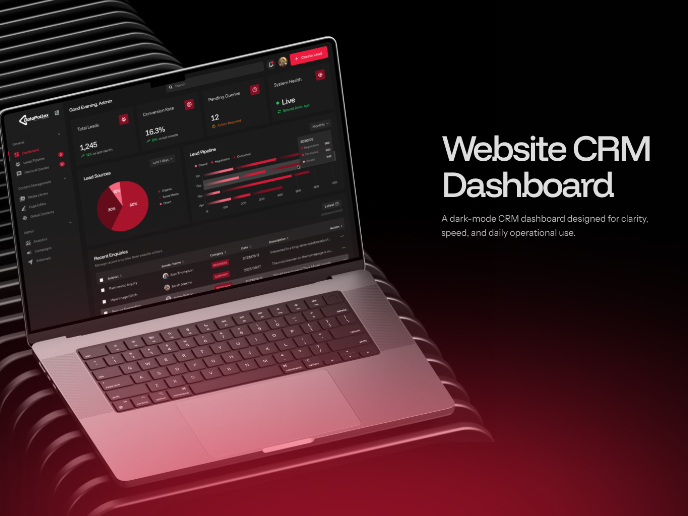
Website CRM Dashboard

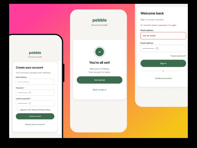
Pebble Accessible SAAS Signup Flow

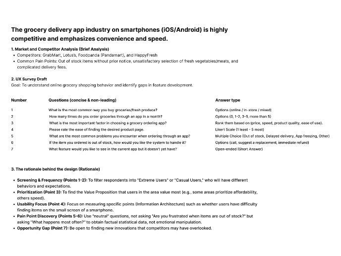
Create a UX Research Survey

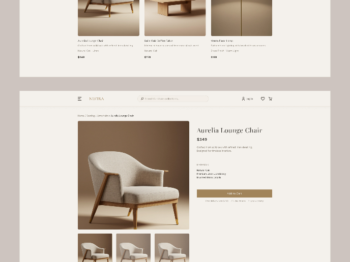
Nestra from homepage to checkout process


QuickScan Onboarding

Visual Design Courses

UX Design Foundations


Introduction to Figma

Design Terminology
