CoinX - Crypto Trading App


1. Project Overview
A Modern Crypto Trading App for All Traders – From Newbies to Pros
Goal:
Create a crypto trading platform that is friendly for beginners yet powerful enough for professional traders.
The design targets Gen Z and Millennials (under 40): tech savvy, fast paced, intuitive users who prefer dark mode and embody a “digital finance lifestyle.”
Challenge:
Most existing crypto apps are complex and overwhelming for newcomers, while simpler ones lack advanced tools for professional traders.
→ How can we create a unified experience that effectively serves both user groups?
2. User Research & Insights
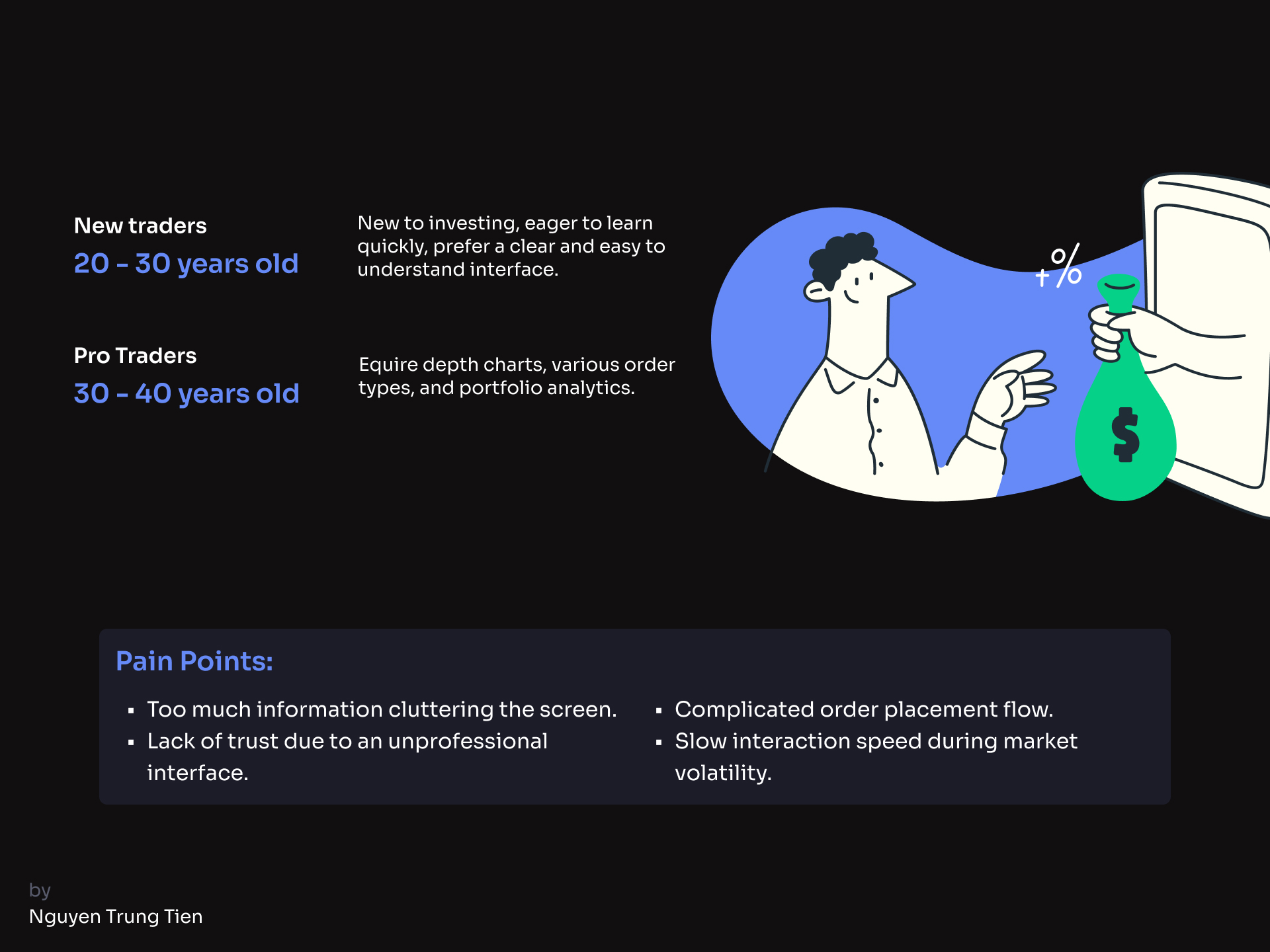
Target Users:
- New Traders: Ages 20–30, new to investing, eager to learn quickly, prefer a clear and easy to understand interface.
- Pro Traders: Ages 30–40, require depth charts, various order types, and portfolio analytics.
Pain Points:
- Too much information cluttering the screen.
- Lack of trust due to an unprofessional interface.
- Complicated order placement flow.
- Slow interaction speed during market volatility.
Opportunities:
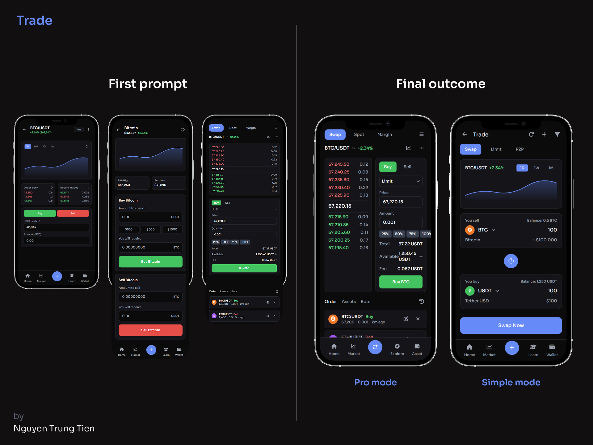
- Create a dual-layer UI: “Simple Mode” & “Pro Mode.”
- Reduce friction in the trading process.
3. Design Principles
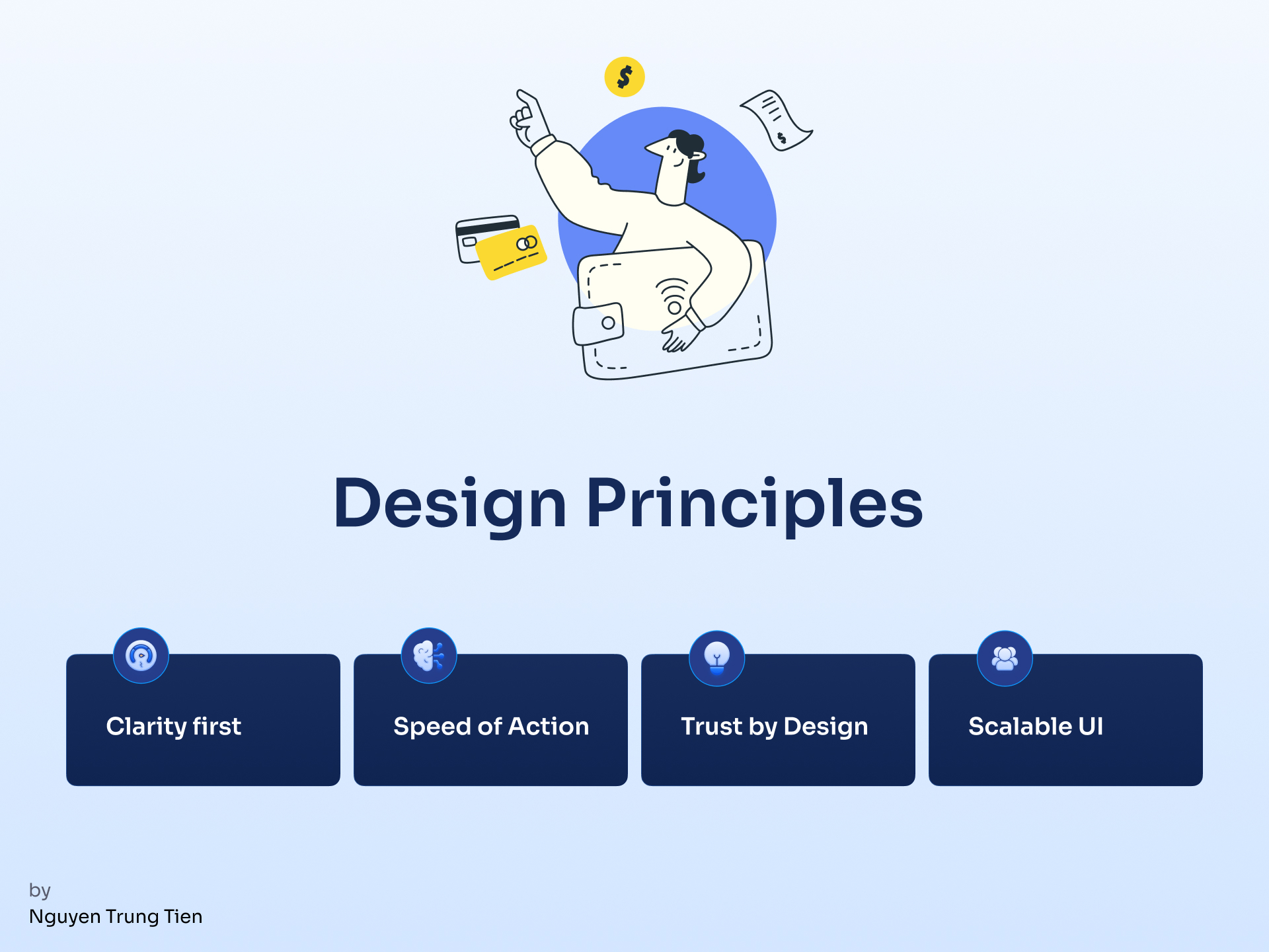
- Clarity first: ll data and charts must be easy to read and visually clean.
- Speed of Action: Every trading action should be completed within ≤ 2 taps.
- Trust by Design: Use a trustworthy color tone
- Scalable UI: The UI structure should be flexible enough to expand with advanced tools for professional traders.
4. Design Process with UXPilot
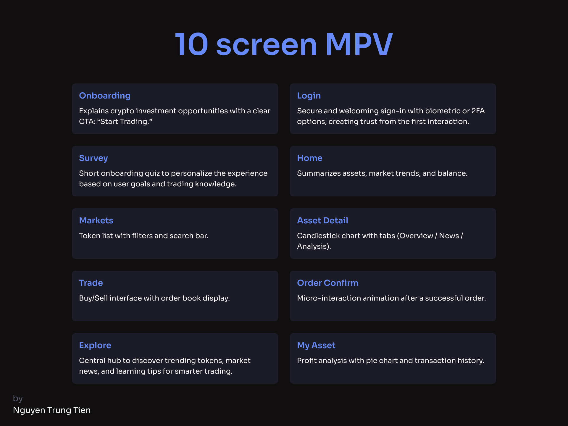
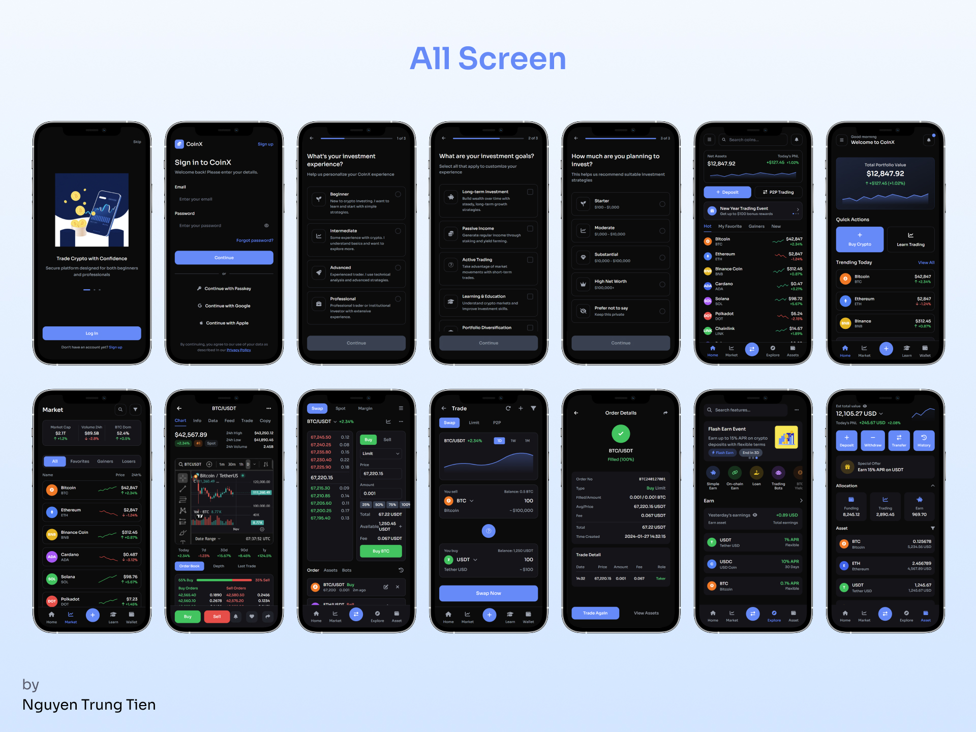
10 screen MPV
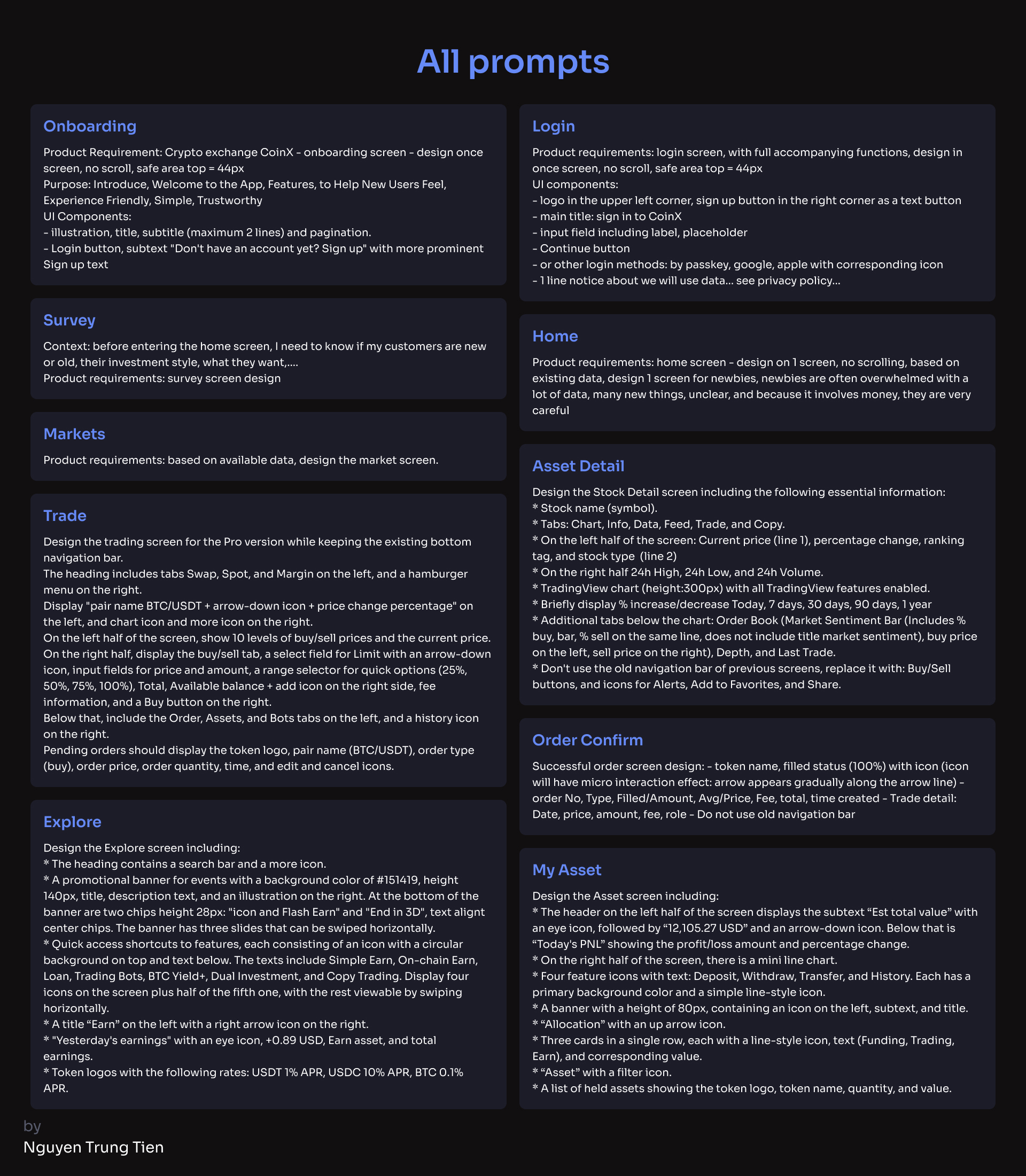
Step 1. Getting Started
At the beginning, I took the recommended Uxcel courses and read through all the suggested materials and showcase projects from other designers. It helped me understand how others structured their work and used AI in design.
Then, I started exploring UXPilot. I went through the official guides and tried different tools to understand how prompts and iterations worked. It wasn’t too difficult to get familiar with, but during this learning phase, I definitely burned through quite a few credits while experimenting and testing different ideas.
Step 2. First Setup
Once I understood the basics, I began by following one of UXPilot’s sample prompts to build my first layout. I set up the page content structure, imported my own images, and started shaping the foundation of the crypto trading app.
This early setup helped me see how AI interprets design intentions and how clear prompts can directly affect visual outcomes.
Step 3. Process with UXPilot
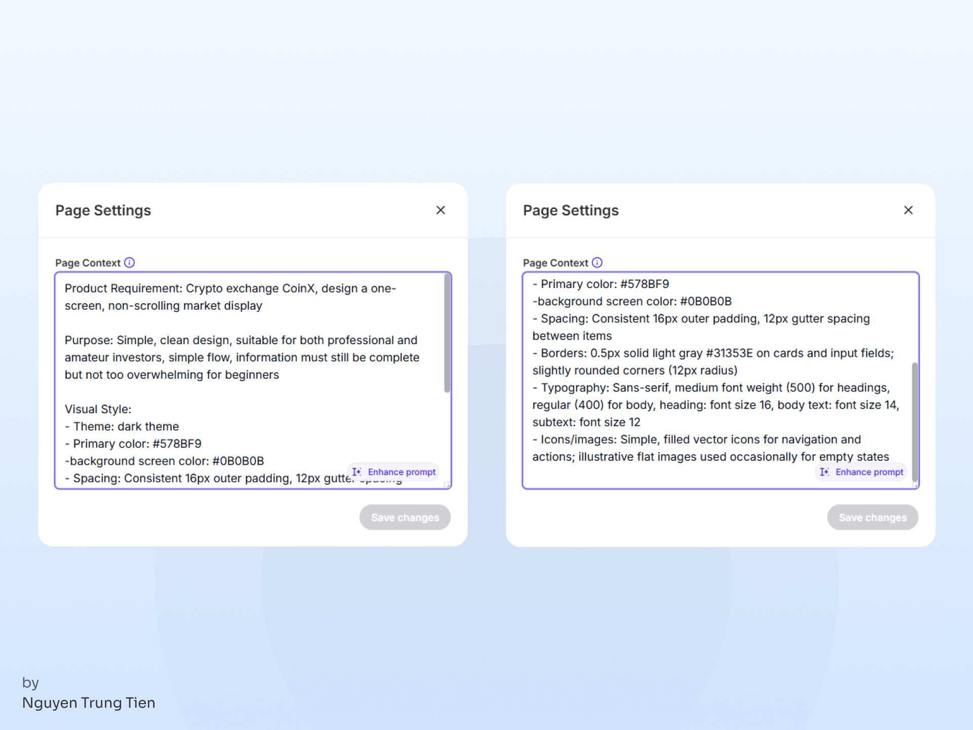
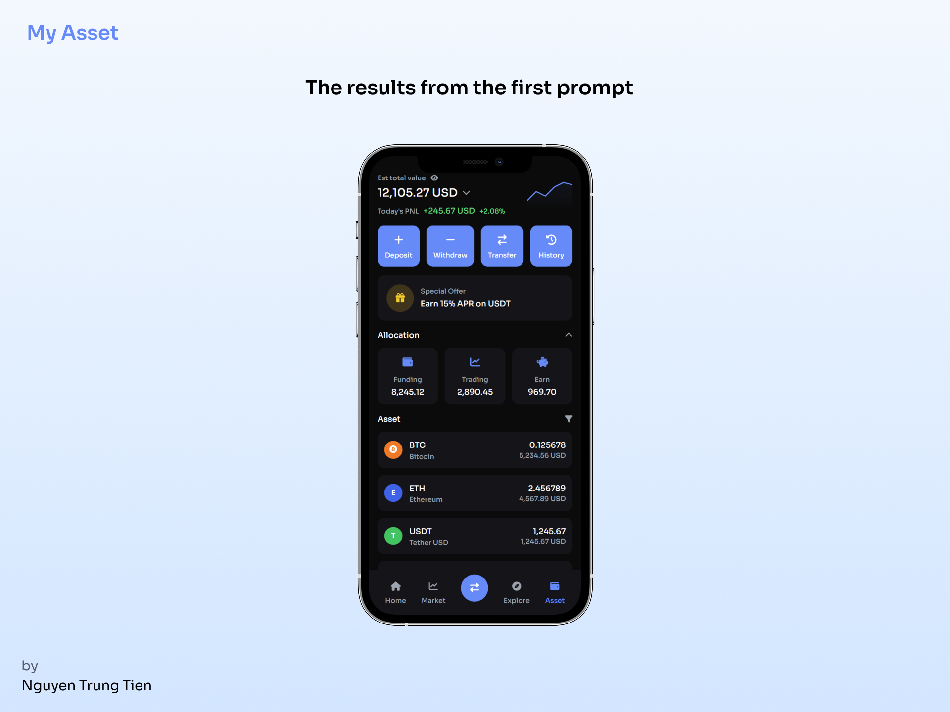
I started by testing a short, summarized prompt describing exactly what I needed and the result was surprisingly good for a first try. The layout captured the overall direction I had in mind.
However, there were still a few things that didn’t feel quite right:
- The subtitles were too long and visually heavy
- The layout lacked proper safe area spacing, which made the composition feel a bit cramped
It was a good reminder that even with a strong prompt, small details still require human refinement to reach a professional finish.
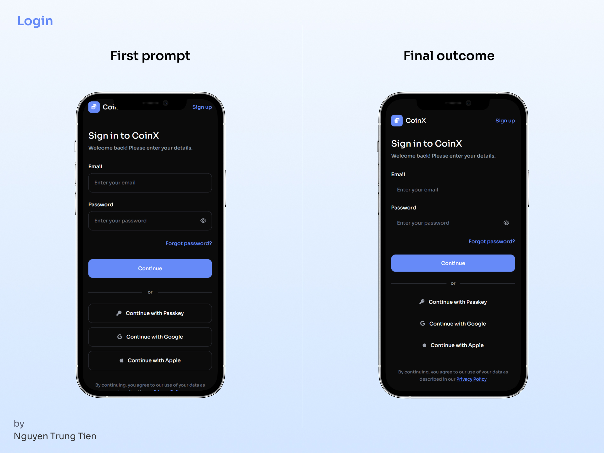
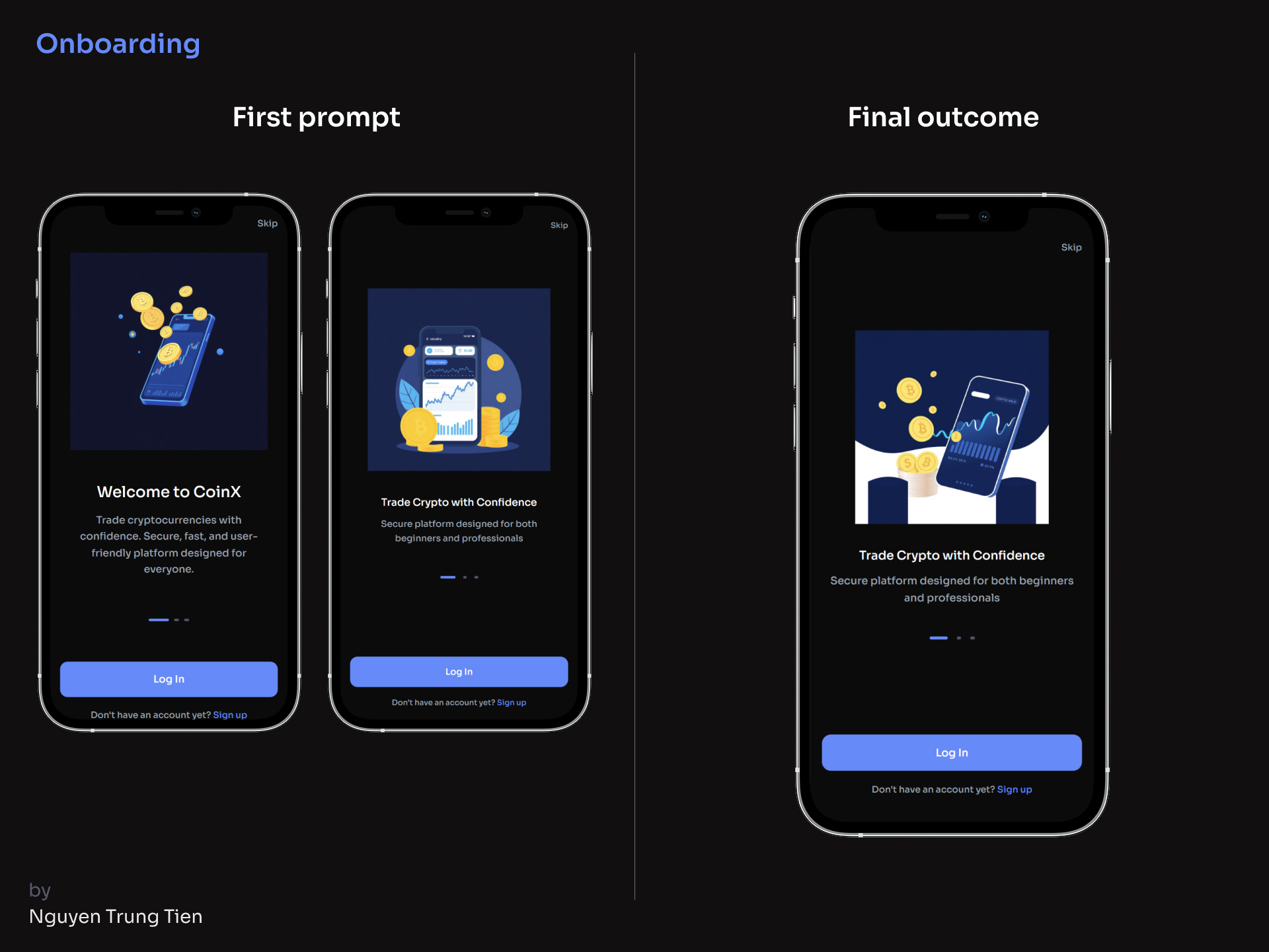
The first attempt at the login screen produced a satisfying result, but it still had issues with the safe area, and the UI extended beyond one screen, requiring scrolling. In the next prompt, I clearly described these issues — and they were successfully fixed.
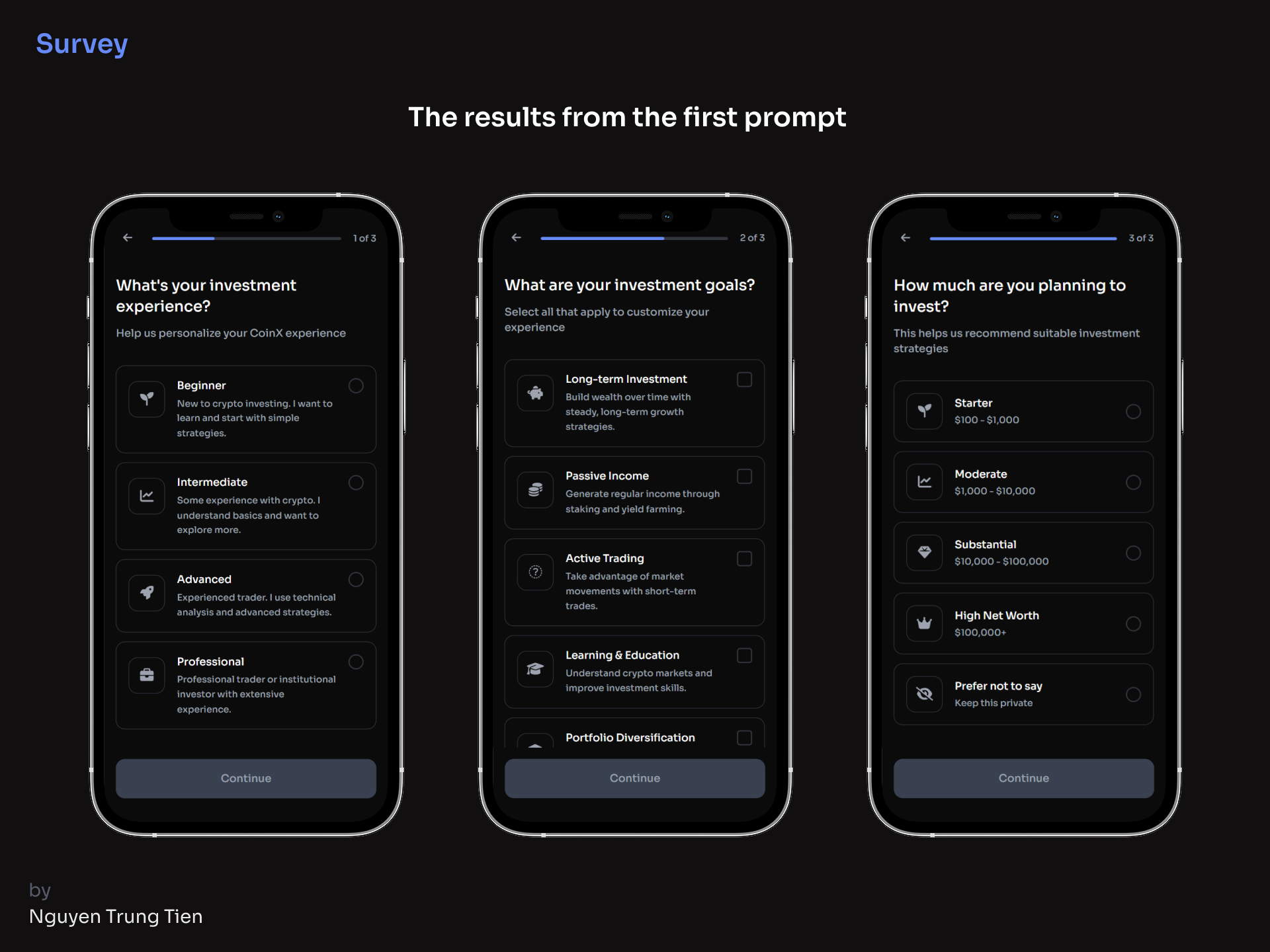
The survey screen turned out great even with a simple, general prompt, the result was so good that I didn’t need to make any further attempts.
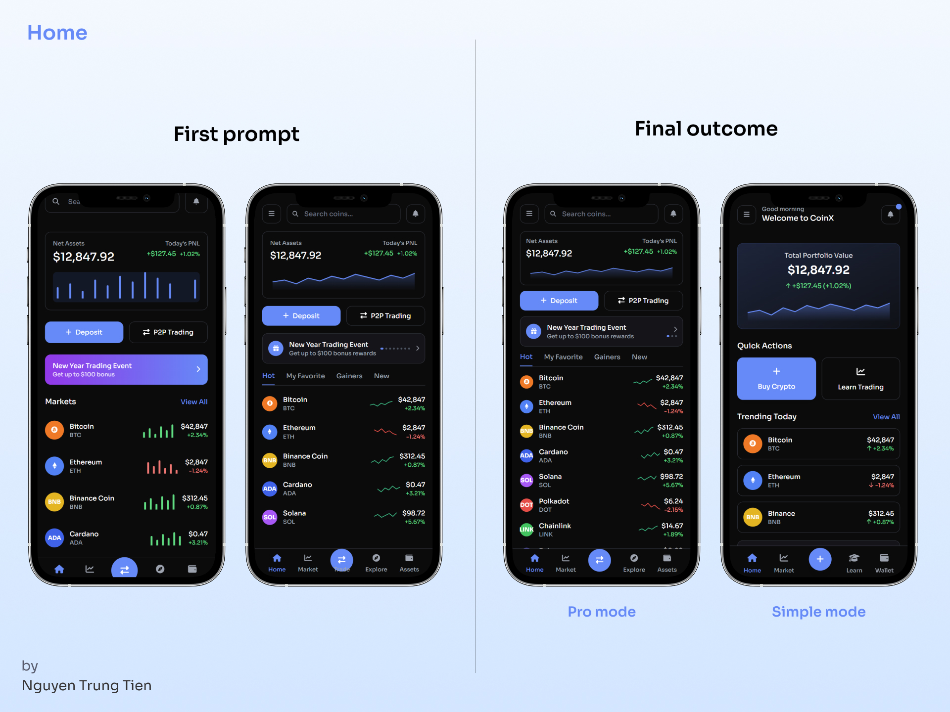
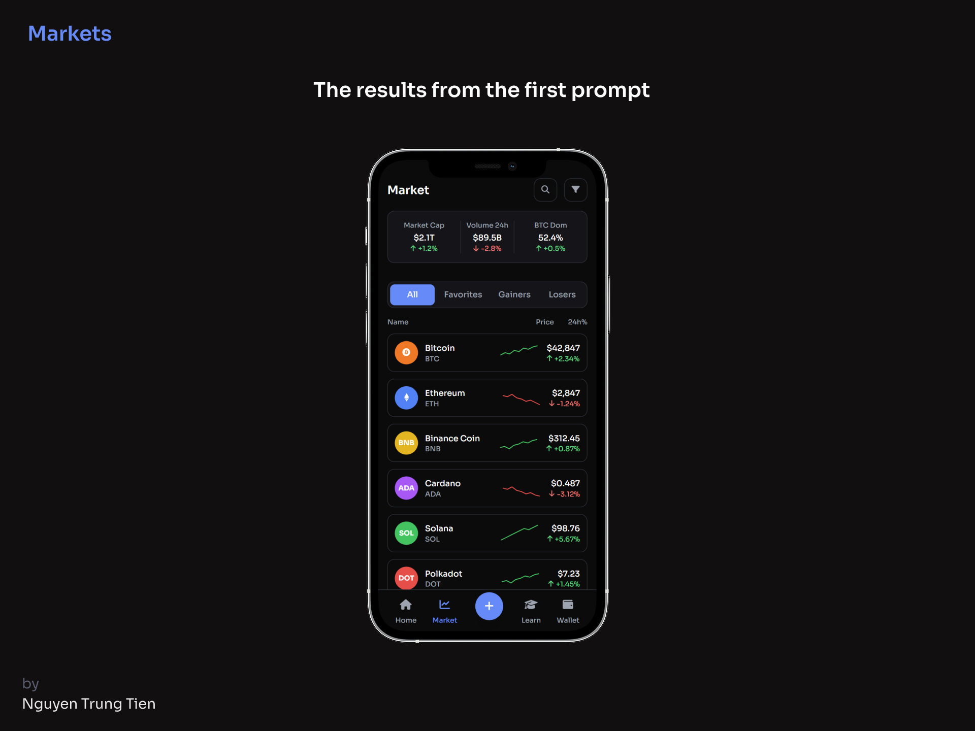
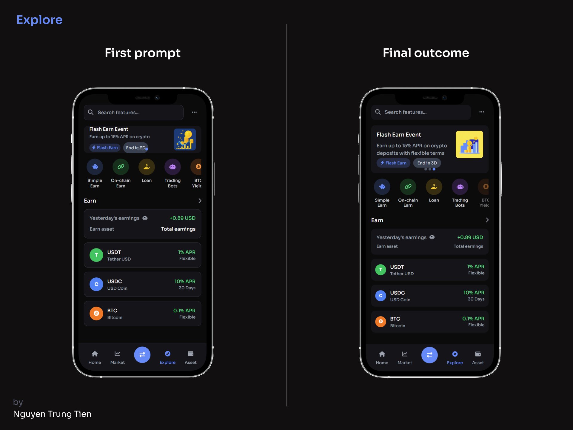
Home screen, I came up with two display modes Pro Mode for experienced traders and Simple Mode for beginners. I started with a fairly general prompt, which led to a few issues in the output: it generated a bar chart instead of a line chart, the event banner looked unattractive, and the “Trade” text in the navigation bar overlapped with the icon.
After several iterations, the results improved significantly, but I still couldn’t fully fix the text-overlap issue so I decided to remove the “Trade” label altogether.
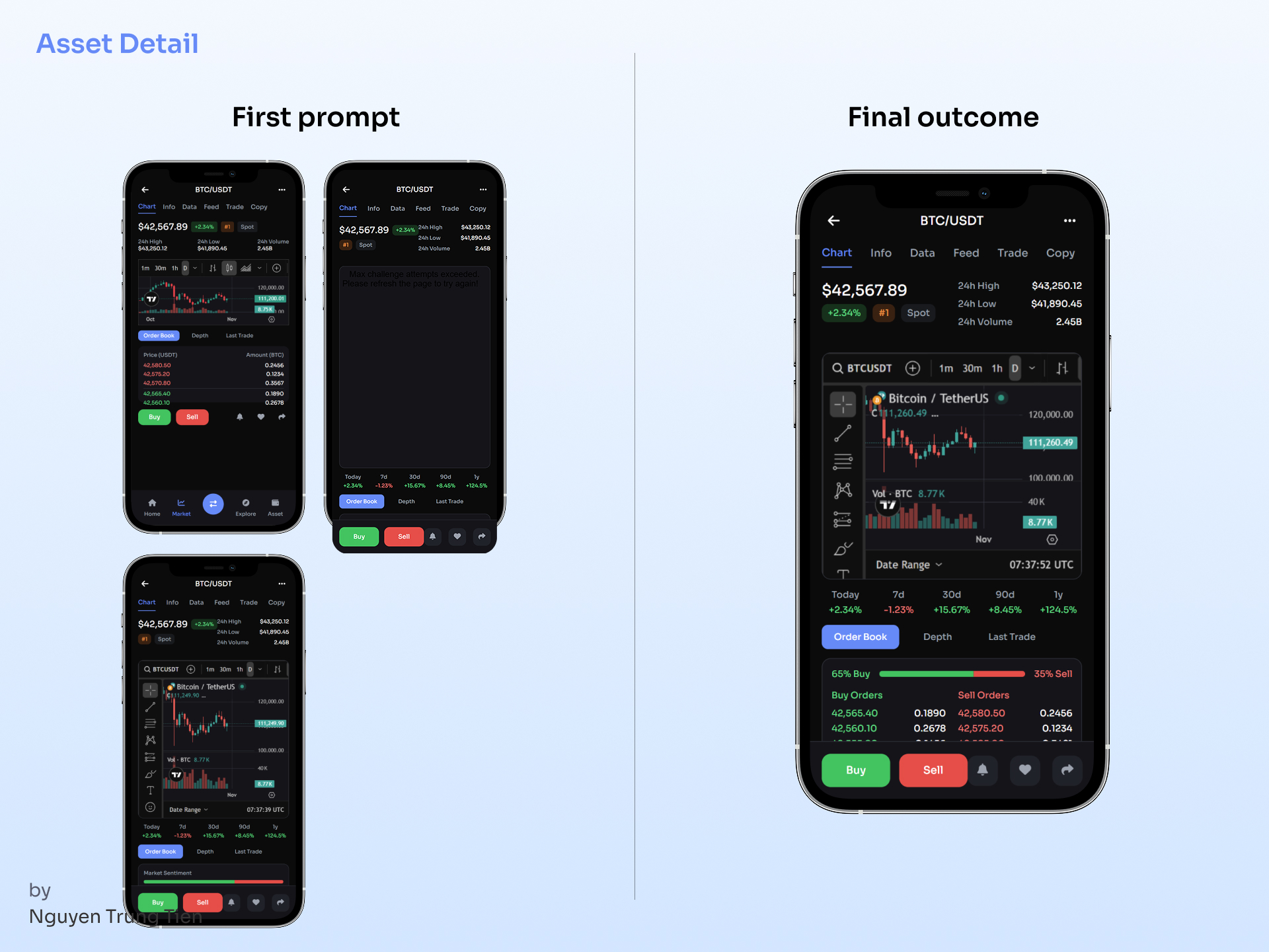
Asset detail screen, I had to write a fairly detailed prompt to achieve the layout I wanted. What surprised me was that the AI was able to embed a TradingView chart directly into the design and make it run in real time something I really liked.
I also experimented with a Binance-style chart, but the result turned out completely dark, as shown in the second image.
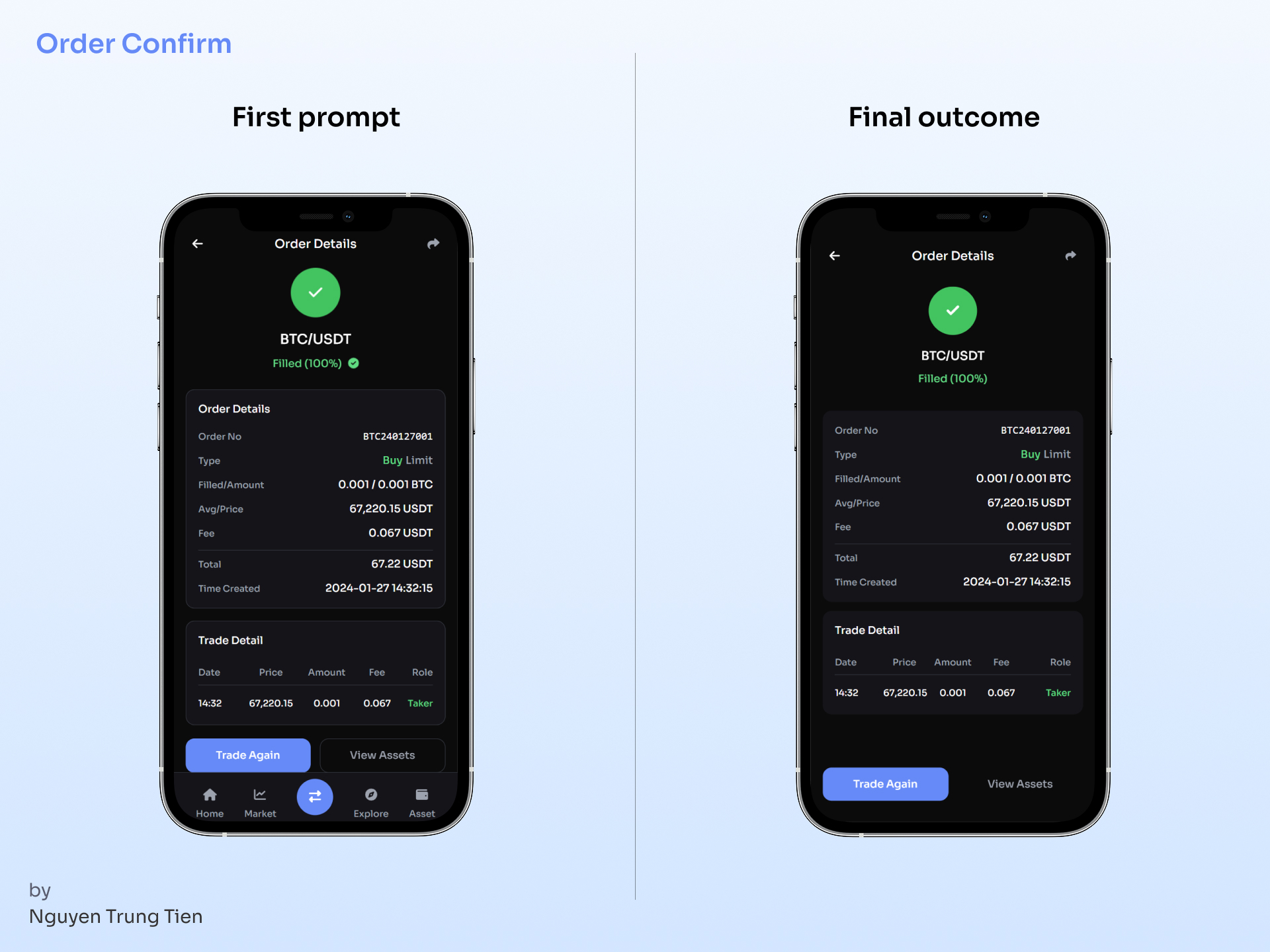
Order confirmation screen, I wanted to create something a bit more engaging, so I experimented with adding a small micro-interaction to the Success icon and it worked, even if only at a basic level.
6. Outcome & Prompts
7. Testing Results
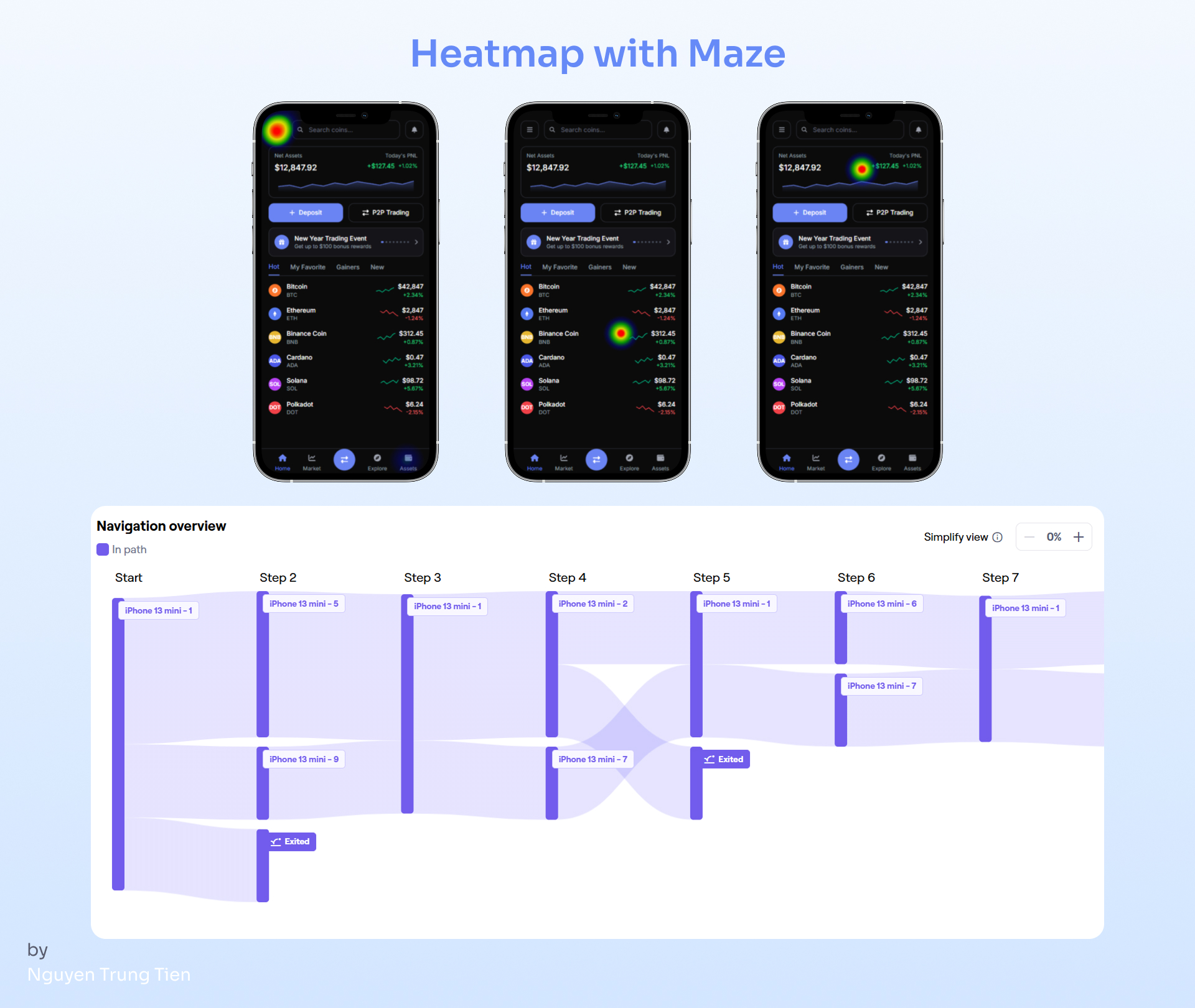
After getting the final results, I tested the design using UXPilot’s Predictive Heatmap feature and Maze’s Prototype Test, then compared the outcomes.
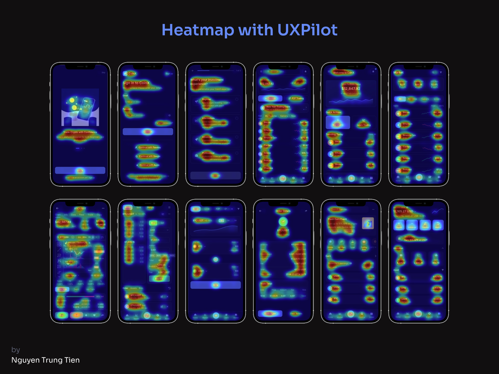
The Predictive Heatmap was surprisingly accurate it quickly highlighted the areas that drew the most user attention, helping me identify whether my visual hierarchy worked as intended. It’s a fast, AI-driven method that saves time in the early validation stage.
On the other hand, the Maze Prototype Test provided deeper insights through real user interactions. It revealed behavioral patterns, such as where users hesitated or clicked off flow, giving a more human layer of feedback.
8. Challenges & Learnings
- The initial prompts were unclear, so the AI generated layouts that didn’t match my intent
- Optimizing the design for both user groups required many iterations, especially in terms of UI density and component priority
- AI helped save about 60% of layout creation time, but the final polish still had to be done manually in Figma
Learnings:
- The more specific the prompt, the more accurate the result
- A solid design system still needs to be built manually to maintain consistency
- Iteration and feedback loops are the key to refinement

Reviews
4 reviews

Nice work!

Good job!!

amazing

This is a super challenging area to tackle—crypto trading—so huge kudos for diving in! Your resulting screens already cover so much of the essential functionality, which is awesome! That said, I'm left wondering about two key things:
- The 'Why': What's the unique magic here? How do these complex screens genuinely improve upon what's already available from existing crypto exchanges?
- The Newbie Barrier: The crypto jargon is still pretty present. It makes me a little concerned about onboarding a total beginner.
You're aiming to create a platform that serves both a pro and a newbie, which is an incredibly ambitious and challenging goal! Their needs are often complete opposites, but if you crack that code, you'll have something truly special!
You might also like

Smartwatch Design for Messenger App


Bridge: UI/UX Rebrand of a Blockchain SCM Product


Pulse Music App - Light/Dark Mode


Monetization Strategy


Designing A Better Co-Working Experience Through CJM


Design a Settings Page for Mobile
Product Thinking Courses

Ethical & Responsible Product Design


Product Vision & Strategy


Product Management Foundations
