ClickUp productivity app with Adventure Time color theme


I started with a common approach and created a couple of color palettes for a wider group of users. But after 3 iterations I've got an idea to create a more specific color theme for people who are familiar with the world of "Adventure Time" cartoon. Therefore I've created a whimsical color system that captures Adventure Time's essence while maintaining usability for a work management platform.
The main characters and locations inspire the colors:
- Princess Bubblegum's pink palette for primary actions
- Jake's yellow spectrum for engaging elements
- Finn's blue tones for progress and heroic achievements
- Dark neutral tones inspired by nighttime adventures
- System colors based on various magical characters
Brand Principles
- Playful & Energetic: Vibrant, candy-inspired colors
- Whimsical: Fun yet functional color combinations
- Adventure-Ready: Bold, encouraging color choices

Reviews
2 reviews

I do like the how you tied the color scheme to a comic book, building a story and the psychology of the system. Otherwise, much to improve!
Let's take a look at the evaluation criteria together.
Visual design: The colour scheme is fun, yet it does not reimagine ClickUp's brand. The scheme is literally lifted from the palette found on its logo. You used way too much color, almost 90% of your screen is colored in one way or another. It does not match at all a work management tool. When asked to make strategic use of colors, remember that the main part of it is when not to use any. The welcoming, optimistic and trustworthy emotions get washed mixing so many pale shades of each.
Accessibility: Your colors could be more safe. Your shades of pink & blue and yellow & green are not safe for protanopia, other combinations are also not safe for deuteranopia or tritanopia. You used such combinations on main interfaces like the sidenav and its active item. The light pink buttons with white text won't pass WCAG for contrast.
Presentation: Be aware that you linked the last slide of your presentation, and that there are multiple slides in the wrong order. There was no rationale as to why did you pick the shades of each color.
A parting note! It would have been simpler if you had selected one color each (primary, secondary, tertiary, etc.) instead of trying to build a palette of shades. Having fewer colors would have prevented the mistake of coloring everything, and would have kept the strong meaning of each.
Keep working!

Hi Kostiantyn. I like the fun way you tried to tied up the colour theme with the story. However, the Design System colour foundation should always be on a practical side.
Your color palette is vivid and beautiful, with some combinations working well together. For the next iteration, I suggest selecting a "main character" to serve as the primary (brand) color and adjusting the supporting "background characters" to play a more subtle, complementary role. This shift will simplify the design and make it more accessible to a broader audience.
Great job taking bold steps! Sometimes unexpected explorations lead to the most effective solutions.
Keep up the great work!
Yuliia
You might also like

eWallet App Development Project


🖥 Desktop Checkout Flow Design


Website CRM Dashboard


Helpful 404 Error Page for a Fintech Mobile App

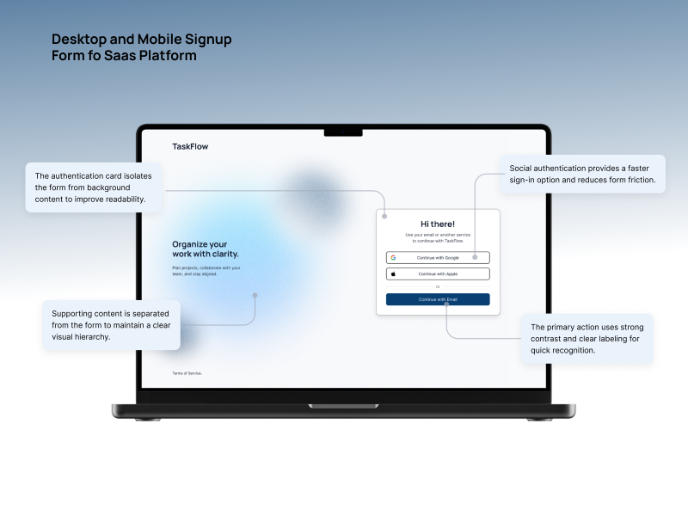
TaskFlow Authentication Flow


Pebble Accessible SAAS Signup Flow

Visual Design Courses

UX Design Foundations


Introduction to Figma

Design Terminology
