Checkout flow for DirectSoccer

I've used my own experience of using the website Direct Soccer. Here, I've tried to keep the brand the same, but I've made the header simpler and focused on improving the checkout process.
Empathise
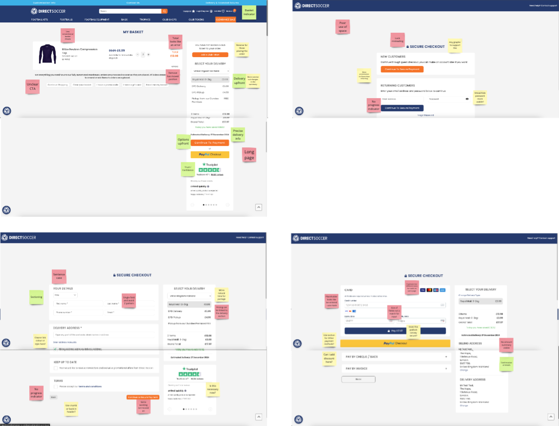
Layout: Long scrolling pages, CTAs hidden for laptop resolutions, poor use of whitespace across some pages.
Content: Use of capitals for headings. Requires some content auditing and to add short and concise sentences and better cues for users.
Forms: Use of placeholders looks like entered values. Width of fields not a match for their inputs. Unexpected arrangement of the fields for "Your details".
Define
To design a new flow I had these thoughts:
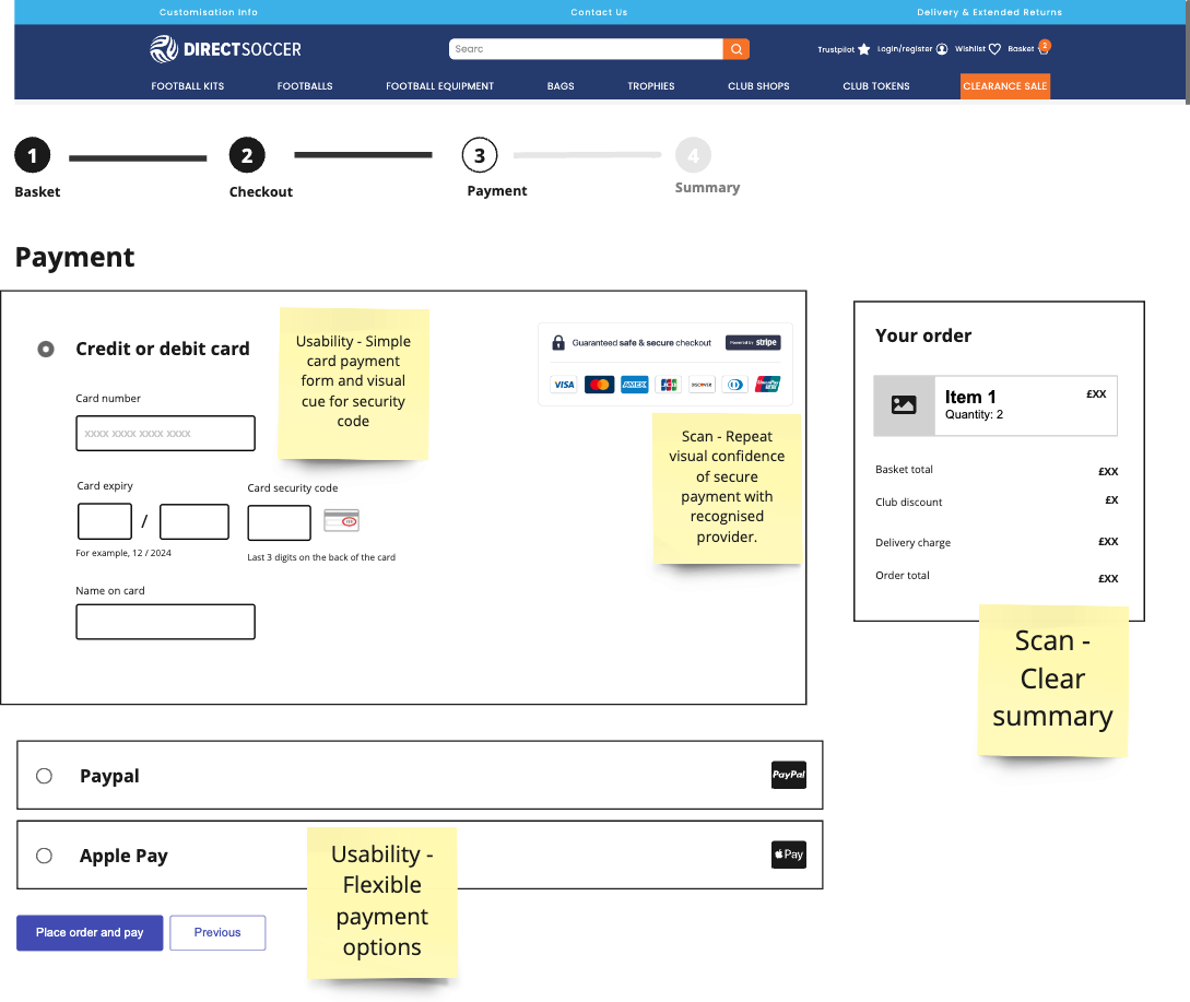
User confidence: Add visibility trusted reviews, membership for promotional discounts, information on delivery costs and signs of secure payment with known provider such as Stripe.
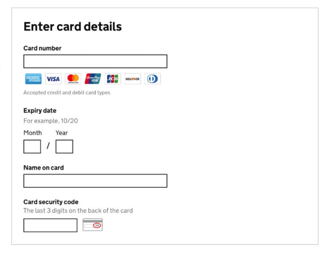
Form usability: Reduce the number of fields, remove placeholders to avoid confusion, use a mask for card input, include various payment options.
Stepped flow: Show progress throughout, reduce distractions but have relevant or engaging contents. Demonstrate a guest checkout and ensure there's a confirmation at the end.
Ideate
To gather my ideas I've looked for at various examples I use when purchasing items. However, it was also useful to think of other examples such as UK Gov who demonstrate accessible payment details gathering that could be relevant in catering for accessibility and all users.
Wireframing
Using Miro and the built in wireframing tool along with some screenshots from the actual site, I was able to quickly mock and demonstrate what the experience could look like and annotate accordingly to review the decision making.
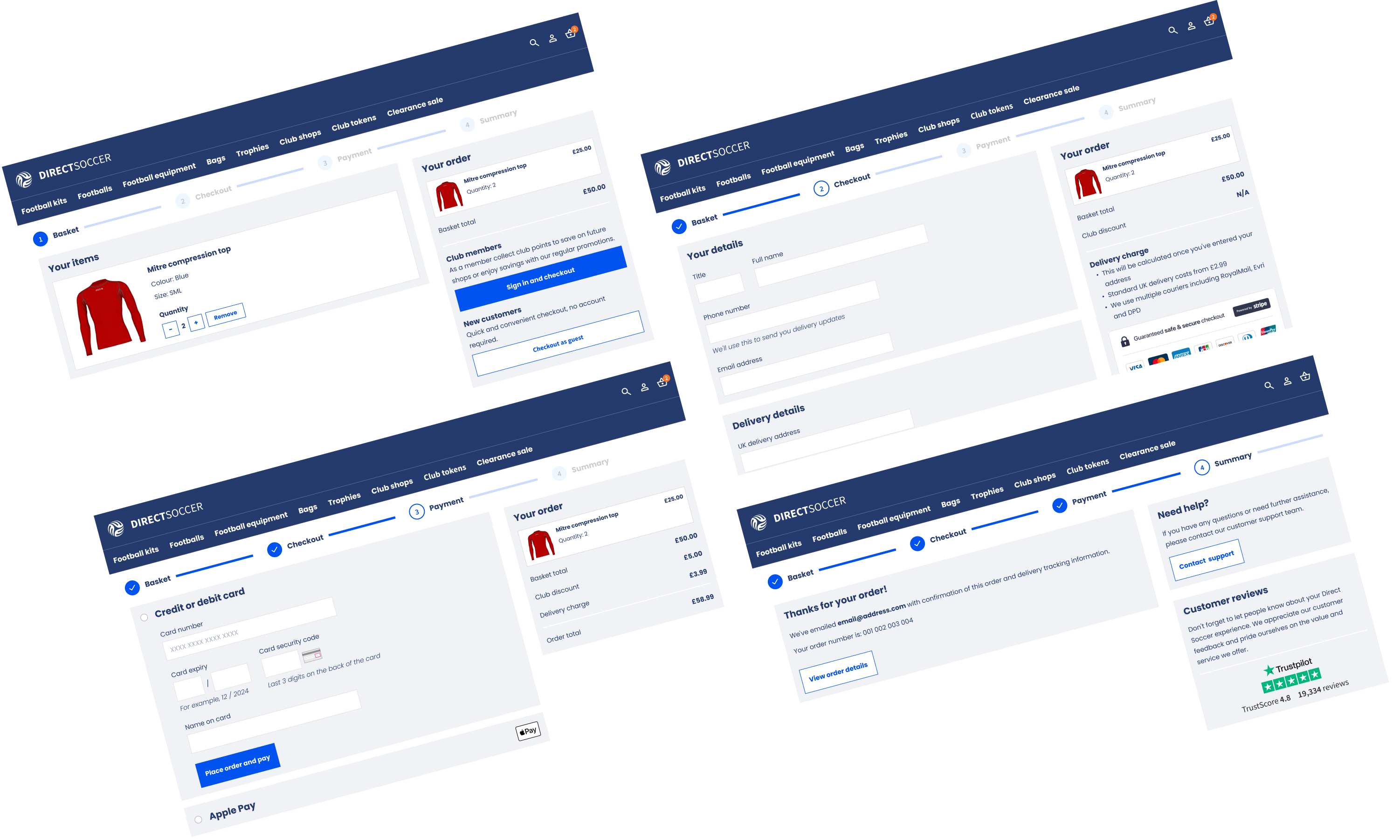
 Final design
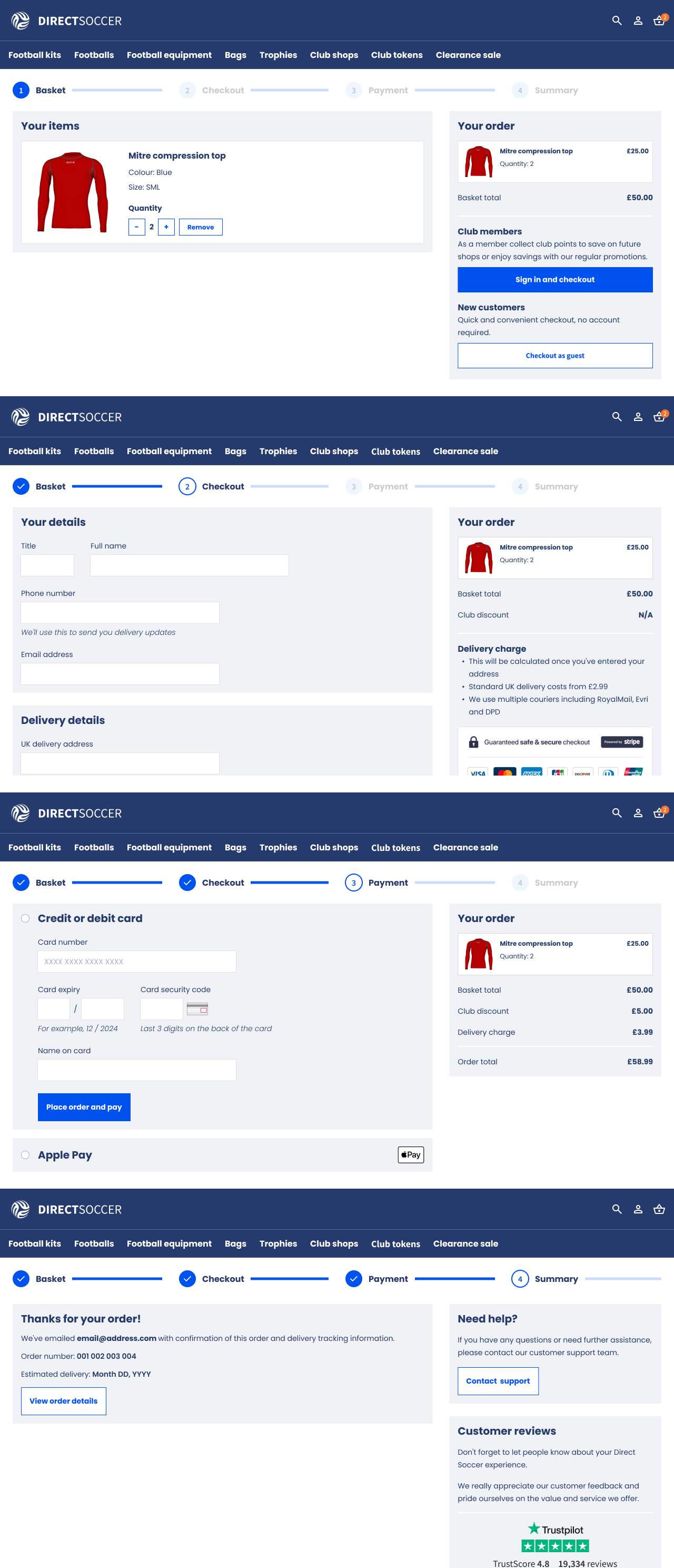
Usability: Here there's flexibility at the start to change or remove items. Choice to sign in or use guest. Form fill is stripped back. Better utilisation of space and layout to clearly section related contents. Include a CTA for assistance at the end of the user journey to enhance user confidence and trust in case things go wrong.
Scan-ability: Reassuring customer reviews (invoke trust), other visual cues added with card number mask and security code image as well as known payment providers. A clear summary panel for "Your order" throughout.
Visual design: Respect the existing brand of this website, but reduce the use of colour and focus on primary and secondary CTA style. Use orange to grab attention (basket count). Use imagery only where necessary for products or other brands.

Reviews
1 review

Good checkout flow design! Clear steps and professional layout for e-commerce. Great work!
You might also like
SiteScope - Progress Tracking App


FlexPay


Mobile Button System


CJM for Co-Working Space - WeWork


Ubani Design System


Accessible Signup Form for SaaS Platform
Interaction Design Courses

UX Design Foundations


Introduction to Figma

Design Terminology
