Chatbox- A friendly chat app for friends
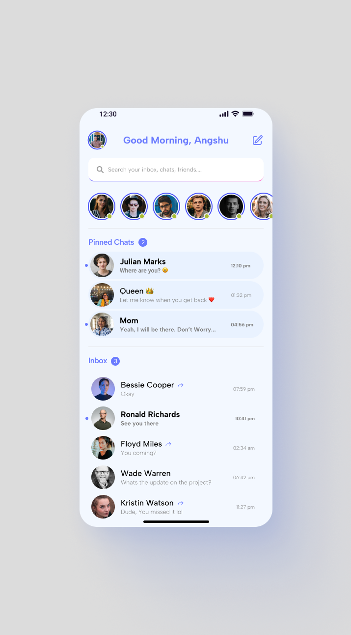
This was a project i did for a course assignment submission. The task was to design a chatting app screen.
I opted to design this screen keeping minimal and clean UI design styles in mind. For me, less is more.
Feel free to give your feedback on this so it helps me to grow as a designer. Thank you <3
Reviews
2 reviews
Interesting exploration Roy. Just a little feedback regarding the pencil icon at the top of the right corner. Instead of using the pencil icon for I assume it's a new chat button you can try using plus icon. Overall goods. Waiting for your next project.
Hey Angshuman,
Nice job on this submission—really clean work! I also love your use of colour. Here are a few small refinements to consider:
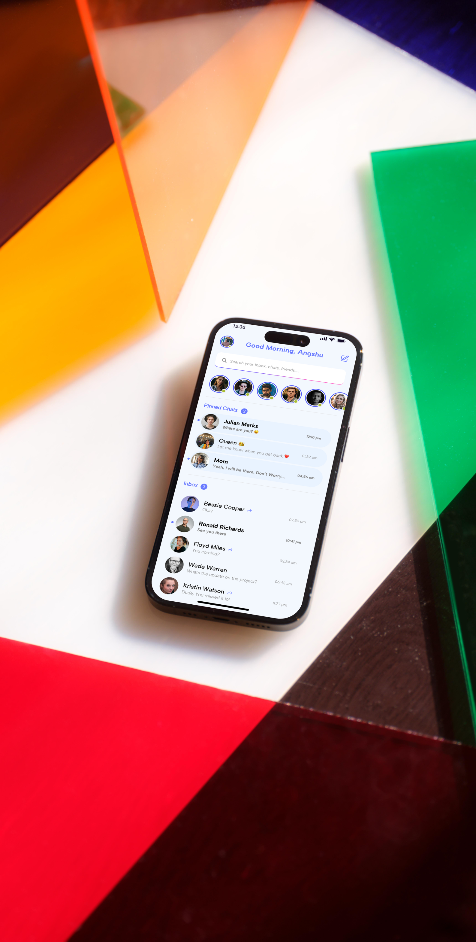
- With only these two images, it’s tough to fully evaluate the work. A Figma link would allow for a high-definition view, and sharing more than one screen would help assess the UX more fairly.
- The hint text in the search field is a bit hard to see. (On a side note, I really like the subtle silver underline—nice touch!)
- Adding a “Stories” title above the stories section could make it clearer that these are interactive and can be played.
- The unread message indicator above the two titles is a great addition! It just seems slightly off-center, leaning a bit too far right—adjusting this could enhance visual balance.
- Regarding the ordering of new messages, while solutions vary by context, bringing new messages to the top could improve:
-Efficiency & Usability – Surfaces active conversations immediately, reducing cognitive load.
-Real-time Communication – Prioritizing new messages ensures a more responsive experience, which is key for engagement.
- The small arrow next to the contact name wasn’t immediately clear—it seems to indicate that the last message was sent by the user? Since this isn’t a standard convention in chat apps, consider exploring a more intuitive way to convey this.
- Adding faint divider lines between list items could improve readability and definition.
- The blue background for pinned chats may not be necessary—the existing chunking already separates sections well.
- A short walkthrough explaining your design process, product purpose, and rationale would provide valuable context and better communicate your vision.
Keep up the great work—looking forward to more from you!
You might also like

Improving Dating App Onboarding: A/B Test Design

FORM Checkout Flow - Mobile

A/B Test for Hinge's Onboarding Flow

Accessibility Asse

The Fitness Growth Engine
Uxcel Halloween Icon Pack
Popular Courses

UX Design Foundations

Introduction to Figma


