Campaign Cat - Accessible Sign Up Form

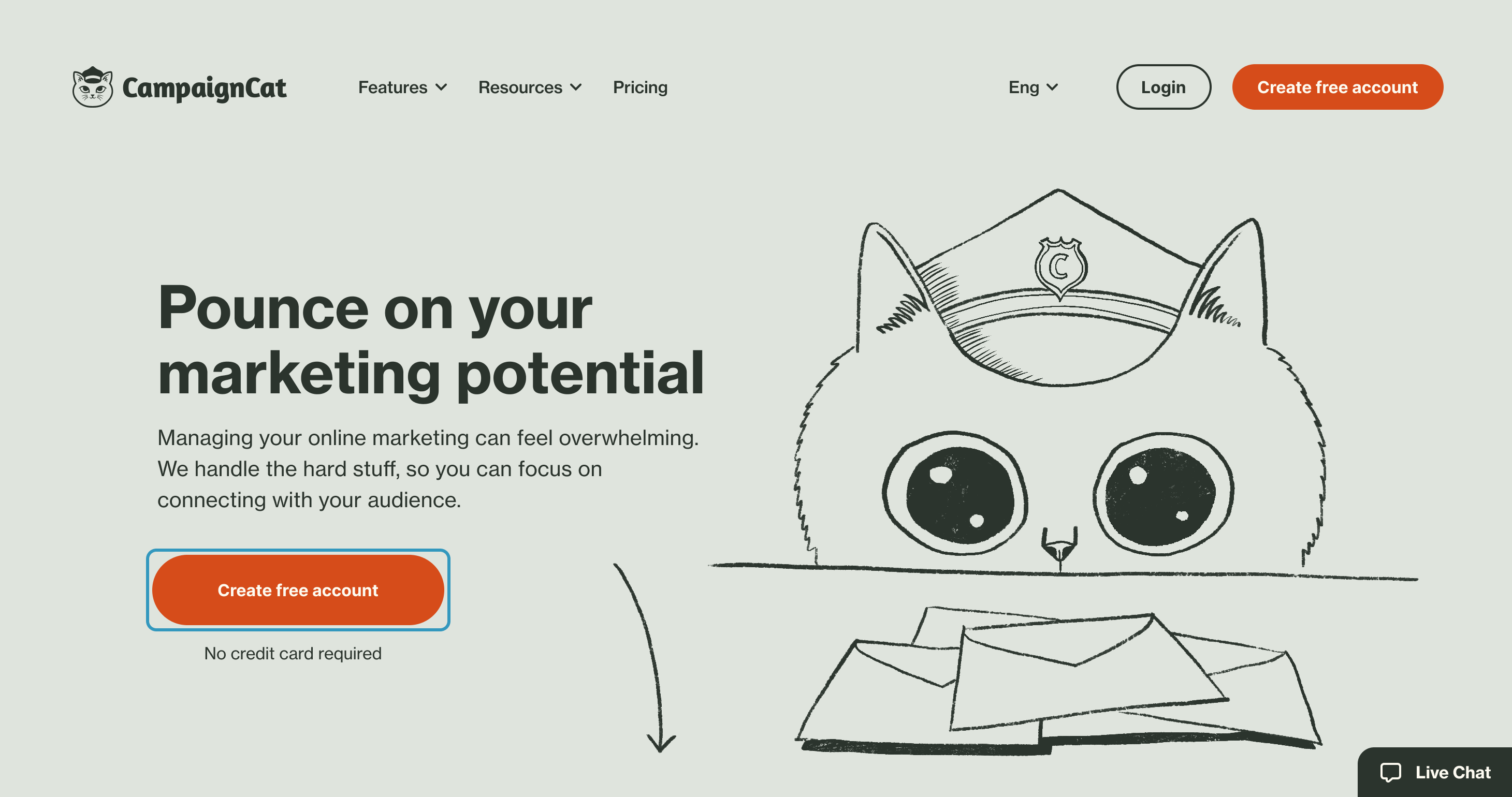
This example is for a mock SaaS email marketing product called “Campaign Cat”. I designed a brand and a landing page that outlines the features of this product to contextualise the form on the ‘sign up’ page.
Typography
Sans serif typeface
Users with dyslexia struggle with serif typefaces, so I have used a sans serif typeface for all text on the site. Italic fonts are also difficult to read for those with dyslexia so I have avoided using them.
Font size
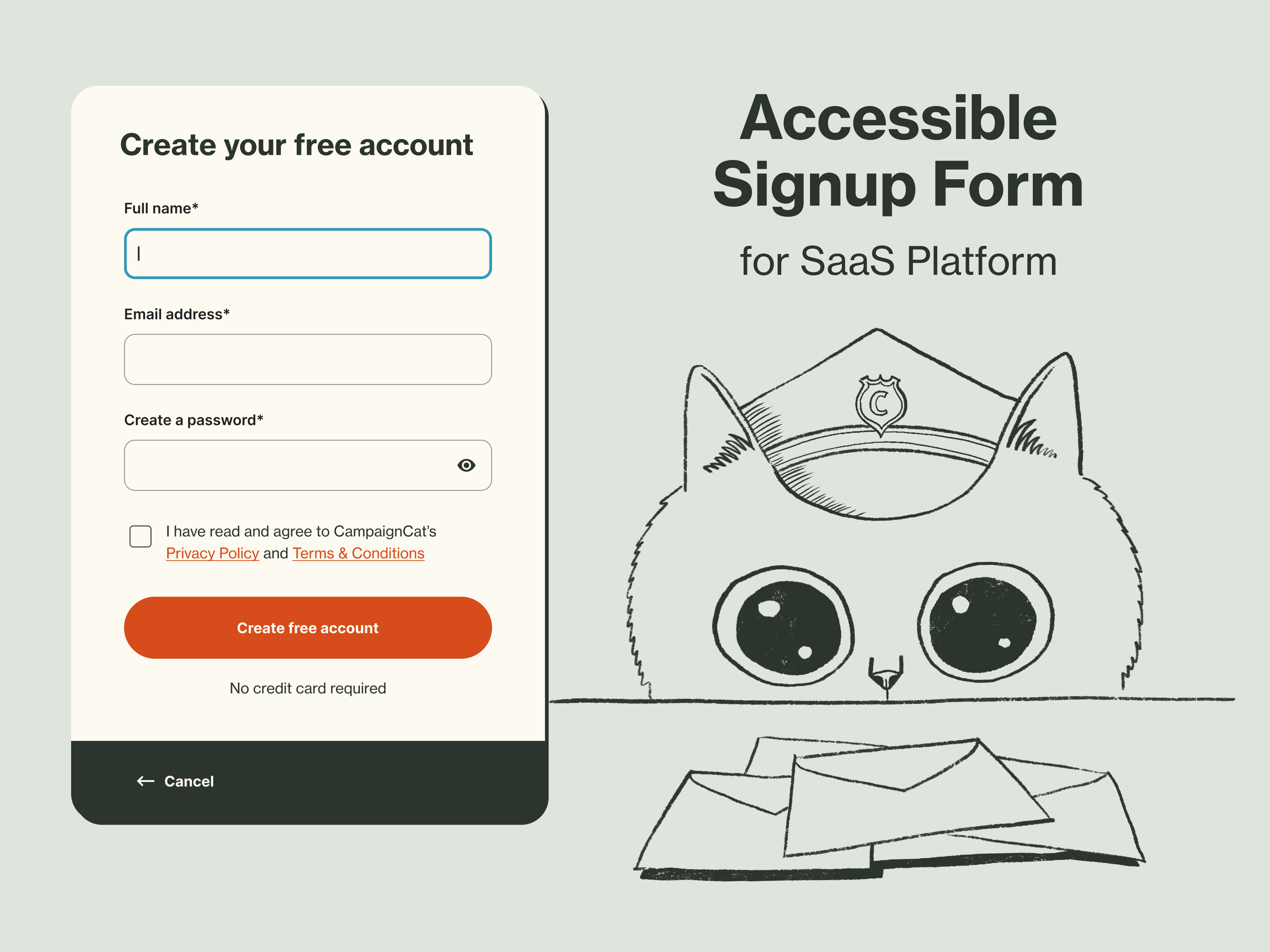
I have kept the minimum WCAG recommended font size to 16px.
Line length
Line length follows the WCAG of 45-75 characters max, which makes text easier to read for everyone.
Body text line height
All line heights are a minimum of 150% as per WCAG requirements.
Colour contrast
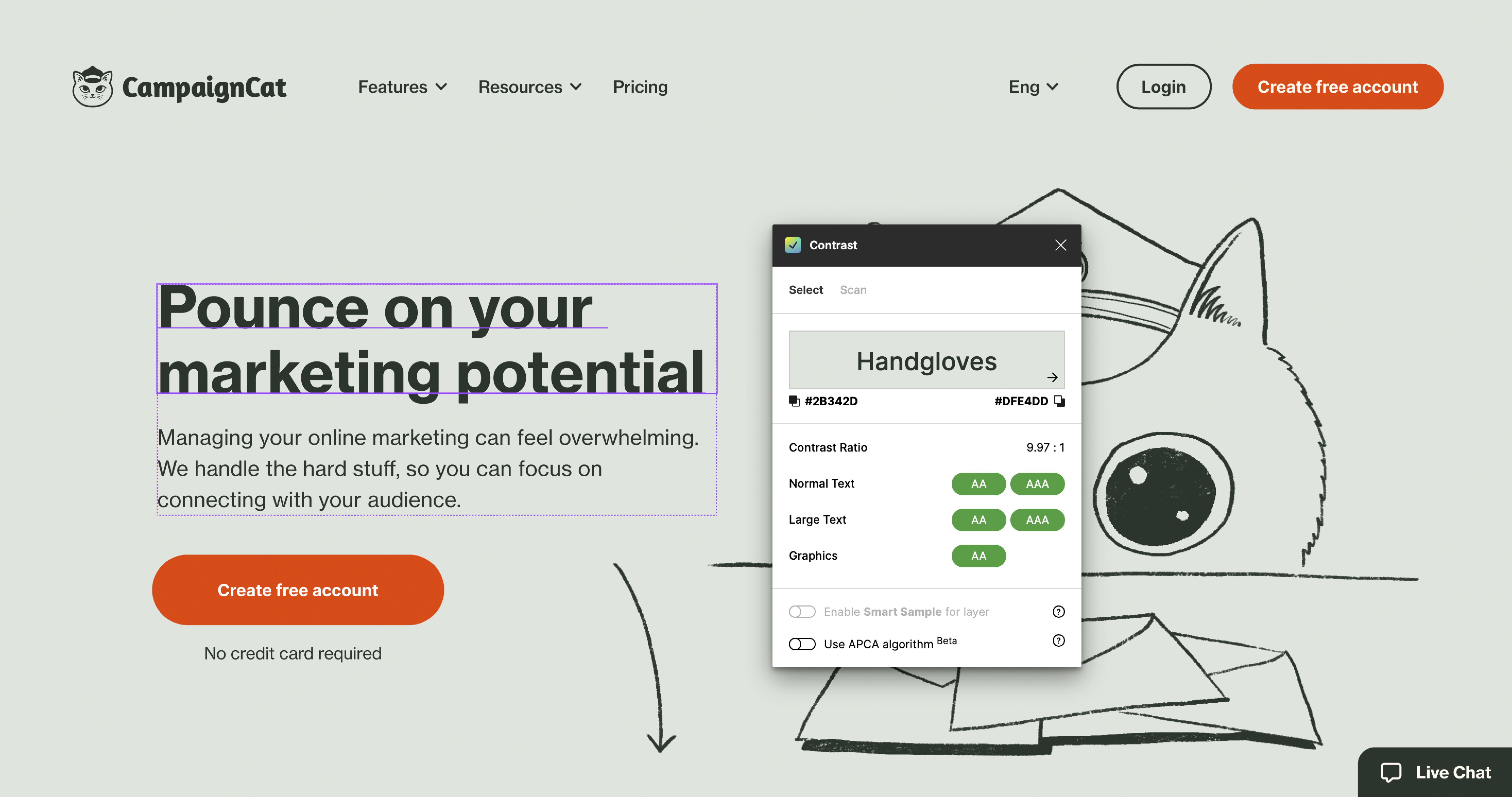
All colours meet the minimum WCAG standards for AA conformity, tested with the ‘Contrast’ plugin within Figma. This includes and is applied to elements such as:
- Body text (4.5:1 minimum)
- Headings (3:1 minimum)
- Icons (3:1 minimum)
- Buttons (4.5:1 - text on colour minimum)
- Form outlines (3:1 minimum)
Readability
I have kept text in easily digestible chunks with simple language. Grouping and chunking makes it easier for those with tunnel vision to perceive content as each content chunk doesn’t take up a lot of space on the screen.
Muted colour palette
The colour palette is fairly muted which can be helpful for those with Autism Spectrum Disorder, who are sensitive to colour.
No Animation or high contrast patterns
I have avoided the use of animation and any patterns with alternating light/dark elements in consideration to those with epilepsy.
Anxiety considerations
- I’ve made sure to inform users about what is happening next with microcopy beneath the main CTA assuring the user that no credit card charges will be made when creating an account.
- I have also included a progress tracker so they see what will happen next
- Live chat is also included so if users have any concerns or questions they can talk to a real person. There is also links to social media and a phone number from the landing page, giving users multiple channels to reach out to staff.
Operability: Keyboard navigation
In accordance with the ‘Operable’ principle of the WCAG I added keyboard navigation to the prototype where users can navigate down the hierarchy using the TAB key and use Shift + TAB to navigation up the hierarchy. For this particular prototype only the top level and the main form elements have been set up.
Skip to content
Making the first TAB key press bring up a ‘Skip to content’ quick link button is essential for keyboard navigation, as it allows users to navigate to the most important content of the page without having to TAB through the entire top level navigation. Pressing RETURN on the focused ‘skip to content’ link will focus the CTA button on the main content area, allowing keyboard users to quickly navigate to the sign up form.
Setting up the navigation structure in the real world would also allow a puff and sip device users to navigate the site, for example puffs could be set to navigate down the hierarchy, with the sip activating the focused link. The focus states and navigation order would appear the same as TAB key presses in this instance.
Clear focus states
Focus states must be clearly shown, so I have used strong outlines and a blue colour to show clear separation from primary red and secondary green colours.
Form navigation
Keyboard users can navigate using the TAB key. This is a common example where designing for users with disabilities benefits everyone, as typing out text in a field then pressing TAB to go to the next field is much more efficient than typing in a field then clicking into another field.
Password validation
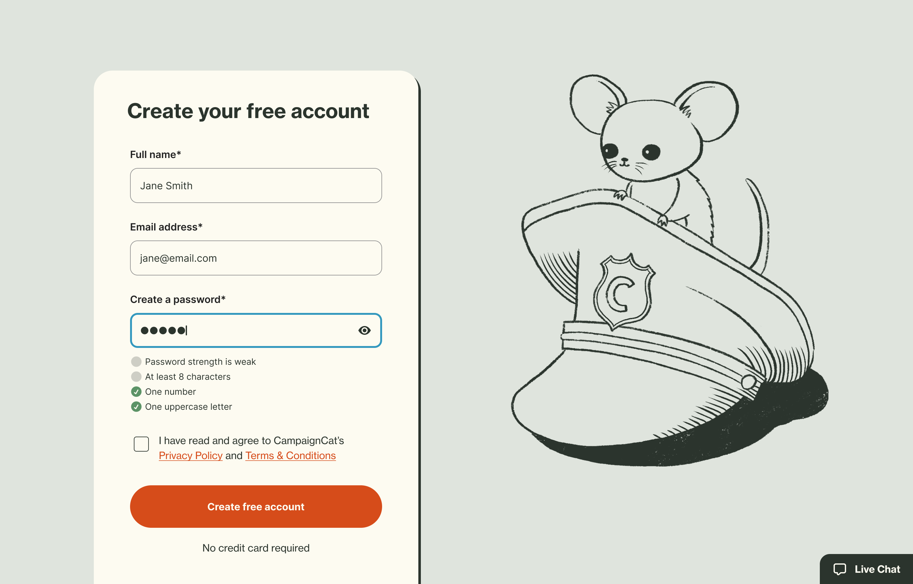
When entering a password, icons and labels are used to show validation rules in real time. Colour alone is not used here to as that could prove difficult for those with colour blindness.
Links
Links include underlines to assist those with colour blindness, who may not be able to see the link colour.
Accessibility issues with Figma
Scrolling to focus states
Keyboard navigation needs to be manually set with keybinding and variant states. When tabbing through these states the page won’t auto scroll, so these scroll events were set up manually using ScrollTo, which can be time consuming to prototype.
No up and down navigation with the keyboard
In a browser, when the screen is focused, pressing the up and down keys allows keyboard users to scroll the page up and down. This feature isn’t available in Figma prototypes, as mouse click and drag or mousewheel are the only built-in options for scrolling.
Tools used
From brief

Topics
Share
Reviews
2 reviews

Hi Jason,
I absolutely adore the illustrations. They make the design unique, engaging, and personable, and the well-formed brand identity creates a connection with the user. Wonderful work.
I'm a beginner, and I find this design beautiful and inspirational. Though I love the color palette, I wonder if the muted red button is the best color choice for contrast since it is mainly used for error states in design. What about using a terracotta color instead? That way, the design maintains the earthy, muted color identity without experiencing much change but significant enough to set the difference between a CTA and an error state.
I would love to know your thoughts!

Hi Jason,
I really liked the use of cats and your concept here.
It made me think about the detail for accessibility that perhaps I hadn't called out in my own project post, so I think (at some point) I'll be going back to review that and include more.
I had some thoughts whilst looking over this and wondered what you thought:
Use of Cancel and Back in one of your screens for the same action, I felt like "Back to <pagename> would be preferable for both?
Would you expect the Skip to content to be visible in the header at all times? I couldn't work that out. I'd imagine it to be a hidden link at the top of the document.
Use of red for the brand colour is an interesting one. I wonder whether red should always be reserved for semantic meaning or at least to best demonstrate accessibility concepts e.g. use for errors
In my project I was questioning whether you should need to ask for anything other than an email address to get straight into the website and trial the content. Deferring the need for a password maybe a step too far as asking for a password upfront is common and expected. I'd not demonstrated when/where I would capture this so perhaps I need to do so for completeness.
Again, great work and helped me think about how I can go back and review my own.
Thanks,
Michael
You might also like

Smartwatch Design for Messenger App


Bridge: UI/UX Rebrand of a Blockchain SCM Product


Pulse Music App - Light/Dark Mode


Monetization Strategy


Designing A Better Co-Working Experience Through CJM


Design a Settings Page for Mobile
Visual Design Courses

UX Design Foundations


Introduction to Figma

Design Terminology
