Button Systems for a Tech Platform - Coworking Space

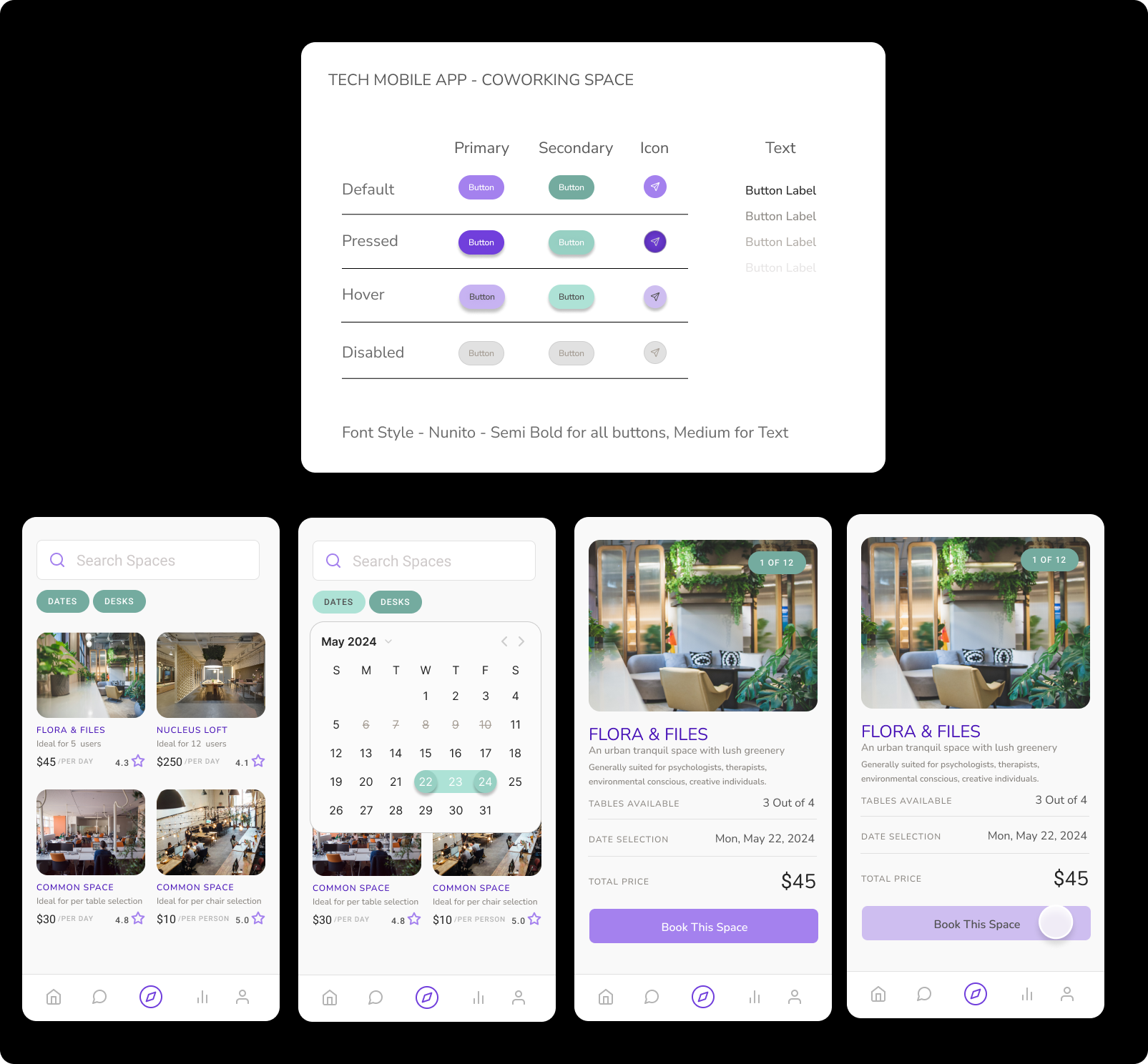
The button system includes primary, secondary, and icon buttons with different states (default, pressed, hover, and disabled) represented through color variations. The primary buttons use shades of purple, while the secondary buttons use shades of green to give an optimal contrast approach. The icon buttons have a distinct purple color to appear prominent on the mobile app.
Regarding design choices, the use of distinct colors for different button states to convey interactivity. The purple and green color palette aligns with a nature-inspired theme, likely complementing the coworking spaces branding and aesthetics.

Reviews
1 review
Hi Adeline, you did great job presenting the states for the buttons and I really like the color palette you used for your system. However, there is a place for improvement.
- In my opinion better choice for a secondary button would be using the same color as for the primary, but as a stroke, or some neutral color. For now, the green button does not seem secondary, especially when we don't have a primary action on the screen. Try to design a screen with primary and secondary CTA and test it with your friends to see if they understand which action is which.
- The second important thing is to test the color contrast for accessibility. I am not sure if the secondary pressed button and primary hover button are accessible.
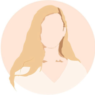
- Looking at the second screen where we can choose dates you are using a hover state for the button, when you should use a dropdown button with an additional state – selected.
- When it comes to disabled buttons I can see no difference between the primary and secondary button – please consider different design for this state.
You might also like

HealthFlow: Designing a Simple and Insightful Wellness Dashboard


Improving Dating App Onboarding: A/B Test Design

FORM Checkout Flow - Mobile


A/B Test for Hinge's Onboarding Flow


Accessibility Asse

Uxcel Halloween Icon Pack

Visual Design Courses

UX Design Foundations


Introduction to Figma

Design Terminology
