Button System for Emails
Choice of platform and design elements
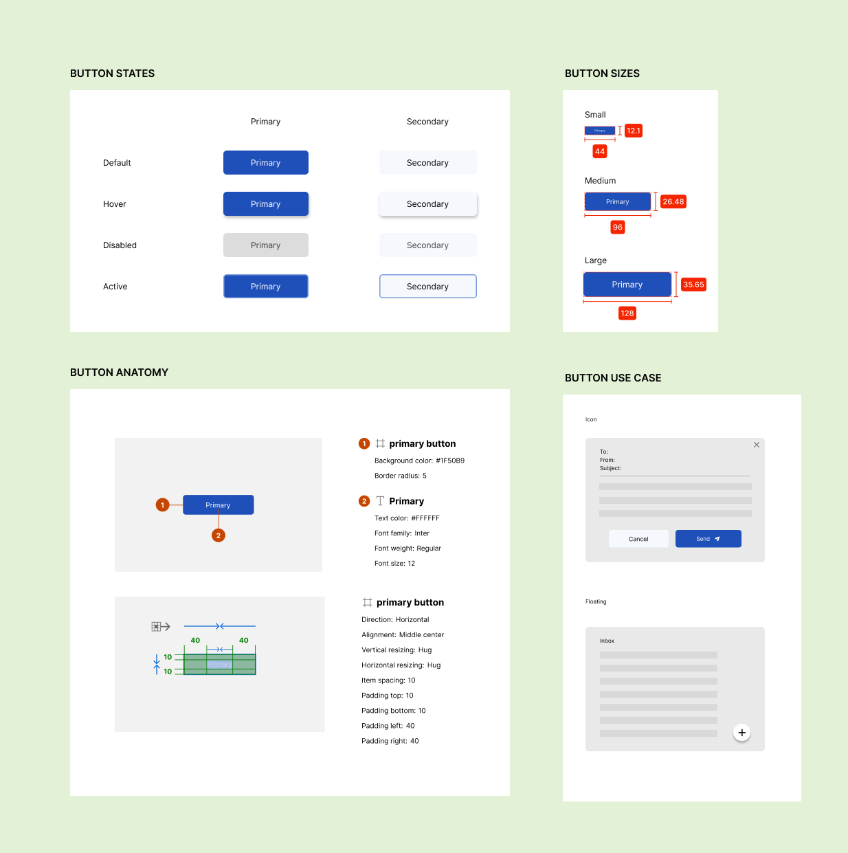
The challenge began with selecting an appropriate platform, which an email web page could benefit from a button system. The typeface chosen was Inter and the primary color was #1F50B9.
Button priorities and types
The first fundamental step was to define three distinct button types - primary and secondary. This classification helps establish a clear visual hierarchy that guides users through their interactions by intuitively prioritizing actions based on their importance:
- Primary buttons: Used for the most important actions within the application, ensuring they capture immediate attention.
- Secondary buttons: Used for less critical actions than primary buttons, supporting the main tasks without overshadowing them.
Defining button sizes
Having categorized button types, and defining their sizes was crucial. The length of a button often correlates with its importance and frequency of use, improving the user experience by aligning visual importance with function.
Designing button states
To promote an engaging and responsive interface, each button has been designed with different states - Normal, Hover, Active, and Disabled. This design choice not only enhances the aesthetic appeal but also provides clear and immediate visual feedback about the button's state, aiding intuitive navigation and interaction.
Accessibility standards
A commitment to accessibility was paramount, with all button designs adhering to WCAG guidelines for sufficient color contrast.
Demonstrating use cases
By modeling real-world scenarios, such as those found on platforms such as Monday.com, the practicality and adaptability of the button system was demonstrated.
Conclusion
The development of this button system illustrates a comprehensive approach to UI design, where every element is considered to improve user interaction and operational efficiency.

Reviews
1 review
Hey Joyce! I like the simplicity of your system, everything is clear and user-friendly. I like the colors and your idea of different states of the buttons. Two things that in my opinion need improvement are:
- The disabled state of the secondary button. The backgroud color is very similar to the default state and only the color of the font is pointing to disabled state. Please consider using more neutral background color in this case
- The sizing of the buttons is not the best. The height of the buttons can't be i.e. 35.65px. You should change all these values to ones dividable by 4, i.e. 36px. Additionally, the small button is not readable at all. Rethink the font sizes used for all the buttons and match the height of the component.
You might also like
Loginino

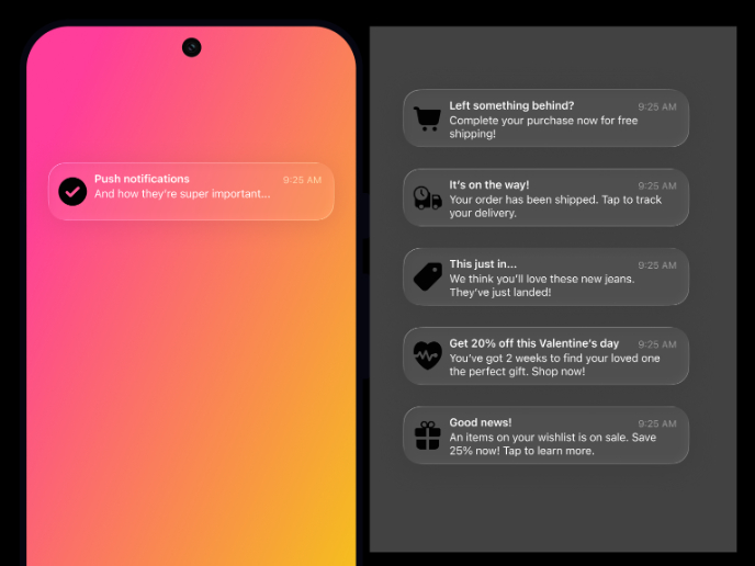
Notification microcopy - Project

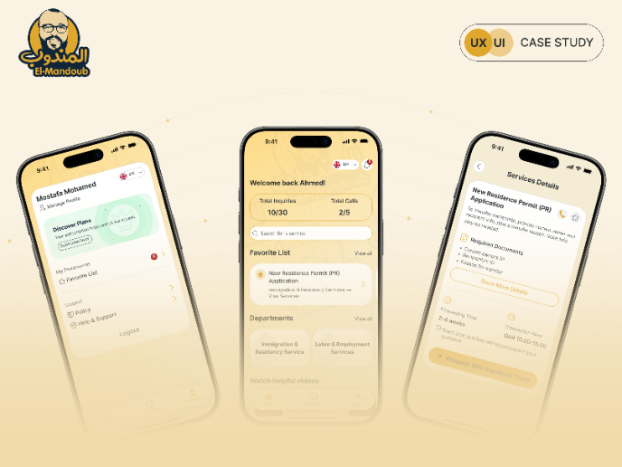
El Mandoub-GovTech App

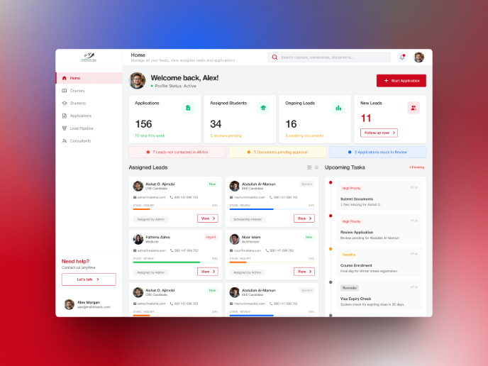
MalishaEdu Counselor Workspace

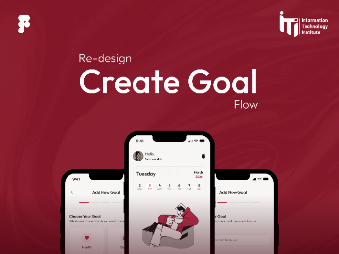
Goal Creation Flow

Portfolio website

Visual Design Courses

UX Design Foundations


Introduction to Figma

Design Terminology
