Button System Design - Habit Tracker

Button System Design for Habit Tracker App
The Platform & Context I selected a mobile habit tracker app as my platform because I'm passionate about designing interfaces that genuinely help people improve their lives. The habit tracking space requires thoughtful UX since users interact with these apps daily, often during vulnerable moments when they're trying to build better routines.
My Design Approach After analyzing user behavior patterns in habit-forming apps, I realized users needed clear visual guidance to distinguish between different action types. This led me to create a three-tier hierarchy:
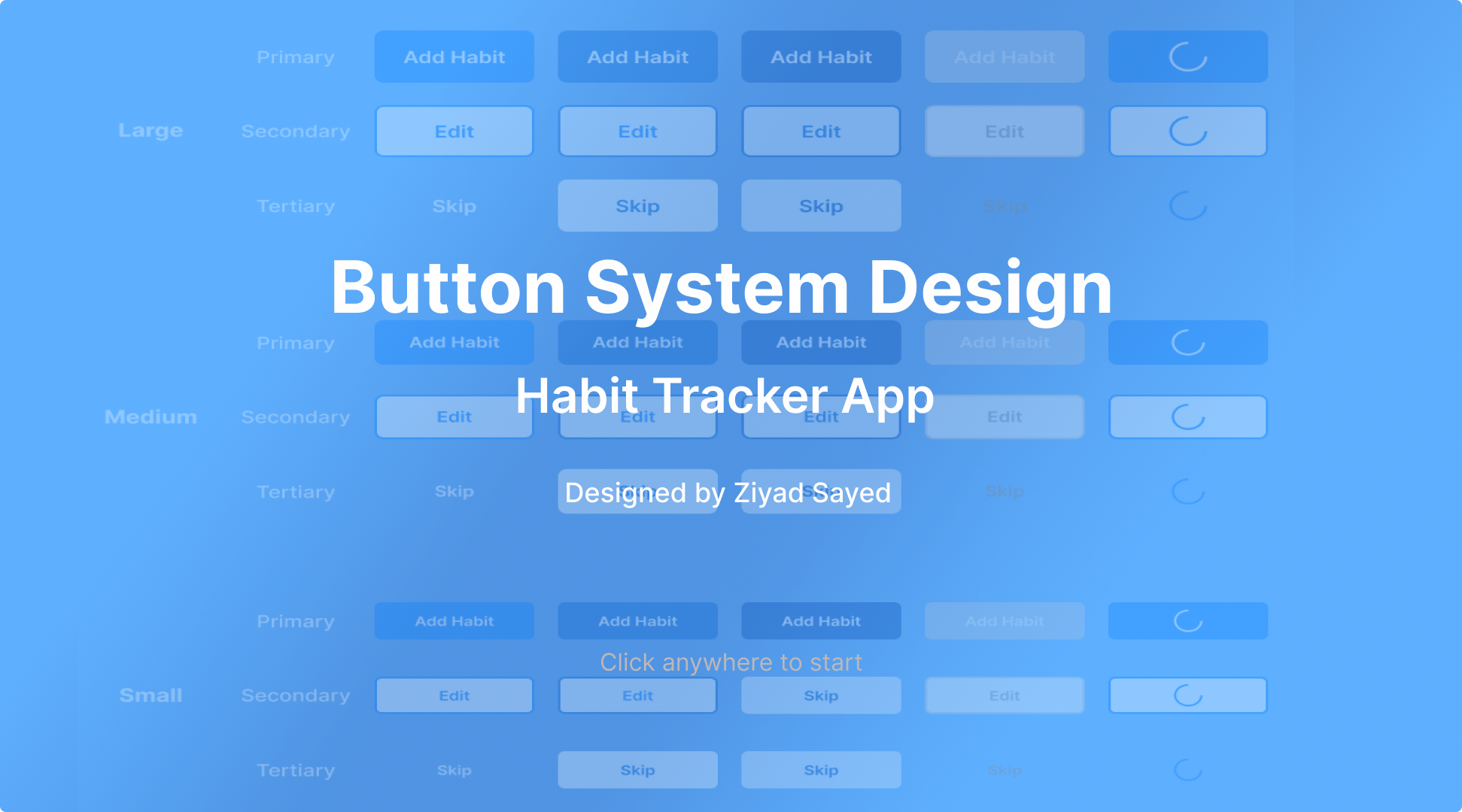
• Primary buttons - I reserved these for life-changing actions like "Add Habit" • Secondary buttons - I used these for management tasks like "Edit" or "View Details" • Tertiary buttons - I designed these for quick actions like "Skip for Today"
Technical Specifications Size Strategy:
- Large (56px): For primary CTAs that need maximum visibility
- Medium (48px): For secondary actions in main flows
- Small (40px): For compact spaces and tertiary actions
Typography Choice: I chose Inter because I needed a typeface that remained legible at small sizes while feeling modern and trustworthy - crucial for an app people use daily.
Color Psychology: I selected blue (#007AFF) as my primary color after researching color psychology in wellness apps. Blue promotes feelings of calm, focus, and reliability - exactly what users need when building new habits.
State Design Philosophy I crafted five distinct states because I believe every user interaction deserves clear feedback:
- Default - Clean, approachable
- Hover - Subtle anticipation
- Pressed - Satisfying confirmation
- Disabled - Honest limitation
- Loading - Patient progress
Accessibility as Priority I ensured WCAG 2.1 AA compliance because I believe good design should be inclusive. Every color combination I chose maintains sufficient contrast, and I tested all buttons with screen readers to ensure they work for users with visual impairments.
Why This System Works Through this design, I solved several key challenges:
- Reduced Decision Paralysis - Users instantly know which action to take
- Built Trust - Consistent feedback makes the app feel reliable
- Supported Daily Use - The system scales beautifully across different contexts
- Promoted Inclusion - Accessible design welcomes all users
- Enhanced Motivation - The blue palette psychologically supports habit formation
Personal Impact Creating this system taught me how thoughtful button design can genuinely impact people's lives. When someone successfully builds a new habit partly because the interface guided them clearly, that's the power of intentional UX design.
Tools used
From brief

Topics
Share
Reviews
2 reviews

Good job, Ziad.
I really liked how you approached the component instances after identifying user needs and challenges. Well done!
I do have one concern regarding accessibility (WCAG). I believe there’s an opportunity to improve the color contrast to make the button labels more accessible. I’ve left you a comment directly on the Figma file for reference.
Looking forward to seeing the next iteration.
Sayed

Hi, Ziad
Really nice work!
A solid piece of practice that reflects how well you understand UI design, including design systems and their components.
I also appreciate how clearly you’ve described your thought process. it shows a good grasp of both the rules and techniques involved.
There’s just one small thing I’d like to point out:
- I noticed that you didn’t include the Focused state in your solution. Was there a particular reason for that?
It’s great that you’re already following WCAG accessibility guideline, especially when it comes to handling Hover and Focus states.
So here’s a helpful link to the relevant section in the documentation:
https://www.w3.org/TR/WCAG22/#content-on-hover-or-focus
Including the Focused state is just as important when building a component library. Here are a few situations where it really makes a difference:
1. Keyboard navigation
2. Accessibility for people with different abilities
- For users who rely on a keyboard or alternative input methods, the focused state is essential for understanding which element is currently active.
3. Feedback when hovering with the cursor (especially when used alongside the hover state)
4. Programmatic focus control:
- Developers can use JavaScript to move focus to a specific element after an action, helping users stay oriented within the interface.
All in all, the focused state is an important part of creating a UI that’s both accessible and pleasant to use. It provides users with clear, consistent feedback about what they’re interacting with.
You might also like

Smartwatch Design for Messenger App


Bridge: UI/UX Rebrand of a Blockchain SCM Product


Pulse Music App - Light/Dark Mode


Monetization Strategy


Designing A Better Co-Working Experience Through CJM


Design a Settings Page for Mobile
Visual Design Courses

UX Design Foundations


Introduction to Figma

Design Terminology
