Button System

a little efforts i put on these, and will update this in better version and more variations soon.

Reviews
1 review

This is a really lovely set of buttons.
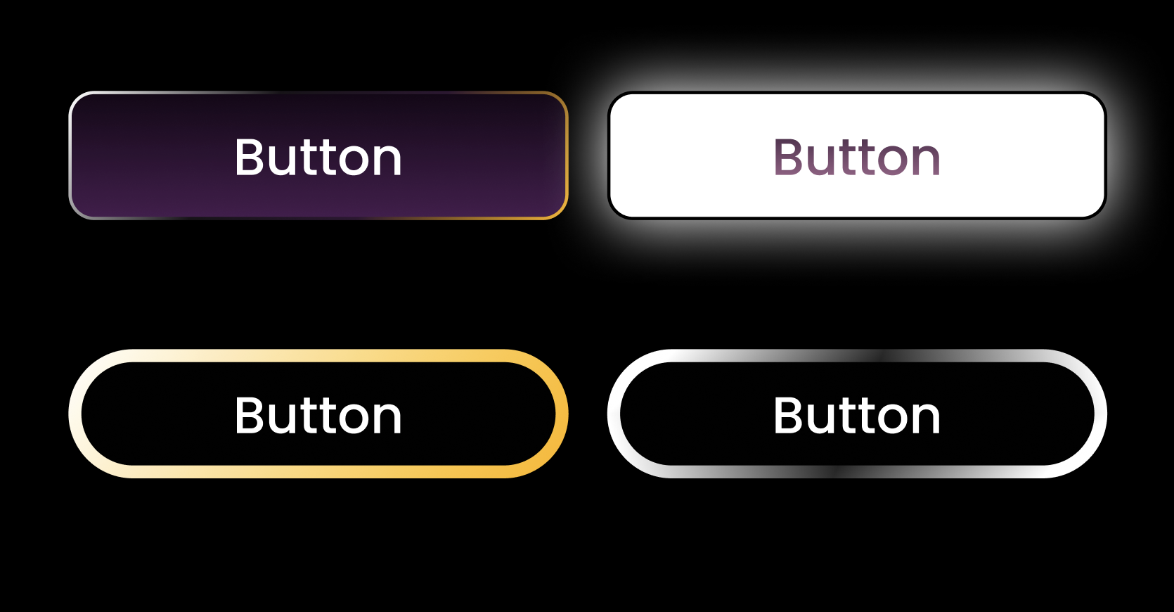
Each one feels intentional, and there’s a nice balance between creativity and control. I can tell you had fun exploring styles, especially with the gradients and glow effects. The gold and silver ones feel especially polished. They stand out, but still feel like they belong in the same system.
The typography is clean and easy to read, and the rounded corners give everything a soft, friendly vibe.
If I were to suggest one small thing—it’d be to tone down the glow just a bit on the top-right button. And maybe check the text contrast on white for accessibility. But honestly, those are small tweaks.
You’ve done a great job here. It feels confident, thoughtful, and well put together. Excited to see what you design next.
You might also like

Smartwatch Design for Messenger App


Bridge: UI/UX Rebrand of a Blockchain SCM Product


Pulse Music App - Light/Dark Mode


Monetization Strategy


Designing A Better Co-Working Experience Through CJM


Design a Settings Page for Mobile
Visual Design Courses

UX Design Foundations


Introduction to Figma

Design Terminology
