Bright Minds ACADEMY

This project aims to develop a secure and user-friendly login system for an eLearning website. The system will enable registered users to access their learning materials, track progress, and participate in interactive features.
Key Features: 😎
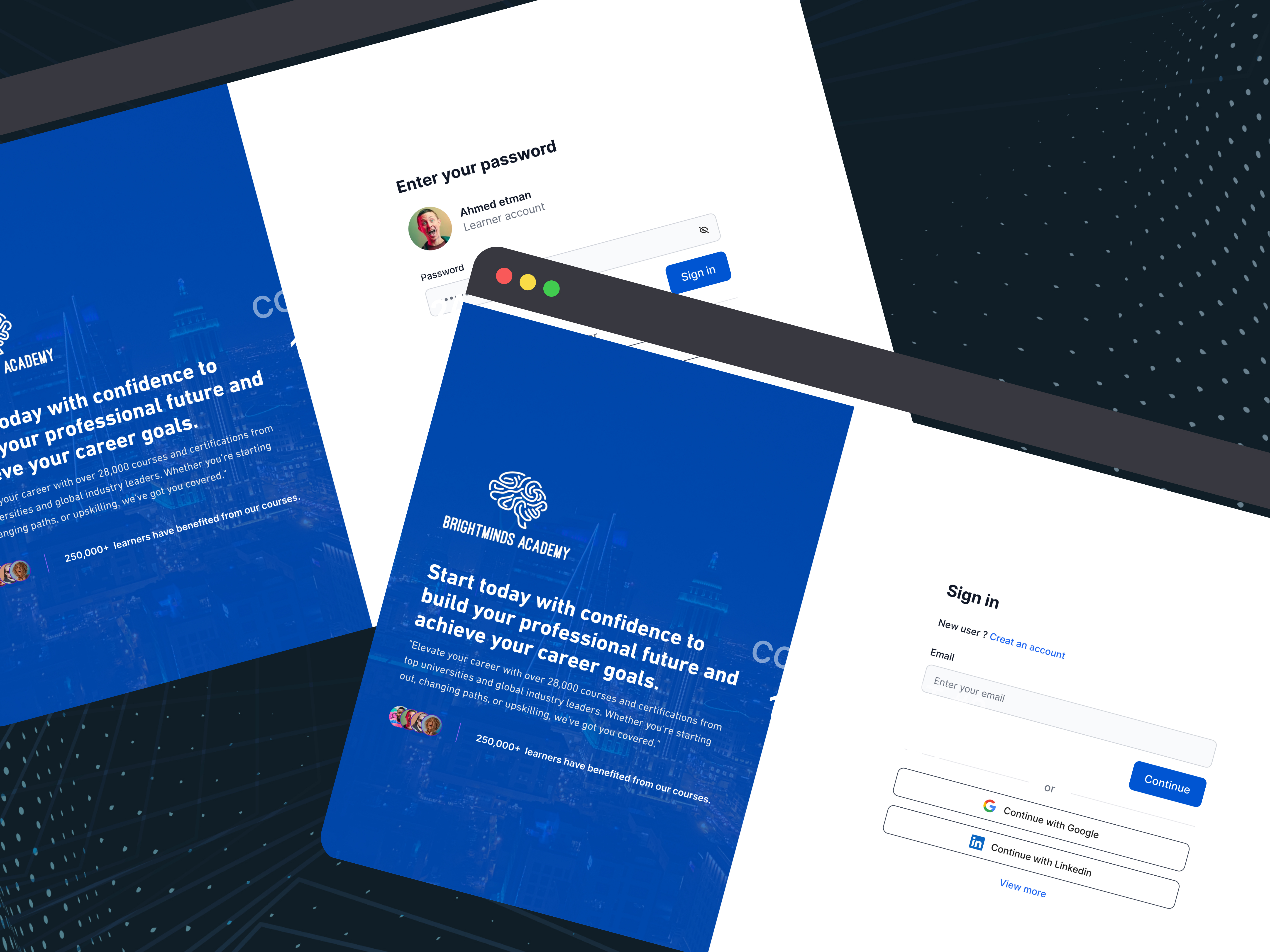
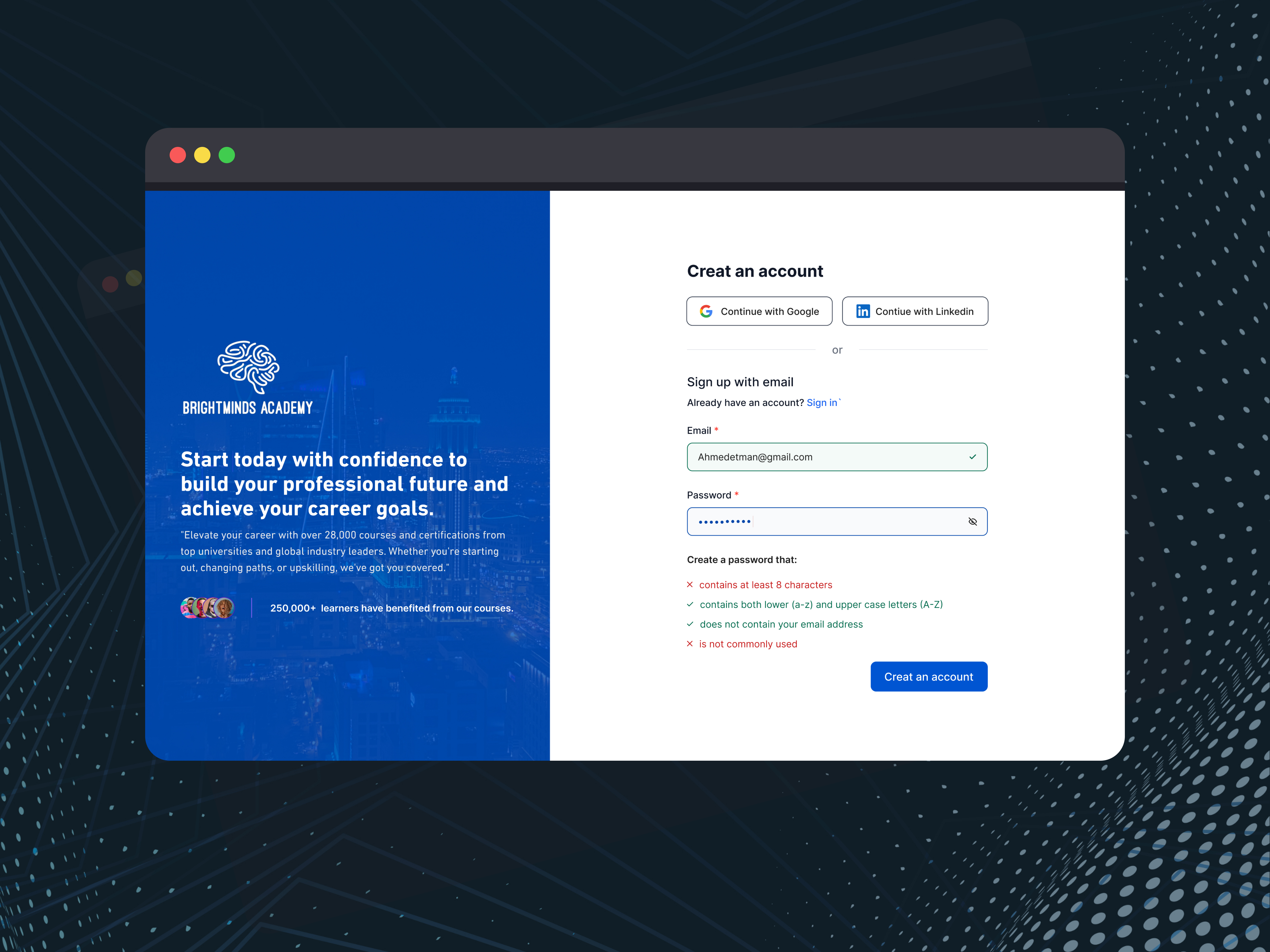
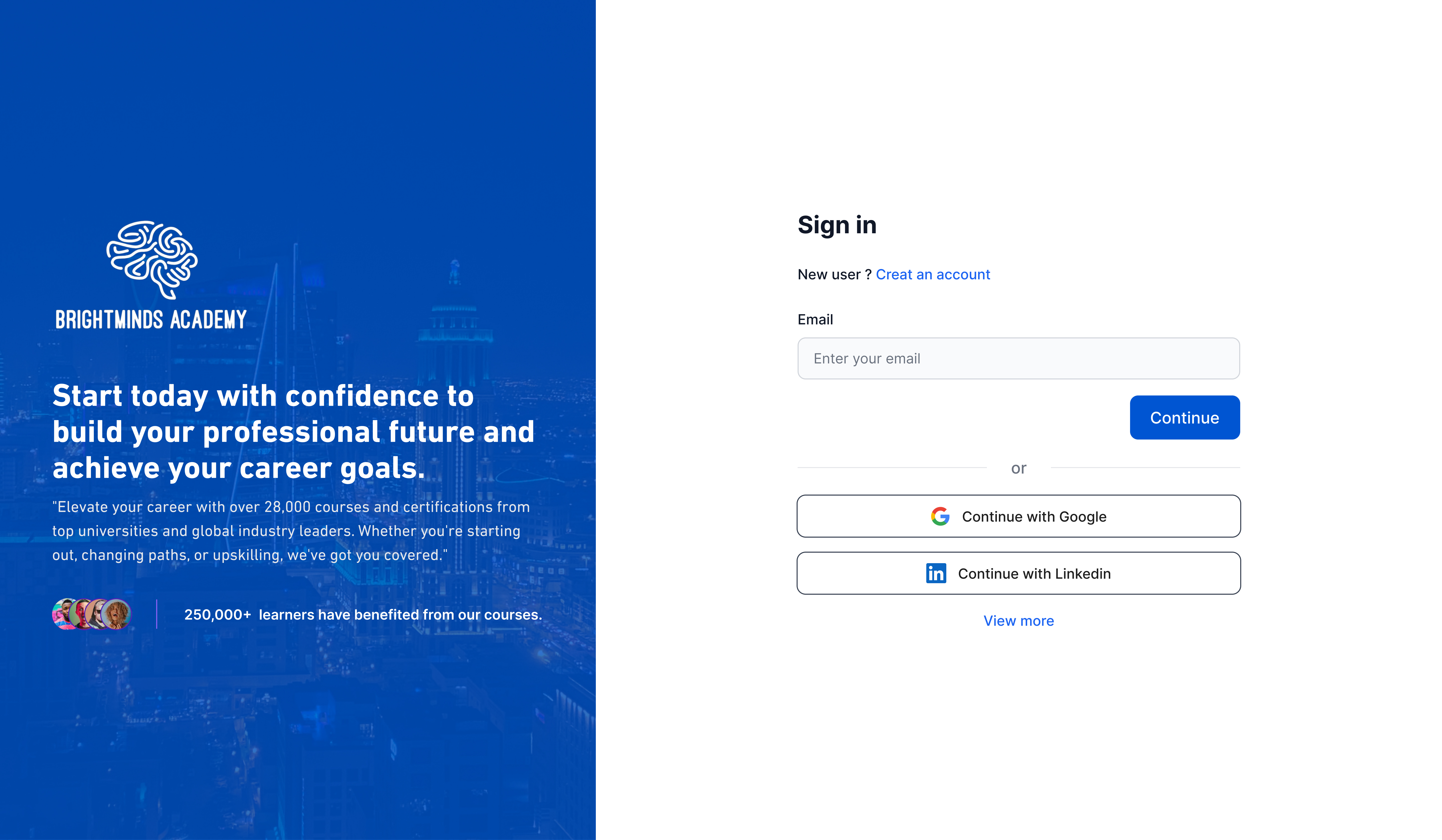
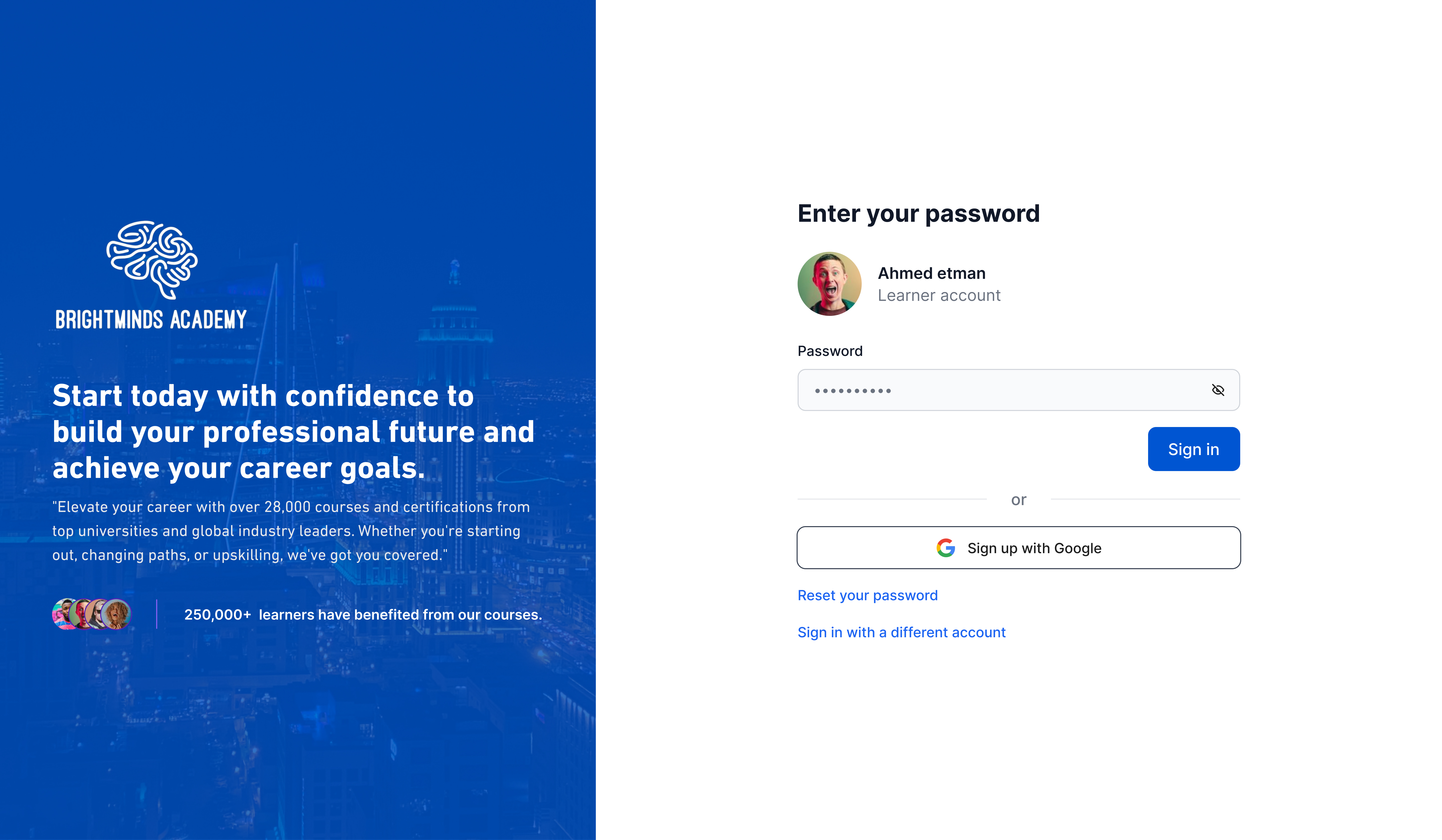
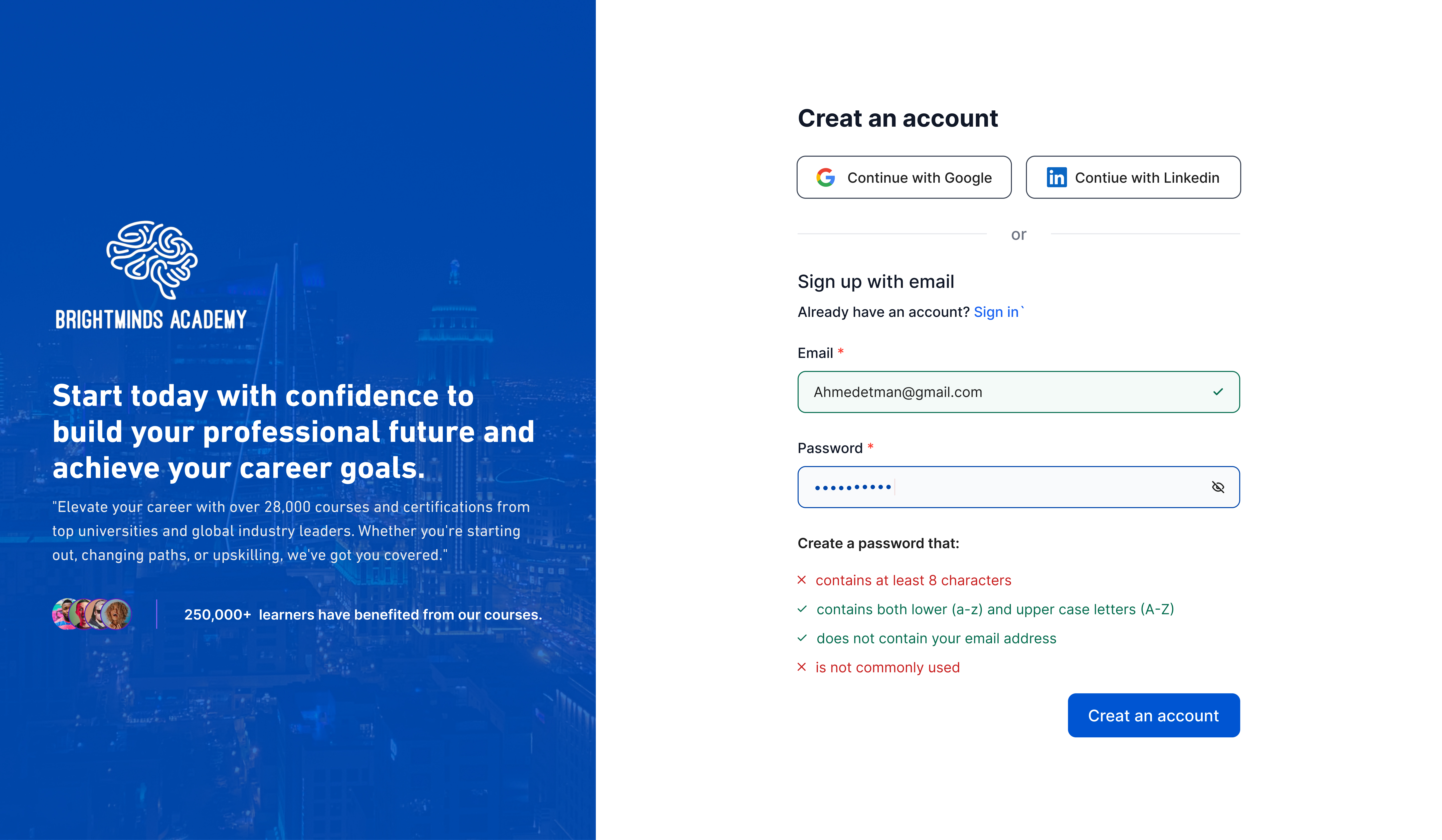
- Progressive Disclosure: this principle states that you should only present users with the information they need at the current stage of the interaction. In your case, by asking for the email first and then confirming details before full login, you're avoiding overwhelming users with unnecessary information upfront.
- Error Prevention: This two-step approach allows users to catch typos in their email address before proceeding further, saving them time and frustration.
- Transparency and Trust: This principle emphasizes the importance of keeping users informed and in control. By showing the username and account type after entering the email, you're giving users a chance to verify they're logging into the correct account before fully committing. This builds trust and avoids accidental logins to the wrong account.
Overall, using two-step sign-in flow is a user-centered approach that promotes a smooth and secure login experience.
Tools used
From brief

Topics
Share
Reviews
1 review

Good job Ahmed!
This is a really simple and accessible signup form. Here is a little feedback to improve it:
- Since the password isn't validated maybe still have it in the error state to give additional signal to user.
- The button placement feels a little bit off for this type of form. Certain web apps and mobile apps do place buttons on the right but it's not a very common pattern for signup forms. Maybe consider left aligning it with input fields or centered with the same width as the input fields.
- The imagery in the blue background could be done a little differently. Maybe imagery on top, blue background below with texts and some fade-in. Basically experiment with that layout for something new.
- The divider between the user profiles and text is really faint making it look like there's too much gap between the two elements
Overall, this is a good job done. Cheers!
4 Claps
Average 4.0 by 1 person
You might also like

Project
PLANTIST

A vibrant online marketplace where plant lovers can buy a diverse range of plants, gardening tools, and accessories. Our platform is designe

Project
Lumen
All explanation on the image above

Project
NORTHSIDE - Coworking space Customer Journey Map

Most coworking brands have the same problem: acquisition is easy, retention isn't. The website sells a lifestyle. The product delivers a des

Project
Accessible Signup Form for Monkey Survey

The following redesign demonstrates how I improved the accessibility of the Survey Monkey signup experience for mobile users. Redesigned the

Project
Crave Corner - Bakery App Design

Project Overview Crave Corner is a bakery ordering app designed to help users easily discover and order freshly baked products. The goal is
Editors’ Choice
Project
Uxcel Halloween Icon Pack

🎃 Introducing the Uxcel Halloween Icon Pack! 🎃 This custom Halloween-themed icon set was created to enhance the seasonal user experience o
Visual Design Courses

Course
UX Design Foundations

Learn UX design fundamentals and principles that create better products. Build foundational knowledge in design concepts, visual fundamentals, and workflows.

Course
Introduction to Figma
Learn essential Figma tools like layers, styling, typography, and images. Master the basics to create clean, user-friendly designs

Course
Design Terminology

Learn UX terminology and key UX/UI terms that boost collaboration between designers, developers, and stakeholders for smoother, clearer communication.