Branding for Food Delivery App
Our Brand
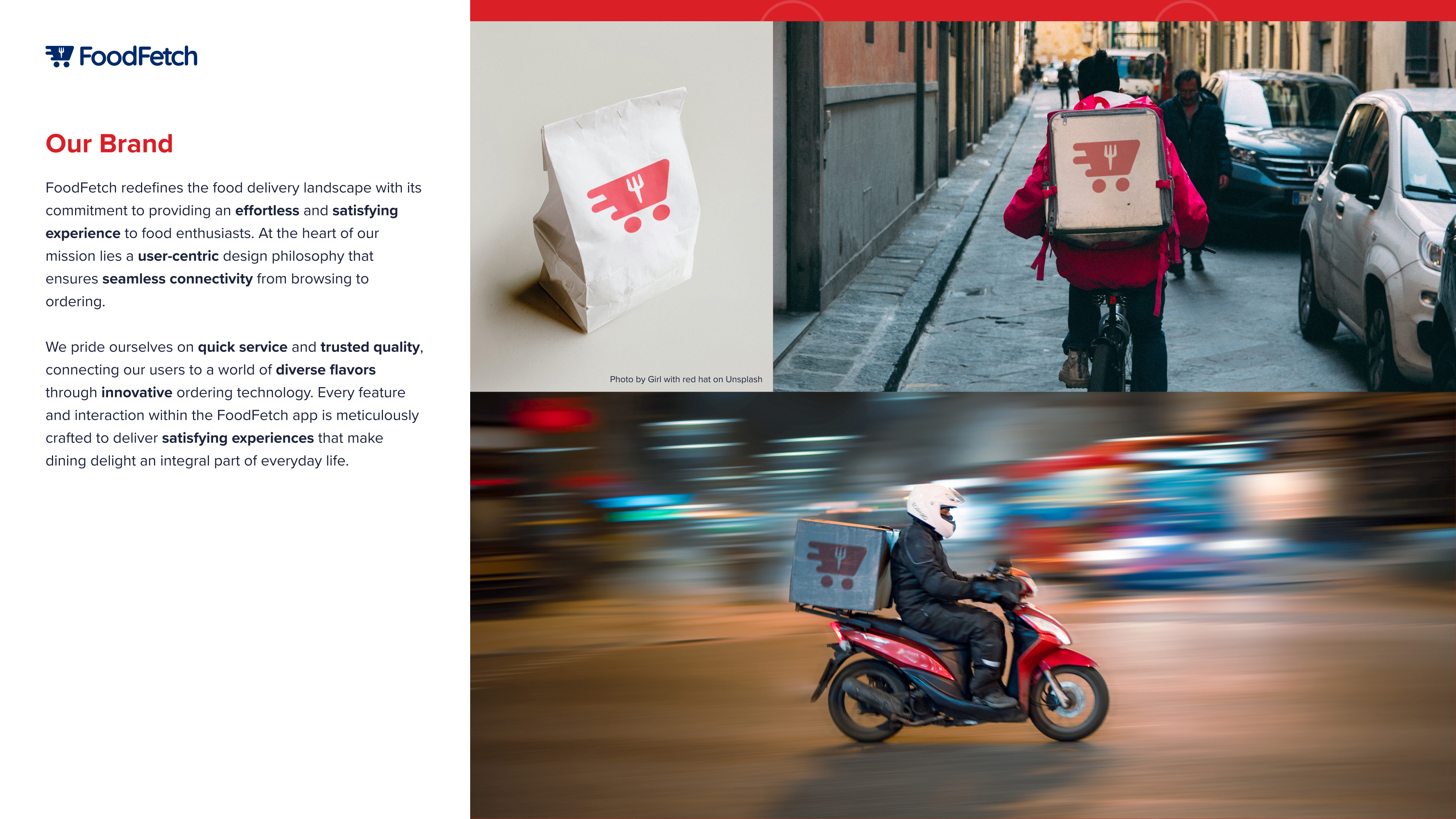
FoodFetch redefines the food delivery landscape with its commitment to providing an effortless and satisfying experience to food enthusiasts. At the heart of our mission lies a user-centric design philosophy that ensures seamless connectivity from browsing to ordering.
We pride ourselves on quick service and trusted quality, connecting our users to a world of diverse flavors through innovative ordering technology. Every feature and interaction within the FoodFetch app is meticulously crafted to deliver satisfying experiences that make dining delight an integral part of everyday life.
Logos
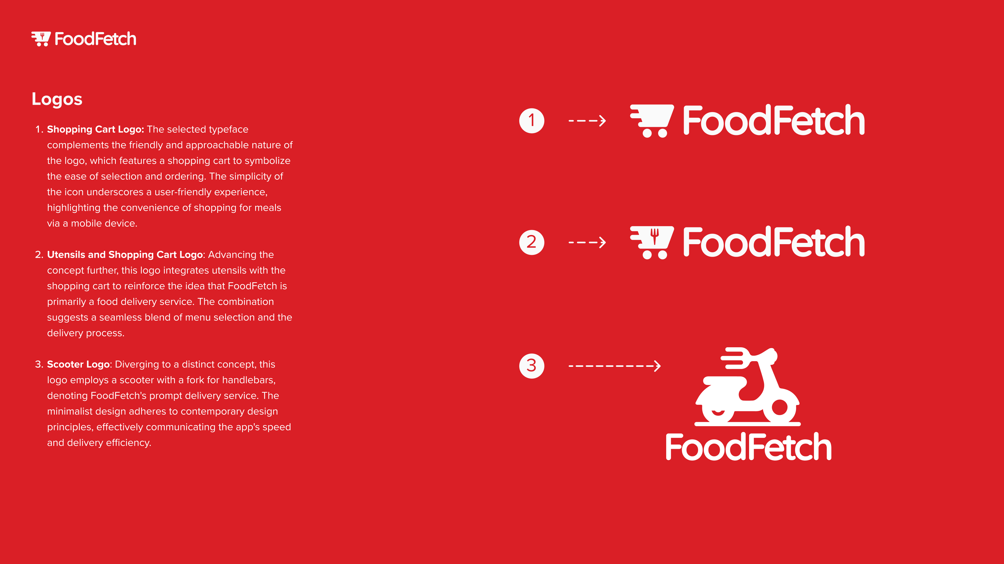
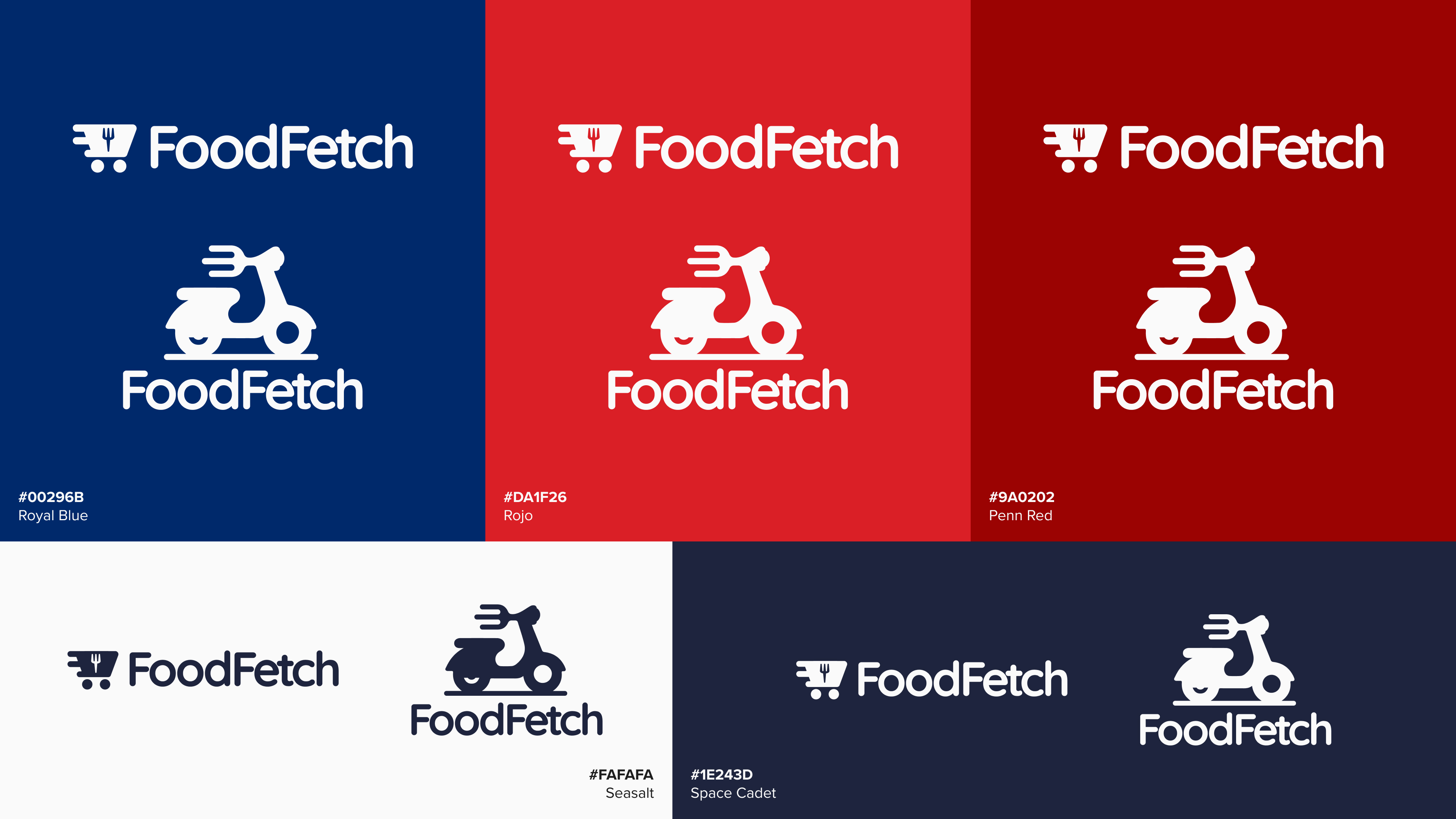
Shopping Cart Logo: The selected typeface complements the friendly and approachable nature of the logo, which features a shopping cart to symbolize the ease of selection and ordering. The simplicity of the icon underscores a user-friendly experience, highlighting the convenience of shopping for meals via a mobile device.
Utensils and Shopping Cart Logo: Advancing the concept further, this logo integrates utensils with the shopping cart to reinforce the idea that FoodFetch is primarily a food delivery service. The combination suggests a seamless blend of menu selection and the delivery process.
Scooter Logo: Diverging to a distinct concept, this logo employs a scooter with a fork for handlebars, denoting FoodFetch's prompt delivery service. The minimalist design adheres to contemporary design principles, effectively communicating the app's speed and delivery efficiency.
Typography
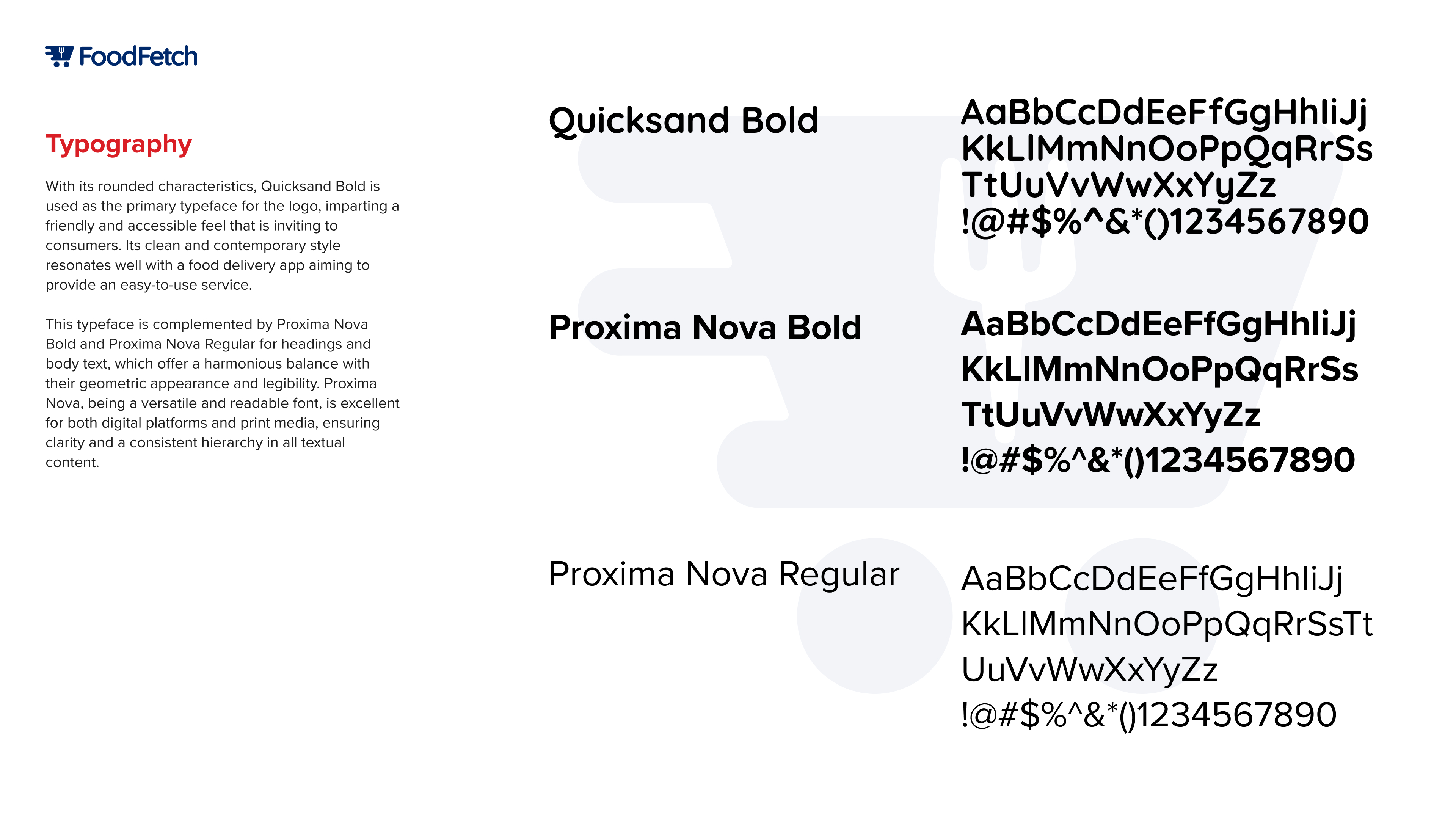
With its rounded characteristics, Quicksand Bold is used as the primary typeface for the logo, imparting a friendly and accessible feel that is inviting to consumers. Its clean and contemporary style resonates well with a food delivery app aiming to provide an easy-to-use service.
This typeface is complemented by Proxima Nova Bold and Proxima Nova Regular for headings and body text, which offer a harmonious balance with their geometric appearance and legibility. Proxima Nova, being a versatile and readable font, is excellent for both digital platforms and print media, ensuring clarity and a consistent hierarchy in all textual content.
Color
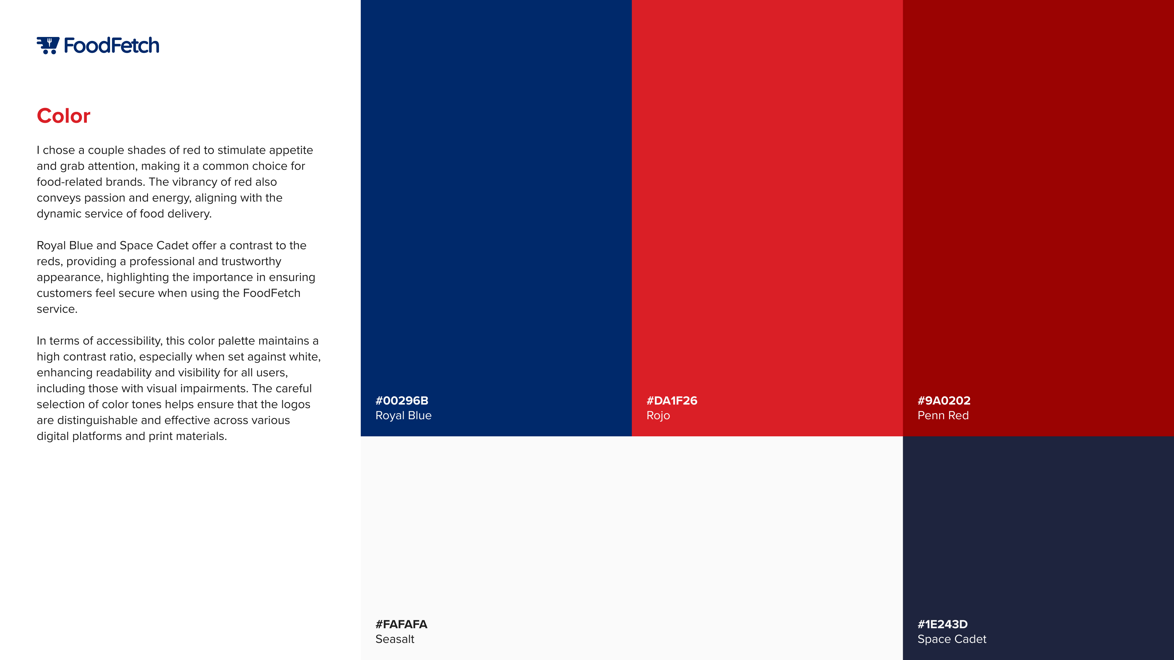
I chose a couple shades of red to stimulate appetite and grab attention, making it a common choice for food-related brands. The vibrancy of red also conveys passion and energy, aligning with the dynamic service of food delivery.
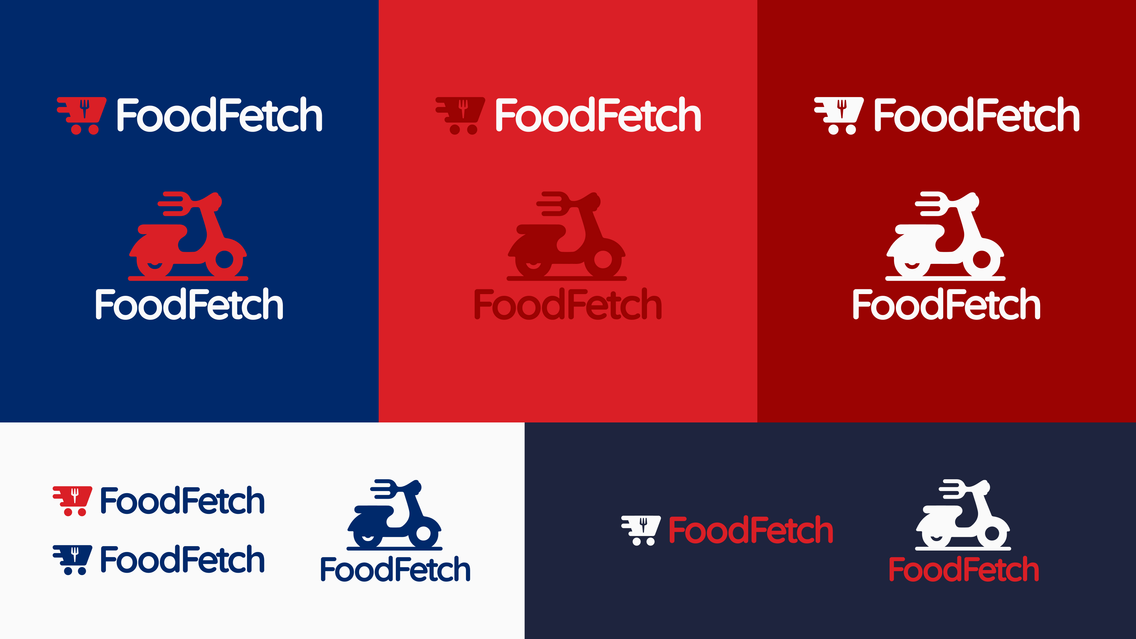
Royal Blue and Space Cadet offer a contrast to the reds, providing a professional and trustworthy appearance, highlighting the importance in ensuring customers feel secure when using the FoodFetch service.
In terms of accessibility, this color palette maintains a high contrast ratio, especially when set against white, enhancing readability and visibility for all users, including those with visual impairments. The careful selection of color tones helps ensure that the logos are distinguishable and effective across various digital platforms and print materials.
Reviews
1 review
Outstanding presentation and an amazing logo! It perfectly captures the essence of the app, giving the right perception of quick delivery, food quality, and overall satisfaction of the service. Thank you, Sam, for sharing this with us.
You might also like

Improving Dating App Onboarding: A/B Test Design

FORM Checkout Flow - Mobile

A/B Test for Hinge's Onboarding Flow

Accessibility Asse

The Fitness Growth Engine

The Relational Workspace
Popular Courses

Introduction to Figma

Design Terminology


