Biman Bangladesh: Heuristic Evaluation


The Biman Bangladesh Airlines website was evaluated using Nielsen’s 10 Usability Heuristics to understand how effectively it supports travelers throughout their digital journey, from discovering flights to booking, managing reservations, and checking in online. This audit focuses on identifying usability gaps that disrupt a seamless travel experience and uncovering opportunities to enhance clarity, consistency, and user confidence.
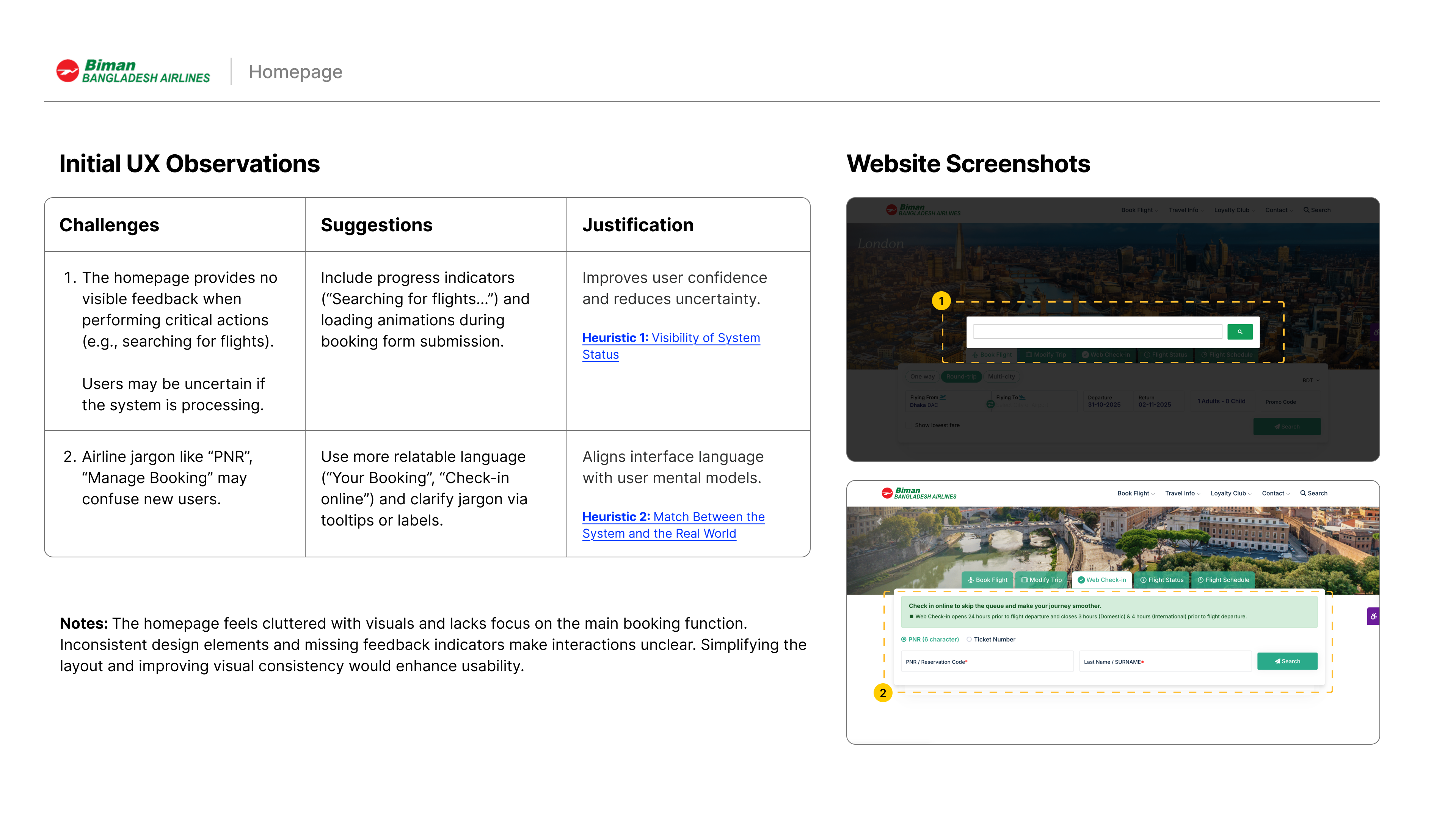
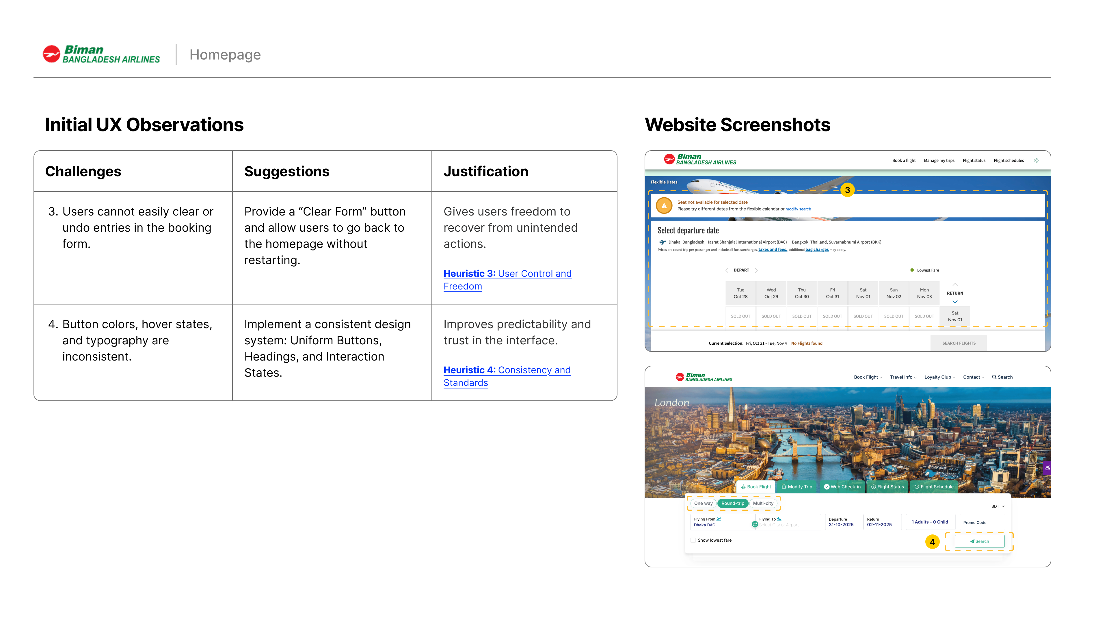
🏠 Home Page
The homepage should act as a clear entry point where users can instantly begin key tasks such as flight booking or check-in. However, the current homepage overwhelms users with visuals and promotions, burying the primary booking action. The lack of visual hierarchy and feedback elements disrupts focus and flow.
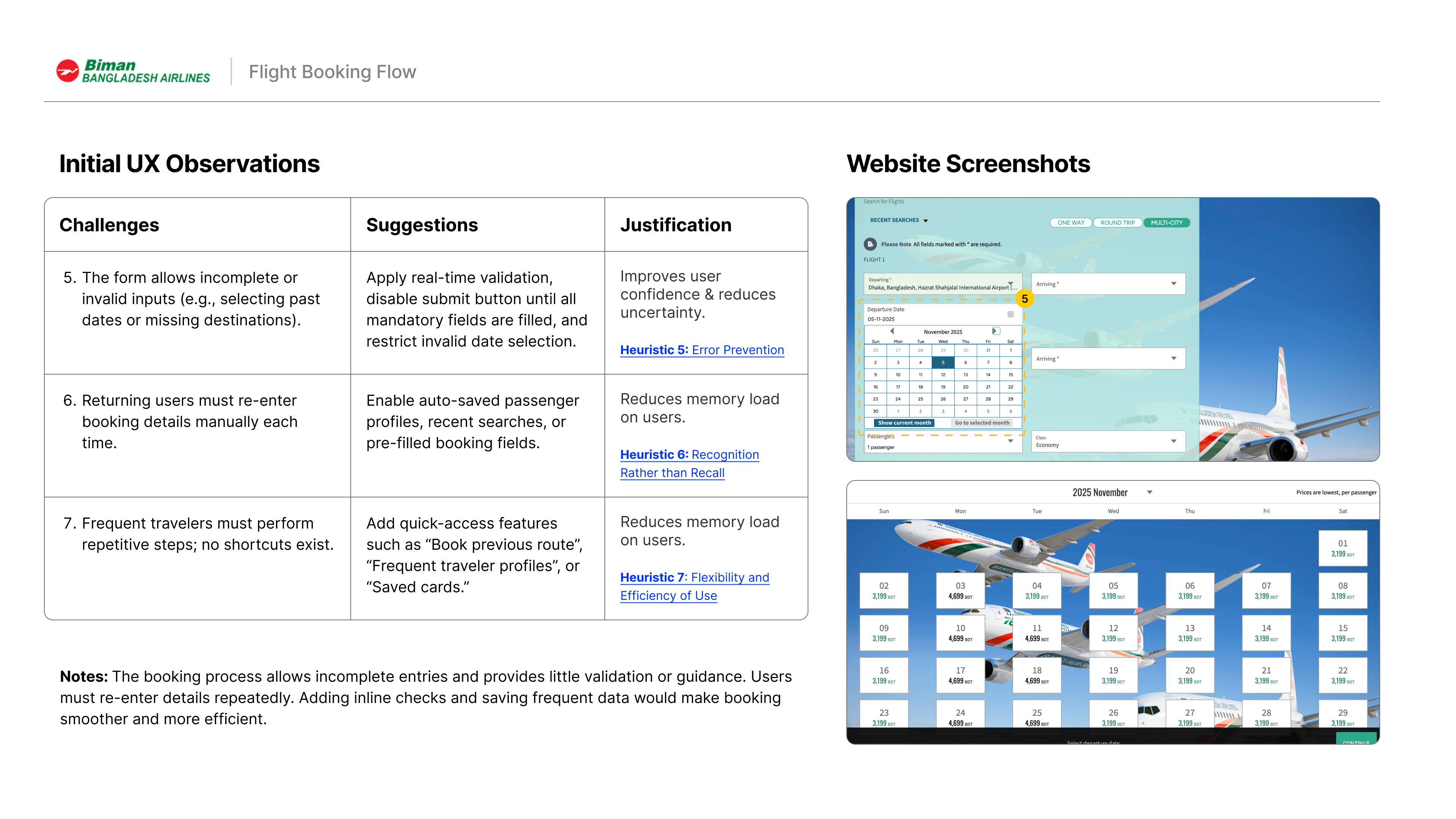
✈️ Flight Booking Flow
An effective booking flow should guide users smoothly from search to confirmation with minimal input friction and clear validation. On the Biman website, the process lacks proactive error handling and requires repetitive data entry, making the experience slow and error-prone compared to industry best practices.
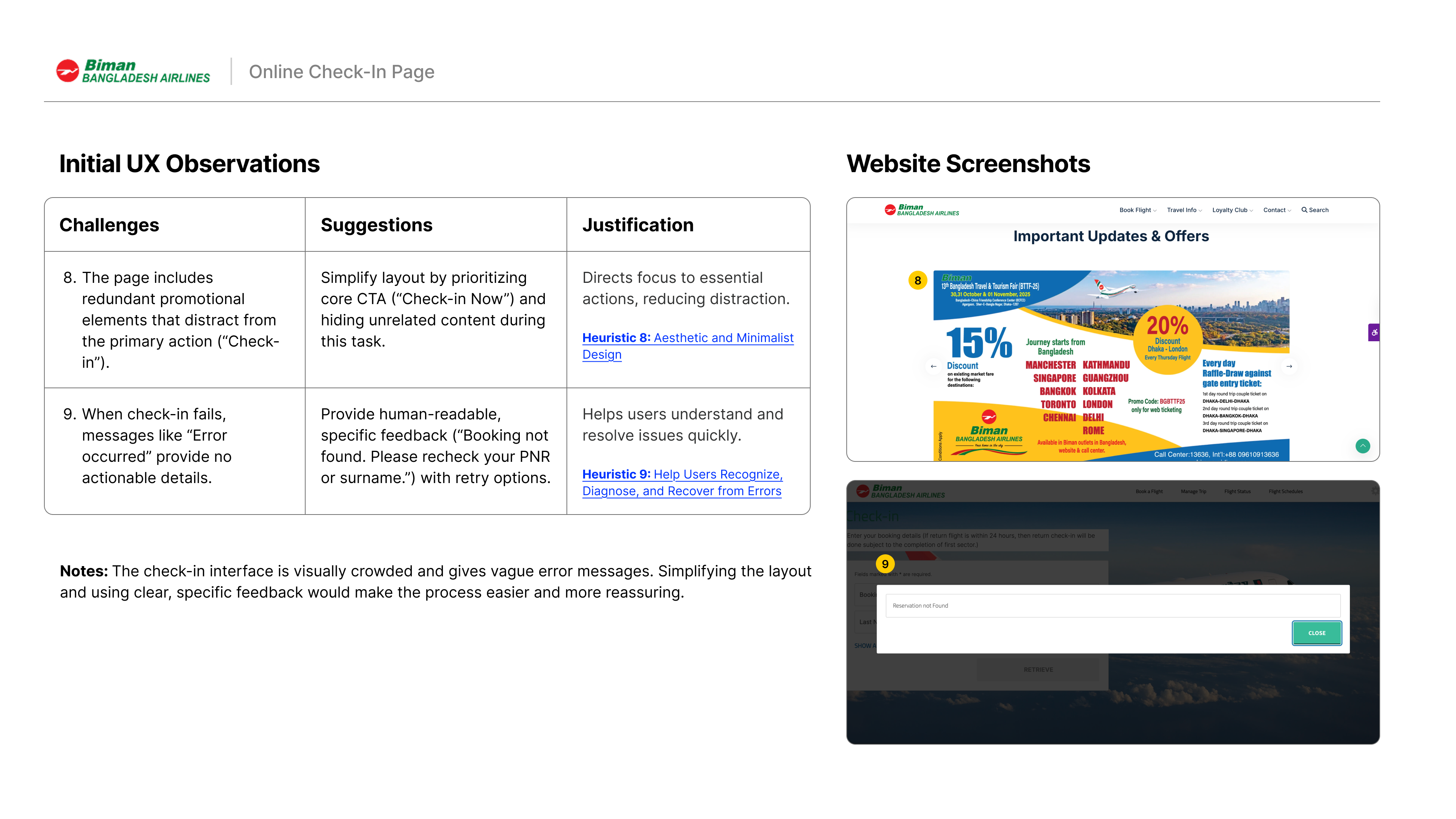
💻 Online Check-In Page
The check-in process is typically a quick, task-oriented flow where users confirm details and generate their boarding pass. Here, visual clutter and generic error messages complicate this simple goal, leaving travelers unsure of next steps and undermining confidence in system reliability.
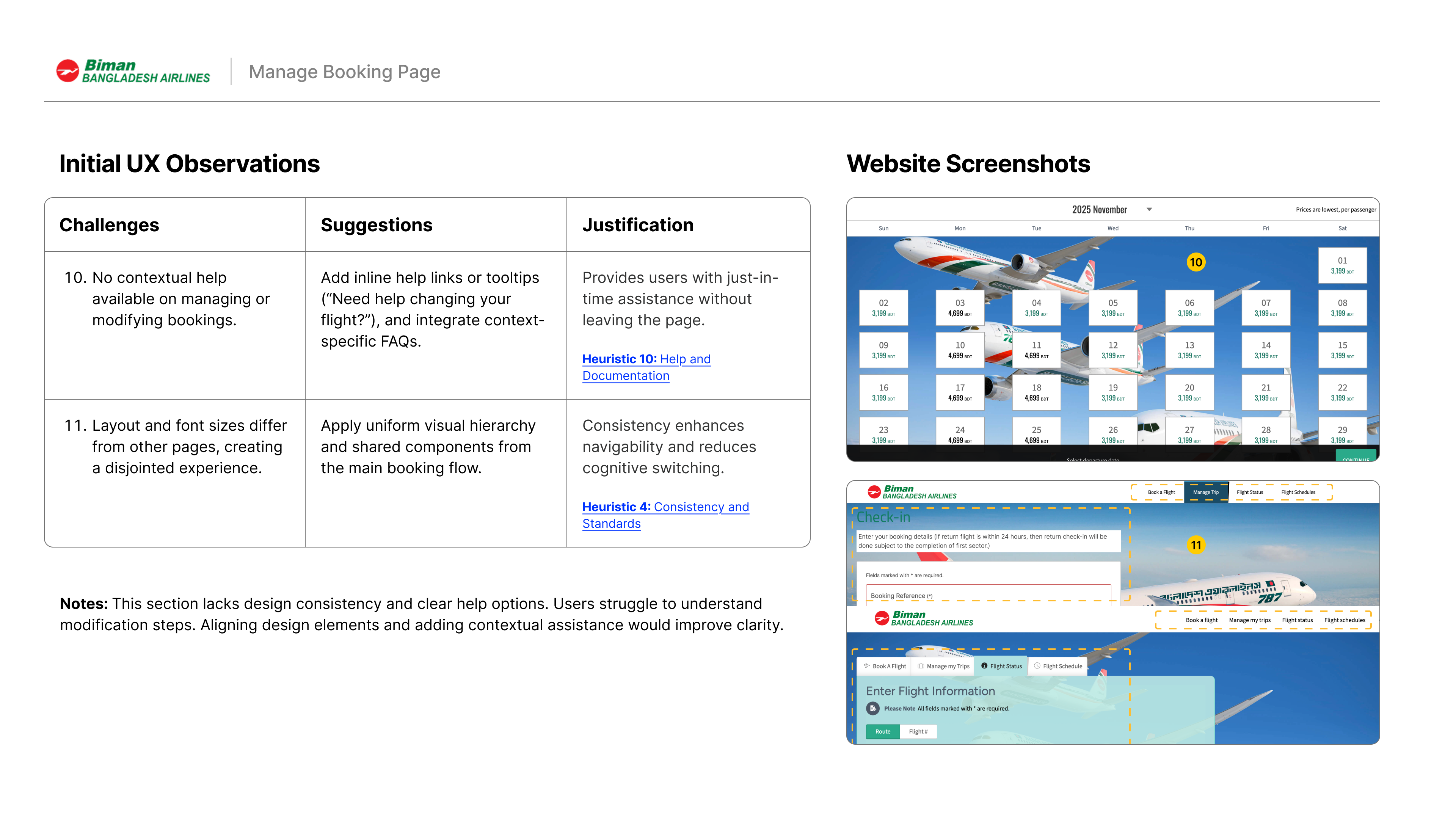
🧾 Manage Booking Page
This section should empower users to modify or review bookings easily, with a consistent design and clear guidance. The current version feels disconnected from the rest of the site and lacks contextual help, making common actions like date changes or cancellations confusing and time-consuming.
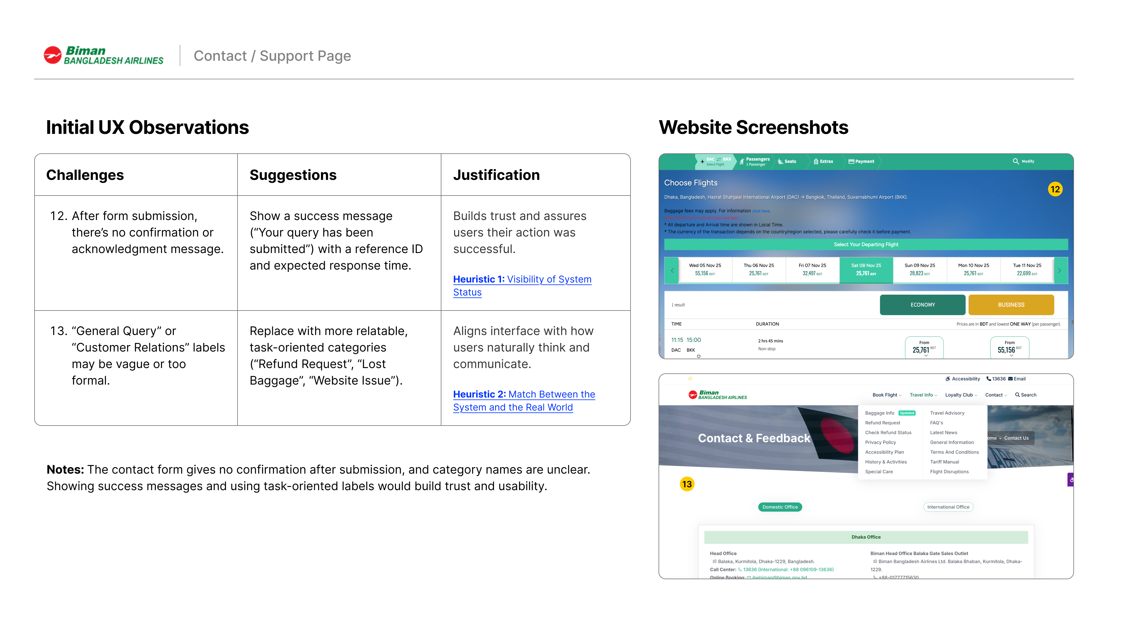
💬 Contact / Support Page
A contact page should reassure users that their queries are received and directed correctly. In its current form, Biman’s contact interface does not confirm submission and uses vague category labels, which diminishes trust and clarity for users seeking assistance.
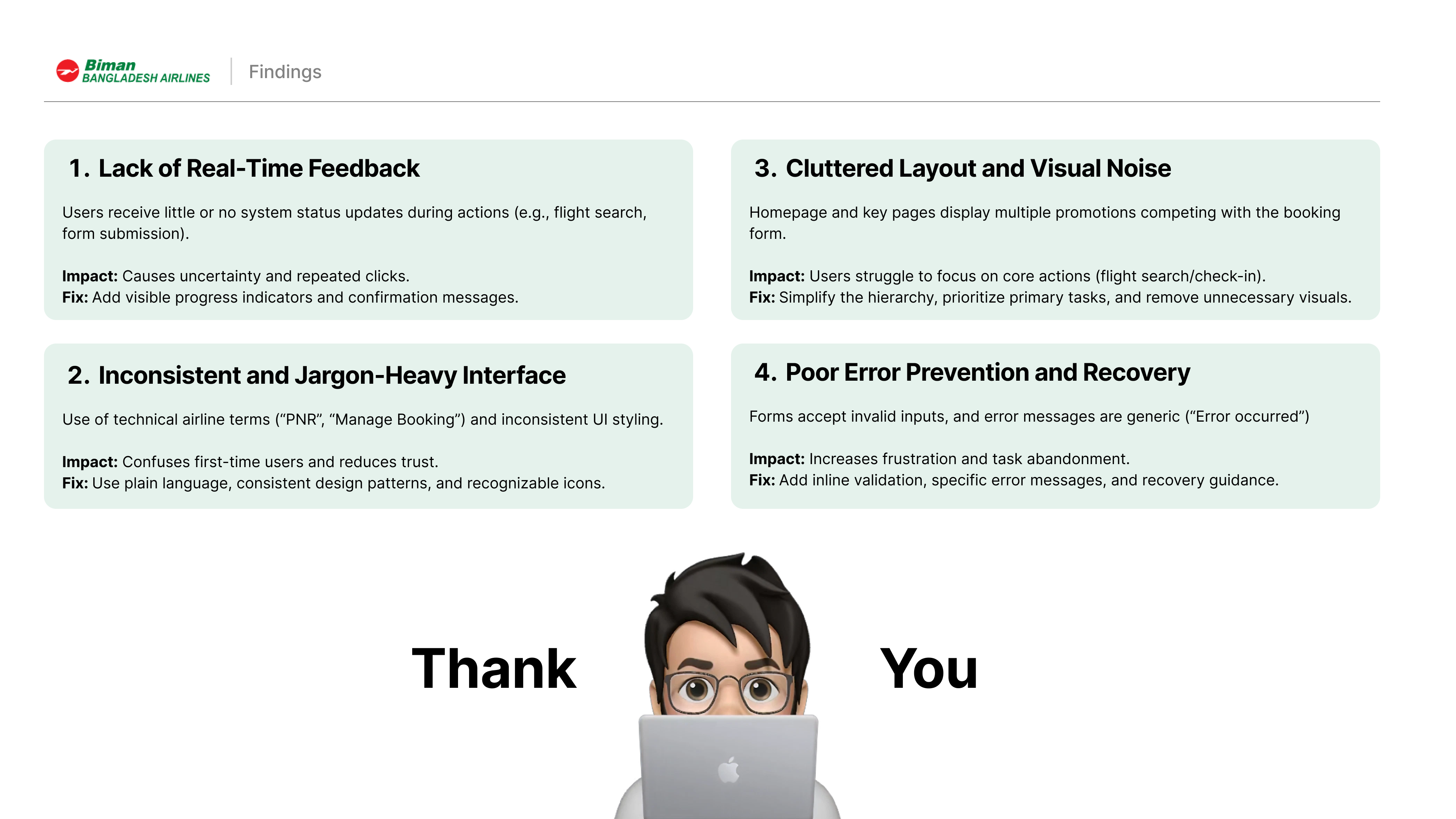
🔍 Findings
The evaluation of the Biman Bangladesh Airlines website reveals that while the platform provides essential travel functionalities, it falls short in delivering a seamless and intuitive user experience. Core interactions such as flight booking, check-in, and customer support lack the clarity, consistency, and feedback users expect from modern airline interfaces. Visual clutter, inconsistent design patterns, and limited mobile optimization further hinder usability. By simplifying workflows, unifying design standards, and strengthening system feedback, Biman has the opportunity to create a more trustworthy, efficient, and traveler-centered digital experience.
Tools used
From brief

Topics
Share
Reviews
1 review

I really like your heuristic evaluation, Rakin! Each challenge is well explained with the right amount of detail and your suggestions made a lot of sense. Great work!
You might also like

Smartwatch Design for Messenger App


Bridge: UI/UX Rebrand of a Blockchain SCM Product


Pulse Music App - Light/Dark Mode


Monetization Strategy


Designing A Better Co-Working Experience Through CJM


Design a Settings Page for Mobile
User Research Courses

Ethical & Responsible Product Design


Product Management Foundations


The Product Development Lifecycle & Methodologies
