Back to Bike Campaign Website

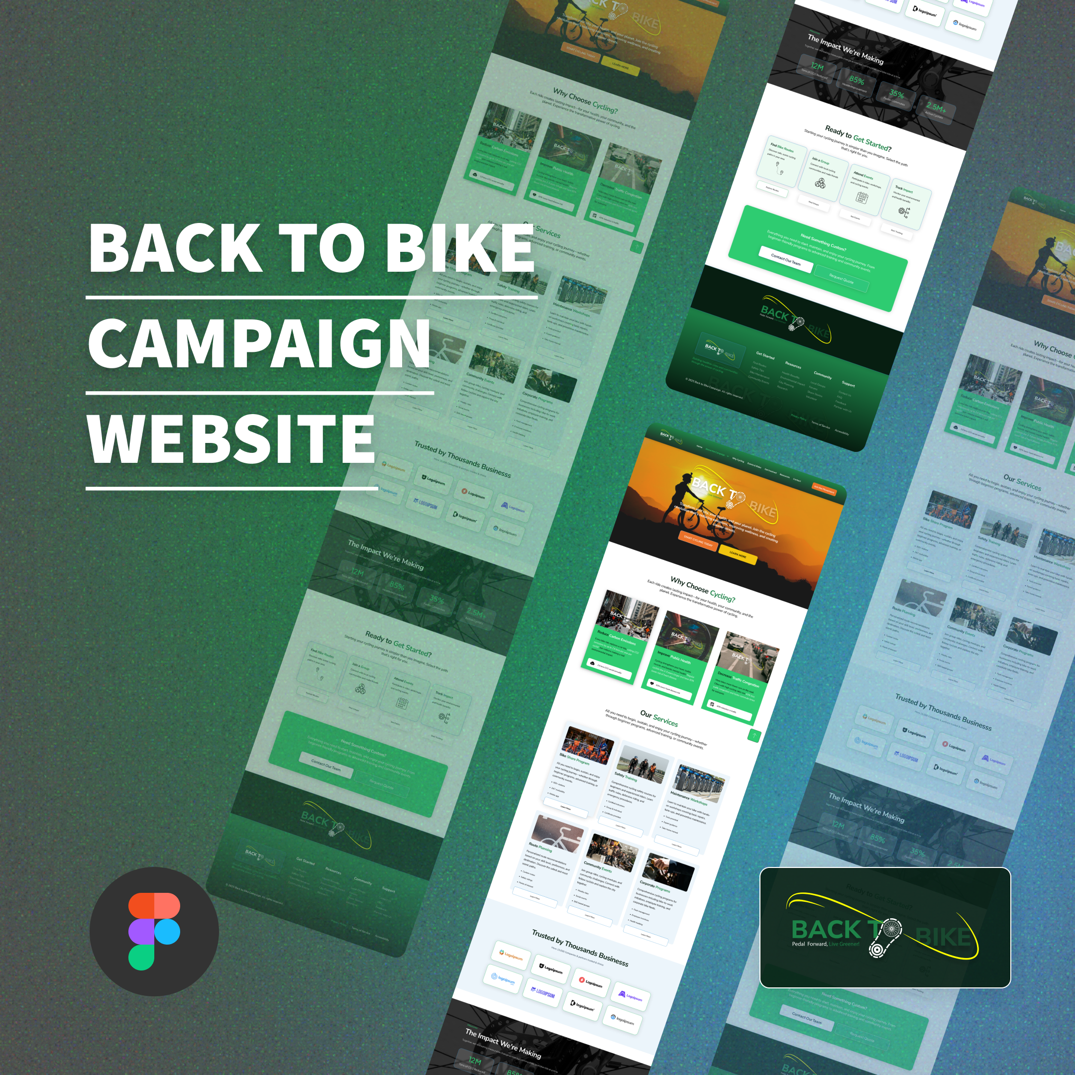
In this design. It showcases a campaign for people who are into cycling. Being fit while reducing traffic and carbon dioxide for a healthy lifestyle and healthy living
Reviews
2 reviews

Hey Nico, do you plan to post the whole page here?
That way I can review it in detail without tilting my head at a small square, ha! It looks good, grid-a-licious!

Looks great!
Maybe align content coloring, such as imagery is complementary towards the brand coloring.
Also, would've loved a little bit more description of the project, what went into each view and why you made some of the design decisions you did.
Keep up the great work!

Hey Nico! Thanks to my ninja skills (zoom your thumbnail), I was able to analyze your design since you forgot to share the full link.
As I've mentioned in previous design reviews, stick to a limited color palette and focus on using those consistently. I really like your hero section, but you need to work on the contrast between text and background images, consider using white text in those areas for better readability(try apply a 10-20% opacity black overlay).
For secondary buttons on your hero (if you decide to stick to orange), try using that orange color but as an outline only, just a stroke without the fill. This gives you hierarchy without adding visual noise.
Be careful with those gradients. They often look appealing but can mess with accessibility and contrast. Pick one specific shade of green and use it throughout the entire design. I'm noticing the green shifts in different sections, especially in that final call-to-action area.
The rest is fairly clean, you did use whitespacing correctly and I really like your cards, but as I said earlier: choose your colors: one primary, one secondary, one accent and concentrate on using only those. This prevents color chaos across your design.
The hierarchy works well overall. When you feel ready to publish the complete design properly, that would be great. Otherwise I'll have to keep using my ninja skills to read your Figma pages directly!
You might also like
SiteScope - Progress Tracking App


FlexPay


CJM for Co-Working Space - WeWork


Ubani Design System


Accessible Signup Form for SaaS Platform

Loginino

Popular Courses

UX Design Foundations


Design Terminology


Building Content Design Systems
