Airbnb Design System - Case study

Breaking the Patterns by Identifying and Solving Airbnb's Design System Mistakes
Problem statement
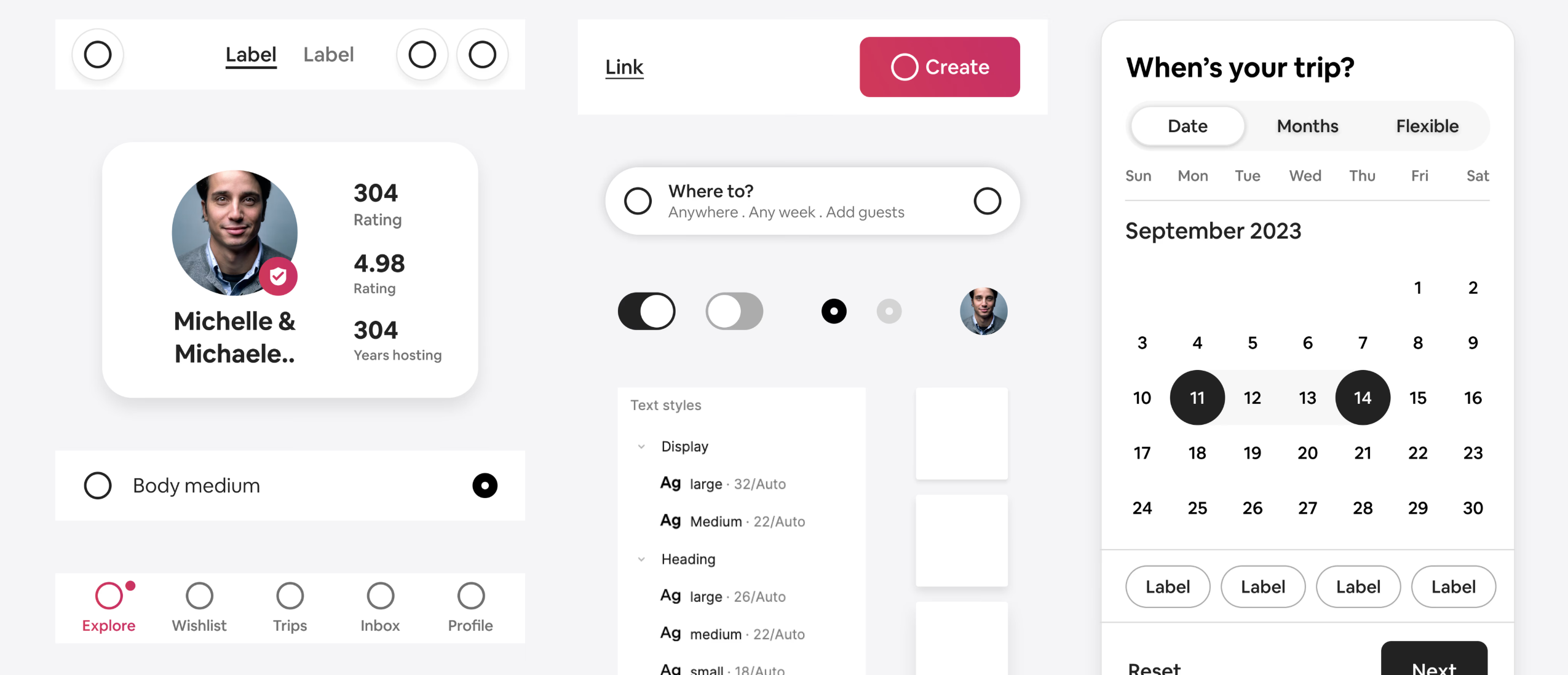
Airbnb's design system is essential for maintaining consistency, accessibility, and efficiency across its platform. However, certain core components suffer from inconsistencies and design inefficiencies, creating challenges for both designers and developers.
This project identifies key mistakes , redesigns critical components for design consistence , and i try to builds a structured, scalable design system from the ground up.
Reach out to me at Linkedin : Visit now
Topics
Share
Reviews
1 review

Hey! I've reviewed your project and I'd like to share my thoughts.
Problem Analysis:
You've excellently identified the main challenges:
- Inconsistencies in components
- Inefficient solutions
- Difficulties for both designers and developers
I appreciate your concrete examples of these problems—you've shown exactly where and why Airbnb's system falls short.
Component Redesign
Typography:
I value your organization of typographic hierarchy with clear headings and precise definition of sizes, font weights, and spacing.
Buttons:
This is one of the strongest aspects of your project:
- Clear states (default, hover, pressed, disabled)
- Consistent padding and rounding
- Distinct variants
Forms:
You've tackled a difficult challenge with good results:
- Consistent inputs
- Well-designed selection fields
- Unified error messages
Colors and Tokens:
Your work on organizing the color palette and creating meaningful design tokens is evident.
Strengths:
- Methodical approach - clear process from analysis to solutions
- Attention to detail - you've focused on often overlooked details
- Practical thinking - not just aesthetics, but implementation too
- Clear documentation - component presentation is transparent
Areas for Growth:
I'd like to see...
- More examples of application in real interfaces
- Information about user testing
- Details about responsiveness
- More about accessibility standards (WCAG)
Summary:
You've done impressive analytical and design work. You not only identified problems but methodically solved them. Your project is a cohesive, well-thought-out component system that truly addresses the identified issues.
I particularly appreciate:
- Visual and functional consistency
- Pragmatic approach (not "redesign for redesign's sake")
- Clear documentation helpful for both designers and developers
In the digital product world, we often forget about fundamentals, focusing on flashy solutions. Your project shows the value of working on basic components. You've created a system that doesn't just look good but works better.
Such a project could bring real benefits to the team, improving both UX and team efficiency.
Great work 🔥🫡
You might also like

Improving Dating App Onboarding: A/B Test Design

FORM Checkout Flow - Mobile


A/B Test for Hinge's Onboarding Flow


Accessibility Asse


The Fitness Growth Engine

Uxcel Halloween Icon Pack

Popular Courses

Introduction to Design Systems


Building Content Design Systems


Design Audits Fundamentals