Accessible Signup for Crisp Chat


The goal of this project was to enhance Crisp's login/signup page's accessibility, making it more user-friendly for people of all abilities. The focus was on creating a smoother, more inclusive experience that ensures everyone can easily interact with the platform, regardless of their needs or limitations. By considering different accessibility aspects, the design aims to provide all users with an easier, frustration-free process.
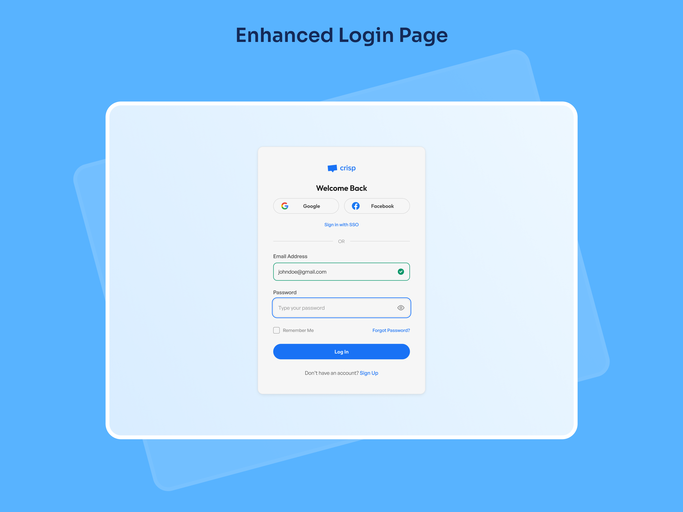
Let's take a look at the enhanced login page design for Crisp, focusing on accessibility improvements that make it easier and more inclusive for all users to log in. The design takes into account various user needs and ensures that everyone, regardless of ability, can interact smoothly and effectively with the login page.
- Clear Input Fields: Input fields are well-labeled and include clear placeholders, making it easy for users to know what information to enter at each step.
- Visual Feedback: The green checkmark gives instant feedback for a valid email. It’s designed to be distinct, with both color and an icon, ensuring colorblind users can identify it without relying on color alone.
- Large, Accessible Buttons: The "Log In" button is large, high-contrast, and easy to click, improving accessibility for users with motor impairments or low vision.
- Flexible Sign-In Options: With options like Google and Facebook, users can log in through their preferred platform, making the process more convenient and adaptable.
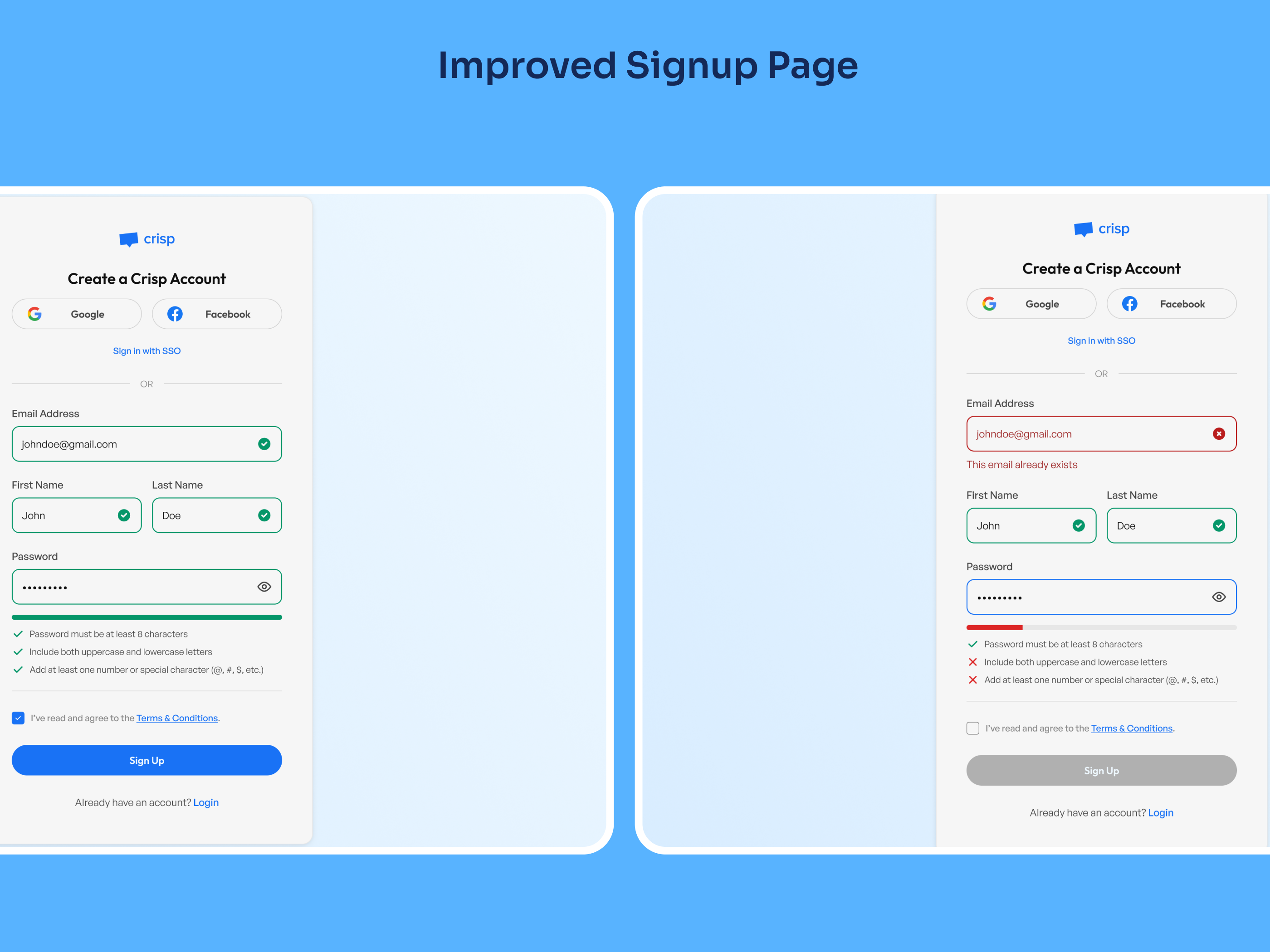
One of the key areas of focus for improving accessibility on the signup page was creating a more intuitive and user-friendly experience, especially around form validation and guidance.
- Real-time Error Feedback: Instant validation for fields like email helps users correct mistakes immediately, reducing frustration.
- Password Strength Indicators: A clear checklist and progress bar guide users to create stronger passwords effortlessly.
- Enhanced Readability: High-contrast colors for success and error messages ensure clarity, even for users with visual impairments.
- Streamlined Layout: A clean, minimal design keeps the process straightforward and easy to navigate.
These adjustments make the Crisp login & signup page more accessible, offering a clearer and more satisfying user experience while ensuring accessibility standards are met.
Tools used
From brief

Topics
Share
Reviews
2 reviews

Great work on your login screen, Ahmad! The design is clean, and I appreciate the thought and effort you've put into explaining your approach.

Well done Ahmad on your login screen! I can see you have done some great ideas going on here! The design is clean and I like how you have explained what you have done! The only suggestion I would make is to put your social login option at the bottom of the screen rather than the top. Maybe have a look at apps you use on a regular basis to get inspiration! Good luck!
You might also like

Smartwatch Design for Messenger App


Bridge: UI/UX Rebrand of a Blockchain SCM Product


Pulse Music App - Light/Dark Mode


Monetization Strategy


Designing A Better Co-Working Experience Through CJM


Design a Settings Page for Mobile
Visual Design Courses

UX Design Foundations


Introduction to Figma

Design Terminology
