Accessible Sign Up Form for Trello

The purpose of my redesign of Trello iOS mobile app signup form was to make it user-friendly. By focusing on accessibility best practices, this redesign aims to provide a seamless and equitable experience for all users.
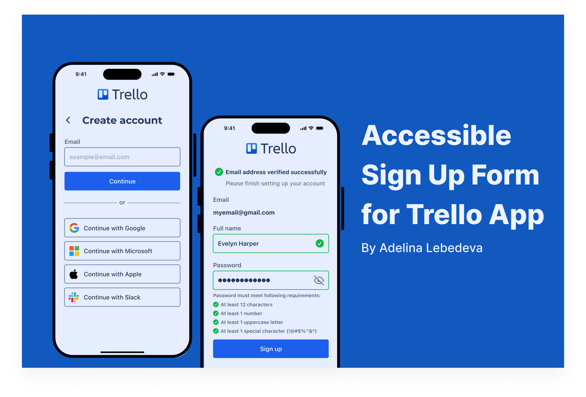
Here is what makes my design accessible:
- Color Contrast. A contrast ratio is at least 4.5:1 for all the text my project includes.
- Font Choices. I used sans-serif fonts for better readability and made them at least 16pt large.
- Clear Labels and Instructions. User always knows exactly what he needs to do at every stage. The language is also simple enough for everyone to understand.
- Touch Targets. I made all the buttons large and very easy to tap.
- Error Feedback. Error messages are noticeable by the red color AND icons, and they provide the reasons for error in short and clear sentences.

Reviews
1 review

Well done Adelina! Feels like you've covered everything here. Only thing that would make this even better is an interactive prototype. Still, this is a good accessible signup form.
5 Claps
Average 5.0 by 1 person
You might also like

Project
HealthFlow: Designing a Simple and Insightful Wellness Dashboard

This project focuses on designing a health and wellness dashboard that simplifies how users track and understand their daily well-being. Das

Project
Improving Dating App Onboarding: A/B Test Design
This project explores how improving the onboarding experience of a dating app can increase profile completion and early user engagement. I d

Project
FORM Checkout Flow - Mobile

Try out the prototype here. Design Rationale Why mobile? Mobile accounts for the majority of e-commerce browsing, and premium furniture pur

Project
A/B Test for Hinge's Onboarding Flow

This project focuses on improving the onboarding experience of a dating app - Hinge, by addressing low profile completion rates. Since profi

Project
Accessibility Asse

For this project, the LearnLink website was selected, and the goal was to redesign the login and sign-up pages specifically, adapting them t

Project
The Fitness Growth Engine

This slide shows how user behavior translates into business success by connecting activation, habit formation, retention, and monetization i
Visual Design Courses

Course
UX Design Foundations

Learn UX design fundamentals and principles that create better products. Build foundational knowledge in design concepts, visual fundamentals, and workflows.

Course
Introduction to Figma
Learn essential Figma tools like layers, styling, typography, and images. Master the basics to create clean, user-friendly designs

Course
Design Terminology

Learn UX terminology and key UX/UI terms that boost collaboration between designers, developers, and stakeholders for smoother, clearer communication.