Accessible Log in & Sign Up Forms

Here is the link to my presentation for a fictional SaaS company’s login and sign-up page. I’d appreciate any feedback!
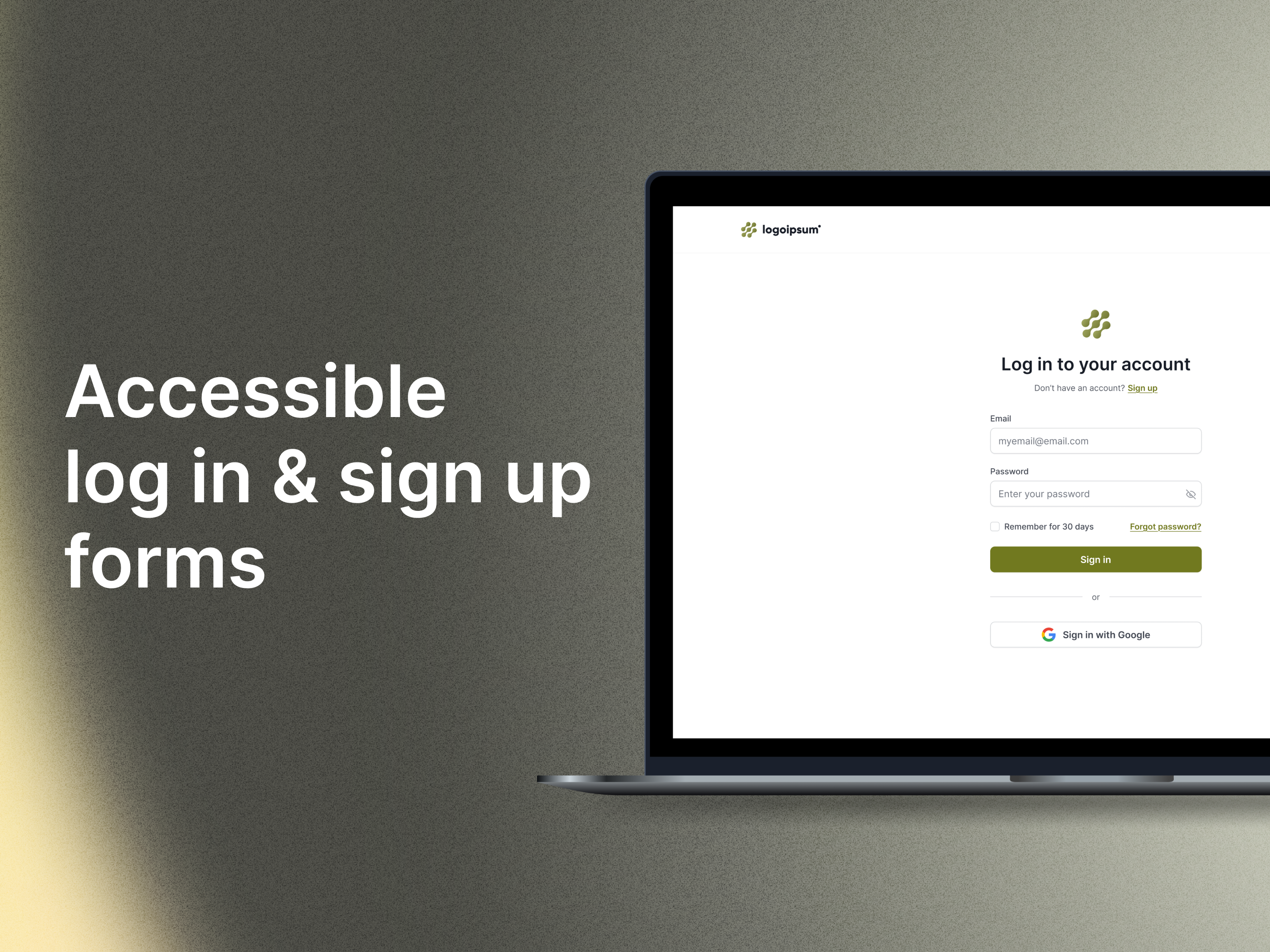
Side note: In this fictional example, there are no password limitations, which is why there are no instructions for bypassing input validation.
Tools used
From brief

Topics
Share
Reviews
1 review

Hi Florencia,
Your designs are very good in terms of UI, with a perfect look and no visual noise. Every section follows the standards and looks perfect. Well done. I just have a few suggestions from a UX point of view.
1 - On the login page, you gave "Sign up" in two places. If we are on the same page and there is no long scroll, one sign up is enough. You already placed it under the heading, which is the most visible area. Same for the login link on the sign-up page—it should belong only to that section.
2 - You placed "Forgot password" at the very bottom, separate from the password field. But it would be better for both IA and UX if it was near the password input.
3 - The "Terms and Policy" section is placed at the bottom of the page in a way that doesn’t attract attention. The most ethical way is to let the user see it clearly and choose to accept it with a checkbox. As for placement, you can put it above the "Create Account" button.
After making these fixes, your design will be perfect in terms of UX and will complete the UI in a perfect way.
You might also like

Smartwatch Design for Messenger App


Bridge: UI/UX Rebrand of a Blockchain SCM Product


Pulse Music App - Light/Dark Mode

Uxcel Halloween Icon Pack


Monetization Strategy


Designing A Better Co-Working Experience Through CJM

Visual Design Courses

UX Design Foundations


Introduction to Figma

Design Terminology
