Page 404 - piggybank
Context and objective
The goal was to design a 404 error page for Piggybank, a finance-focused platform with a friendly and accessible brand identity. Rather than delivering a cold error message, this page aims to provide guidance, maintain user trust, and create a moment of delight—even in the face of frustration.
Key design decisions
Friendly illustration
The central visual element is a floating pig astronaut, which is not only playful but also Piggybank’s representative icon. As the mascot of the brand, it reinforces visual identity while creating an emotional connection with the user. Its "lost in space" pose supports the metaphor of being lost (on a wrong or broken link), softening the negative experience and turning it into a moment of charm.
Clear and empathetic messaging
The headline "Lost in space?" uses light-hearted language to resonate with the visual and guide the user toward action. It expresses empathy while keeping things simple and human.
Navigation to key pages
Instead of leaving users stranded, the page provides quick links to the most visited sections of the site:
- Create account
- Financial Services
- Loans
This helps users quickly regain orientation and continue their journey—reducing bounce rates and improving overall usability.
Primary CTA: “Go back home”
The pink “Go back home” button is designed to stand out, offering a clear escape route to the homepage. This CTA uses brand colors, generous padding, and a rounded shape to increase visibility and encourage clicks.
Visual cohesion
The visual tone is soft, clean, and consistent with Piggybank’s overall aesthetic. The use of space-themed elements reinforces the narrative, while whitespace and hierarchy ensure that the error message is not overwhelming. Every component was chosen to match the friendly, trustworthy image expected from a finance brand—without becoming too serious or intimidating.
Reviews
6 reviews
Fun and creative 404 Error Page! The visuals are playful and attention-grabbing, which makes the experience feel a lot less frustrating. Love the clean layout and clear call-to-action to guide users back. Maybe a touch of animation or micro-interaction could make it even more engaging, but overall—great job!
Great 404 page with a cool brand personality and good ux writing. If those links truly represent the most visited sections then the navigation strategy makes sense, though you might consider adding a search bar or "Go back" option for users who want to return to their previous path rather than restart their journey. The visual hierarchy and brand consistency are excellent, and the friendly tone strikes the right balance for a finance platform without being overly playful for the context.
William, your pig astronaut 404 is charming and user-friendly — adding a subtle animation could make it even more delightful, but overall it’s a fantastic design!
Great job on this 404 page 👏 The pig astronaut illustration immediately makes the experience feel friendly and approachable, while the clear headline and supportive copy keep the tone empathetic. I really like how you’ve combined brand personality with practical navigation links and a strong CTA — it feels polished, engaging, and user-centered 🚀✨
This project uses cuteness to ease the anxiety users often feel when they hit a dead end. It also offers helpful text links that guide them to the pages they need. Great job—the piggie is adorable!
Very artistic and cutesy illustration as well as great work on the UX as well. Fantastic work!
Wow, great work, William!
You might also like
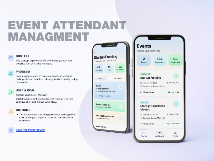
Events Managment App
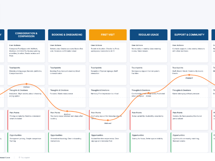
Customer Journey Map — Offsite Co-Working Experience
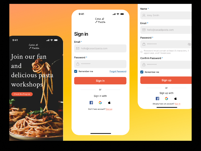
Mobile Onboarding: Casa di Pasta
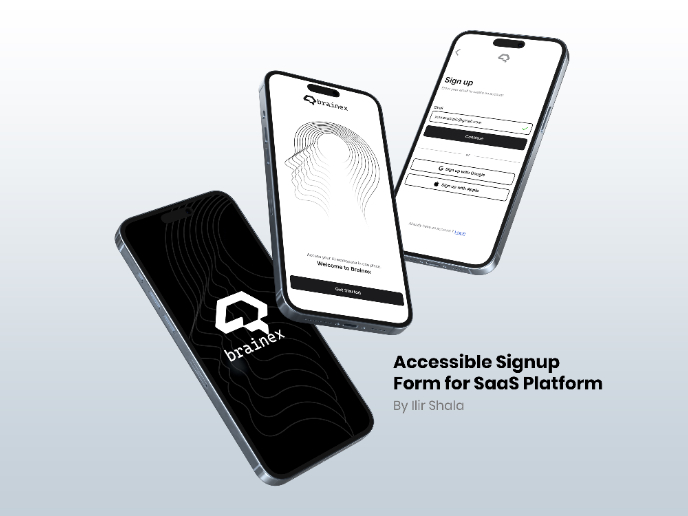
Accessible Signup & Login Experience — Brainex
Accessible Signup Form
Accessible Signup Form
Content Strategy Courses

UX Writing

Common Design Patterns


