Punctuation & Special Characters in Typography
Uncover the rules for styling punctuation and special characters in typography and their impact on the overall design and readability of text
Punctuation marks (commas, exclamation marks, etc.) and diacritics (acute, grave, etc.) are often neglected in typography. However, their look and formatting can make a big difference in how professional the overall design looks.
Punctuation marks and diacritics need to visually complement the typeface in weight, width, angle, etc. But it's also crucial to use them correctly according to the language punctuation rules and style guides.
Style conventions for punctuation usage can vary a lot, even between countries that speak the same language — compare American and British punctuation styles. In this lesson, we'll refer to American-style punctuation in typography and web content. However, when typesetting for other languages or countries, always research their individual requirements.
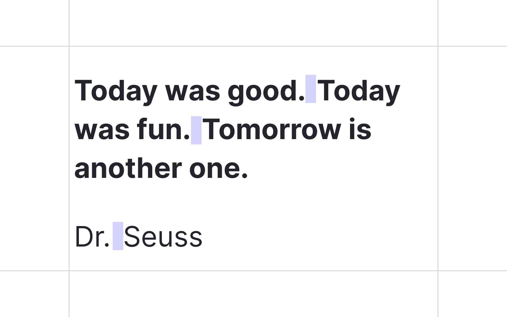
Nowadays, nearly all
In the era of typewriters, two spaces after a full stop were the norm. It was needed to delineate the beginning of a new sentence because of the monospaced typesetting.
In monospaced fonts, every character, be it "j" or "w", occupies the same space on the screen. As a result, a monospace font always takes more space on the screen than a proportional font. For this reason, two spaces were used after punctuation to indicate a full stop — such as a period, question mark, or exclamation point.
In 2019, the American Psychological Association’s Publication Manual changed their recommendation from two to one space after a period. A year later, Microsoft updated Word to mark two spaces after a period as an error.[1]
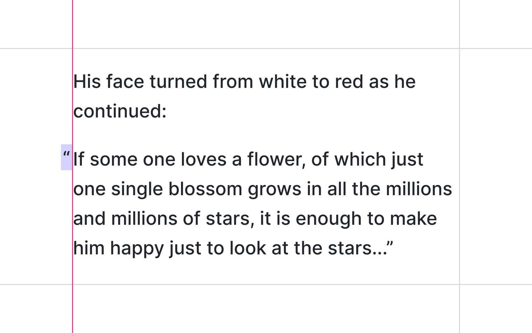
Hanging punctuation, also known as optical margin alignment, can be traced back all the way to the 1400s and Gutenberg's Bible. This method sets punctuation marks outside the margins of a body of text.
The rationale is to balance the visual flow of the text. If a line starts with a character like an opening quotation mark, it leaves a lot of vertical spacing, disrupting the flow. "Hanging" punctuation marks, such as quotation marks (” “ ’ ‘) and hyphens (– —), outside of the margins creates the appearance of a uniform edge and improves the optical flow. You can hang punctuation in left-aligned, right-aligned, or justified text.[2]
Pro Tip: Avoid hanging full cap height punctuation marks such as the exclamation point (!) and question mark (?).
The em dash is a versatile punctuation mark. Depending on the context, it can take the place of commas, parentheses, or colons. Like commas and parentheses, em dashes can set off extra information, such as examples, explanatory or descriptive phrases, or additional details:
Every element of a design — typography, colors, etc. — carries a visual weight.
Or like a colon, an em dash can introduce a clause that explains or expands upon something that precedes it:
All users agreed — the design looked amazing.
Pro Tip: Web content creators often insert a space before and after the dash, but most books and journals omit spacing.
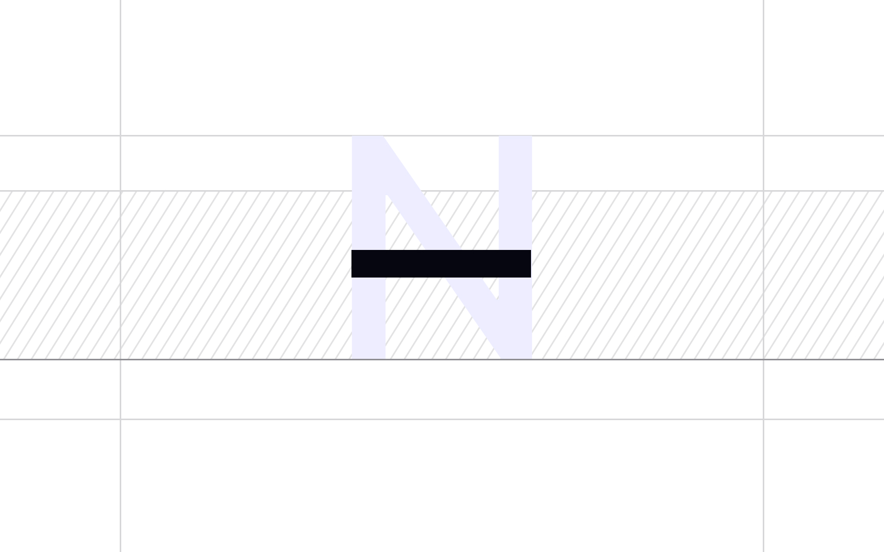
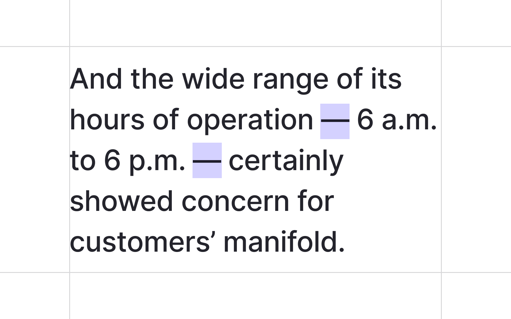
En dash is the dash of the approximate length of a capital N (–). The en dash doesn't require spaces around it, and it's most often used:
- Between number ranges: pages 79–113
- Between date ranges: 12–15 October
- To replace the word "to" between capitalized names: a Boston–Washington train[3]
Pro Tip: To create an en dash, use the Option - keys on a Mac Alt 0 1 5 0 on Windows.
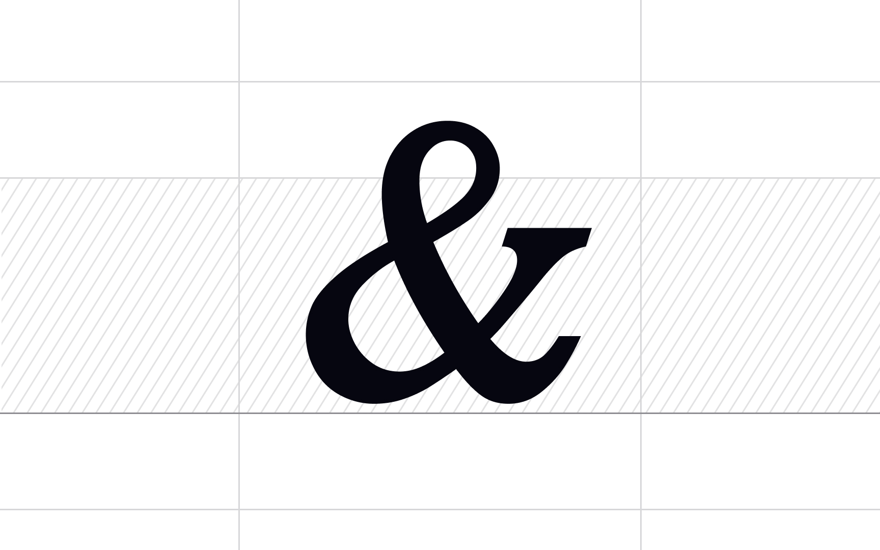
Ampersand is a symbol that stands for "and" in modern English. It can be traced back to the first century AD, when it was a ligature of the letters E and T ("et" is Latin for "and"). The term itself was coined in the early 19th century.
Ampersands are often used:
- Instead of "and" in informal writing
- In business names formed from partnership of two or more people — Dolce & Gabbana
- In abbreviations containing the word "and" — AT&T (American Telephone and Telegraph)
- In film credits and screenplays where it has its own meaning and indicates a closer collaboration than "and," and some other cases[4]
Because ampersands are often used in eye-catching headlines, signage, and advertisements, type designers often get creative with their designs. There are coloring books about ampersands, ampersand-a-day Tumblr blogs, and a whole cottage industry of t-shirt makers working in ampersands.[5]
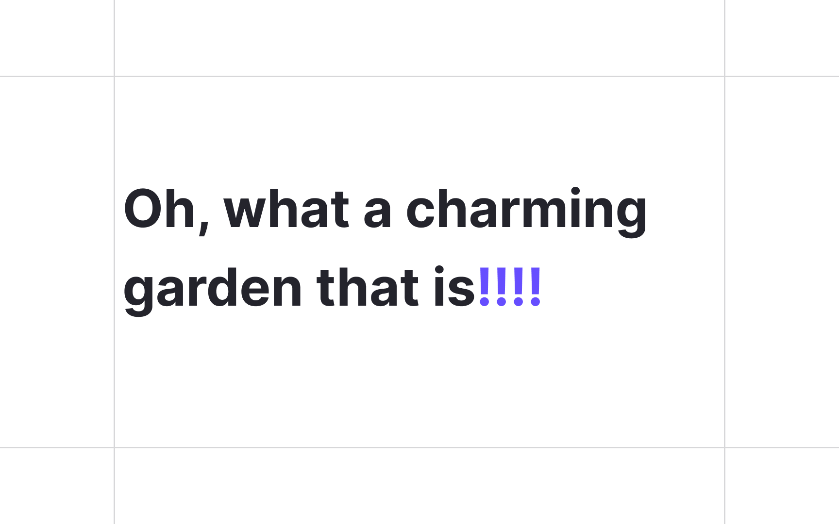
The exclamation point or exclamation mark is used at the end of a sentence to indicate strong feelings. Reasonably strong feelings!
Exclamation marks make the greatest impact when they aren't overused. Back in 2001, Nielsen Norman Group advised avoiding exclamation marks in professional writing, but their opinion has changed since then. User research has found that users are attracted to exclamation points in
But, like in all things, moderation is the key. Avoid using more than 3 exclamation marks. The
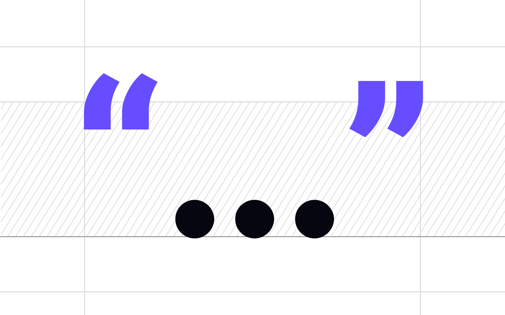
Curly quotes are the quotation marks used in proper
In traditional printing and typography, all quotation marks are curly. Compared to straight quotes, curly quotes are more legible on the page and match the other characters better. Although there are no keys assigned to curly quotes, most modern word processors have the smart quotes feature. When turned on, it automatically changes straight quotes to curly.[7]
Straight quotes are the two generic vertical quotation marks located near the return key: the straight single quote (') and the straight double quote ("). Straight quotes come from typewriter times. Back then, using ambidextrous straight quotes was easier than using separate slots for curly opening and closing quotes.
Nowadays, you can see straight quotes in many web publications. The reasons are numerous. Straight quotes are easier to type as they have their assigned keys, and they are always displayed correctly, which is not always the case for curly quotes. However, the downside of straight quotes is that they often lack cohesion with other characters of the
Type designers advise using curly quotes where possible, including digital
Pro Tip: If you have smart quotes turned on, watch out when sending emails containing code or command lines. The code with curly quotes won't be rendered correctly.
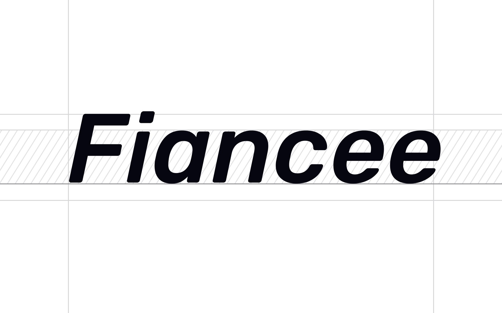
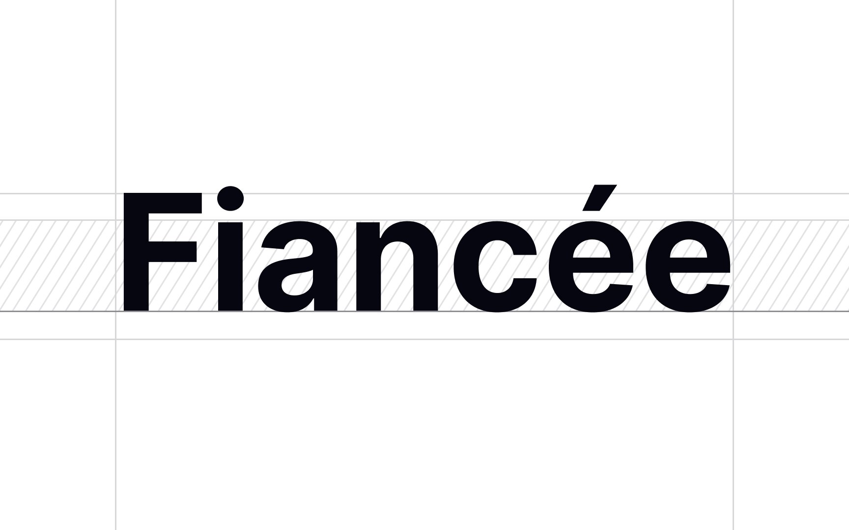
An accented character is a letter or basic glyph to which a special glyph is added. These special glyphs are called diacritics, accent marks, or sometimes simply accents.
In English, accented characters are used in words borrowed from other languages, such as résumé or tête-à-tête. In their respective languages of origin, accented characters can define an individual sound, tone, emphasis, or meaning.
Some of the most common diacritics used in English borrowed words are:
- Acute (é)
- Grave (è)
- Circumflex (â, î or ô)
- Tilde (ñ)
- Umlaut and dieresis (ü or ï – the same symbol is used for two different purposes)
- Cedilla (ç)
Diacritics don't stand alone — they need to be added to an already existing letter.
Fonts incorporate diacritics in two ways:
- In
fonts with floating accents, you create accented characters on the fly. First, type the base letter, then press a dedicated key to add the needed accent. - In fonts with prebuilt accented characters, you can type an accented character either from the glyph panel or by using specific key combinations.
Most professional-quality fonts include a range of floating accents and prebuilt accented characters.
References
- Getting the Hang of Hanging Punctuation | Web Design Envato Tuts+
- Why Designers Love The Ampersand | Fast Company
- Really Break Grammar Rules on Websites: Part 2 | Nielsen Norman Group
Top contributors

Topics
From Course

Share


