Microcopy patterns for tooltips
Tooltips provide some extra information about an element or a feature that isn't evident at first sight when users are performing a task. The main difference between a good and bad tooltip is the value it brings to users. If a tooltip confuses users or states the obvious, it's a poor user experience that needs to be rewritten or discarded.
Here are a few features of good tooltips:
- They don't contain critical information. If users don't find the tooltip or forget what it says, they should still be able to complete the task without it. The tooltip should never contain vital information that users need to refer to frequently.
- They're short. Usually, tooltips are just up to 150 characters long and are remarkably straightforward. Imperative verbs can be very helpful when giving a brief command on what users should do.
- They're helpful. Obvious or redundant tooltips are disappointing for users as they bring no value. If you can't come up with a useful tooltip, don't offer one at all.[1]
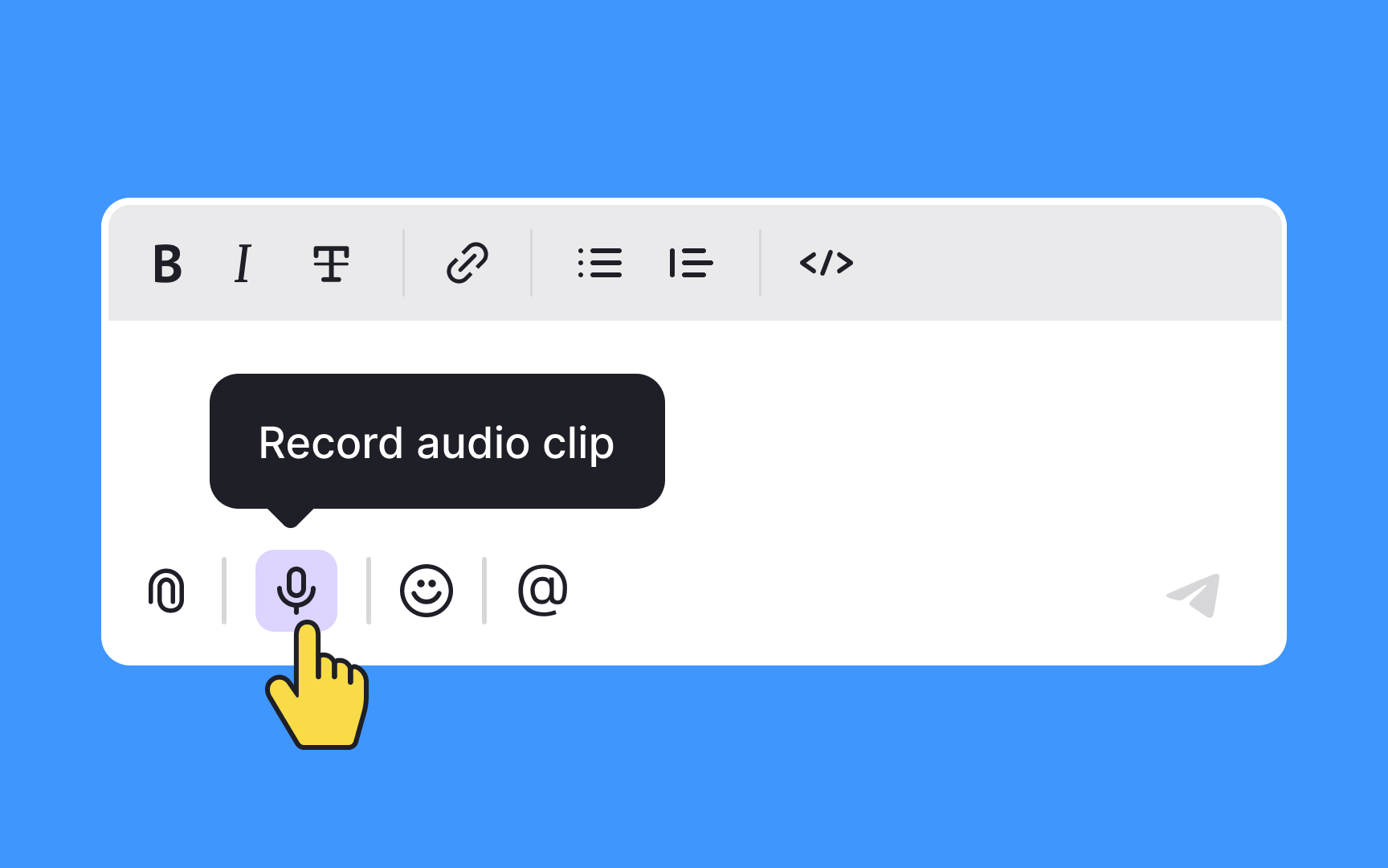
Pro Tip: Always accompany unlabeled icons with a tooltip.
