Toggle switches
Toggle switches are selection controls that provide only 2 mutually exclusive options (usually On or Off) and always have a default value.
Since designers sometimes falsely replace toggle switches with radio buttons or checkboxes, it's essential to define the usage scenarios:
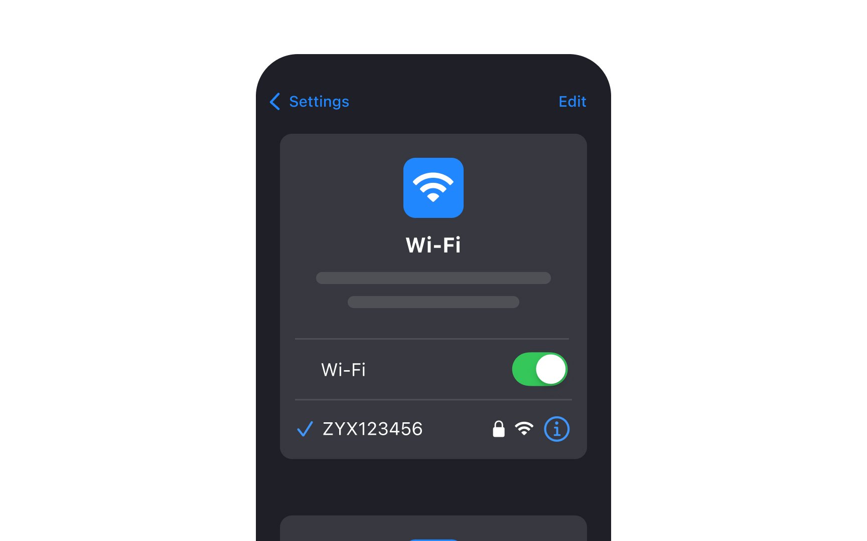
- Use toggles when selected options take an immediate effect. That's why we often use toggle switches for the Settings page where choices get applied instantly and it isn’t required for users to confirm their decision.
- Make sure the labels are direct and clear. Avoid using questions and formulate labels by saying what will happen when the switch is on. For example, the label "Show Notifications" is more straightforward than "Notifications."
- Use color contrast to signify the difference between On and Off states. The On state should be more contrasting so that even people with visual impairments can notice the difference.[1]