Utilize button hierarchy
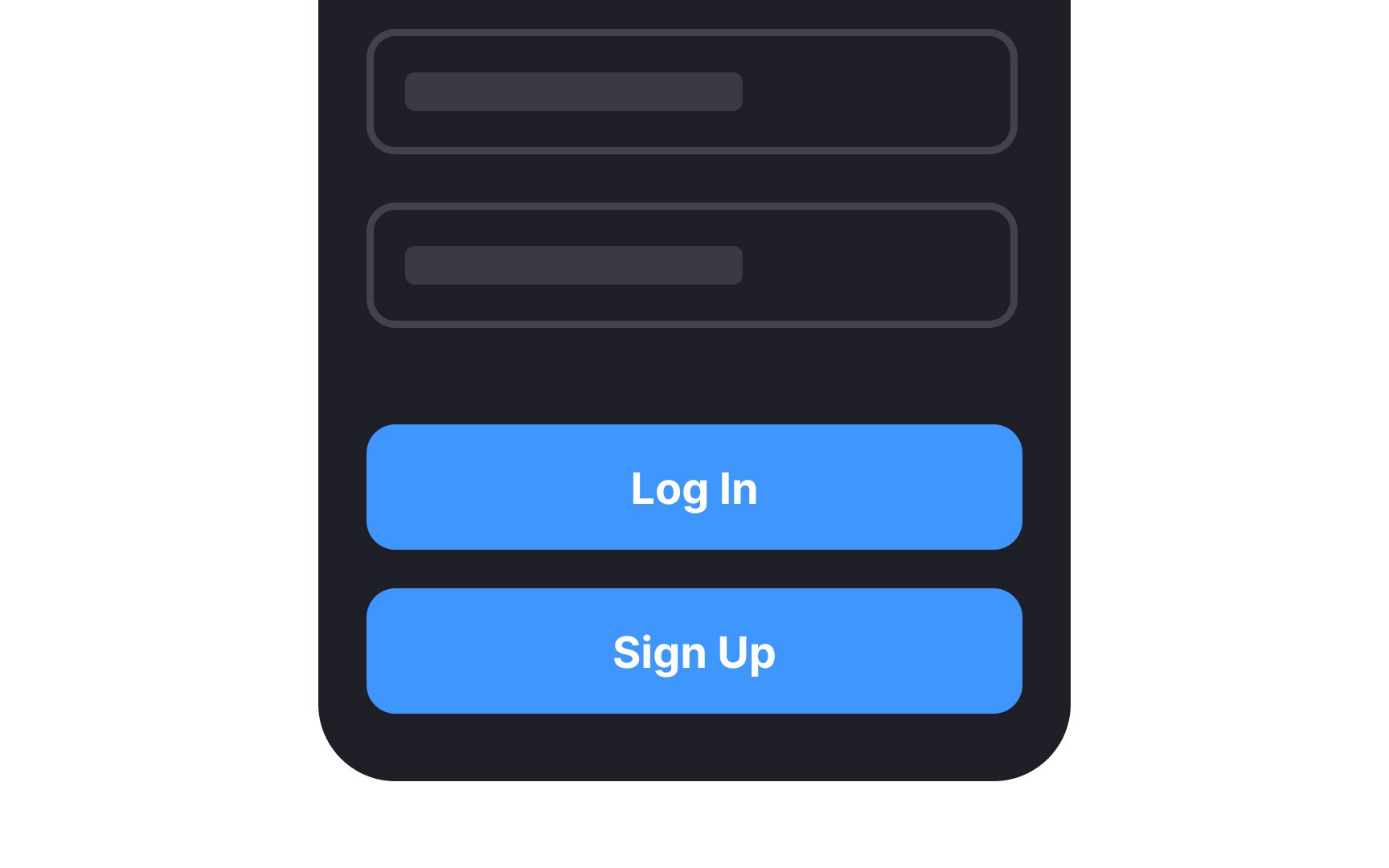
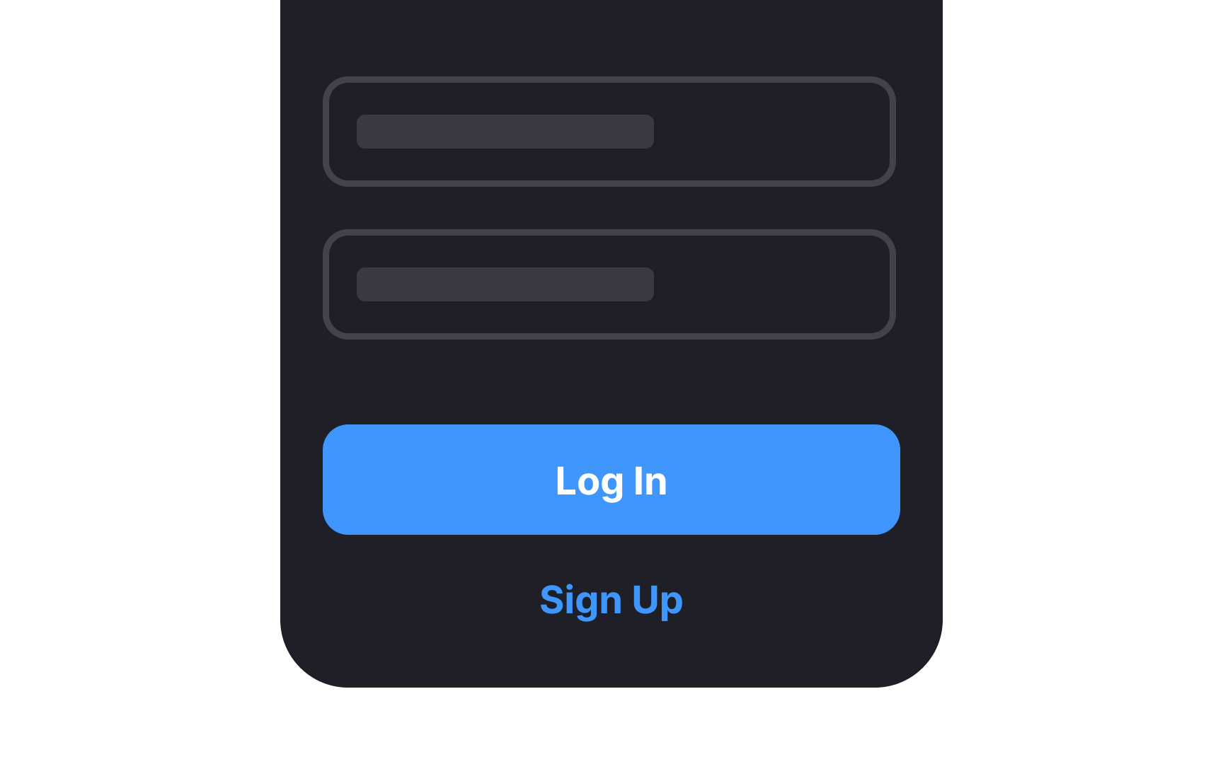
While the actions of logging in and signing up serve different functions, they're often placed together on a platform's interface. Therefore, employing a distinct button hierarchy is vital for reducing user errors and enhancing navigability.
Button hierarchy isn't merely an aesthetic choice; it serves a functional purpose. Utilize contrasting colors, size variance, and strategic positioning to differentiate between the two actions clearly. For instance, a prominent Log In button on the login page could use a brand's primary color, while the Sign-Up option might appear in a more muted shade or as a text button.
