Use a descriptive CTA button

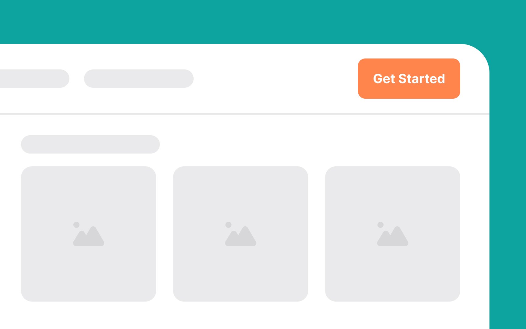
The CTA button in the header guides users towards the desired action you want them to take. To be effective, it needs to be prominently displayed so that it catches users' attention immediately. Here's how to optimize your CTA button:
- Placement: Position the CTA button in the top-right corner of the header. This ensures it is visible without scrolling, so users see it as soon as they land on the page.
- Visibility: Use contrasting colors to make the CTA button stand out and draw the eye.
- Message: Keep the button's message clear and concise, such as "Sign Up" or "Get Started." This tells users exactly what will happen when they click it.
