Avoid too much clutter on the dashboard
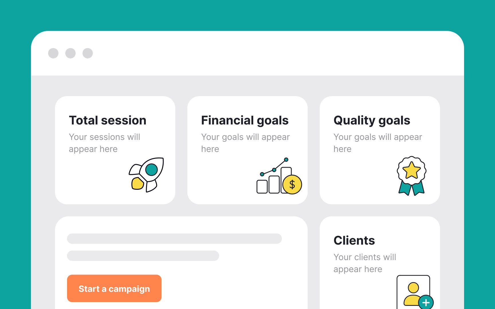
In designing empty dashboards for new users, it's crucial to avoid information overload. The goal is to guide users without overwhelming them. Here are some go-to tips:
- Use clear microcopy: Opt for a concise, clear microcopy that directly assists users. This approach is often more effective than overloading the page with text.
- Incorporate minimalistic visuals: Employ subtle visual elements or minimal graphics. These should guide users subtly, complementing the microcopy rather than overwhelming it.
- Focus on user goals: Every element on the empty page should aim to nudge users towards their primary objectives in a user-friendly manner.
Top contributors