Color Combination Preconceptions
Discover popularly used color combinations and the emotions they tend to evoke
According to the ecological valence theory, our color preferences don't emerge out of thin air.[1] Our likes and dislikes of colors are products of our past experience that, like a puzzle, consist of various pieces.
Events in politics and culture, technological innovations, cinema, music, and fashion influence our perception of reality. We watch movies, attend art exhibitions, buy new devices, listen to music, go to restaurants, and celebrate holidays. On the go, we absorb everything that happens around us to create our opinions. Positive events produce positive color associations, while unpleasant events boost negative color impressions.
Understanding the mechanism of forming color preferences can help designers develop a deeper knowledge of color psychology and grasp the nature of color trends.

According to a study conducted by a UK insurance intermediary, many industries are prone to using particular
For example, many airline companies pick blue to represent trust and security (e.g., United Airlines or Finnair) and red to ensure a caring attitude (e.g., Kenya Airways or Turkish Airlines).
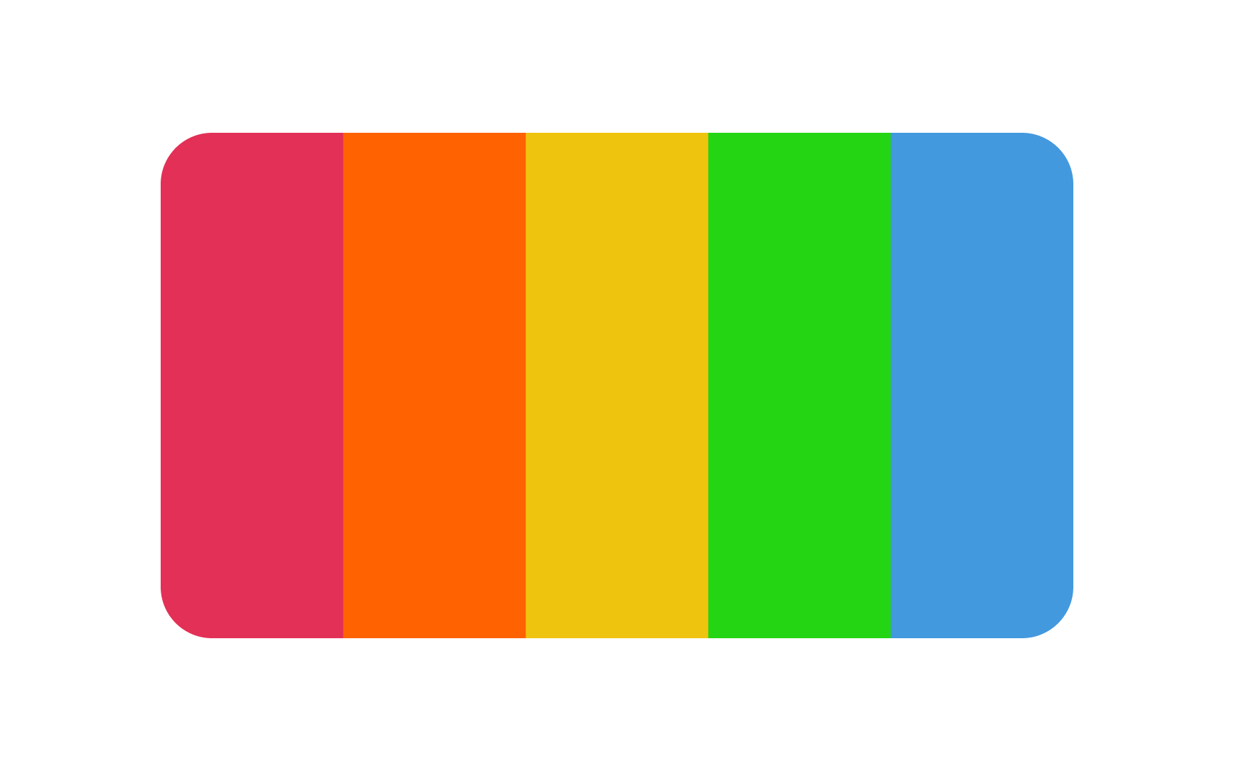
On the contrary, red and yellow are the most common colors for fast-food restaurant chains (KFC, McDonald's, or Wendy's) as they're usually associated with appetite and stimulate hunger.
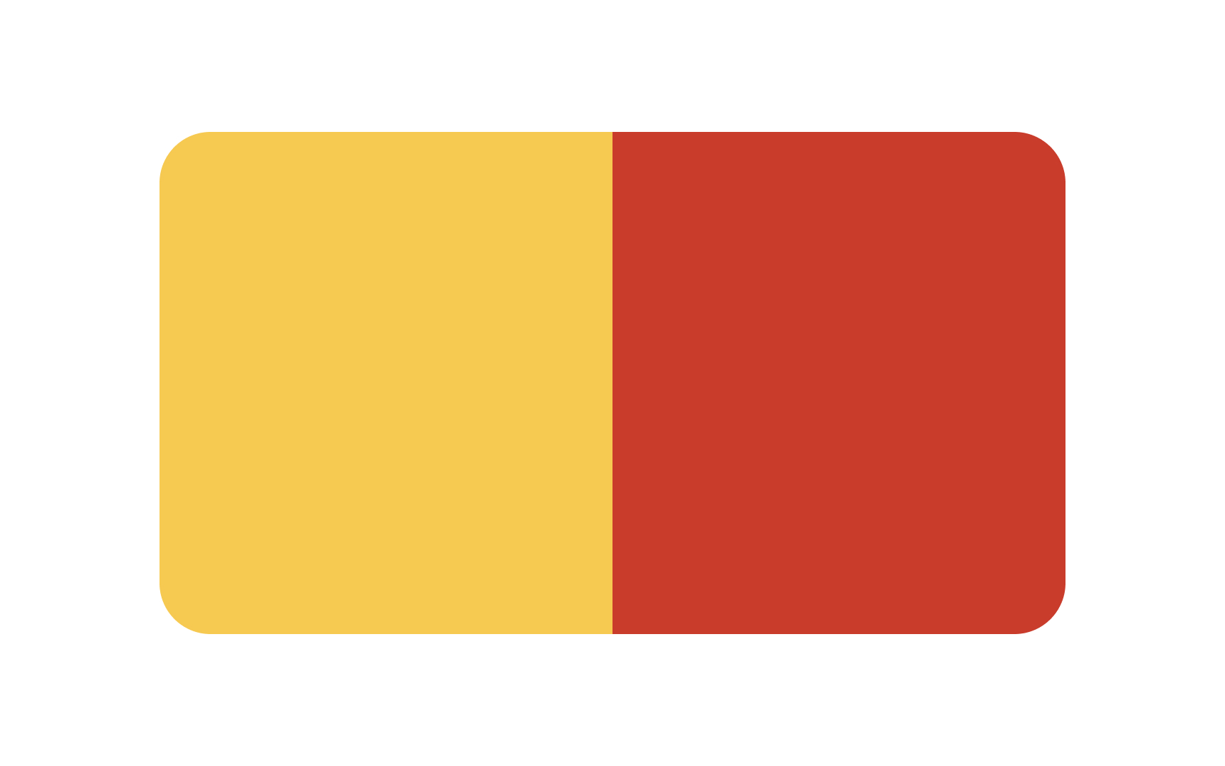
Reds and yellows are incredibly stimulating, vibrant, and bold
While these colors can make your customers feel hungry and crave your food, it can be a challenge for your brand to stand out. To address this, consider incorporating other accent colors and put thought into the brand name and logo design. For example, at Wendy's, they've managed to use the unappetizing blue, but it looks great and memorable.
If you are designing


Although there are cultural differences in holiday associations, it's also important to remember how colors affect moods or evoke particular memories or feelings among many users.
Specific shades of red and green may be associated with Christmas time and its attributes like Christmas trees, red stockings hanging over the fireplace, beautiful evergreen wreaths, candy canes, and mistletoe.
Similarly, in China and other Asian cultures, the
When selecting a color palette, keep these associations in mind and make sure to pick hues that promote the feelings you would like users to have when they see your product.
In filmmaking,
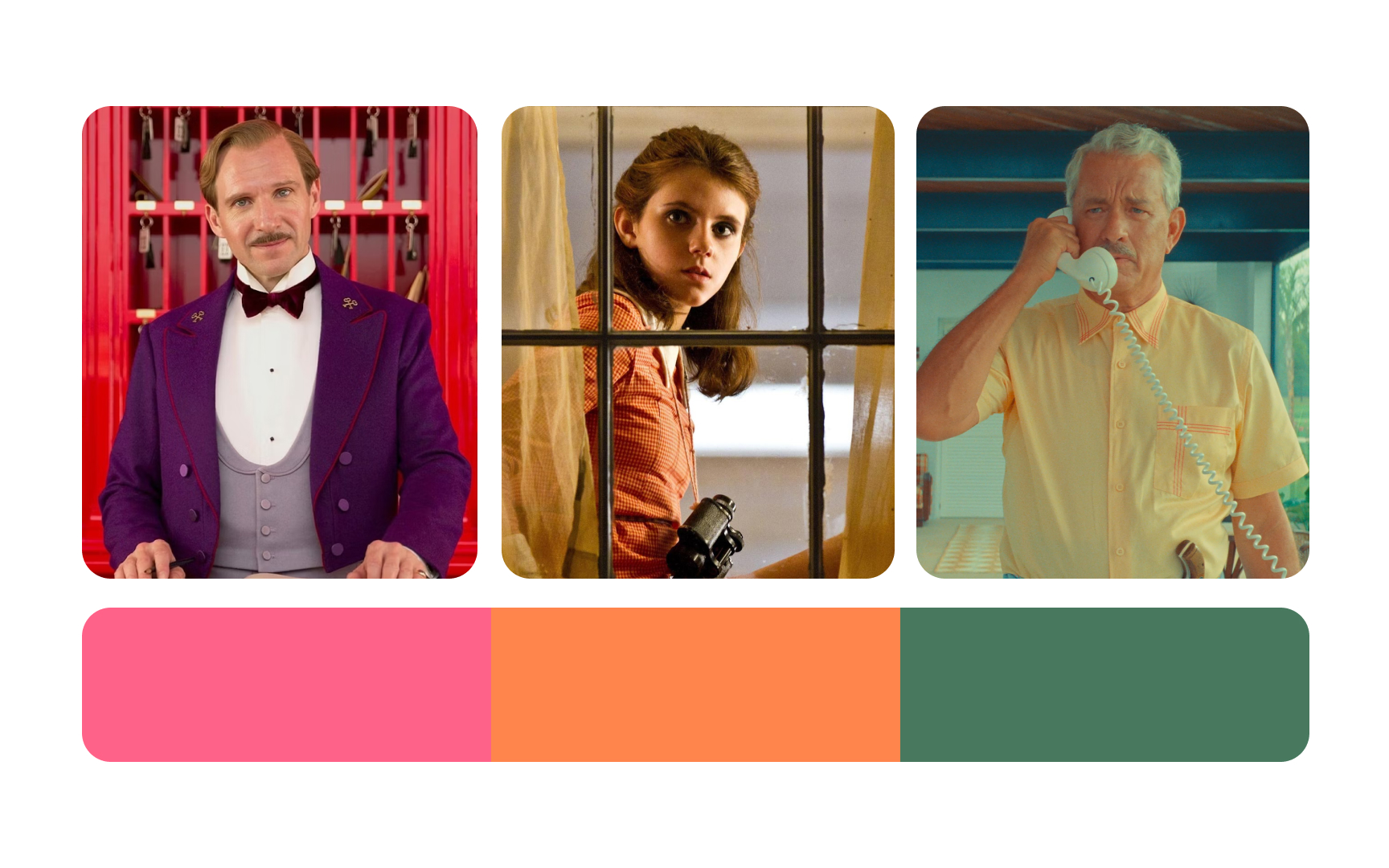
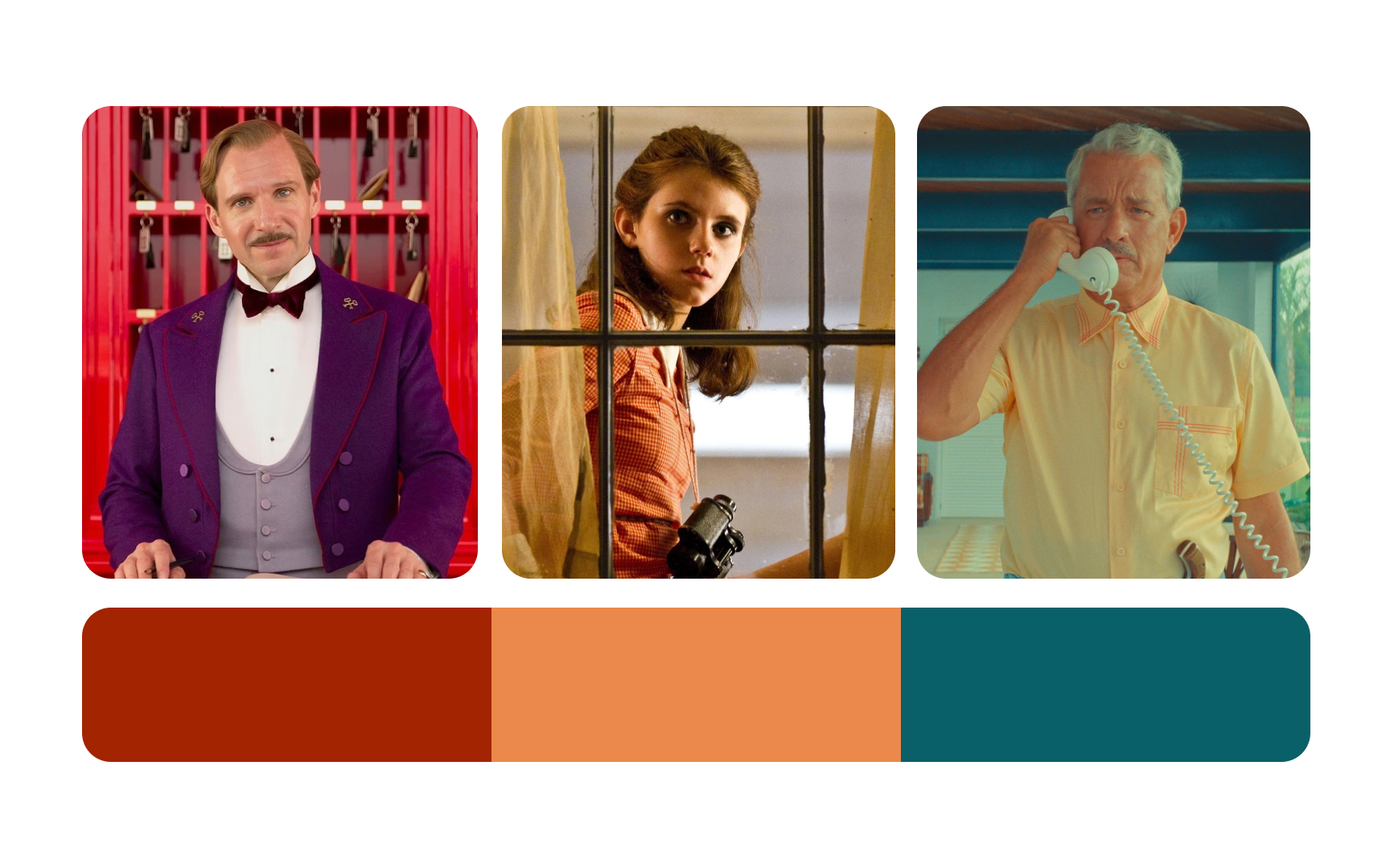
Wes Anderson's pastel color palettes used in his works always feel dream-like and a bit nostalgic. The muted pink in The Grand Budapest Hotel or hazy oranges and greens in Moonrise Kingdom help the cinematographer create a unique atmosphere for his characters to live in and creates a particular mood for viewers.[5]
People tend to associate romantic movies with consistently bright and more saturated colors. They feel more relaxed, safe, and eager to laugh seeing characters highlighted with cheerful light. Conversely, dramatic scenes are linked to melancholic dark or muted blue, green, black, or gray. Not to mention that heroes and villains can also be easily revealed by color.[6]


Scientists suggest that our positive associations with green and blue have been rooted in our brains through evolution.[7] Green landscapes are linked to growth and vitality, while blue skies and water bodies suggest clarity and calmness. These natural
Exposure to nature's colors, such as green and blue, has been shown to reduce stress, lower blood pressure, and improve mood. For instance, the serene greens of a forest can calm the mind, while the expansive blues of the sea can evoke a sense of peace.
Incorporating these colors into interfaces can help mitigate the negative effects of urbanization.[8]
Apple's early iPod commercials with dark silhouettes dancing to a tune against colorful backgrounds were not just about selling a portable music player — they were selling an experience, a lifestyle.[9]
People got attached to the iPod on an emotional level, and
While selecting the
If you enjoy watching movies from different decades, you're likely to notice that some colors dominate particular eras, creating specific moods and feelings. The popularity of different colors across the decades isn't accidental. Events in society, fashion, music, and art shaped the role of
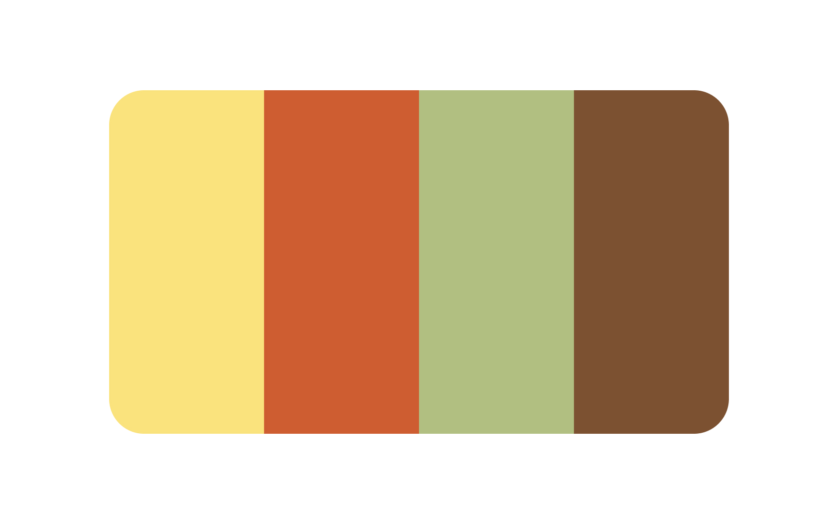
The 1970s were signified by a tremendous revolution in television when most stations worldwide upgraded from black-and-white to color transmission.[11] Furthermore, on the 22nd of April in 1970, Earth Day was celebrated for the first time in the US, aimed at increasing public awareness of the world's environmental problems. Earth tones dominated this era and the palette became more nature-inspired with harvest gold, rusty oranges, chocolate browns, overripe avocado green, etc.[12]
References
- PNAS | PNAS
- McDonald's Logo: History, Meaning, Design Influences, and Evolution | crowdspring Blog
- Lunar New Year | Traditions, Legend, & Facts | Encyclopedia Britannica
- Wes Anderson's Colour Palettes | AnOther
- Cinematographers and the Color Palette: The Impact of Color | Student Filmmakers Magazine
- How Does the Color Green Make You Feel? | Verywell Mind
- #1 iPod commercial | YouTube
- How Did Color TV Come to Be? | ThoughtCo
Top contributors


Topics
From Course

Share


Similar lessons

Intro to Color Theory

Color Properties
