Select the right chart type
Choosing the right chart type is crucial for effectively conveying your data. Start by considering your data's nature and what you want to communicate.[1]
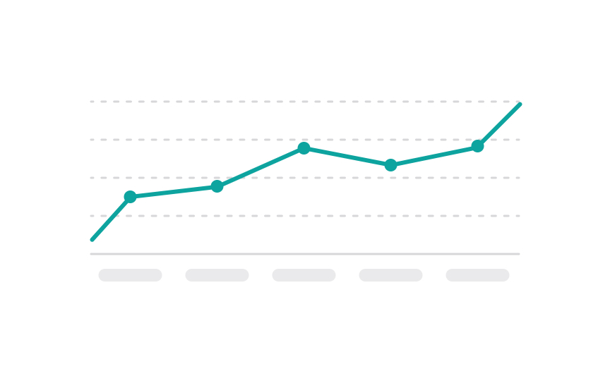
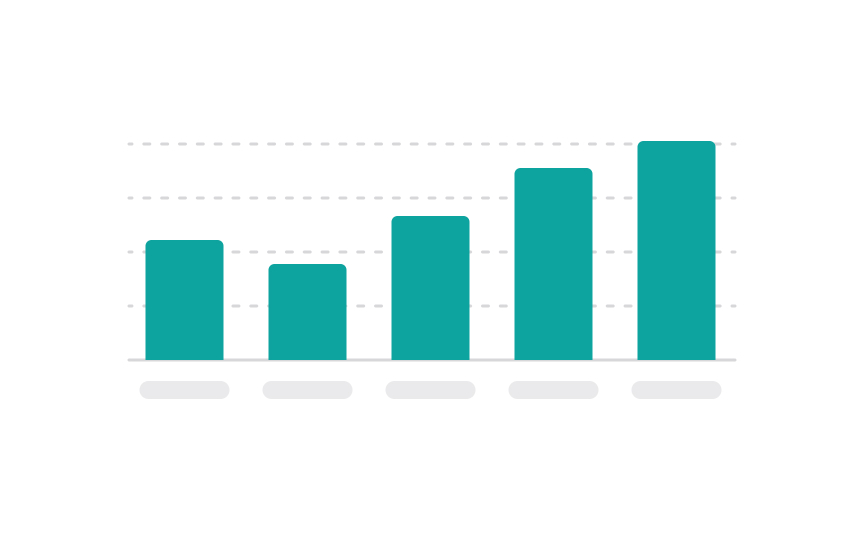
Use bar charts for comparisons among discrete categories, line charts to show trends over time, and pie charts for displaying parts of a whole. Scatter plots are ideal for showing relationships between two variables, while histograms work well for displaying the distribution of data. For complex data sets with multiple variables, consider multi-series charts or stacked bar charts.
Always prioritize clarity — the chart should make the data easier to understand, not more complicated. Keep it simple and direct to ensure your message is effectively communicated.


