Set charts to zero-valued baselines
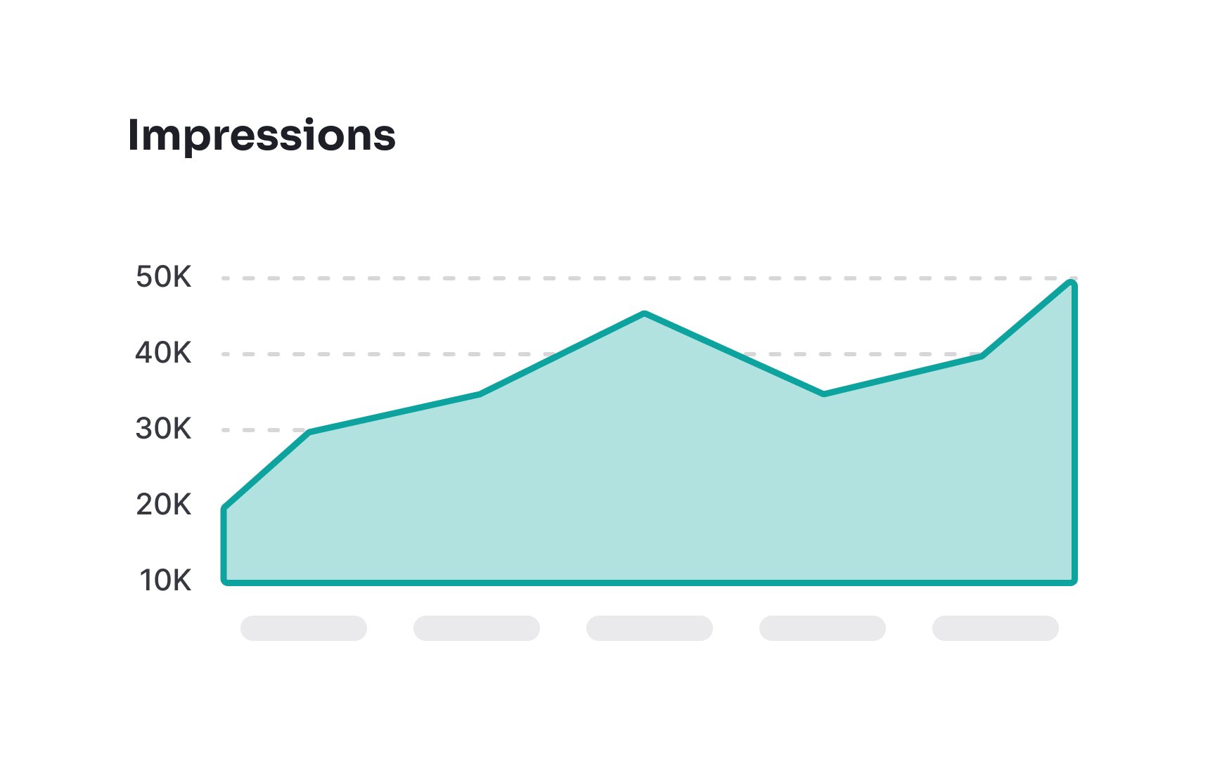
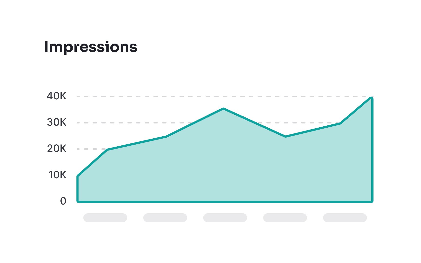
When designing a chart, always keep in mind zero values. Not starting the y-axis (or x-axis for horizontal bar charts) at zero can make data appear misleading and untruthful. For example, when the y-axis begins at 10, the bar reaching a value of 10 appears disproportionately smaller than one reaching a value of 30. By starting the axis at zero, you guarantee that data is displayed correctly and reduce the chances of users misinterpreting the data.
However, you don’t always need to start at zero. For line charts or scatter plots showing frequency distributions like stock prices or temperature trends, the important part is the change over time, not the absolute value. Starting the axis closer to the data range makes small changes easier to see.