Confirm destructive actions
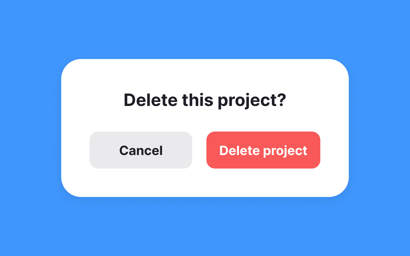
Confirmation dialogs serve as a crucial checkpoint to verify users' intentions before proceeding with potentially irreversible actions. For instance, imagine users managing files in a cloud storage app. If they select multiple files and hit the delete button — perhaps mistaking it for the download button — a confirmation dialog that asks, "Delete these files?" gives them a moment to pause and reconsider their action. This simple interaction helps prevent the accidental loss of important data.
However, it's important to use confirmation dialogs judiciously. Overuse can lead to dialog fatigue, where users become so accustomed to dismissing confirmation dialogs that they no longer pay attention to the content, potentially leading to the very errors the dialogs are meant to prevent. Therefore, they should be reserved for actions with high consequences to maintain their effectiveness and prevent workflow disruption.[1]
Don't place the confirmation button in the same spot as the initial trigger button that triggered it. For example, if a user clicks "Delete" in the top-right corner, the "Confirm delete" shouldn't appear in that same position. Users in a hurry might accidentally double-click or tap twice in the same location, inadvertently confirming an action they meant to reconsider. By spatially displacing the confirmation (perhaps centering the dialog with buttons in a different location) and introducing a brief temporal buffer, you create a more deliberate decision-making moment that better protects against accidental data loss.
References
- Preventing User Errors: Avoiding Unconscious Slips | Nielsen Norman Group
Top contributors