Adhere to broad, shallow hierarchies
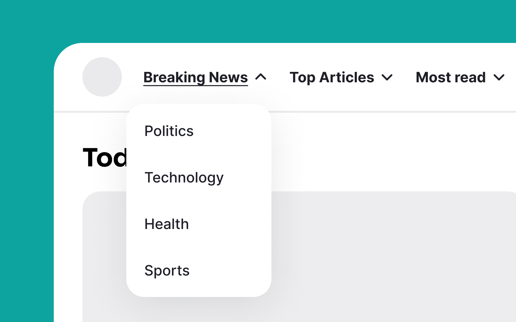

A broad and shallow hierarchy organizes information or options across a few layers that are easily visible and accessible. This contrasts with a narrow and deep hierarchy, where information is stacked under several layers, requiring more navigation steps to access. For example, consider a mobile app for a news site. A broad and shallow hierarchy might have a main screen with large, clear buttons for categories like "World News," "Sports," "Entertainment," and "Weather." Tapping on one of these buttons might bring you directly to a list of articles in that category. This setup allows users to access the information they need quickly and with minimal effort.
This helps users find what they need faster without memorizing complex navigation paths or making many clicks. It makes the interface easier to use and enhances the overall user experience by reducing cognitive load and navigation time.[1]
However, in some situations, there may simply be too many categories to show them all at one level. In other cases, showing specific topics too soon will just confuse your audience, and users will understand your offerings much better if you include some intermediate category pages to establish context.
References
- Spatial Memory: Why It Matters for UX Design | Nielsen Norman Group
Top contributors