Visual or wording tricks
Visual or wording tricks in design exploit the limits of human cognition, taking advantage of cognitive biases or breaking common design patterns to mislead users. These tricks can erode trust and create frustration.
Here are a few common examples:
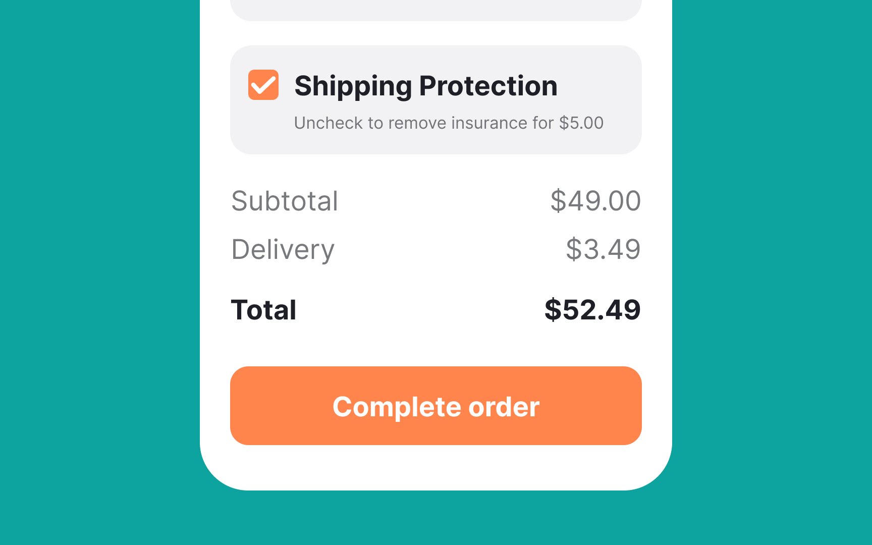
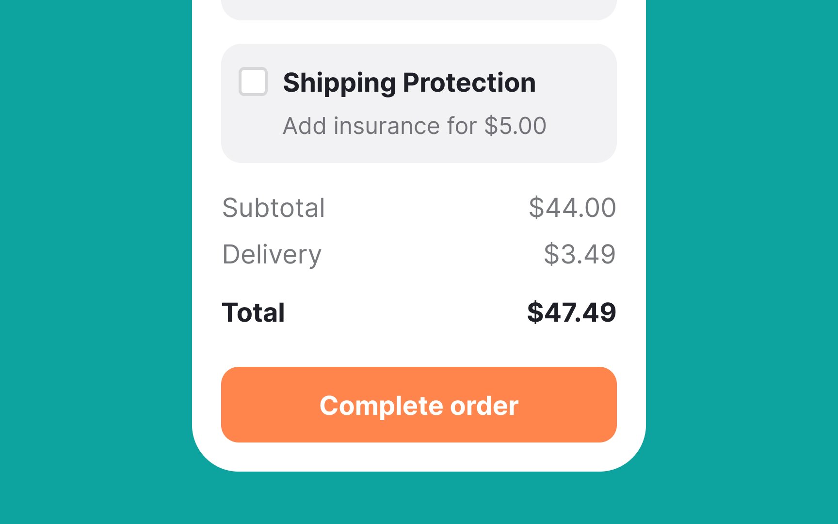
- Tricky language: Some products use confusing language to compel users into buying or subscribing to something they don't want. For example, a subscription service might have a checkbox that says, "Uncheck to avoid subscribing to our newsletter," which can easily confuse users.
- Misdirection: This involves using design elements to distract users from what is really happening. An example would be a flashy banner promoting a discount that overshadows a small note saying the discount applies only after enrolling in a monthly plan.
- Hidden information: Sometimes, critical information is hidden in places where users are unlikely to look. For example, hiding cancellation fees or renewal terms in small print at the bottom of the page makes it hard for users to make informed decisions.
