Use a recognizable slider thumb style

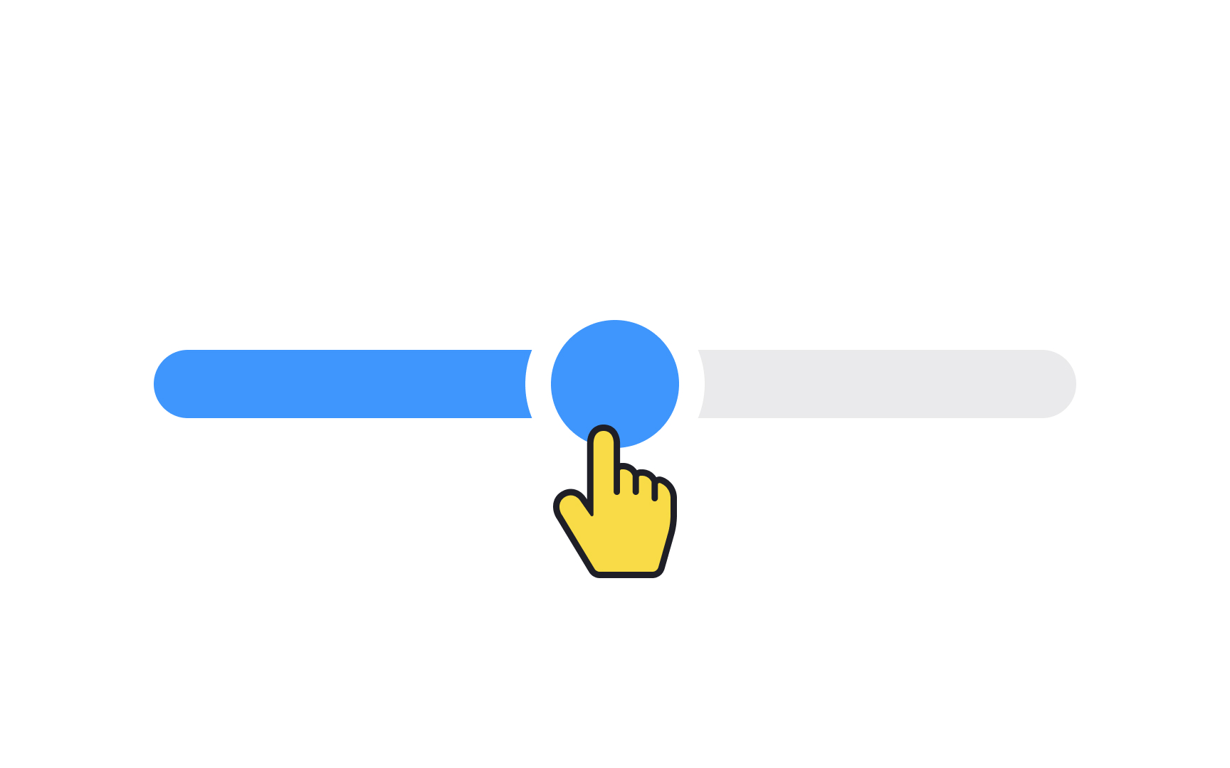
A recognizable slider thumb style not only looks visually appealing but also signals to users that they can interact with it. It's a crucial cue that can prevent users from feeling confused or stuck when they encounter a slider.
When you opt for a familiar design, you're relying on users' past experiences with other interfaces. This means less cognitive load and quicker interactions. On the flip side, an unconventional or overly artistic slider thumb might leave users scratching their heads, wondering what to do next. So, it's not just about aesthetics; it's also about usability and efficiency.
Pro Tip: In general, a 32×32px thumb works well, but make the clickable area a bit larger than that.
