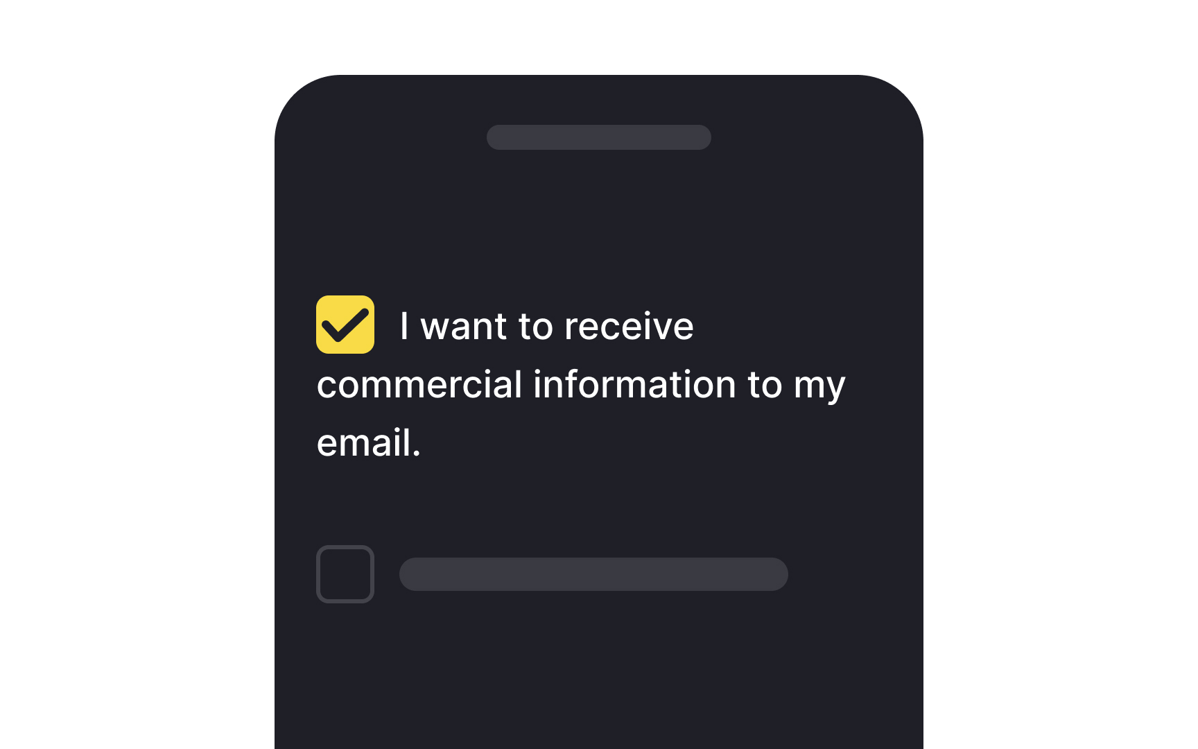
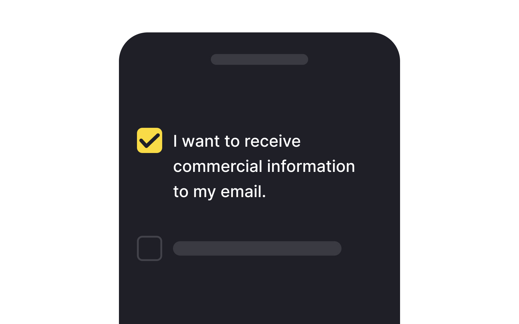
Maintain uniform alignment for wrapped text
When it comes to designing interfaces, text readability next to selection controls like checkboxes or radio buttons shouldn't be an afterthought. Making text easy to read can significantly accelerate the user journey, enhancing overall satisfaction.
One crucial tip is to maintain consistent alignment for wrapped text. If your text spans multiple lines, each line should align with the one above. This approach not only boosts legibility but also ensures that key information won't be missed. Plus, it draws the right kind of attention to the selection controls themselves, making them more noticeable.
Top contributors